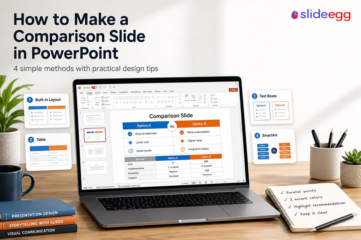
A comparison slide does one job: it helps your audience make a decision. Whether you’re pitching two vendors, showing a before-and-after, or breaking down a product lineup, a well-structured comparison slide puts every key difference in the same line of sight.
PowerPoint gives you several ways to build this — from a ready-made layout that takes 60 seconds to a custom table that handles complex feature sets. This guide walks through four methods, with step-by-step instructions for each, plus design tips that prevent the most common mistakes.
Quick Answer
To make a comparison slide in PowerPoint: go to Home → New Slide → Comparison to use the built-in two-column layout. For more control, insert a table (Insert → Table) with a feature column and one column per option. Label each column, add your criteria row by row, and use color or icons to highlight the winner.
What Is a Comparison Slide?
A comparison slide is a structured visual that places two or more options side by side against a shared set of criteria. It’s different from a plain bullet-point list because it forces a consistent framework: every option is measured on the same dimensions, so your audience can scan vertically and draw their own conclusions.
Common use cases include:
| Use Case | Example | Best Format |
|---|---|---|
| Product vs. product | Free plan vs. Pro plan features | Checkmark table |
| Before vs. after | Old workflow vs. new workflow | Side-by-side layout |
| Pros vs. cons | Outsourcing vs. in-house | Two-column with icons |
| Vendor comparison | 3 software options evaluated | Feature table (3+ columns) |
| Concept contrast | Strategy A vs. Strategy B | SmartArt or split layout |
4 Methods at a Glance
Pick the method that matches your content type and the time you have.
| Method | Best For | Time to Build | Skill Level |
|---|---|---|---|
| Built-in Comparison Layout | Simple two-option text or image comparison | 1–2 min | Beginner |
| Table | Feature-by-feature or checkmark comparison | 5–10 min | Intermediate |
| Side-by-Side Text Boxes | Pros vs. cons, before vs. after | 5–8 min | Beginner |
| SmartArt | High-level visual contrast (small text sets) | 3–5 min | Intermediate |
Method 1: Use the Built-In Comparison Layout
PowerPoint includes a dedicated Comparison slide layout — two content areas side by side, each with its own heading placeholder. It’s the fastest starting point for a basic two-option slide.
1. Open your presentation and go to the target slide position
Click between two slides in the left panel where you want to insert the comparison slide.
2. Insert a new slide with the Comparison layout
Go to Home tab → click the New Slide button (the arrow below it) → select Comparison from the layout gallery.
3. Add your main slide title
Click the top title placeholder and type the comparison question or topic — for example, “Plan A vs. Plan B” or “Current Process vs. Proposed Process.”
4. Label each column
The layout has two smaller heading placeholders above each content area. Click each one and type the name of each option (e.g., “Option A” and “Option B”).
5. Fill in the content areas
Click each large content placeholder and add bullet points, images, or charts. Keep the points parallel — if the left side lists three criteria, the right side should address the same three in the same order.
6. Apply color differentiation
Select each column heading and apply a distinct fill or font color so the two sides are visually distinct at a glance. Use your theme colors to keep it consistent with the rest of the deck.
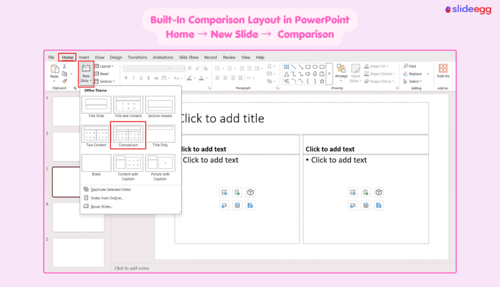
Tip: The Comparison layout and the Two Content layout look similar but differ in one key way. Comparison gives each content area its own heading placeholder, making it purpose-built for labelling options. Two Content has a single title at the top with no per-column headings.
Method 2: Build a Comparison Table
For feature-by-feature comparisons — especially those with checkmarks, pricing tiers, or multiple criteria — a table is more readable than a two-column text layout. Each row represents one criterion; each column represents one option. If tables are new to you, our guide on creating and formatting tables in PowerPoint covers the basics.
1. Start with a blank slide
Add a new slide and choose the Blank layout (or Title Only if you want a header). A blank canvas gives you full control over the table size and position.
2. Insert a table
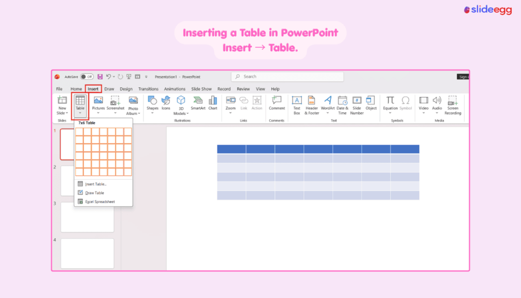
Go to Insert → Table. For a two-option comparison, choose 3 columns (Feature | Option A | Option B) and as many rows as you have criteria, plus one header row. For three options, use 4 columns.
3. Format the header row
Select the top row → apply a bold background color (your brand’s primary color works well). Type the column headers: leave the first cell blank or label it “Feature,” then name each option in the remaining cells.
4. Fill in the criteria and values
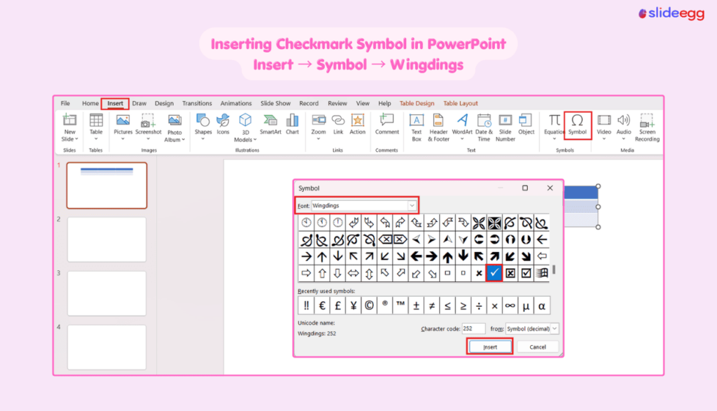
List each feature or criterion in the first column. In the option columns, enter values, short descriptions, or checkmarks. To insert a checkmark symbol, press Alt + 0252 on the numpad (with Wingdings font) or go to Insert → Symbol → Wingdings and select ✓.
5. Use alternating row colors for readability
Select the table → go to Table Design tab → check Banded Rows. Adjust the light row color to a very soft gray or a tint of your brand color.
6. Highlight the recommended option
If one option is your recommendation, give its column header a brighter fill — or add a thin colored border around the entire column using the table border tools under Table Design → Borders.
7. Resize and center the table
Drag the table handles so it fills most of the slide with equal margins on all sides. Center it using Home → Arrange → Align → Align Center and Align Middle.
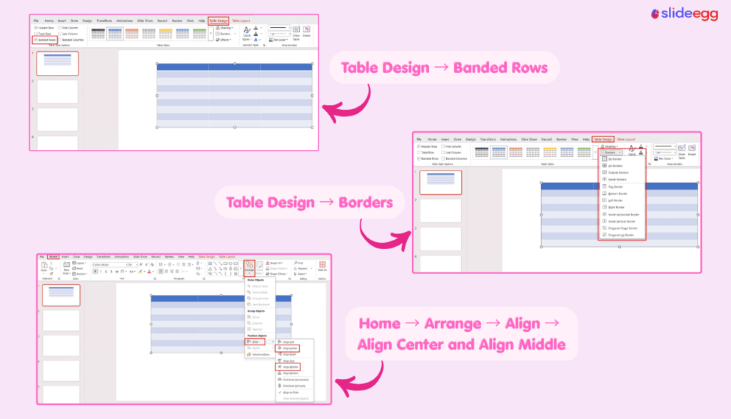
Note on checkmark symbols: The quickest method in PowerPoint 365 is to go to Insert → Icons, search “checkmark,” and insert a scalable vector icon. This looks sharper than a symbol character and resizes without pixelating.
Method 3: Side-by-Side Text Boxes (Pros vs. Cons)
This method works well for before/after scenarios, pros/cons breakdowns, or any comparison where the two sides don’t share a strict row-by-row structure. You build it manually using text boxes and a dividing line.
1. Enable guides for alignment
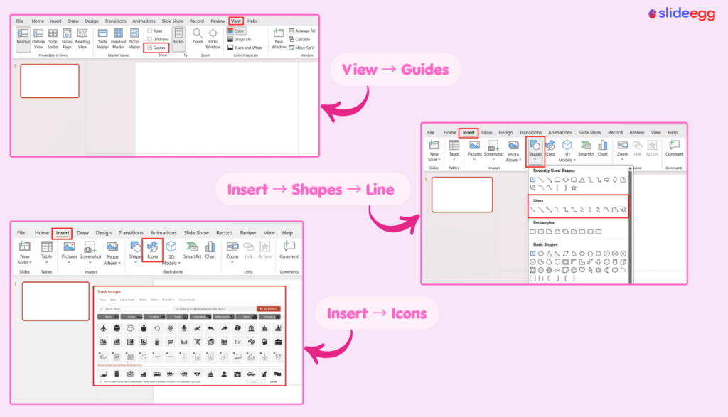
Go to View → Guides (check the box). PowerPoint adds a horizontal and vertical guide through the center of the slide. These help you place elements symmetrically.
2. Add a slide title
Insert a text box at the top of the slide for the main heading. Keep it concise — the comparison itself should be the visual focus, not a long title.
3. Insert a vertical dividing line
Go to Insert → Shapes → Line. Hold Shift while drawing to keep it perfectly vertical. Place it along the center guide. Set the line color to a mid-gray and weight to 1–1.5pt.
4. Add column heading text boxes
Insert a text box above the left half and one above the right half. Type the label for each side — for example, “Pros” and “Cons,” or “Before” and “After.” Use a larger, bold font (18–22pt).
5. Add bullet-point content text boxes
Insert one text box per side below the column heading. Use bullet points or short sentences. Keep each point to one line if possible — the audience is reading from a distance.
6. Apply color coding to the headings
Give the two column headings different fill colors — for pros/cons, green and red work intuitively. For a neutral before/after comparison, use your two brand accent colors.
7. Add icons for visual anchoring (optional but recommended)
Go to Insert → Icons and place a relevant icon above or beside each column heading — a thumbs-up and thumbs-down, a clock, a dollar sign, or a shield, depending on the context.
Method 4: Use SmartArt for a Visual Overview
SmartArt gives you a diagram-style comparison without manual positioning. It’s useful when you have a small number of text points and want a polished look quickly — but it has real limitations for data-heavy comparisons.
1. Insert a SmartArt graphic
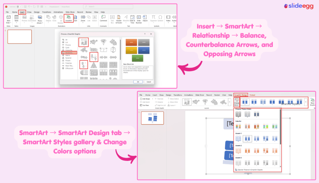
Go to Insert → SmartArt. In the gallery, select the Relationship category. Look for layouts like Balance, Counterbalance Arrows, or Opposing Arrows — these are designed specifically for comparisons.
2. Type your content in the text pane
The text pane opens on the left when the SmartArt is selected. Click each placeholder text and replace it with your content. Each top-level bullet maps to a section of the diagram.
3. Apply a SmartArt style
Click the SmartArt → go to the SmartArt Design tab → choose a style from the SmartArt Styles gallery. Avoid 3D or beveled styles — flat designs read better on screen and in print.
4. Change colors to match your theme
Click Change Colors in the SmartArt Design tab and choose a color set from your theme palette. Using off-brand colors here is a common mistake that makes slides look inconsistent.
5. Resize font sizes manually if needed
SmartArt auto-shrinks font sizes to fit. If text becomes too small to read on a projector (below 16pt), reduce the number of bullet points or switch to a table instead — SmartArt is not suited to long text sets.
When to skip SmartArt: If you have more than 4–5 bullet points per side, or if audience members will be reading off a printout rather than watching a screen, a table or text box layout gives better legibility.
Design Tips That Make Comparison Slides Actually Work
The structure is only half the job. These are the most common design decisions that separate a clear comparison slide from a confusing one.
🎨 Use two accent colors, maximum
One color per option. More than two turns the slide into a color puzzle the audience has to decode before reading the content.
↕️ Keep points parallel
Row 1 on the left and Row 1 on the right should compare the same criterion. Misaligned rows force the audience to hunt for the relevant counterpart.
🔍 Limit to 6–8 criteria
More than 8 rows creates visual overload. If you have 15 criteria, split into two slides or group related criteria under shared headings.
✅ Use icons over text for yes/no
A checkmark or cross communicates feature availability three times faster than “Yes” or “No” as text. Icons from Insert → Icons scale without pixelating. Here’s how to add and modify icons in PowerPoint.
⭐ Highlight your recommendation
If you have a preferred option, use a subtle background tint on that column or add a “Recommended” label. Don’t make the audience guess your point.
📐 Align everything on a grid
Use View → Gridlines to check alignment. Unaligned text boxes or a slightly off-center dividing line look unprofessional and undermine your credibility.
Skip the Build — Use a Ready-Made Comparison Template
SlideEgg offers professionally designed comparison slides for PowerPoint — feature tables, pros/cons layouts, and multi-column comparisons, all fully editable. Download once and replace the placeholder text with your own content. Prefer to start from a full deck? You can also generate one in seconds with our AI presentation maker and drop your comparison slide into it.
Which Method Should You Use?
| If you need to… | Use this method |
|---|---|
| Put two options side by side quickly with text or images | Built-in Comparison Layout |
| Compare 5+ features with checkmarks or data | Table |
| Show pros and cons or before/after without a strict grid | Side-by-Side Text Boxes |
| Create a visual, diagram-style overview for an exec audience | SmartArt |
| Build a polished slide fast without starting from scratch | Pre-built Template |
Common Mistakes to Avoid
- Overcrowding the slide: Fitting 12 criteria onto a single slide forces a font size no one can read from the third row. If your list is long, pare it down to the most decision-relevant points or break it across two slides.
- Unequal point counts per column: If Option A has 6 bullet points and Option B has 3, the audience assumes you’re padding one side or hiding weaknesses in the other. Keep counts equal.
- No visual hierarchy: A comparison slide where every element is the same size and weight forces the audience to read the whole thing. Use size, weight, and color to direct attention to the most important row or column first.
- Using SmartArt for data-dense comparisons: SmartArt auto-shrinks text. For anything with more than four or five points per side, a plain table will be more legible and faster to build.
- Forgetting a conclusion: A comparison slide that just lists differences without signaling a direction leaves work for the audience. Add a brief callout, a “Recommended” badge, or a one-sentence verdict at the bottom.
Frequently Asked Questions
Does PowerPoint have a built-in comparison slide layout?
Yes. Go to Home → New Slide → Comparison. The layout gives you two content areas side by side, each with its own heading placeholder. It’s the fastest way to start a basic two-option comparison without building from scratch.
What is the difference between the Comparison layout and the Two Content layout in PowerPoint?
Both have two content areas side by side, but the Comparison layout adds a separate heading placeholder above each column so you can label each option independently. Two Content has only one title at the top, shared across both columns.
How do I add checkmarks to a comparison table in PowerPoint?
Three options: go to Insert → Icons and search “checkmark” for a scalable vector icon; use Insert → Symbol → Wingdings and select ✓; or type the character directly using Alt + 0252 with the Wingdings font active. The Icons method produces the sharpest result at any size.
How many items should I compare on one slide?
Two to three options is ideal. Four becomes tight. For the criteria rows, aim for six to eight maximum — enough to be comprehensive without creating visual overload. If you have more, group related criteria or split across two slides.
Can I use SmartArt for a comparison slide?
Yes, but only for small text sets. SmartArt auto-shrinks font sizes to fit, so anything with more than four or five points per side becomes unreadable on a projector. For feature-heavy comparisons, a plain table gives better legibility and more layout control.
How do I highlight the recommended option in a comparison table?
Select the column header cell, apply a brighter fill color, and add a “Recommended” or “Best Value” label. You can also add a thin colored border around the entire column using Table Design → Borders. Keep the visual cue subtle — it signals a recommendation without overpowering the data.
What colors should I use for a comparison slide?
Stick to two accent colors — one per option. Use your presentation’s existing theme colors so the comparison slide doesn’t look disconnected from the rest of the deck. For pros/cons slides, green and a neutral gray read clearly without being aggressive.
How do I compare three options instead of two in PowerPoint?
The built-in Comparison layout only supports two columns. For three options, insert a table with four columns (Feature | Option A | Option B | Option C) and format it manually. Alternatively, download a three-column comparison template from SlideEgg to skip the formatting work.
Is it better to use a table or text boxes for a comparison slide?
Use a table when you have structured, row-by-row criteria — it keeps content aligned automatically and scales easily. Use text boxes when the two sides don’t share a strict parallel structure, such as a before/after narrative or a pros/cons list where each side has different depths of content.
How do I make a comparison slide look professional without a design background?
Three rules cover most cases: use gridlines to align everything precisely (View → Gridlines); limit yourself to two accent colors; and start from a pre-built template rather than a blank slide. SlideEgg’s comparison templates are fully editable and give you a polished baseline in under five minutes.
Summary
PowerPoint’s built-in Comparison layout handles most quick, two-option slides. For structured feature comparisons, a table is more flexible and scales better. Side-by-side text boxes work well for narrative contrasts like pros/cons or before/after. SmartArt is worth using only when you have a small number of high-level points and want a visual diagram without manual positioning.
Whichever method you choose, the rules are the same: keep criteria parallel, limit your colors to two, highlight your recommendation, and don’t crowd the slide. A comparison slide that requires three minutes of reading has already failed its purpose.