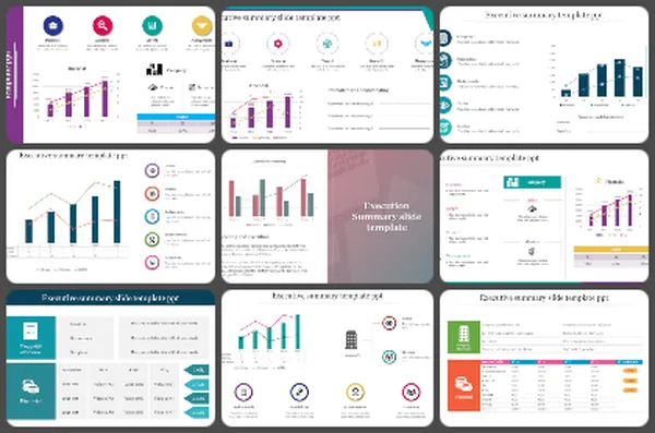
300+ KPI Dashboard Presentation Templates

Numbers alone don't communicate. You know what your metrics mean. Your audience doesn't. Spreadsheets are full of data but empty of insight. That gap between what you know and what people understand is frustrating.
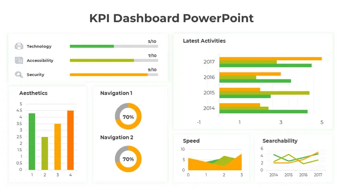
Got a Unique Idea? Craft with AI
PRO
Credits left : 0
Free
Add to Wishlist
Download
AI Customize
Dashboard with multiple metrics including a percentage increase, bar chart, circular progress graphic, and financial data.
Free
Add to Wishlist
Download
AI Customize
Dashboard layout with charts, graphs, and a world map in vibrant colors, showcasing data visually.
Add to Wishlist
Download
AI Customize
KPI slide showcasing cash flow metrics and financial performance over six months in different bar chat layouts.
Add to Wishlist
Download
AI Customize
KPI format slide displaying financial performance metrics with detailed charts and figures.
Add to Wishlist
Download
AI Customize
Six panel infographic featuring KPI metrics with colorful charts, graphs, and numerical data insights.
Free
Add to Wishlist
Download
AI Customize
KPI dashboard template with six sections which includes charts, graphs, and numerical data.
Add to Wishlist
Download
AI Customize
Creative KPI Dashboard PPT And Google Slides Template
Free
Add to Wishlist
Download
AI Customize
KPI Dashboard PPT slide displaying project analysis, revenue, profitability, and gap analysis with data visualizations.
Add to Wishlist
Download
AI Customize
KPI dashboard with a mix of bar, pie, and line charts highlighting revenue, sales, and customer buying patterns.
Add to Wishlist
Download
AI Customize
KPI dashboard layout with a yellow header, two gauge in teal and green, bar metrics, and pie charts on a light background.
Free
Add to Wishlist
Download
AI Customize
Dashboard slide showcasing project management KPIs with bar graphs, a line graph, and a pie chart in different colors.
Add to Wishlist
Download
AI Customize
Dashboard slide with a pie chart, stacked area chart, and multiple colored rectangular boxes displaying metrics.
Free
Add to Wishlist
Download
AI Customize
KPI dashboard featuring a funnel chart, audience metrics, bar graph, and a circular chart with 2021 data.
Add to Wishlist
Download
AI Customize
KPI dashboard template with progress bars, pie chart, bar graphs, and workload metrics in a clean blue theme.
Add to Wishlist
Download
AI Customize
KPI dashboard with a dual-line graph, balance performance gauge, and quarterly income metrics.
Add to Wishlist
Download
AI Customize
KPI Dashboard slide displaying metrics with bar charts and line graphs for key business indicators.
Add to Wishlist
Download
AI Customize
Dashboard with bar chart comparing planned vs. actual tasks for projects, pie chart for project share, and a line graph displaying project data.
Add to Wishlist
Download
AI Customize
Executive dashboard slide displaying many charts from new business to operational expenses.

Experience the power of visualization with our Free KPI PowerPoint Templates and Google Slides Themes!


KPI, short for Key Performance Indicator, acts as a team's scoreboard, reflecting the pulse of progress. Employed across diverse settings such as businesses, schools, and organizations, KPI serves as a compass for gauging performance. Its significance lies in its ability to track progress, offering insights into both successful endeavors and areas needing improvement. Much like a map navigating toward success, KPI illuminates the path forward, guiding individuals and teams toward their objectives. Presentations are crucial for communicating KPIs as they visually showcase data, trends, and achievements, making complex information easily understandable and enabling effective decision-making.

What do we offer in our KPI presentation templates gallery?

Our category has lots of different slides for KPI. We have slides with pictures and graphs that make things easy to understand. You can find slides for many themes here. We have slides for sales, marketing, project management, and more. 

Why choose our slides?

Our slides are special. They're colorful and easy to customize. You can change things around to fit your needs perfectly to make them look exactly how you want. Our slides are royalty-free, which means you can use them without worrying about paying extra fees. We also offer a range of free slides! Plus, they come in different formats and orientations, so they'll always fit your needs.

Who and where can use them?

KPI presentation slide templates can be utilized by anyone, including businesses, educators, students, and organizations, across various settings such as boardrooms, classrooms, meetings, conferences, and seminars, to effectively communicate key performance indicators and drive informed decision-making. You can use them in presentations, reports, or anywhere else you need to show off your data.

So, are you ready to take your KPI presentations to the next level? Check out our KPI slides today and see the difference they can make!

Related Collections

Frequently Asked Questions

1. What metrics should managers track and present to leadership?

Track what matters to your business: revenue, profit margins, customer satisfaction, quality metrics, project timelines, cost control. Choose 5-7 key metrics, not 20. Leadership cares about trends and status, not every number. Show what's improving and what needs attention.

2. How do I choose which KPI to visualize in a dashboard?

Pick metrics tied to your goals. Sales managers: revenue, conversion rates, pipeline. Operations: efficiency, timelines, cost. Finance: cash flow, budgets, variance. HR: hiring, retention, engagement. Only include metrics you act on. If a number doesn't drive decisions, it doesn't belong on the dashboard.

3. What's the best way to visualize different types of data?

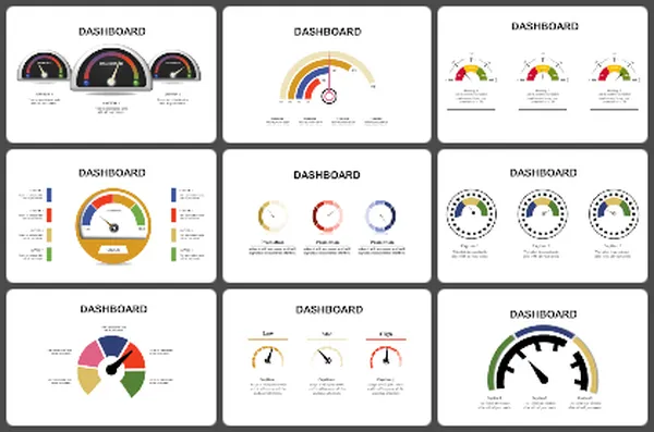
Use bar charts for comparing amounts. Line graphs for trends over time. Pie charts for proportions. Gauges for status (on track/at risk). Progress bars for completion. Tables for detailed numbers. Match the visual to what you're trying to show, not what looks pretty.

4. How often should KPI dashboards be updated?

Update based on your business cycle. Sales: weekly or daily. Finance: monthly. Projects: weekly. Operations: daily or real-time. The frequency depends on how fast things change and how often decisions get made. Regular updates show your data is current and trustworthy.

5. How do I explain declining KPIs to leadership without looking bad?

Be honest about what changed. Show context — market conditions, staffing issues, timing. Present what you're doing to improve. Leadership respects transparency more than hiding bad numbers. Focus on the plan forward, not blame backward.

6. Should KPI dashboards include targets and benchmarks?

Yes. Show where you are now and where you need to be. Use color coding: green (on track), yellow (at risk), red (off track). Benchmarks give context. Without targets, numbers are just numbers. With targets, they tell a story of progress or concern.

7. How many KPIs should I put on one dashboard?

5-10 metrics maximum. More than that overwhelms people. One dashboard = one story. If you need to show 20 metrics, create multiple dashboards by department or goal. Your audience should understand the dashboard in 10 seconds, not spend 5 minutes reading it.