530+ Dashboard Presentation Templates

Data without structure is just noise. Your audience sees numbers but doesn't understand what they mean. Dashboards organize scattered metrics into one clear story. They transform confusion into actionable clarity.

Got a Unique Idea? Craft with AI
PRO
Credits left : 0
Add to Wishlist
Download
AI Customize
Green speedometer graphics illustrating performance levels at 70, 50, 55, and 85 percent in a PowerPoint template.
Add to Wishlist
Download
AI Customize
Yellow speedometer design with two semicircular gauges displaying percentages, each paired with captions.
Add to Wishlist
Download
AI Customize
Dashboard slide with three blue semicircle gauges and captions below, set against a black gradient background.
Add to Wishlist
Download
AI Customize
Dashboard slide with three gray semicircle gauges and captions below, set against a black gradient background.
Add to Wishlist
Download
AI Customize
Dashboard PowerPoint slide featuring three green speedometer style gauges, each labeled with captions.
Add to Wishlist
Download
AI Customize
Dashboard PowerPoint slide with two blue speedometer style gauges and two captions.
Add to Wishlist
Download
AI Customize
Dashboard gauges with red, yellow, green indicators showing low, medium, high performance against a gray background.
Add to Wishlist
Download
AI Customize
Speedometer style dashboard template with green, yellow, and red zones for progress tracking with captions.
Add to Wishlist
Download
AI Customize
Dashboard template with three fuel gauge icons, each showing different fuel levels with placeholder text.
Add to Wishlist
Download
AI Customize
Speedometer dashboard PowerPoint slides showing three colored gauges with 25, 50, and 75 percent progress with captions.
Add to Wishlist
Download
AI Customize
Blurred car dashboard with speedometer, overlaid with a blue text box placed in dark background.
Add to Wishlist
Download
AI Customize
Dashboard template showing last deposit, transaction, payment types, and data market percentages.
Add to Wishlist
Download
AI Customize
Sales KPI PPT slide featuring charts for Revenue, Revenue Comparison, New Customers, and Customer Acquisition Cost CAS.
Add to Wishlist
Download
AI Customize
KPI dashboard slide with metrics for Visits, Visitors, Conversion rate, and Revenue per user along with views per device.
Add to Wishlist
Download
AI Customize
Semi circular gauge with six color coded sections from green to red, With numbers 01 to 06, labeled KPI at the bottom.
Add to Wishlist
Download
AI Customize
Plant growth dashboard with descriptive text, a bar chart comparing three plants, and individual species information cards.
Free
Add to Wishlist
Download
AI Customize
Slide with multiple dashboard elements including bar charts, line charts, pie charts, and progress meters in various colors.
Free
Add to Wishlist
Download
AI Customize
Speedometer graphic with a blue progress bar, labeled distance values, and a right-side text box explaining its concept.
Free
Add to Wishlist
Download
AI Customize
Green radial gauge with a modern layout, surrounded by five labeled rectangular sections on a neutral background.
Add to Wishlist
Download
AI Customize
Modern dashboard PowerPoint template featuring circular progress charts, bar graphs, and key performance metrics.
Add to Wishlist
Download
AI Customize
Sales performance dashboard with four circular progress charts in orange, blue, purple, and green, showing percentage values.
Enhance your data visualization with our free dashboard PowerPoint templates and Google Slides themes!

A dashboard is essentially a visual representation of complex data, allowing users to grasp insights swiftly. It displays key metrics, gauges your progress, and reveals what's working (and what's not) at a glance. In presentations, dashboards do the same for your data. They condense complex information into visually stunning, easy-to-grasp formats that captivate your audience and drive your message home.

But crafting a captivating dashboard can be tricky. Data alone doesn't tell the story; it needs a stage, a framework that illuminates its meaning and sparks action. That's where our dashboard presentation templates come in for converting dry data into dynamic presentations.

What We Offer:

Our vast library of dashboard PowerPoint templates caters to every need. Whether you're presenting:

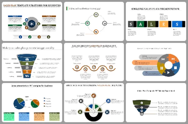
  • Performance Dashboards: Track goals, smash targets, and celebrate milestones with vibrant speedometer designs and progress bars.
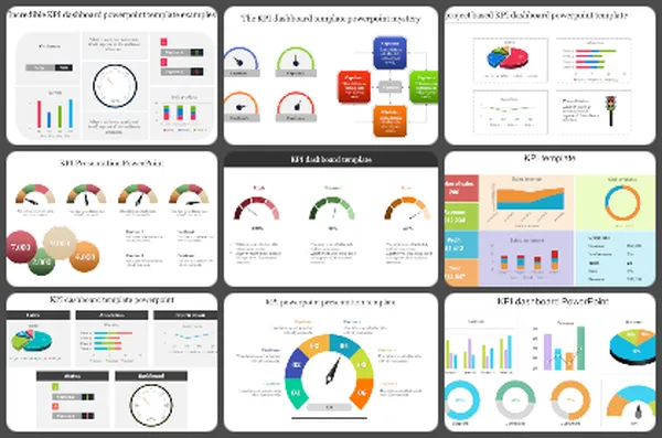
  • KPI Dashboards: Keep your key performance indicators front and center with clear, concise displays that tell the story behind the numbers.
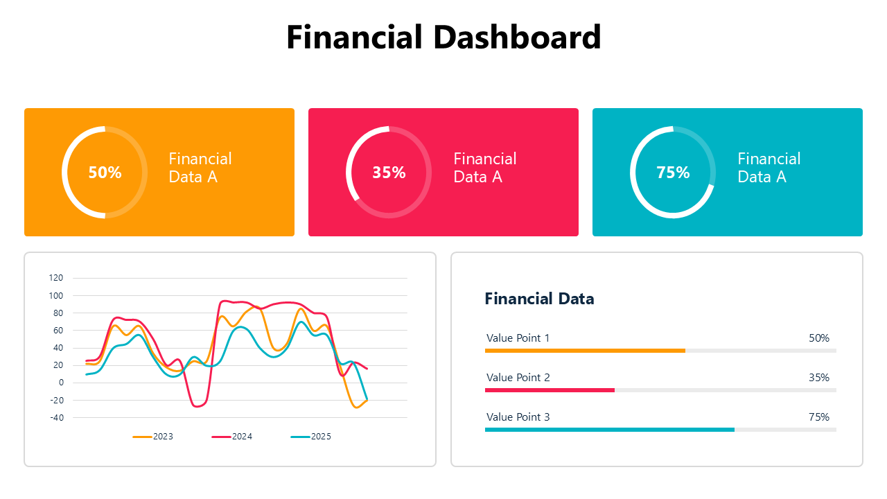
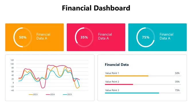
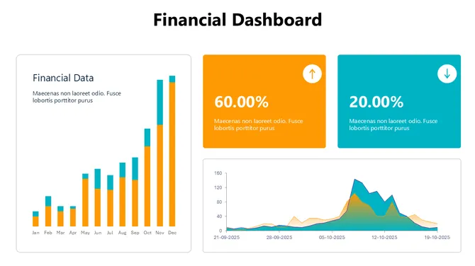
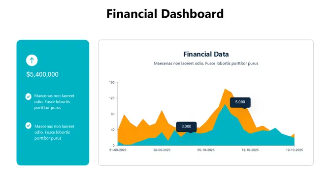
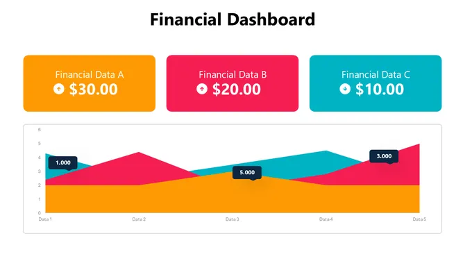
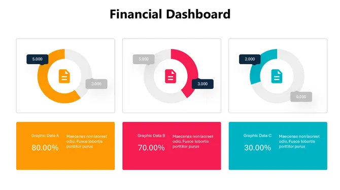
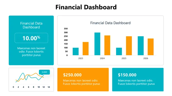
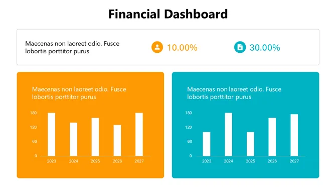
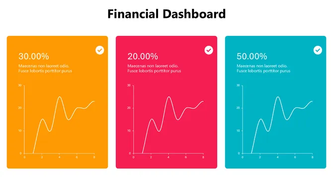
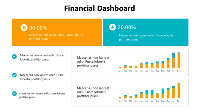
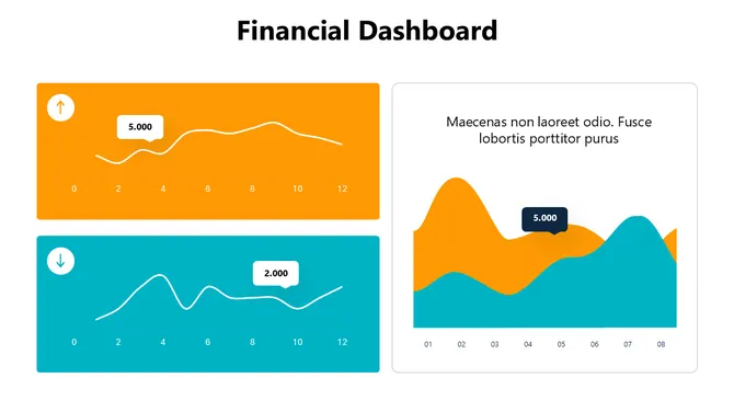
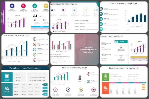
  • Financial Summary Dashboards: Impress investors and stakeholders with sleek, professional layouts that showcase your financial prowess.
  • Project Dashboards: Manage projects like a pro with visual roadmaps, milestone trackers, and task completion meters.

Why Choose Our Dashboard Slides?

Our editable dashboard slides are crafted with creativity and clarity in mind. Multicolor designs make your information pop, while intuitive layouts ensure everyone understands your message with ease. Our templates are hassle-free – no copyright worries with royalty-free use. They're super editable, letting you adjust everything to fit your brand and data just right. Pick the perfect fit with multiple formats – 4:3 or 16:9, portrait or landscape. And the best part? Take a test run with our free dashboard slides before making any commitments. It's that simple!

Where and who can use these dashboard slides?

Our slides are for everyone with a story to tell through data – whether you're a CEO updating investors or a team leader sharing project progress. They're helpful for board meetings, impressing stakeholders with insights. Win deals in client presentations by showcasing your expertise. Keep your team aligned and promote collaboration in team meetings with clear data visualization. For internal reports, share insights and track progress effortlessly across departments. The possibilities are endless!

Don't let your data drown in obscurity. Unleash the power of captivating dashboards with our extensive collection of presentation templates. Start browsing our templates today!

Related Collections

Frequently Asked Questions

1. I have data in Excel—can I actually use these dashboard templates or do I need special software?

Yes. Download the template, open it in PowerPoint or Google Slides, and paste your numbers into the editable fields. The charts update automatically. No special software needed. If your data is in Excel, just copy and paste the numbers. The template handles the visualization.

2. I'm not a designer—can I really customize this template to match my company's colors and branding?

Completely. All templates are 100% editable. Select any color element, right-click, and change it. Change fonts, logos, text—everything. You don't need design skills. The template's structure is already professional; you just swap in your brand colors and logo.

3. Which dashboard template should I pick—I have sales data, budget data, and customer metrics. Do I need three different templates?

One template works. Most dashboard templates have multiple slides, each showing different metric types. One Financial Dashboard might have slides for revenue, costs, profit, and forecasts. Check the slide pack before downloading. You might find everything you need in one template.

4. Can I edit the charts in these templates or are they locked?

Fully editable. Click any chart, change the data, and it updates instantly. Want to switch from a bar chart to a line chart? Right-click, change chart type. Want different chart labels? Edit them directly. Nothing is locked. Everything adapts to your needs.

5. My data updates weekly—do I have to rebuild the dashboard every week or does it update automatically?

If you link the template to a live data source (Excel sheet, Google Sheets, database), it updates automatically. If you manually paste data, just replace the numbers each week—takes 5 minutes. Either way, you're not rebuilding. The structure stays the same; only numbers change.

6. These templates show specific metrics like revenue and profit. What if my business tracks different KPIs?

Delete the metrics you don't need and add your own. The template's power is the STRUCTURE and LAYOUT, not the specific metrics. You control what data appears. Swap out "Revenue" for "Website Traffic" or "Customer Satisfaction Score." The visual format works for any metric.

7. Can I use the same template for different audiences—like one version for executives and one for my team?

Yes. Duplicate the slide, keep different metrics on each version. Executives might see high-level KPIs (revenue, profit margin). Your team might see operational details (daily sales, conversion rates). Same template structure, different data. Save both versions for different presentations.