Harvey Balls Diagram PPT Presentation Slides
Nodes
Colors
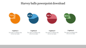
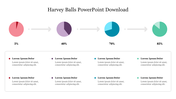
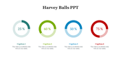
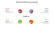
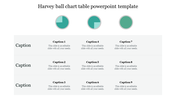
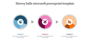
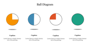
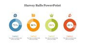
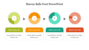
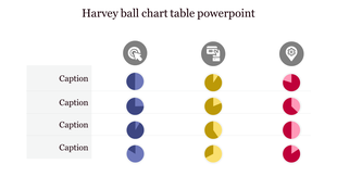
Multicolor Harvey Ball Slide For Business Presentation
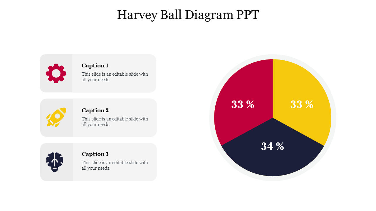
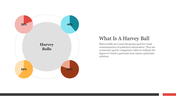
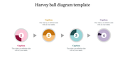
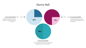
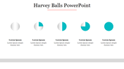
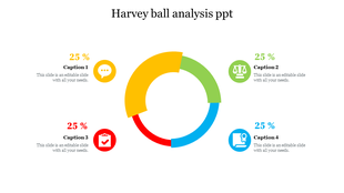
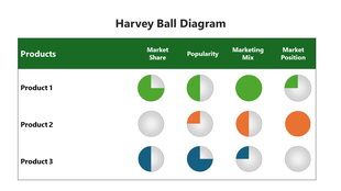
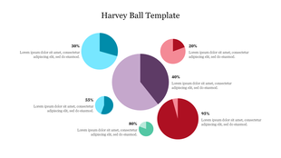
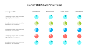
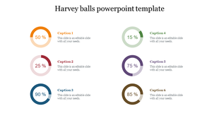
Get ready to make the best Harvey Ball presentations instantly with SlideEgg's readymade Harvey Balls diagram PPT slide. Harvey balls are the best visual representation tool for quick comparison in presentations and reports. We also made this slide perfectly to help you design comparison presentations for your business needs. It has a three-segmented Harvey Ball to compare three sets of information. Each segment is filled with bright and attractive colors and segmented into various percentage levels for easy analysis. It also has legends with icons to make your presentations more effective. With this 100% editable slide, it will be easy for you to personalize its elements, including nodes, colors, background, text format, and more. Download it today to see the light at the end of the tunnel!
Features of the template
- 100% customizable slides and easy to download.
- Slides are available in different nodes & colors.
- The slide contains 16:9 and 4:3 formats.
- Easy to change the colors of the slide quickly.
- Well-crafted template with an instant download facility.
- Three nodes slide to compare three sets of data.
Explore Related Collections
Recommended based on this template.
You May Also Like These PowerPoint Templates
Showing20 of69,218 templates