EXCLUSIVE Grab Unbeatable Independence Day Deals – Up to 80% OFF

Harvey Ball Diagram Chart PowerPoint And Google Slides
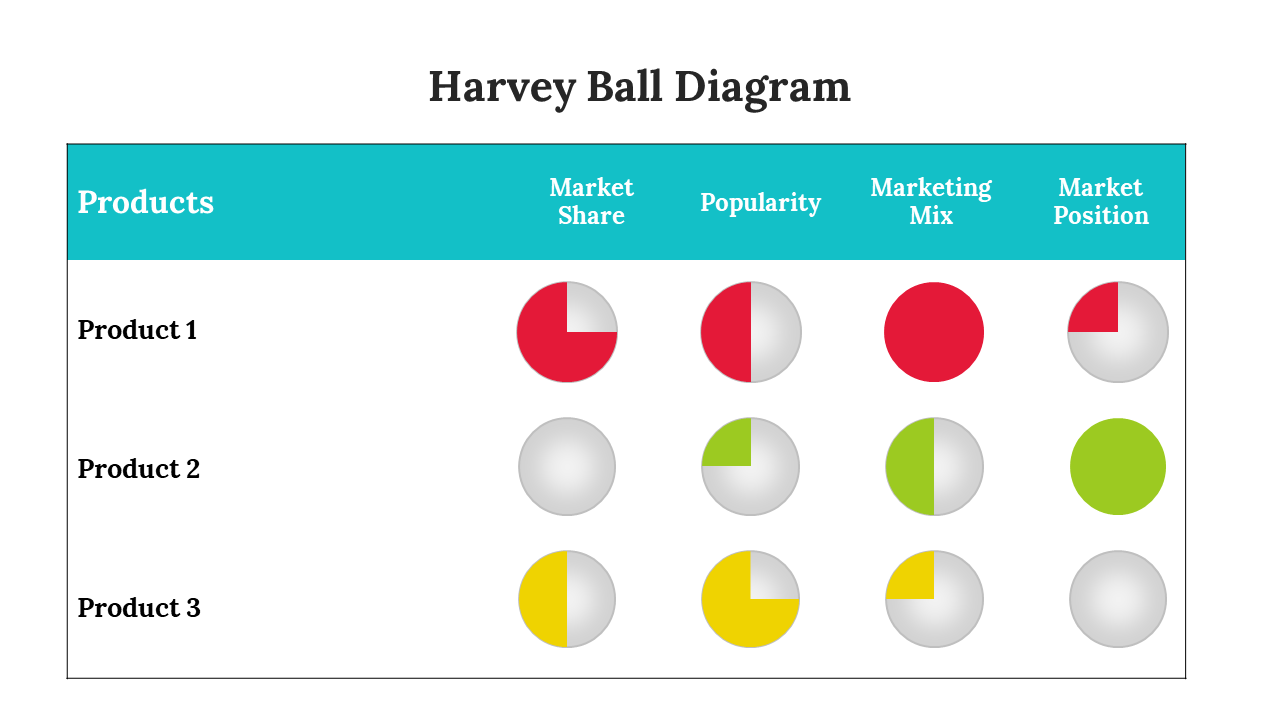
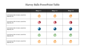
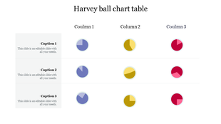
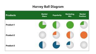
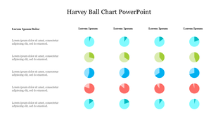
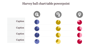
A comparison table of three products with coloured Harvey balls showing varied degrees of completion across four categories.
P.ID : 47940
    503 views
    95 Downloads
    Designer
    Shanmugapriya
    Get Custom Slides by Experts
    Enhance Your Presentations with Add-ins
    Google Slides Add-in
    Access templates directly in Google Slides
    Microsoft PowerPoint Add-in
    Access templates directly in PowerPoint
    GPT Add-on
    AI-powered presentation assistance

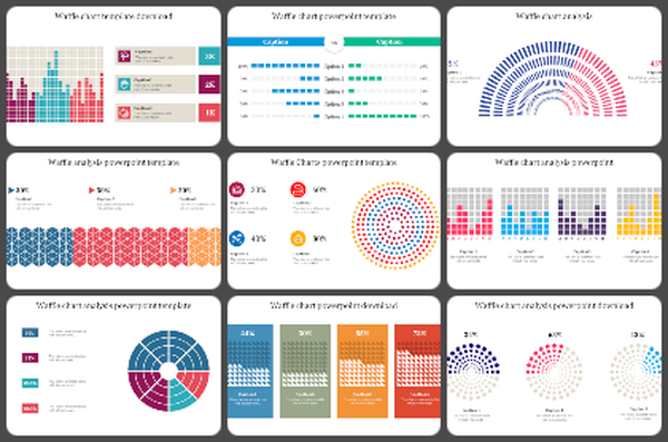
    Awesome Waffle Charts PowerPoint Template

    Waffle charts are typically employed while assembling elements of a larger whole or assessing progress toward a specific objective. These charts generally follow other types of data visualization to aid audience cognition. Here is an excellent Waffle chart template to help you plan perfectly and increase the quality of your composition. Describe specific details and statistical methods in depth. The slide contains three or four nodes in varied colors for your pursuit. Use dark-shaded fonts to draw in the largest number of readers. Hold fast to your principles and advance with astounding information to accomplish more.

    Features of the template

    • 100 % customizable slides and easy to download.
    • Slides are available in different colors
    • The slide has 4:3 and 16:9 formats.
    • Easy to change the slide colors quickly.
    • Appealing presentation to impress an audience.
    • Create feature-rich slide presentations. 
    • An eye-pleasing color slide helps to give a catchy presentation.
    • Crisp and clear font styles.
    • Two nodes with a simple design.
    Advertisement

    You May Also Like These PowerPoint Templates
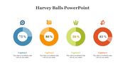
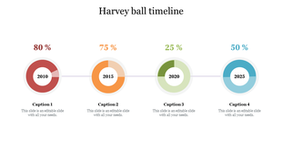
    Harvey ball timeline slide showing percentages for 2010, 2015, 2020, and 2025 with corresponding captions.
    Free
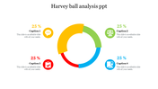
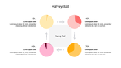
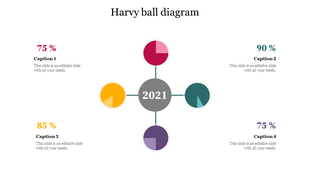
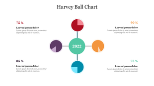
    Harvey ball graphic with four percentage segments around a central year label, color-coded and paired with caption areas.
    Free
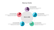
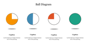
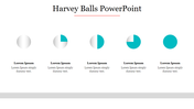
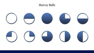
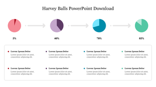
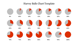
    Harvey Balls infographic showing circles in varying degrees of shading to represent percentage completion.
    Free
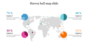
    World map infographic with four harvey ball charts in blue, pink, teal, and orange, showing varying percentage values.
    Free
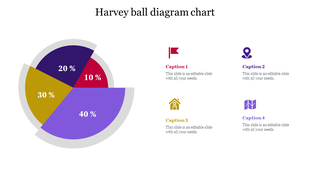
    Harvey Ball chart slide showing four colored segments around a central circle labeled 2022, each with percentage values.
    Free
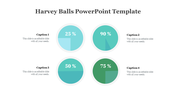
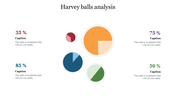
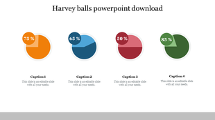
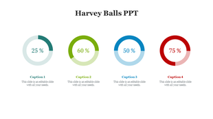
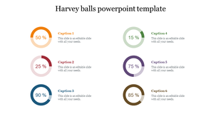
    Circular Harvey Balls showing percentages from 25% to 75% with colored segments and captions areas.
    Free
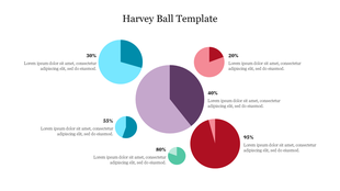
    Infographic slide with colorful Harvey ball chart showing five different completion levels ranging from 20 to 95 percent.
    Free
    PowerPoint slide featuring a table with Harvey ball charts, representing data with colored segments and icons with captions.

    Showing20 of69,218 templates