Editable Data Driven Presentation Template Download



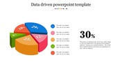
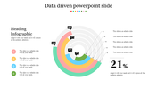
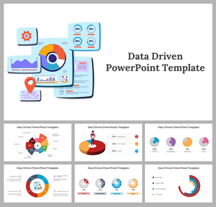
Data-Driven Presentation Template
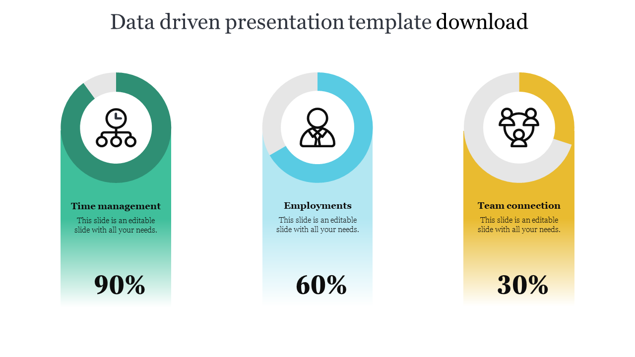
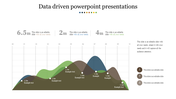
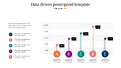
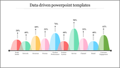
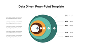
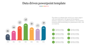
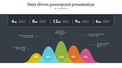
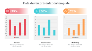
Data is a crucial component of every element in the modern business world. All decisions must be supported by reliable information. Thus, selecting the correct data and conducting the crucial analysis is essential. Once the data has been collected and felt, it must be presented in a simple way to understand. The three rectangular boxes of the cardholder model are helpful to show the plan and proceed with the concepts of Time management, employment, and a team connection. This data-driven approach will give you all the aids needed to make an appealing presentation. Grab now!
Feature of the template
- They are available in different nodes & colors.
- This slide contains 16:9 and 4:3 formats.
- It is easy to change the slide colors quickly.
- It is a well-crafted template with an instant download facility
- The best PowerPoint theme template.
- It is a well-designed presentation template.
- Excellent Data analysis template.
You May Also Like These PowerPoint Templates
Showing20 of69,218 templates