EXCLUSIVE Grab Unbeatable Independence Day Deals – Up to 80% OFF

Analysis Presentation Template
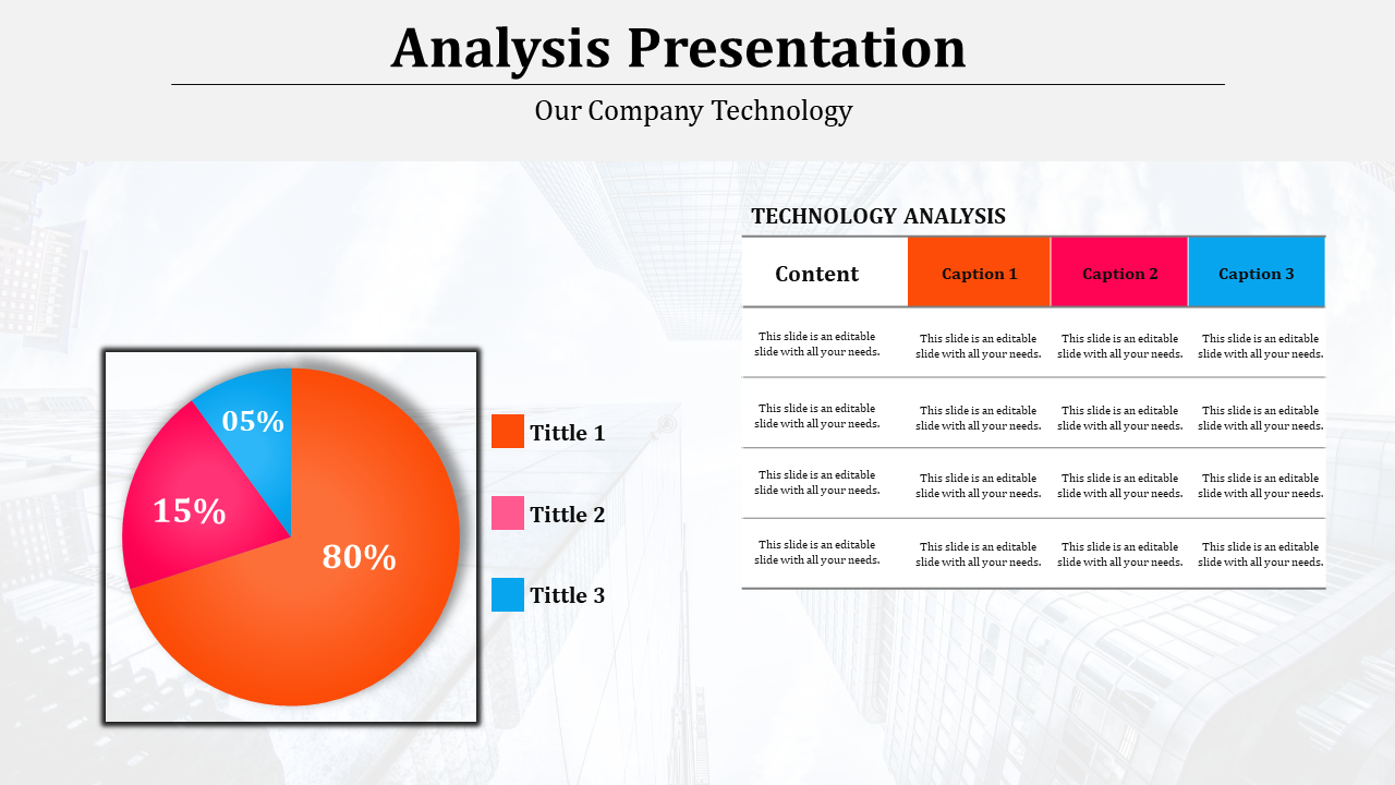

Technology analysis slide with a colorful pie chart split into orange, pink, and blue segments, alongside a labeled table.
P.ID : 7596
    19 slides
    The Stylistic Analysis slides show classroom visuals, text examples, icons, and red white modern layout designs.
    18 slides
    The Retrospective Analysis slides show data charts, review steps, business visuals, icons, and blue clean layouts.
    13 slides
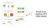
    Break Even Analysis slides showing various models, charts, and graphics for loss, profit, and break even points with icons.
    13 slides
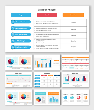
    Pack of slides with colorful icons and sections for various data analysis, including visuals and layouts.
    11 slides
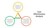
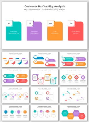
    Slide deck showcasing cost effectiveness analysis with a triangular infographic and colorful supporting charts.
    20 slides
    The Root Cause Analysis Report slides show problem charts, fishbone diagrams, 5 Whys tables, and blue layout shapesplus.
    20 slides
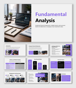
    Fundamental analysis evaluates financial data, industry trends, and economic factors to determine a company’s true value.
    13 slides
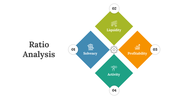
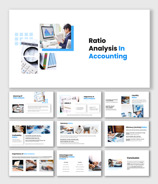
    Slide deck showcasing ratio analysis elements with colorful geometric designs and icons, highlighting financial metrics.
    13 slides
    Analysis PowerPoint Presentation And Google Slides Themes
    18 slides
    Partnership Proposal Analysis slides evaluating strategic fit, value creation, risks and growth potential now!
    848 views
    58 Downloads
    Designer
    Kavitha
    Get Custom Slides by Experts
    Enhance Your Presentations with Add-ins
    Google Slides Add-in
    Access templates directly in Google Slides
    Microsoft PowerPoint Add-in
    Access templates directly in PowerPoint
    GPT Add-on
    AI-powered presentation assistance

    Analysis Presentation Template
    Dive into Data Clarity with our Analysis Presentation Template—Illuminate Insights with Precision! This template unveils a compelling pie chart that transforms complex data into a visually engaging story. The chart is composed of three vibrant slices, each color-coded for instant comprehension. The dominant orange slice captures a substantial 80%, followed by the pink slice at 15%, and the blue slice concluding with 5%.

    Tailored for presentations demanding data-driven insights, this template is your go-to choice for illuminating analytical findings, statistical breakdowns, or any scenario where presenting proportions is key. Whether dissecting market trends, financial distributions, or project allocations, this template effortlessly communicates the essence of your data.

    Seamless integration with PowerPoint presentations in "16:9, 4:3, and zip formats."Free template that is 100% customizable, allowing you to adjust colors, percentages, and labels to align with your specific data.Download our Analysis Presentation Template now and embark on a visual journey through your data. 

    Advertisement

    You May Also Like These PowerPoint Templates
    Free
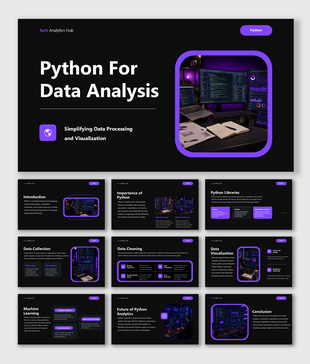
    Python for data analysis presentation covering visualization, machine learning, analytics, and coding tools in business.

    Showing20 of69,218 templates