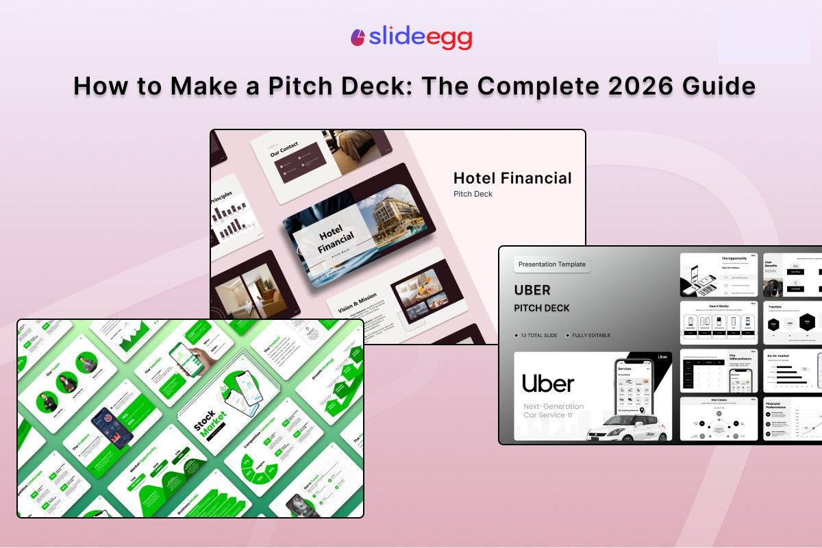
A pitch deck is a short set of slides — usually 10 to 14 — that shows investors what your business does, why the market needs it, and why your team can build it.
On average, investors spend just two minutes and fourteen seconds on their first read. That means each slide must earn its place. Anything that doesn’t move the story forward should be cut.
This guide walks through every slide you need and what to put on each one. The design rules come from real funded decks — including Airbnb’s 14-slide deck that raised $600K from Sequoia in 2009.
Quick Answer
To make a pitch deck: build 12 core slides in this order — cover, problem, solution, market opportunity, product, business model, traction, competitive landscape, team, financial projections, funding ask, and closing slide. Keep the total to 10–14 slides, use one idea per slide, and lead with your strongest asset in the first four slides, since that’s where investors spend 60% of their attention.
Pitch Deck by the Numbers in 2026
Before you build your first slide, it helps to understand how investors actually read decks and what they prioritize when they do.
| 2:14Average time investors spend on a deck on first pass | 10–14Slide count that raises the most funding in 2026 |
| 60%Of total deck attention falls on the first 4 slides | 22%More follow-up meetings when deck ends with a clear next step |
What Is a Pitch Deck?

A pitch deck is a short visual presentation — typically 10 to 20 slides — that shows investors the core story of your business: the problem you solve, the product you’ve built, and the ask you’re making. If you’d rather not start from a blank slide, this pitch deck presentation template gives you the full slide order ready to fill in.
A pitch deck is not a business plan. A business plan covers every operational detail of your company, often running 20 to 40 pages. A pitch deck covers just enough to spark interest and earn a second meeting. The goal is curiosity, not closure.
The Airbnb example: Their 2009 deck was 14 slides long, raised $600K from Sequoia, and has since become the most-studied startup pitch of all time. The deck opened with a sharp problem, walked through market validation, and closed with a clear ask — with no slide wasted on anything that didn’t serve the story.
How Many Versions of Your Deck Do You Need?
In 2026, most top founders maintain three or four versions of the same pitch deck, each calibrated for a different stage of the investor relationship.
| Version | Slides | When to Use |
| Email deck | 8–10 | Cold outreach — short enough to scan in two minutes |
| Meeting deck | 12–14 | Live investor meetings and demo days |
| Deep-dive deck | 20+ | Due diligence — for serious investors doing detailed research |
| Leave-behind PDF | 12–14 | Share after the meeting so investors can review at their own pace |
Start by building the meeting deck, then adapt it into the other versions once you’ve tested it with real investors and refined the story based on their questions. The emphasis also shifts with your stage — our breakdown of seed round vs. Series A pitch decks covers what changes as you move up rounds.
The 12 Slides Every Pitch Deck Needs
These slides appear in nearly every funded deck and follow the order in which investors naturally evaluate risk — from believing the problem exists, to trusting the team that’s solving it.
1. Cover Slide

Your cover slide should show your company name, logo, a one-line description of what you do, and your contact details. The tagline needs to communicate your value proposition in plain language — no jargon, no buzzwords.
Airbnb’s tagline was: “Book rooms with locals, rather than hotels.” Seven words that make the idea completely clear to anyone who reads them for the first time.
What to include: Company name · Logo · One-line description · Your name and email address
2. Problem Slide
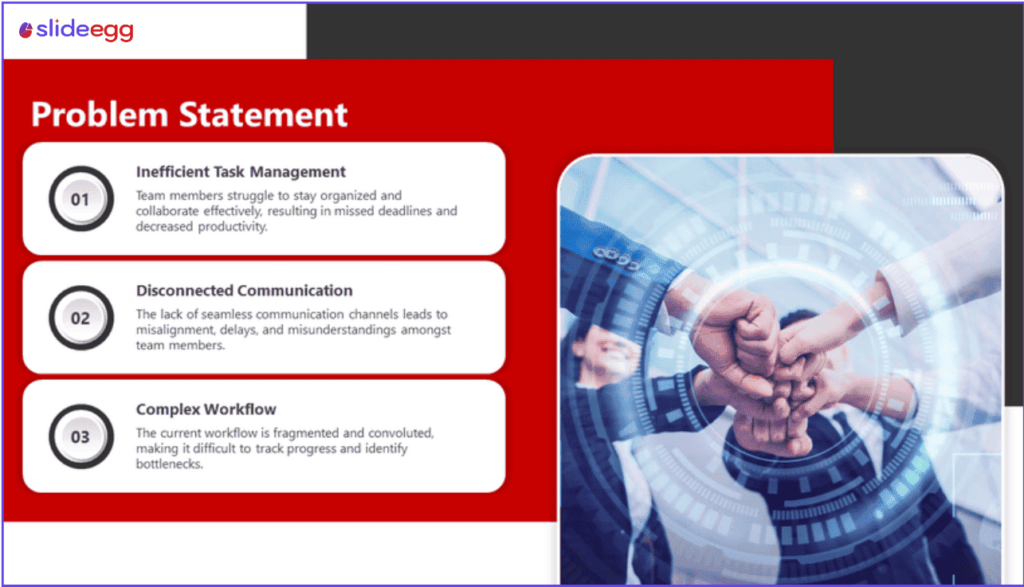
This is the most critical slide in your deck. If investors don’t believe the problem is real and painful, nothing else in the presentation will matter to them.
Be specific. Don’t write “small businesses struggle with inefficiency” — that’s a category, not a problem. Name exactly who suffers from the issue and how much it costs them. Then say how often it happens. Specific pain creates urgency. Generic statements create doubt.
Strong format: Name the person · Show the cost (time, money, or frustration) · Describe how often it happens
3. Solution Slide

Show clearly how your product solves the problem you described on the previous slide, addressing each pain point you raised in a direct and visible way.
Show the actual product if you can. A real screenshot or a short product demo will always outperform a conceptual diagram. Investors want to see that the thing actually exists and works. Avoid vague phrases like “AI-powered platform” without showing what the interface looks like.
Best practice: Mirror the problem — for every pain point you raised, show exactly how your product resolves it.
4. Market Opportunity Slide

Show investors how large the opportunity is by using three numbers: TAM (total addressable market), SAM (serviceable addressable market), and SOM (your realistic share of that market over the next three to five years).
Don’t inflate your TAM to look impressive. Experienced investors spot this immediately, and it damages your credibility for the rest of the meeting. A well-sourced smaller number is always more convincing than a large number with no backing data.
Red flag to avoid: “The global X market is worth $500B” with no cited source. Always show where your numbers come from.
5. Product Slide
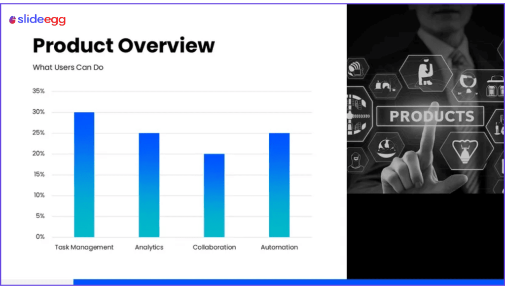
Walk investors through how your product works using screenshots, a short demo, or a simple three-step flow diagram that shows the core user experience from start to finish.
Focus on the one feature that makes your product different from everything already on the market, rather than trying to show every screen or option in the interface. One minute spent on the right feature is far more valuable than three minutes spent showing everything.
Best format: A 3-step visual flow or annotated screenshots of the key user action that delivers value
6. Business Model Slide

Explain clearly how your company makes money — whether that’s a subscription, usage-based pricing, a one-time fee, or a marketplace commission — so investors can immediately understand the revenue structure.
Include your average revenue per user (ARPU) if you have it. Investors need to understand your unit economics before they can evaluate your financial projections. Keep the explanation simple and direct.
Keep it simple: “We charge $X per user per month, and our average contract value is $Y.”
7. Traction Slide

Show evidence that real people want what you’re building, with revenue being the strongest form of proof you can present at any stage of fundraising.
If you don’t have revenue yet, use other indicators — user growth, retention rates, waitlists, signed pilots, or letters of intent. Show a trend over time, not just a single snapshot. A chart with three months of consistent growth tells a stronger story than one number with no context, so it’s worth presenting that data clearly.
Avoid vanity metrics: “100K app downloads” means little without active user numbers and retention data to support it.
8. Competitive Landscape Slide
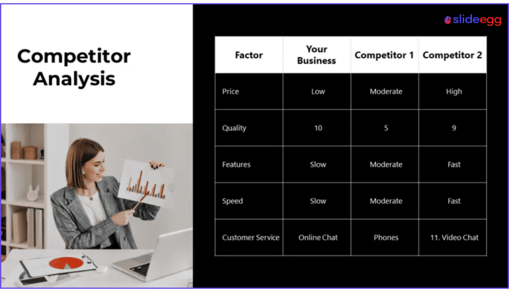
Show how your company is positioned relative to existing alternatives by using a 2×2 matrix — two dimensions that matter most to your buyers, with your company plotted clearly in the advantaged position.
Never claim you have no competitors. Investors know that’s not accurate, and it signals either poor research or a market that doesn’t yet exist. Instead, show where you fit and name the specific advantage no existing option delivers.
Strong format: 2×2 grid with competitors mapped and your company in the top-right “winning” quadrant
9. Team Slide

In 2026, the team slide received more investor attention than any other single slide in funded decks — more than the product, more than the market, and more than the traction numbers.
Investors are placing a bet on people. This slide needs to show each founder’s relevant experience, domain expertise, and any prior exits. Keep bios to two or three lines — focused, specific, and credible rather than exhaustive.
Include: Name · Role · 1–2 lines of the most relevant background · LinkedIn profile or notable credential
10. Financial Projections
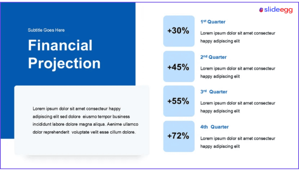
Show a 3-year revenue forecast and include the assumptions behind every number — how many customers you expect, at what price, with what growth rate, and what your churn rate will be.
Projections without assumptions look like guesses, and investors will treat them that way. Keep the chart simple — one line for revenue, one for expenses, one for profit or loss — rather than a data table full of rows that nobody will read during a live meeting.
Key rule: Every projected number needs a note beside it explaining exactly how you calculated it.
11. Funding Ask Slide
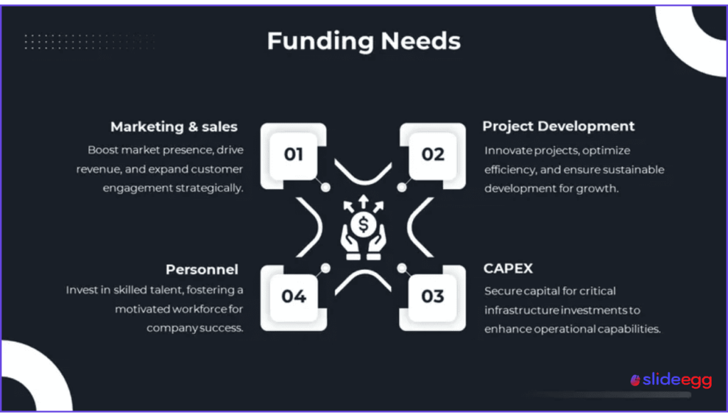
State clearly how much you’re raising, what round type it is, and how you’ll allocate the capital — broken into two or three spending buckets such as 50% product, 30% sales, and 20% operations.
Also state the milestone this round will help you reach. “This gets us to $1M ARR by Q4 2027” is far more convincing than “this covers 18 months of runway.” The second version tells investors nothing about what you’ll have built by the end of it.
Include: Amount · Round type · Use of funds breakdown · Key milestone the funding unlocks
12. Closing / Contact Slide

Don’t end with a “Thank You” slide. Decks that close with a direct call to action — your email, a calendar link, and a clear next step — generate 22% more follow-up meetings.
Repeat your one-line company description here too. It’s the last thing investors see, so make sure the core message is still fresh when they close the file.
Include: One-line company pitch · Email address · Calendar booking link · LinkedIn URL
Pitch Deck Design Tips That Actually Matter
Your content wins the meeting, but weak design can undermine strong content before investors finish reading the first slide. These are the rules that make the biggest difference — and our guide on designing a pitch deck that wins investors goes deeper on each one.
1️⃣One idea per slide
If a slide contains two main points, split it into two separate slides. Investors should understand the message in under five seconds without reading every word.
🎨Two fonts maximum
Use one typeface for headlines and one for body text. Geometric sans-serifs like Inter or DM Sans work well. Decorative and script fonts have no place in an investor deck.
🌑Dark backgrounds perform well
Deep navy or charcoal with white text reads clearly on projectors and screen shares. It’s the dominant visual trend at Y Combinator and Techstars demo days in 2026.
🔢Use numbers, not adjectives
“We grew 3x in six months” lands harder than “We’ve seen strong growth.” Numbers give investors something specific to evaluate; adjectives give them nothing to hold.
📐Minimum 18pt body text
Anything below 18pt becomes difficult to read in a conference room or on a Zoom screen share. Use 28pt or larger for slide headlines so they register immediately from a distance.
🎯Stay consistent slide to slide
Use the same colors, fonts, and layout structure throughout the entire deck. Inconsistent design is one of the most common signals that a founder hasn’t paid close attention to detail.
Start With a Professional Pitch Deck Template
SlideEgg has fully editable pitch deck templates for PowerPoint and Google Slides — investor-ready layouts with the right slide order, clean design, and placeholder content you can replace with your own story in minutes.
Browse Pitch Deck Templates on SlideEgg →
Speeding up the first draft? See how to use AI to design pitch decks without letting it invent your numbers.
Common Pitch Deck Mistakes to Avoid
Too much text crammed onto each slide
Dense text slides create friction that makes investors stop reading and start skimming — which means they miss your key points entirely. Use concise bullet points and say the rest out loud during the meeting.
A problem statement that’s too vague to feel real
“Businesses struggle with X” is a category, not a problem. Name the specific person who suffers, the specific cost it creates for them, and the specific frequency it happens — that’s what creates the urgency investors need to feel.
An inflated TAM with no supporting source
TAM slides are the most common source of credibility damage in pitch decks. Citing a $500B global market without a source destroys trust quickly and makes every other number in the deck look suspect as well.
Financial projections that show no assumptions
A revenue chart that goes up and to the right with no underlying inputs is treated as wishful thinking by experienced investors. Show your customer count assumptions, pricing, churn rate, and growth drivers alongside every projection you include.
Claiming you have no competitors
Every unsolved problem has an existing workaround — even if it’s a manual process or a spreadsheet. Claiming no competition signals either that you haven’t researched the market or that the market doesn’t exist yet, neither of which builds investor confidence.
Ending the deck with a “Thank You” slide
A thank-you slide is a missed closing opportunity. End instead with your email, a calendar link, and a brief restatement of your ask — making it easy for an interested investor to take the next step immediately after reading.
Does Slide Order Really Matter?
Yes — and it matters more than most founders expect. Investors read decks in the same sequence they evaluate risk. First, they need to believe the problem is real. Then they check the solution. Then they assess the market size. Then they look for proof the team can execute.
If you open with the team slide or financials before establishing the problem, you break the logical flow. Investors lose the thread and stop engaging. Follow the order in this guide — it’s the same structure used by Airbnb, Uber, and most well-known funded decks.
One exception worth knowing: If your traction is exceptionally strong — significant revenue, rapid growth, or a recognizable early customer list — consider moving it forward to slides 2 or 3, because leading with proof of momentum captures investor attention more effectively than starting with the problem.
Frequently Asked Questions
How many slides should a pitch deck have?
Aim for 10 to 14 slides for a live investor meeting, since decks with more than 15 slides see a 40% drop in engagement. For cold email outreach, keep it to 8 to 10 slides so investors can scan it quickly. Every slide should add something new to the story — if it doesn’t, cut it.
What is the most important slide in a pitch deck?
The problem slide is the most important, because if investors don’t believe the problem is real and painful enough to build a business around, nothing else in the deck will resonate. Make it specific — name the person, the cost, and the frequency. Airbnb didn’t just say “travel is hard.” They showed exactly why hotels failed budget-conscious travelers.
What do investors look at first in a pitch deck?
The first four slides receive 60% of all investor attention on the first read, so those need to be your strongest four slides. In 2026, the team slide also gets the most time of any individual slide in funded decks. Investors in this environment prioritize who is building over what is being built.
Should a pitch deck have a dedicated executive summary slide?
Not usually — your cover slide and problem slide together already serve as the summary, and a separate executive summary slide typically repeats what the next two or three slides will cover anyway. Instead of adding a summary slide, put that effort into sharpening your problem and solution slides so they immediately communicate the core value.
What is TAM, SAM, and SOM in a pitch deck?
TAM is your total addressable market — the full global opportunity for the problem you’re solving. SAM is the portion of that market you can realistically serve given your current product and geography. SOM is your projected share of SAM over the next three to five years, which shows investors a credible and specific revenue opportunity rather than an abstract headline number.
How long should a pitch deck presentation take?
Guy Kawasaki’s 10/20/30 rule sets the standard: 10 slides, 20 minutes of presenting, and a minimum 30pt font throughout. In practice, most investor meetings run 30 to 45 minutes total, so plan for 15 to 20 minutes of presenting and save the rest of the time for questions — that’s where deals actually move forward.
Do I need financial projections if I’m pre-revenue?
Yes — but you need to show the assumptions behind them clearly. Build a 3-year forecast and explain every input: expected customer count, price point, growth rate, and churn. Investors don’t expect perfection at the pre-revenue stage, but they do expect to see that you understand your unit economics and have a realistic path to generating revenue.
What’s the difference between a pitch deck and a business plan?
A pitch deck is 10 to 14 slides designed to spark investor interest in a short meeting and earn a follow-up conversation. A business plan is a full written document — often 20 to 40 pages — covering operations, legal structure, and detailed multi-year financials. Most investors ask for a pitch deck first and only request the business plan once they’re deep into due diligence.
Should I use PowerPoint or Google Slides for my pitch deck?
Both work well for investor pitches. PowerPoint gives you more precise design control and doesn’t require an internet connection during the meeting — which matters when Wi-Fi is unreliable. Google Slides makes sharing and collaboration easier and lets you track who opens the link. Many founders design in PowerPoint and export a PDF for email outreach.
How do I make a pitch deck stand out from others investors see?
Open with a sharp, specific problem that investors can feel immediately. Support every claim with real data rather than descriptive language. Show actual product screenshots instead of concept diagrams. End with a direct call to action rather than a vague close. Most decks fail because of weak content, not weak design — so focus on evidence and clarity before visual polish.
Summary: What Makes a Strong Pitch Deck in 2026
A strong pitch deck tells one clear story from the cover slide to the closing call to action. It opens with a specific, felt problem, builds credibility through real data and traction, and ends with a precise ask that makes it easy for an investor to say yes.
Keep your meeting deck to 12 to 14 slides and make sure the first four slides carry your strongest material, since that’s where most investor attention lands. Show your financial projections with clear assumptions, never claim you have no competition, and always end with a next step rather than a thank-you.
If your story is honest, your data is specific, and your team is credible, the design only needs to stay clean and consistent — it doesn’t need to be a work of art to get a second meeting.