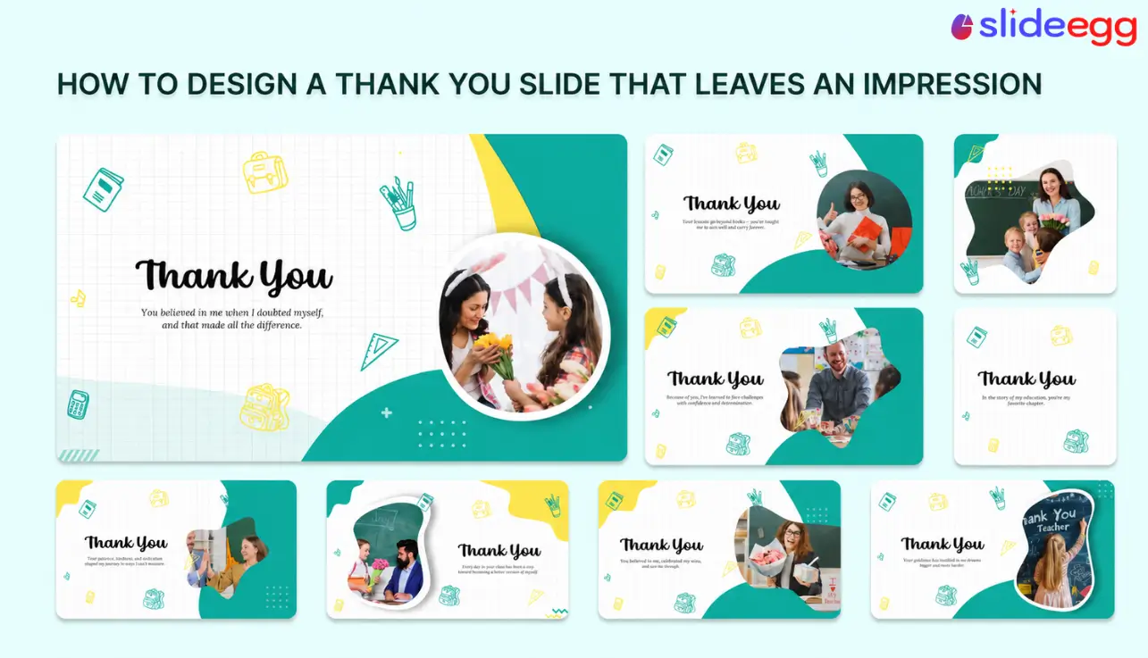
Most presenters design their thank you slide as an afterthought — big text, blank background, no contact information. They finish building their thirty slides, add one more with “Thank You” in 80pt Arial, and call it done.
That is a missed opportunity. Your closing slide is what the room sees during Q&A, while people pack up, and as they decide whether to follow up with you. It can be five to fifteen minutes of uninterrupted screen time.
Cognitive science research helps explain why this matters. According to the peak-end rule, documented by psychologists Kahneman and Tversky, people judge an experience by how it felt at its most intense moment and at its end. The final impression carries disproportionate weight. Your thank you slide is that final impression.
A well-designed closing slide does several things at once: it keeps your contact details visible, points the audience to a next step, and closes the visual story you started on slide one. This guide shows you how to build one.
Quick Answer
A well-designed thank you slide should include a thank you message, your name, and your contact information. Optionally add a single call to action, your company logo, or a one-line takeaway. Match the font, color, and style of your title slide. Keep it to three or four elements — it is not a summary slide.
In This Guide
- Why the last slide matters more than most
- What to include on a thank you slide
- Good vs. bad: what the difference looks like
- Design principles for a polished closing slide
- Thank you slide ideas by presentation type
- Common mistakes to avoid
- How to build one in PowerPoint, Canva, and Google Slides
- Frequently asked questions
Why the Last Slide Matters More Than Most
Memory research shows that people remember the beginning and end of an experience more clearly than the middle. This is called the serial position effect. In presentations, the closing moment is the one the audience will most vividly recall when deciding whether to follow up with you.
Your thank you slide might be on screen for five to fifteen minutes during Q&A and the post-presentation mingle. A plain “Thank You” slide with nothing else on it gives the audience no information and no visual memory to hold. A well-designed one gives them your contact details, a reason to reach out, and a last visual impression of your professionalism.
Presenter note: The same logic applies to your opening slide. Mirror the design of your title slide on the closing slide — same background, same font, same visual treatment. When a presentation opens and closes with the same visual language, it feels complete. See our guide on how to design a PowerPoint presentation for more on visual consistency.
What to Include on a Thank You Slide
Not everything belongs on a closing slide. The goal is a calm, readable layout with three to four elements maximum. Here is what to include and why:
- Required
Thank you message
Short and direct. “Thank You,” “Thank You for Your Time,” or “Thank You for Being Here” all work well. Keep the tone consistent with your presentation — do not become suddenly formal or overly casual on the last slide. - Required
Your name and contact information
At minimum: your name and email address. Add your LinkedIn URL or phone number if relevant. This is the element most presenters skip — and the most useful thing you can leave behind. If the audience cannot reach you after the presentation, the slide has failed its primary job. - Optional
A single call to action
One clear next step — visit a URL, scan a QR code, book a call, or download a resource. One action only. Two or more calls to action split the audience’s attention and reduce the chance any of them follow through. - Optional
Company logo or brand mark
Useful for sales and client presentations where brand recall matters. Position it in a corner or centered — wherever it sits on your other slides for consistency. - Optional
One key takeaway
A one-sentence summary of your core message. Works well in keynote and academic contexts. Skip it for sales or client decks where the CTA should take priority — having both competes for attention. - Optional
QR code
Links the audience to your LinkedIn, portfolio, booking page, or a resource from the talk. Make it at least 1.5 inches square on screen. Add a short label underneath so people know where it goes before they scan.
Do not use the thank you slide as a summary of your key points, a references page, or a place to cram extra information. Those belong in earlier sections or in a handout. The closing slide should feel calm — not like another dense content slide.
Good vs. Bad: What the Difference Looks Like
The gap between a forgettable thank you slide and a professional one usually comes down to three things: contact information, visual consistency, and simplicity. Here is what that looks like in practice:
✕ Poor example
THANK YOU!
[no contact info, no next step, generic Arial font, white background that doesn’t match the deck]
- No contact information
- No logo or visual identity
- No call to action
- Different font from the rest of the deck
- White background when rest of deck is dark
✓ Strong example
Thank You
Jane Smith · Product Lead
jane@company.com
linkedin.com/in/janesmith
Book a call → calendly.com/jane
BRAND
- Name, email, and LinkedIn visible
- Logo in bottom-left corner
- Single clear CTA
- Matches deck’s dark background and font
- Calm layout — four elements maximum
When you replace the actual screenshots, use the same three-column structure above as a caption reference. The two slides you need are: (1) a minimal bad example — “Thank You” only on a white slide in Arial — and (2) a completed good example showing the heading, contact block, logo, and optional CTA.
Design Principles for a Polished Closing Slide
The design rules for a thank you slide are simpler than for any other slide in your deck. The content is minimal, and the goal is clarity rather than persuasion. These five principles cover what matters most.
1. Mirror your title slide
Use the same background color or image, heading font, and color treatment as your opening slide. When the closing slide echoes slide one, the presentation feels complete. A completely different visual style on the last slide signals it was an afterthought — even if the content is good.
If you build the whole deck with an AI presentation maker, this consistency happens on its own — every slide, the closer included, is generated on one theme, so there’s no mismatched final slide to fix later.
2. Limit the layout to three or four elements
The thank you heading, your contact block, one optional visual, and one optional CTA. That is the maximum. Remove anything else. White space on a closing slide signals calm and confidence. See our guide on choosing colors in PowerPoint for help matching your deck’s palette.
3. Size for the back of the room
Thank you heading: 48pt to 72pt. Name and contact: 18pt to 24pt. CTA text: 20pt to 28pt. If the contact text is too small to read at ten feet, it is not doing its job. See our guide on formatting text in PowerPoint for sizing and spacing tips.
4. Use one dominant visual element
One company logo, one headshot, one icon, or one background illustration. Multiple competing visuals fragment attention. If you are using a background image, apply a color overlay so text stays readable — a dark semi-transparent layer over a photo works well.
5. Align everything on a grid
Use View → Guides to set alignment anchors, then use Home → Arrange → Align to snap elements into place. Off-center logos or contact lines that drift slightly to one side undercut an otherwise clean layout. Alignment is what separates a polished slide from one that merely looks polished at a distance.
Want a head start? SlideEgg’s thank you slide templates are professionally designed, fully editable in PowerPoint, and available in dozens of styles — from minimal to bold, including animated 3D designs. Pick one that matches your deck and customize it in minutes.
Thank You Slide Ideas by Presentation Type
The best closing slide depends on the context of your presentation. Here is what works across five common scenarios:
| Presentation type | What to prioritize | Suggested CTA |
|---|---|---|
| Sales pitch / investor deck | Company name, presenter name, email, and a clear next step. Logo is important here for brand recall. | “Book a 30-minute call” or “Visit [URL] to see our product” |
| Conference keynote | Speaker name, social handle, and a resource the audience can access later — slides, a newsletter, or a resource download. | QR code linking to slides, newsletter, or website |
| Client deliverable / project update | Next steps and your direct contact. The audience needs to know what happens after this meeting. | “See attached report” or “Contact [email] to discuss next steps” |
| Internal / team presentation | A warmer, more informal tone works here. Keep it simple — name and team affiliation is enough. | “Questions? Slack me at [handle]” |
| Academic / classroom | Put your references on a separate slide before the closer, then end with a clean thank you slide showing your name and institution. | “Questions?” as a subtitle is appropriate here |
Slide count note: Not sure how many slides should come before your thank you slide? See our guide on how many slides a presentation should have — broken down by presentation type and duration.
Common Mistakes to Avoid
These are the mistakes that make a closing slide forgettable — or worse, unprofessional.
✕ Just “Thank You” with nothing else
Big text, blank background, no contact info. The audience has no way to follow up, and the slide suggests the presenter ran out of time or ideas. Always include at least your name and email.
Fix: Add a contact line below the headline. Two lines of information is the baseline.
✕ A completely different visual style from the rest of the deck
Switching to a stock photo background on slide 30 when the rest of the deck uses flat color, or changing to a different font family on the last slide, breaks the visual coherence of the presentation.
Fix: Pull colors and fonts from your slide master. Mirror the title slide design.
✕ Too much text
Putting a full summary, bullet points, or multiple paragraphs on a closing slide defeats the purpose. The audience is winding down — not reading more. This mistake is especially common in academic presentations.
Fix: Move the summary to the slide before the thank you. The closer itself should have four elements or fewer.
✕ Multiple calls to action
“Visit our website. Follow us on LinkedIn. Download the report. Book a call.” Five options mean zero follow-through. When you give the audience too many things to do, they do none of them.
Fix: Choose the single most important next step. One clear action gets results.
✕ Contact text too small to read
Contact details in 12pt look fine on a laptop screen but disappear in a meeting room. If someone in the fourth row cannot read your email address, that contact line does nothing.
Fix: Contact text should be 18pt minimum. 20pt to 24pt is safer for a room of any size.
✕ Ending on a blank slide
A blank slide at the end looks like a technical error. It leaves the audience with no contact information, no next step, and no impression. It is the one truly wrong way to close a presentation.
Fix: Always build an explicit closing slide. Even a simple one takes five minutes and is infinitely better than blank.
How to Build a Thank You Slide in PowerPoint, Canva, and Google Slides
Below is the full step-by-step process for PowerPoint, followed by quick guides for Canva and Google Slides.
How to Build a Thank You Slide In PowerPoint
1. Add a new blank slide at the end
Right-click the last slide in the panel → select New Slide. Then right-click the new slide → Layout → choose Blank. This gives you a clean canvas without auto-filled text boxes from the slide master.
2. Set the background to match your deck
Go to Design → Format Background. Match the background to your title slide — same solid color, gradient, or image treatment. Consistency signals the slide belongs to the same deck.
For background images, use Picture or texture fill. Apply a color overlay if the image is too bright for text. For more, see our guide on how to change backgrounds in PowerPoint.
3. Add the thank you headline
Go to Insert → Text Box. Draw a wide text box across the slide. Type your message — “Thank You” or “Thank You for Your Time” both work well.
- Font: same heading font used throughout your deck
- Size: 48pt to 72pt depending on how much else is on the slide
- Color: your deck’s heading color — usually white on dark backgrounds
- Weight: Bold or ExtraBold for prominence
Good practice: Center-align the heading text. Left-aligned thank you text can work with a strong layout, but centered reads cleanly in any context.
4. Add your contact information below
Insert a second text box below the heading. Add your name on one line, your email on the next, and your LinkedIn or website URL on the line after that. Keep it to three lines or fewer.
- Font: same body font from your deck, or heading font in a lighter weight
- Size: 18pt to 24pt — readable from the back of a room
- Color: a secondary brand color or a lighter shade of your heading color
Hyperlink tip: Select the email address, press Ctrl+K, and add a mailto: link. When the file is shared digitally, the audience can click directly to email you.
5. Add one supporting visual element
Go to Insert → Pictures or Insert → Icons and add one visual — your company logo, a professional headshot, an icon, or a brand graphic. Position it so it does not crowd the text.
6. Add a call to action if applicable
One clear next step — a URL, a QR code, or a booking prompt. Use a font size between 18pt and 24pt. To add a QR code, go to Insert → Add-ins → QR4Office, or insert a pre-generated QR image.
Skip the CTA for formal settings, like board meetings, academic defenses, and client reviews. A sales-focused CTA in those contexts can feel out of place. Your contact details are sufficient.
7. Align everything and review at full screen
Select all elements and use Home → Arrange → Align → Center Horizontally. Then press F5 to preview at full screen.
Check four things: Can you read the contact text from ten feet away? Does the background match your title slide? Is there enough space between elements? Does the slide feel calm rather than crowded?
Colleague test: Show the slide to a colleague and ask what they would do next based on what they see. If they cannot identify the contact info or the next step within five seconds, the layout needs adjustment.
How to add a thank you slide in Canva
Open your presentation in Canva. Right-click your title slide in the left panel and choose the Duplicate page. This copies the background, fonts, and colors — giving you an identical visual base without rebuilding from scratch. Clear the content, then add three text elements: your thank you heading, your name, and your contact details. Keep the same font and color from your design.
Use Canva’s alignment guides to position elements precisely — go to File → View settings → Show rulers and guides, then drag from the ruler edge to place guides on your canvas.
For a QR code, click Elements in the left sidebar and search “QR code” to use Canva’s built-in generator.
Download as PDF Presentation or Microsoft PowerPoint (.pptx) when done.
For more Canva workflow tips, see our guide on how to convert Canva to Google Slides if your next step is sharing the deck with Google Slides users.
How to add a thank you slide in Google Slides
In Google Slides, right-click your title slide in the panel on the left and choose Duplicate slide. Move the duplicate to the end of the deck by dragging it in the panel. Clear the text content, keeping the background intact. Add a text box for your thank you heading, a second text box for your contact details, and your logo if applicable.
Use Arrange → Align → Center to position elements cleanly. For a QR code, insert it as an image via Insert → Image → Upload from computer after generating it with a free QR tool like qr-code-generator.com. Publish or download as PowerPoint or PDF when done.
Prefer to skip the build entirely? SlideEgg’s thank you PowerPoint slide templates — including animated and 3D designs — are fully editable and ready to drop into your existing deck. Free and premium options available.
Frequently Asked Questions
What should I put on a thank you slide?
At minimum: a thank you message, your name, and your contact information (email or LinkedIn). Optionally add a single call to action, a key takeaway statement, or your company logo. Avoid putting too much — the slide should be readable at a glance and feel calm, not busy.
Should the last slide say “Thank You” or “Questions”?
“Thank You” is warmer and suits most contexts — sales, keynotes, client meetings, and internal presentations. “Questions?” is more functional and fits academic or training settings. A practical middle ground: use “Thank You” as the main heading and add “Questions?” as a smaller subtitle. That way you acknowledge both the closing sentiment and the Q&A invitation in one slide.
Do I have to end my presentation with a thank you slide?
No — a thank you slide is not required. But whatever you end on should be intentional and useful to the audience. Good alternatives include:
A call-to-action slide: Just your next step — a URL, QR code, or booking link — without the thank you text. Works well for product demos and sales pitches.
A key-takeaway slide: One sentence capturing the core message, with your contact details below. Strong for keynotes and academic presentations.
A “Questions?” prompt slide: Clean, simple, and signals Q&A clearly. Common in academic and corporate training contexts.
The only genuinely wrong choice is a blank white screen or an accidental slide. Any intentional closing slide — including a simple thank you — is better than that.
How do I make a thank you slide look professional?
Use the same fonts, colors, and background style as the rest of your deck — especially your title slide. Keep the layout to three or four elements. The heading text should be at least 48pt and contact text at least 18pt. Align everything on a consistent grid. Avoid clip art, decorative borders, or gratuitous animations.
Can I add a QR code to my thank you slide?
Yes, and it is one of the most practical things to include. Link it to your LinkedIn profile, a booking calendar, a free download, or your website. It gives the audience a way to follow up without writing anything down. Make the QR code at least 1.5 inches square on screen, and add a short text label below so people know where it goes before scanning.
What font size should a thank you slide use?
Thank you heading: 48pt to 72pt. Name and contact details: 18pt to 24pt. CTA text: 20pt to 28pt. The practical test: stand ten to fifteen feet from your monitor. If you need to squint to read the contact line, increase the font size. Every element on the slide should be readable from the back of a room without effort.
How do I create a thank you slide in Canva?
Duplicate your title slide in the Canva panel — this copies the background, fonts, and colors. Move it to the end, clear the content, and add your thank you text, contact block, and logo. Use Canva’s built-in QR code element if needed. Download as PPTX or PDF. See the Canva mini-guide above for the full walkthrough.
Is it unprofessional to end with a blank slide?
Yes. A blank slide at the end looks like a technical error. It leaves the audience with no contact information, no next step, and no visual impression. Always create an explicit closing slide, even if it only takes five minutes to build. The baseline is your name, your email, and a “Thank You” heading — anything beyond that is a bonus.
Can I use a thank you slide template instead of designing from scratch?
Yes — it is often the faster and more reliable option. A pre-built template gives you a professionally designed starting point. You swap in your own text, colors, and logo without worrying about layout or alignment. SlideEgg’s thank you PowerPoint templates include minimal, bold, and animated 3D styles — all fully editable.
Related Guides From SlideEgg
- Presentation Tips: How to Design the Perfect Thank You Slide: 5 Layouts & Examples
- Presentation Tips: How to Make Creative Thank You Slides: 5 Fresh Trends for 2026
- Presentation Tips: How Many Slides Should a Presentation Have? (By Use Case)
Wrapping Up
Your thank you slide does not need to be complex. It needs to be intentional — designed with the same care you gave the rest of the deck.
The minimum: a clear thank you message, your name, and a way for the audience to reach you. Add one call to action if the context calls for it. Mirror the visual style of your title slide so the presentation opens and closes with the same look.
The alternative to a thank you slide is not a blank screen — it is a different intentional closing: a CTA slide, a key takeaway, or a “Questions?” prompt. Any of those work. A blank white slide is the only option that wastes the opportunity entirely.
If you want a head start, SlideEgg’s thank you PowerPoint templates — including animated and 3D designs — give you a professionally designed base you can customize in minutes.