Best Data Scientist Vs Data Engineer PPT And Google Slides

Data Scientist Vs Data Engineer Presentation Slides
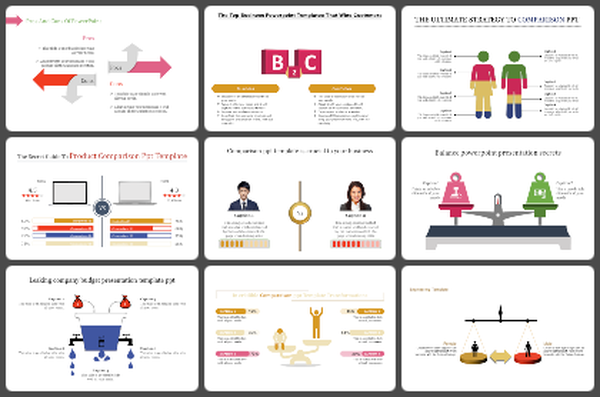
Explore an insightful journey comparing the pivotal roles of a Data Scientist and a Data Engineer with this meticulously designed PowerPoint presentation. Tailored for professionals, educators, and students in the data industry, it provides a comprehensive analysis of the distinctive responsibilities and skill sets that define each role. Dive deep into the unique domains of Data Science and Data Engineering, gaining valuable insights into how they contribute to the data landscape. It's equally beneficial for anyone looking to enhance their understanding of the dynamic data industry. The template features visually engaging slides, each meticulously designed to elucidate the distinct responsibilities and skill sets of Data Scientists and Data Engineers. Customize each slide to align with your specific requirements and objectives, ensuring seamless integration into your presentation. This feature empowers you to effectively convey the significance of these roles in diverse professional environments. Gain a comprehensive understanding of the distinctive roles of Data Scientists and Data Engineers, enabling you to effectively communicate their significance in various professional settings.
Features of the templates:
- 100% customizable slides and easy to download.
- Slides are available in different nodes & colors.
- The slide contained 16:9 and 4:3 formats.
- Easy to change the slide colors quickly.
- It is a well-crafted template with an instant download facility.
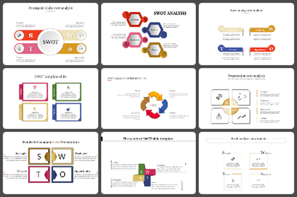
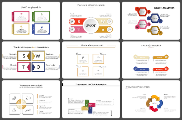
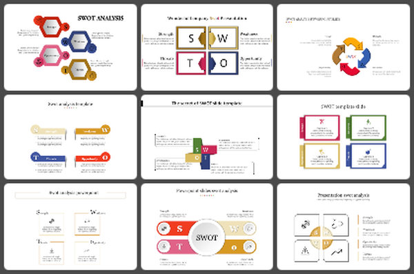
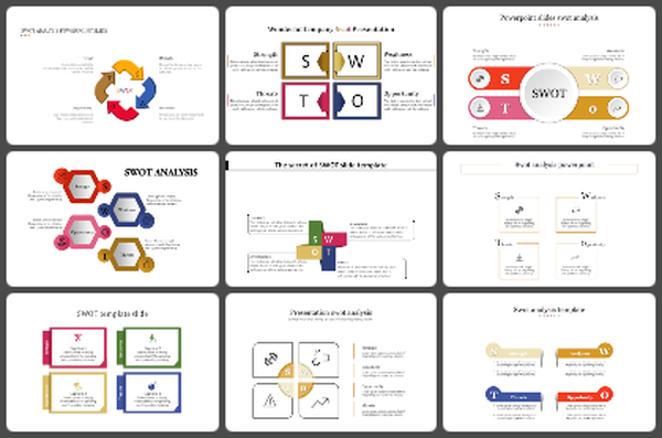
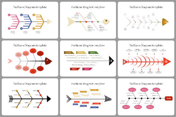
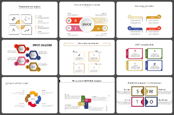
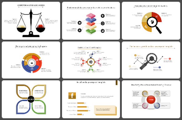
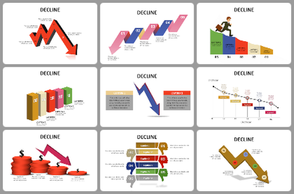
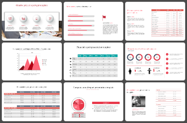
You May Also Like These PowerPoint Templates
Add to Wishlist
Download
Edit

Add to Wishlist
Download
Edit

Add to Wishlist
Download
Edit

Add to Wishlist
Download
Edit

Add to Wishlist
Download
Edit

Add to Wishlist
Download
Edit


Add to Wishlist
Download
Edit

Add to Wishlist
Download
Edit

Add to Wishlist
Download
Edit

Add to Wishlist
Download
Edit

Add to Wishlist
Download
Edit

Add to Wishlist
Download
Edit

Add to Wishlist
Download
Edit

Add to Wishlist
Download
Edit

Add to Wishlist
Download
Edit

Add to Wishlist
Download
Edit

Add to Wishlist
Download
Edit

Add to Wishlist
Download
Edit

Add to Wishlist
Download
Edit
