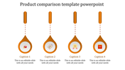
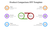
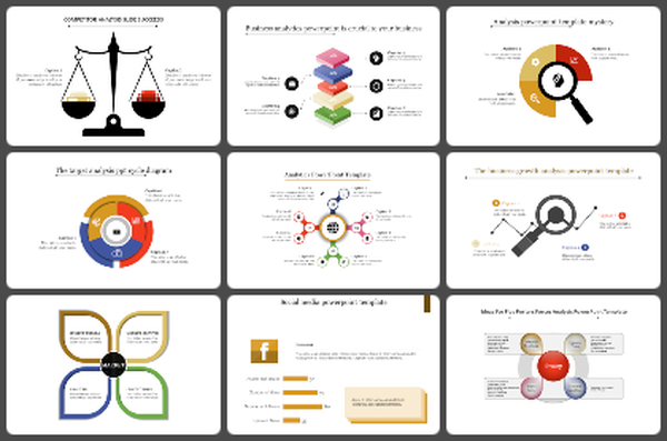
Comparison Infographic PPT Slide - Gear Wheel Model


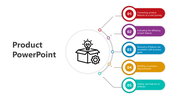
Four Noded Comparison PPT Slide
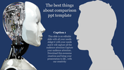
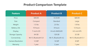
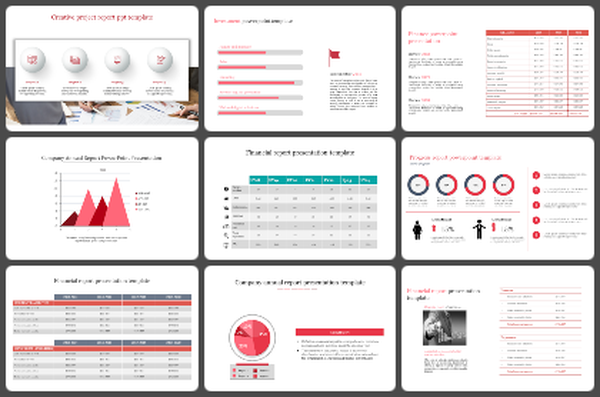
Download this creative Comparison Infographic PowerPoint Template to make a powerful comparison presentation. This visual presentation is great for comparing products, services, or concepts. It will help you to compare the pros and cons of each item and highlight their benefits and drawbacks. This template is a great way to make your message stand out.
The Comparison Infographic PowerPoint Template includes four multicolor gear wheels, which have different percentage levels. It has a variety of features that are essential in making a comparison presentation. This visual aid makes it easy for you to compare different items and make decisions. It is also a highly customizable slide.
Features of this template:
1. 100% customizable slides and easy to download.
2. Slides available in different nodes & colors.
3. The slide contained 16:9 and 4:3 format.
4. Easy to change the slide colors quickly.
5. Well-crafted template with instant download facility.
6. The gear wheels are attractive.
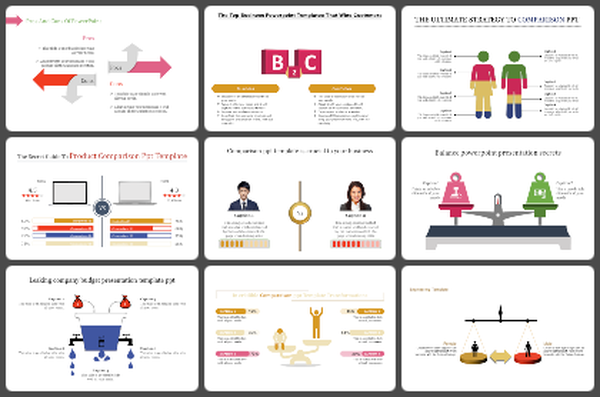
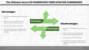
You May Also Like These PowerPoint Templates
Add to Wishlist
Download
AI Customize

Add to Wishlist
Download
AI Customize

Add to Wishlist
Download
AI Customize

Add to Wishlist
Download
AI Customize

Add to Wishlist
Download
AI Customize

Add to Wishlist
Download
AI Customize


Free
Add to Wishlist
Download
AI Customize

Add to Wishlist
Download
AI Customize

Add to Wishlist
Download
AI Customize

Add to Wishlist
Download
AI Customize

Add to Wishlist
Download
AI Customize


Add to Wishlist
Download
AI Customize

Add to Wishlist
Download
AI Customize

Add to Wishlist
Download
AI Customize

Add to Wishlist
Download
AI Customize

Add to Wishlist
Download
AI Customize

Add to Wishlist
Download
AI Customize

Add to Wishlist
Download
AI Customize
