Creative Good And Bad Chart Diagram PPT Slide Design

 Canva
Canva
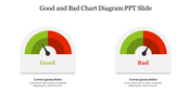


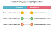
Creative Good And Bad Chart For Presentation
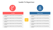
This Good and Bad Chart Diagram PPT Slide template is ideal for comparisons. It can be customized to meet your desire. You can use the template to create a presentation comparing the two.
About this template
Use the Good and Bad Chart Diagram PPT Slide to create an impressive presentation. It is a two noded slide with a simple background theme. It is a multicolor slide to create a professionally designed presentation. This slide design can also be customized with different colors to showcase your information. Download the best editable slides from SlideEgg.
Features of this template
- The Slides are available in different nodes & colors.
- This slide contains 16:9 and 4:3 format.
- It is easy to change the slide colors quickly.
- It is a well-crafted template with an instant download facility.
- The best PowerPoint theme template.
- It is a well-designed presentation template.
- Best template for presentation.
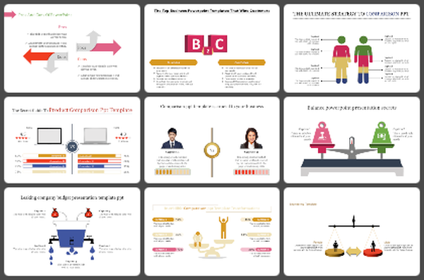
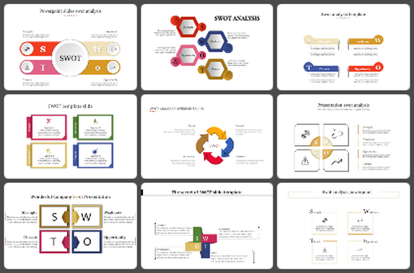
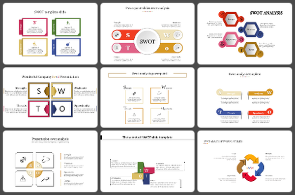
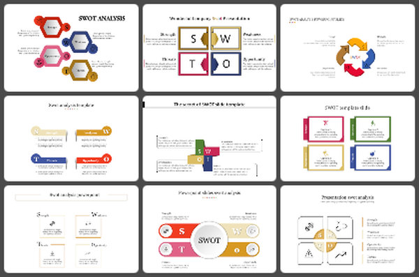
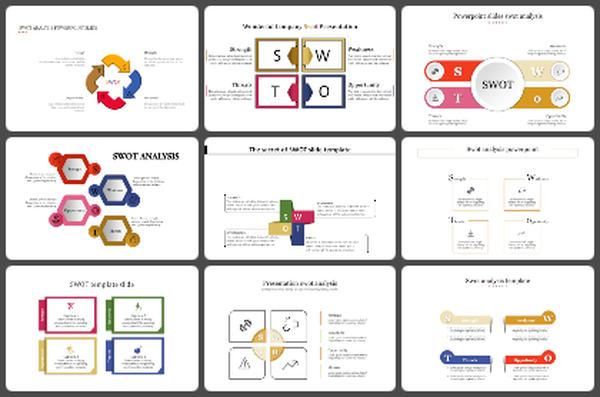
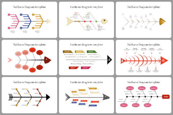
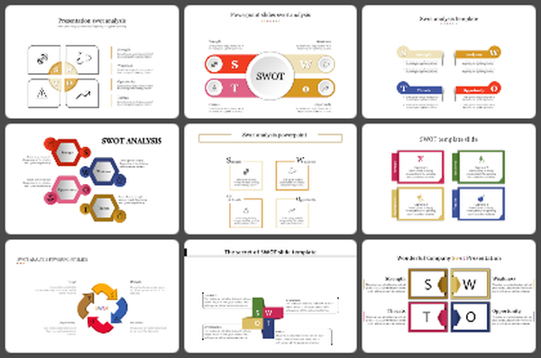
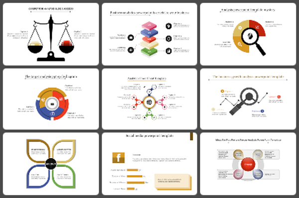
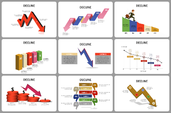
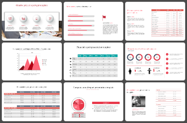
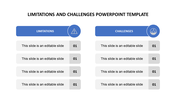
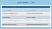
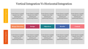
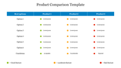
You May Also Like These PowerPoint Templates
Add to Wishlist
Download
AI Customize

Add to Wishlist
Download
AI Customize

Add to Wishlist
Download
AI Customize

Add to Wishlist
Download
AI Customize

Add to Wishlist
Download
AI Customize

Add to Wishlist
Download
AI Customize

Add to Wishlist
Download
AI Customize

Add to Wishlist
Download
AI Customize

Add to Wishlist
Download
AI Customize


Add to Wishlist
Download
AI Customize

Add to Wishlist
Download
AI Customize

Add to Wishlist
Download
AI Customize

Free
Add to Wishlist
Download
AI Customize

Add to Wishlist
Download
AI Customize

Add to Wishlist
Download
AI Customize

Add to Wishlist
Download
AI Customize

Add to Wishlist
Download
AI Customize

Add to Wishlist
Download
AI Customize

Add to Wishlist
Download
AI Customize
