Free - Amazing Superlative PowerPoint Presentation Slides

Free
Template for superlative adjectives and adverbs, featuring a table with columns for base form, comparative, and superlative.
P.ID : 53745
    11 slides
    Leadership Vs Management PPT Template and Google Slides
    11 slides
    Android mobile vs. Apple mobile slides featuring logos of both platforms in different layout designs and icons with text.
    21 slides
    Comparison slide deck featuring different visual formats like arrows, charts, and hexagons to compare two products.
    11 slides
    Best Fixed Vs Growth Mindset PPT And Google Slides Templates
    10 slides
    Amazing Build Vs Buy PowerPoint And Google Slides Templates
    1.1K+ views
    170 Downloads
    Get Custom Slides by Experts
    Instantly Access Templates in PowerPoint

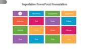
    Superlative Presentation Slide

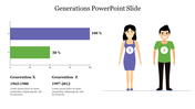
    A superlative is a form of an adjective or adverb used to indicate the highest degree of comparison between two or more things. In grammar, superlatives are used to describe the quality, quantity, or intensity of a noun or verb in the most extreme way possible. Superlatives are formed in different ways, depending on the word being modified. For example, one-syllable adjectives typically add "-est" to the end, while longer adjectives use "most" or "least" before the word. Superlatives are commonly used in everyday language to describe people, places, things, and events in a highly favorable or unfavorable way, such as "the best restaurant in town" or "the worst movie ever made." We've included a summary slide at the end to help you quickly review the key takeaways.


    Features of the template

    • 100% customizable slide and easy to download. 
    • The slides contained in 16:9 and 4:3 formats.
    • This slide has a colorful design pattern.
    • Highly compatible with PowerPoint.
    • Drag and drop image placeholder.
    • Well-crafted template with instant download facility.
    Advertisement

    You May Also Like These PowerPoint Templates

    Add to Wishlist
    Download
    AI Customize
    Gender symbols chart slide with two sections displaying groups of male and female icons, each with percentage markers.
    Free
    Add to Wishlist
    Download
    AI Customize
    Top Notch Comparison Bar Graph PowerPoint Presentation
    Add to Wishlist
    Download
    AI Customize
    A slide showing two gauge meters, one labeled good in green and the other bad in red, indicating performance levels.
    Add to Wishlist
    Download
    AI Customize
    Table comparing GSM and CDMA technologies with key differences on a blue background.
    Add to Wishlist
    Download
    AI Customize
    Comparison slide with an orange and red vertical bar featuring a grid with gray text boxes separated by colored headers.
    Add to Wishlist
    Download
    AI Customize
    Comparison chart slide showing the differences between a leader and a supervisor, with icons and bullet points for each role.
    Add to Wishlist
    Download
    AI Customize
    A superlative slide showing three individuals, with labels from short to shortest with placeholder text.
    Add to Wishlist
    Download
    AI Customize
    Two column competitor chart showing varying percentage comparisons with multicolored bars for each row.
    Add to Wishlist
    Download
    AI Customize
    A series of four colorful gears in yellow, red, green, and blue, each labeled with a percentage and numbered captions.
    Add to Wishlist
    Download
    AI Customize
    Two side by side images of engineers with performance, punctuality, and overtime bars in green and blue below each.
    Add to Wishlist
    Download
    AI Customize
    Two side by side rectangular boxes in red and purple, each featuring icons at the top and bullet points inside.
    Add to Wishlist
    Download
    AI Customize
    Comparison chart slide displaying various metrics with color coded bars and icons indicating performance across categories.
    Add to Wishlist
    Download
    AI Customize
    A product comparison table slide showing three products evaluated across six options using green, yellow, and red dots.
    Add to Wishlist
    Download
    AI Customize
    Two arrows at the top in orange and green representing forces, with three rows of content boxes below, each numbered.
    Add to Wishlist
    Download
    AI Customize
    Slide comparing the roles of Data Scientists and Data Engineers, detailing their responsibilities and programming languages.
    Add to Wishlist
    Download
    AI Customize
    Innovate Myth Vs Facts PowerPoint And Google Slides
    Add to Wishlist
    Download
    AI Customize
    Two-column layout illustrating Herzberg's Theory with dissatisfaction factors in red and satisfaction factors in green.