Quantitative Data Analysis PowerPoint And Google Slides


 Canva
Canva
Quantitative Data Analysis PowerPoint, Google Slides, and Canva Template
When the story is in the numbers, the presentation needs to make those numbers impossible to misread. This Quantitative Data Analysis template is a clean, methodically structured deck built for data analysts, statistics educators, business researchers, academic professionals, and students who want to present the full process of quantitative analysis — from data types and collection through statistical techniques and real-world applications — in a way that is academically sound and easy for any audience to follow.
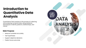
Unlike qualitative research that explores opinions and experiences, quantitative analysis is built on precision — and this deck reflects that. It opens with a focused introduction to quantitative data analysis that defines the discipline as the process of collecting and analyzing numerical data using statistical techniques to identify patterns, relationships, and trends. Four core purposes are presented immediately — measuring variables accurately, testing hypotheses, supporting objective decisions, and predicting future outcomes — giving audiences a clear understanding of what quantitative analysis is designed to achieve before any method or technique is introduced.
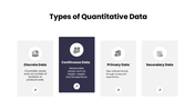
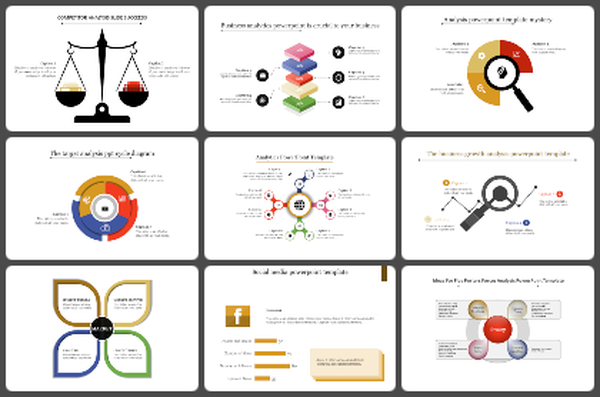
The types of quantitative data slide maps four distinct data categories — continuous data covering measurable values, discrete data covering countable values, primary data collected directly through surveys and experiments, and secondary data drawn from existing sources — giving researchers and students a clear taxonomy for understanding how numerical data is classified before analysis begins. The methods of data collection slide follows with five common collection approaches — surveys and questionnaires, online forms, experiments, observations, and database records — reinforcing that reliable analysis always begins with reliable data collection.
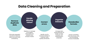
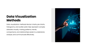
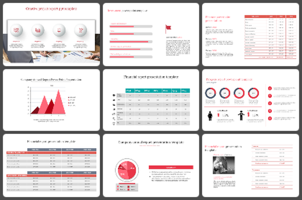
The data cleaning and preparation slide is one of the most practically valuable in the deck — covering five essential preparation steps that every analyst must complete before touching a statistical tool: handling missing values, organizing datasets, removing duplicates, correcting errors, and standardizing formats. Each step is explained with a concise purpose statement that makes the importance of clean data immediately clear to any audience. The data visualization methods slide then explains how bar charts, pie charts, histograms, and scatter plots transform complex numerical datasets into visual representations that make patterns, trends, comparisons, and relationships genuinely accessible — reinforcing that good visualization is not cosmetic but analytical.
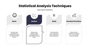
The statistical analysis techniques slide covers four descriptive statistics measures that form the foundation of quantitative analysis — mean as the calculated average, median as the middle value in an ordered dataset, mode as the most frequently occurring value, and standard deviation as the measure of data spread and variation from the average — each explained with a precise, plain-language definition that works for both specialist and non-specialist audiences. The advantages slide highlights four key benefits of quantitative analysis — improved accuracy in decision-making, pattern and relationship identification within datasets, simplified communication through visual representations, and stronger forecasting and business performance evaluation — making a persuasive case for why numerical analysis is indispensable in any evidence-based organization.
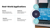
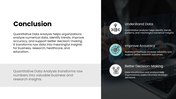
The real-world applications slide grounds the entire presentation in practical relevance — showing how quantitative analysis creates measurable value across four industries: business for sales forecasting and market analysis, healthcare for patient statistics and clinical research, education for student performance analysis, and finance for risk assessment and financial planning. A grounded conclusion closes the deck by connecting quantitative analysis directly to three organizational outcomes — understanding data through trend and pattern identification, improving accuracy through reliable statistical methods, and enabling better strategic decision-making through data visualization and analysis.
Everything is fully customizable — data type descriptions, collection methods, cleaning steps, statistical technique definitions, application areas, color schemes, and layout elements — no design experience needed. Download the Quantitative Data Analysis PPT today and give your audience a clear, structured, and confident understanding of how numbers become meaningful insights.
Features of this template
- 100% customizable slides and easy to download.
- The slides contain 16:9 and 4:3 formats.
- Easy to change the colors quickly.
- Highly compatible with PowerPoint, Google Slides, and Canva templates.
You May Also Like These PowerPoint Templates


