Free - Dive In To How To Make A Comparison Chart In PowerPoint
Free

Guide to Make a Comparison Chart in PowerPoint
To analyze the similarities and differences of a subject in PowerPoint, creating a comparison chart can be an effective way. Here are the steps to create a comparison chart in PowerPoint:
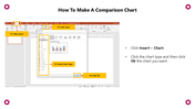
Step 1: Click on the 'Insert' option from the Menu bar.
Step 2: Select the 'Chart' option.
Step 3: Choose the 'Chart type.'
Step 4: Click 'OK.'
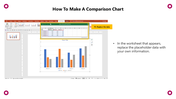
Step 5: In the worksheet that appears, replace the placeholder data with your own information.
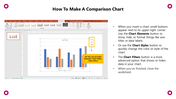
Step 6: You can use Chart Elements, Chart Styles, and Chart Filters.
After inserting the chart, small buttons appear next to its upper-right corner. Use the Chart Elements button to show, hide, or format things like axis titles or data labels. Alternatively, use the Chart Styles button to quickly change the chart's color or style. An advanced option is the Chart Filters button, which shows or hides data in your chart.
Step 7: When you're done, close the worksheet.
For more PowerPoint tips and tricks, visit SlideEgg.
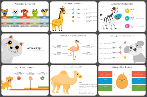
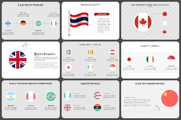
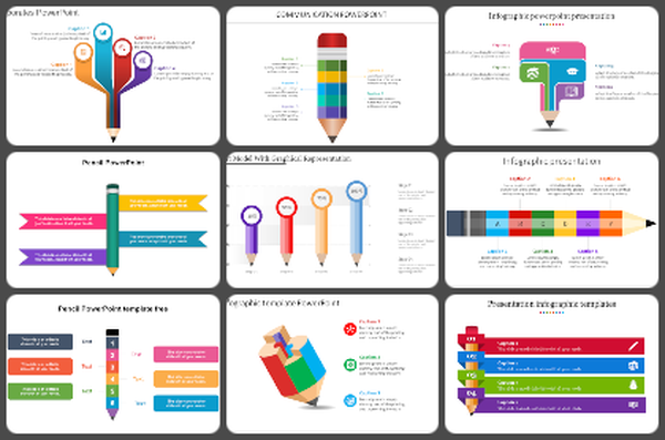
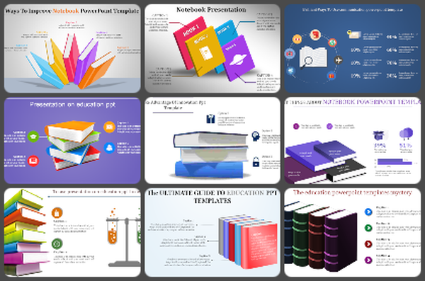

You May Also Like These PowerPoint Templates

Add to Wishlist
Download
AI Customize

Free
Add to Wishlist
Download
AI Customize

Add to Wishlist
Download
AI Customize


Add to Wishlist
Download
AI Customize

Add to Wishlist
Download
AI Customize

Add to Wishlist
Download
AI Customize

Add to Wishlist
Download
AI Customize

Add to Wishlist
Download
AI Customize

Add to Wishlist
Download
AI Customize

Add to Wishlist
Download
AI Customize

Add to Wishlist
Download
AI Customize

Add to Wishlist
Download
AI Customize

Add to Wishlist
Download
AI Customize

Add to Wishlist
Download
AI Customize

Add to Wishlist
Download
AI Customize

Add to Wishlist
Download
AI Customize

Add to Wishlist
Download
AI Customize


Free
Add to Wishlist
Download
AI Customize

Free
Add to Wishlist
Download
AI Customize

Add to Wishlist
Download
AI Customize

Add to Wishlist
Download
AI Customize


Free
Add to Wishlist
Download
AI Customize


Add to Wishlist
Download
AI Customize


Add to Wishlist
Download
AI Customize

Free
Add to Wishlist
Download
AI Customize

Free
Add to Wishlist
Download
AI Customize

Add to Wishlist
Download
AI Customize

