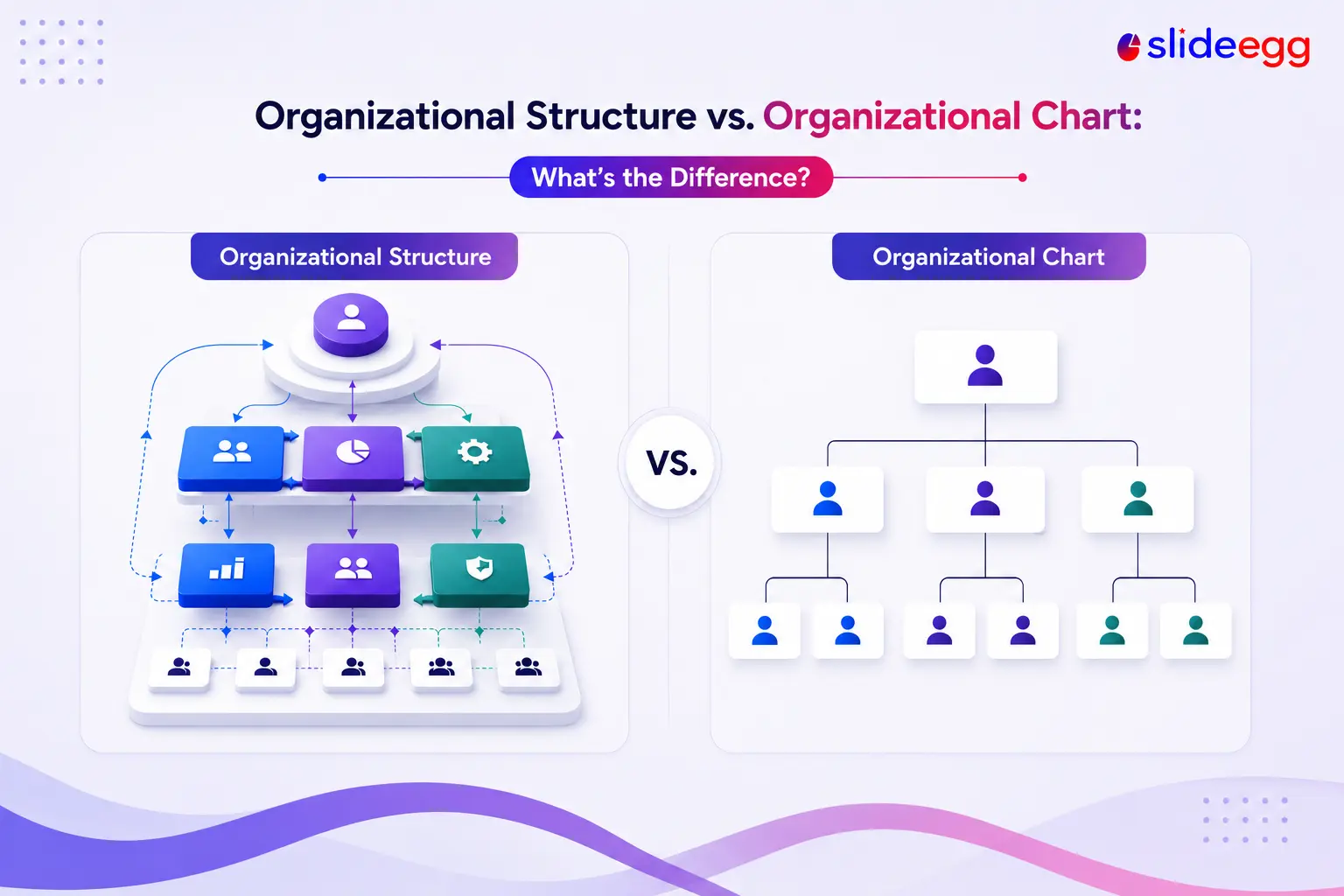
The two terms get used interchangeably, but they describe different things. Your organizational structure is the underlying system that decides how work, authority, and information move through your company—who owns what, who decides what, and how teams connect. Your organizational chart is the picture of that system: the boxes-and-lines diagram that shows the reporting relationships at a glance. One is the framework; the other is the snapshot of it.
Getting the distinction right matters because you can redraw a chart in an afternoon, but changing the structure behind it is a real business decision. This guide defines each term, lays them side by side, explains which one comes first, and shows how to turn a structure into a clear chart.
In one line: An organizational structure is how a company is actually organized and run; an organizational chart is a visual representation of that structure. The structure is the system; the chart is the map.
Key Takeaways
- Structure = the system of roles, authority, and information flow; built around functions and accountability.
- Chart = the boxes-and-lines diagram that depicts that system; built around individuals and titles.
- The structure comes first; the chart is drawn to represent it.
- Structure changes rarely (only with strategy); charts change often (with every hire or exit).
- Common structure types: functional, divisional, matrix, flat, and hierarchical.
What Is an Organizational Structure?
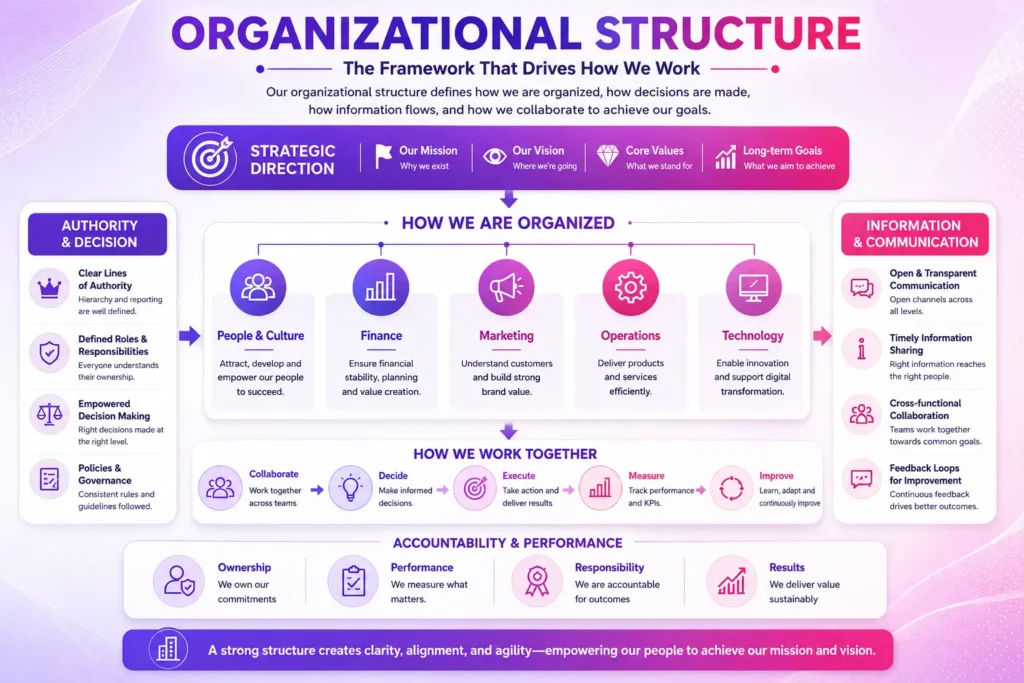
An organizational structure is the framework that defines how a company arranges its people and work to reach its goals. It sets out roles and responsibilities, lines of authority, how decisions get made, and how information flows between teams. Crucially, it’s built around functions and accountability—departments like sales, finance, and engineering, and the goals and performance each one owns—rather than around specific individuals.
Because it’s tied to strategy, a structure is relatively stable. It changes when the business changes: a new market, a merger, a shift from a founder-led team to functional departments. If you’re mapping your model, a quick read on what an organizational chart is and how it works covers the fundamentals the structure sits on.
What Is an Organizational Chart?
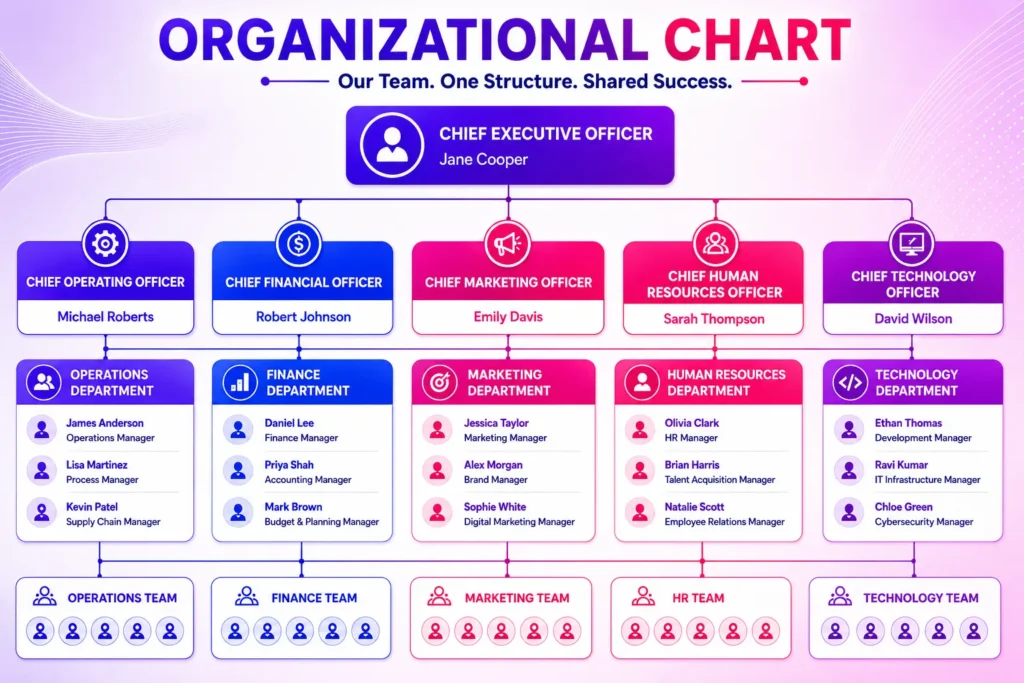
An organizational chart (also called an org chart, organogram, organigram, or organizational breakdown structure) is the visual diagram of that structure. It’s built around individuals and their titles, using boxes for roles and lines for reporting relationships, so anyone can see who reports to whom in seconds. A chart often carries practical detail too—names, job titles, sometimes photos or contact information.
Because it’s tied to specific people, a chart dates quickly: every hire, exit, or promotion can make it inaccurate. That’s why charts are refreshed often, while the structure underneath usually stays put.
Organizational Structure vs. Organizational Chart: Side by Side
| Aspect | Organizational Structure | Organizational Chart |
|---|---|---|
| What it is | The system for how work, authority, and information are organized | The visual diagram that depicts that system |
| Built around | Functions, departments, and accountability | Individuals and their job titles |
| Answers | How is the company run and who owns what? | Who reports to whom? |
| Typically contains | Roles, authority, decision rights, KPIs, information flow | Names, titles, reporting lines, sometimes photos |
| How often it changes | Rarely—only with a strategy shift | Often—with every hire, exit, or promotion |
| Form | A concept and a plan | A diagram or document |
Which Comes First?
The structure comes first. You decide how the company should be organized—functional, divisional, matrix, or flat—and the chart is drawn afterward to represent it. Drawing a chart without having settled the structure tends to reveal the problem rather than solve it: unclear reporting lines and overlapping roles show up as messy boxes and crossed connectors. Sort out the structure, and the chart almost draws itself.
Common Types of Organizational Structure
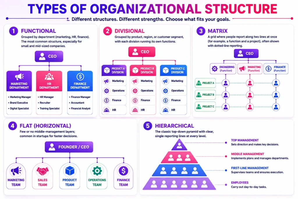
Most companies use one of a few recognized structures, each producing a different-looking chart:
- Functional — grouped by department (marketing, HR, finance). The most common structure, especially for small and mid-sized companies.
- Divisional — grouped by product, region, or customer segment, with each division running its own functions.
- Matrix — a grid where people report along two lines at once (for example, a function and a project), often shown with dotted-line reporting.
- Flat (horizontal) — few or no middle-management layers; common in startups for faster decisions.
- Hierarchical — the classic top-down pyramid with clear, single reporting lines at every level.
Your structure determines which chart layout fits. A functional structure suits a clean top-down tree; a matrix needs a layout that can show dual reporting without becoming a tangle.
How to Turn Your Structure Into a Chart
Once your structure is clear, drawing the chart is the straightforward part. You can build one in the tool you already use:
- In a presentation: our step-by-step guides for PowerPoint and Google Slides walk through the SmartArt method.
- In a design tool: Canva is handy for a branded, presentation-ready chart.
- In documents or spreadsheets: Word and Excel both build charts from SmartArt or a data list.
Shortcut: To skip the layout work entirely, start from a ready-made organizational chart template and drop your roles in. SlideEgg’s templates open directly in PowerPoint, Google Slides, and Canva, so you can match the layout to whichever structure you use.
Why the Distinction Matters
Confusing the two leads to a common mistake: reorganizing the chart when the real problem is the structure. Moving boxes around won’t fix unclear ownership or a decision bottleneck—those live in the structure. Conversely, when you do change the structure, the chart should be updated to match, or people end up working from an out-of-date picture. Keep them aligned: design the structure deliberately, keep the chart current as a live representation of it, and sidestep the common org chart mistakes that make even an accurate chart hard to read.
Frequently Asked Questions
Is an organizational chart the same as an organizational structure?
No. An organizational structure is the system that defines how a company is organized—roles, authority, and information flow. An organizational chart is the visual diagram that represents that structure. The structure is the framework; the chart is the picture of it.
Which comes first, the structure or the chart?
The structure comes first. You decide how the company is organized, then draw the chart to represent it. A chart is only as clear as the structure behind it.
What is an example of the difference?
A company might choose a functional structure—separate marketing, sales, and finance departments, each with its own goals and accountability. The org chart is the diagram that shows those departments and who reports to whom within each one.
Why do organizational charts become outdated so quickly?
Because a chart is built around specific people and titles, every hire, departure, or promotion can make it inaccurate. The underlying structure changes far less often, since it only shifts with a change in strategy.
What are the main types of organizational structure?
The most common are functional (by department), divisional (by product, region, or customer), matrix (dual reporting), flat (few management layers), and hierarchical (a classic top-down pyramid).
Can two companies with the same structure have different org charts?
Yes. Two companies can both use a functional structure yet have very different charts—different departments, team sizes, names, and reporting depth. The structure type is shared; the chart reflects each company’s specific people and layout.
Conclusion
The simplest way to hold the two apart: the organizational structure is how your company works, and the organizational chart is the picture of how it works. Decide the structure first, choose a chart layout that fits it, and keep the chart current as people change. Do that, and the diagram stays a true, useful map of the business rather than an outdated org-chart artifact on a shared drive.