
Presenting Data Is Easy — Making It Clear Is the Real Goal
Inserting a graph or a number in PowerPoint is easy. But making people understand that data quickly is a skill. When shown well, your data makes your point stronger and builds trust with the audience. If your slides are too crowded or messy, your message will get lost.
This guide will help you understand:
- What data really is
- How to Present Data in PowerPoint: Step-by-Step
- How to create data slides step-by-step
- Types of charts and when to use them
- Tips, Tools and templates that make your job easier
📘 What Is Data?
Data is simply facts, numbers, or information. It tells us what is happening around us — in business, education, marketing, or life. It helps us make better decisions.
Examples of data:
- Number of products sold last month
- Test marks of a student
- Visitors to your website
- Budget used by each team
When this information is shown clearly in PowerPoint, people can quickly understand it and take action.
How to Present Data in PowerPoint: Step-by-Step
If you are facing any confusion about how to select the best chart for data presentation , explore the points below. Let’s break it down into five easy steps that anyone can follow.
1️⃣ Collect Your Data First
Before you design your slide, make sure all your data is in one place and ready. This is the base for everything.
Why this step is important:
If your data is not clean or complete, you’ll spend more time fixing errors than designing your slide. Clear data means you can focus more on how it looks and what message it gives.
Activities:
- Remove repeated entries
- Keep only the data that supports your message
- Highlight key numbers or patterns
2️⃣ Think About Your Audience
Always ask: Who will see this presentation?
If your viewers already understand the topic, you can go into details. If they are beginners, you need to simplify things and use more pictures.
Why this matters:
When you match your slide to the viewer’s level, they understand better. They feel like the slide was made just for them.
Tips:
- Use simple icons for kids or students
- Show numbers and charts for a business team
- Avoid jargon unless your audience knows it
3️⃣ Choose the Best Way to Show the Data
Data can be shown in many ways — but not all are suitable for every message.
Why this matters:
The right chart makes your message stronger. The wrong one makes it confusing. Choosing wisely helps people focus and remember the point.
Tips:
- Use line charts for changes over time
- Use bar charts to compare values
- Use pie charts for showing parts of a whole
4️⃣ Design Your Slide for Easy Viewing
Your slide should be clean and easy to read, even from the back of a room. This is where many people make mistakes — by adding too much on one slide.
Why this matters:
Cluttered slides confuse the eyes. Clean slides guide the eyes. When viewers can follow the flow, they stay interested.
Tips:
- Use large fonts (at least 24 pt)
- Leave white space around elements
- Limit to 2–3 colors per slide
- Show only one chart per slide if possible
5️⃣ Add Helpful Text or Notes
If needed, you can add short text next to your chart. This can be a quick takeaway or a reason why the data matters.
Why this matters:
Some people need numbers. Others need an explanation. The combination helps everyone.
Tips:
- Use call-out text like “Sales increased by 40%”
- Add a simple title to each slide that gives context
- Avoid full sentences — keep it short and punchy
🎨 Creative Ways to Present Data in PowerPoint
When you show numbers or information in a presentation, using just text can make it hard for people to understand. That’s why charts, diagrams, and timelines are important. They help your audience see what the numbers are telling them — quickly and clearly.
PowerPoint has many useful tools to help you present data in a clean and simple way. Let’s look at the most common types of data visuals and how each one helps tell your story better.
📈 Line Charts
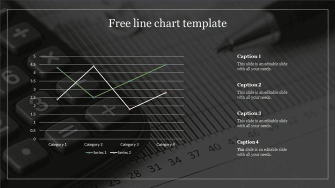
What it is:
A line chart is a simple chart that uses lines to connect dots. Each dot shows a value, and the lines between them show how that value is changing over time. The lines go up and down depending on the numbers.
When to use it:
Use a line chart when you want to show how something grows, drops, or changes over time. It is perfect for showing trends, such as monthly sales, temperature changes, website visitors, or profit across months or years.
Why it’s useful:
Line charts help people see patterns. For example, if your line goes up slowly, it means growth. If the line falls, it means a drop. You can also show two or three lines in the same chart to compare different things, like sales of two products or visits to two websites. This makes it easier to find out which one is performing better.
Example:
A business wants to show how their sales grew from January to June. They use a line chart to connect the monthly sales numbers, and people can clearly see that the sales are going up each month.
📊 Bar and Column Charts
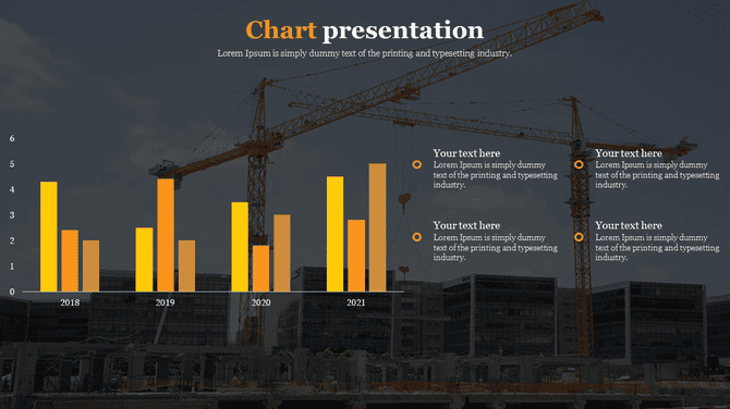
What it is:
Bar charts and column charts show data using bars. In a bar chart, the bars go sideways. In a column chart, the bars go up and down. Each bar shows the value of one item. The longer or taller the bar, the bigger the value.
When to use it:
These charts are very helpful when you want to compare different items. For example, you may want to compare how much money was earned by different branches of a company, or how students scored in different subjects. Bar charts are best when the labels are long. Column charts are great when showing data over time.
Why it’s useful:
It’s easy to compare one bar to another and find the highest and lowest values. These charts help people quickly understand which item is better, worse, or equal.
Example:
A company wants to show sales from four regions: North, South, East, and West. They use a column chart with four bars. The highest bar shows the best-performing region.
🔵 Pie Charts
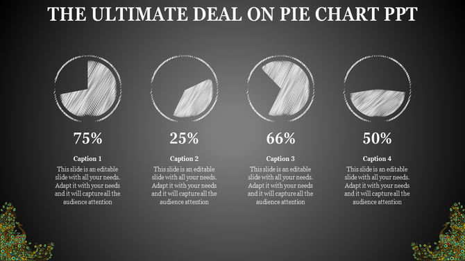
What it is:
A pie chart looks like a round pie that is cut into slices. Each slice shows how big a part of something is. The whole circle represents 100%, and each slice is a portion of that total.
When to use it:
Use pie charts when you want to show how a whole is divided into parts. They are best for showing percentages, budgets, or market shares. It’s especially useful when you want to focus on which part is the biggest or smallest.
Why it’s useful:
Pie charts give your audience a visual idea of proportion. When someone sees a large slice, they understand that it’s an important part. Small slices show areas that have less importance or value.
Example:
You are showing how your monthly expenses are split. 50% goes to rent, 20% to food, 10% to transport, and the rest to savings and bills. A pie chart clearly shows where most of the money goes.
Tip:
Don’t add too many slices. If you go beyond six, the chart becomes messy and hard to read. Stick to the main categories.
🔁 Venn Diagrams
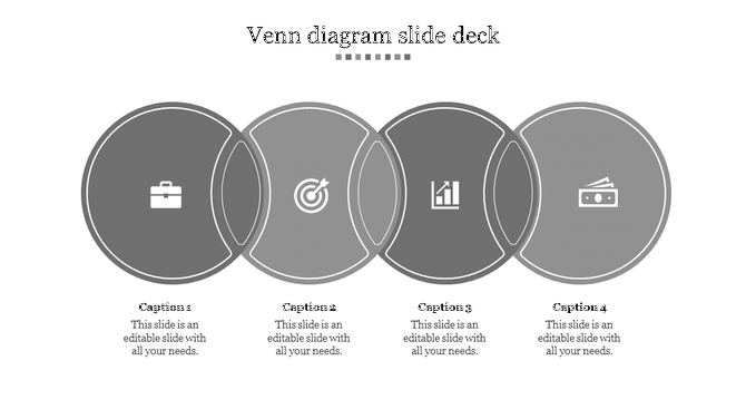
What it is:
A Venn diagram uses two or more overlapping circles. Each circle represents a group. Where the circles overlap, it shows what the groups have in common. The outer parts show what’s different.
When to use it:
Use Venn diagrams when you want to compare two or more things and show both the similarities and the differences. It works well for comparing features, services, ideas, or products.
Why it’s useful:
Venn diagrams make it very easy to understand shared and unique characteristics. People don’t need to read a lot of text to understand the comparison — the circles do the job visually.
Example:
You are comparing Android phones and iPhones. The shared area shows features both phones have (like touchscreen, apps, and camera), while the outer areas show what is only found in one of them.
🫧 Bubble Charts
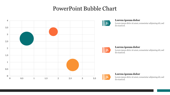
What it is:
A bubble chart uses circles (bubbles) of different sizes to represent values. The bigger the bubble, the larger the value it shows.
When to use it:
Use bubble charts when you want to compare multiple items using size instead of numbers. This type of chart is very useful for showing how different items relate to one another visually. It can also add a fun, creative touch to a boring report.
Why it’s useful:
It’s easier for the audience to spot what matters just by looking at the bubbles. Bigger bubbles catch attention quickly, while smaller bubbles show items that are less important. This method is great for showing spending, market size, or team performance.
Example:
You want to compare the budgets of five departments. Each department is shown as a bubble. The marketing bubble is the largest because it has the biggest budget, while the admin bubble is the smallest.
🗺️ World Maps
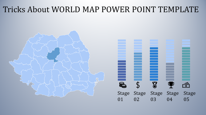
What it is:
A map chart shows data related to locations. It could be countries, states, cities, or regions. The map is shaded or marked based on the values for each area.
When to use it:
Use maps when you want to show geographic data. This could include sales by country, customer locations, delivery routes, or user activity by region.
Why it’s useful:
Maps make your data more real. They help people connect data to actual places. It also makes patterns easier to spot — like which area is performing best or needs attention.
Example:
Your business sells products in five countries. A color-coded map shows how much each country is contributing to total sales. Darker colors show higher sales.
🕒 Timelines
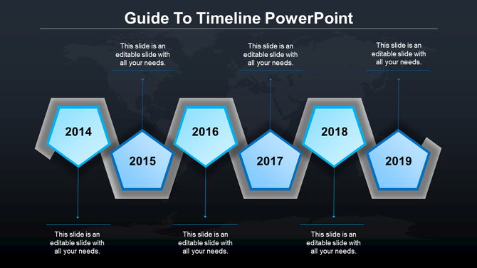
What it is:
A timeline is a line (horizontal or vertical) with important dates or steps arranged in order. Each point on the line represents an event or a task.
When to use it:
Use a timeline when you want to show a series of events or tasks that happened (or will happen) over time. This is helpful in planning, storytelling, or explaining past achievements.
Why it’s useful:
Timelines help the audience see the sequence of actions without confusion. It makes your explanation smooth, logical, and easy to follow.
Example:
You are creating a company report. A timeline shows: Started in 2021 → Launched product in 2022 → Expanded in 2023 → Crossed 1 million users in 2024.
🔄 Flowcharts
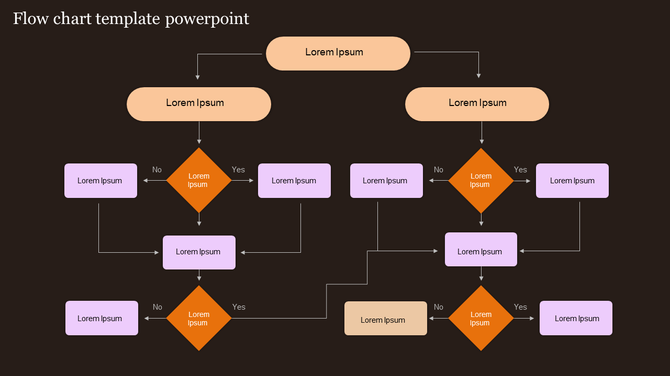
What it is:
A flowchart is a diagram made of boxes, arrows, and lines. Each box shows a step or stage. The arrows show what comes next.
When to use it:
Use flowcharts to explain a process or step-by-step flow. It’s perfect for business operations, task management, or showing how something works.
Why it’s useful:
Flowcharts help simplify complex steps. They guide the viewer from the start of the process to the end. They can also show loops or repeated actions.
Example:
You want to explain the steps in online order processing. Your flowchart starts with “Place Order,” then goes to “Payment Done,” then “Order Packed,” then “Shipped,” and finally “Delivered.”
5 Easy Tips to Improve Your Data Slides
✅ 1. Keep It Simple
Use big fonts, short labels, and only important data. Don’t fill the slide with too much information.
✨ 2. Be Creative
Try different colors, icons, or backgrounds. Use animation to bring in one chart at a time.
🎯 3. Match Your Brand
Use your company colors, fonts, and logo to make the slide look more professional and trustworthy.
🔍 4. Highlight What Matters
Make important numbers bold or use bright colors like red/green. Use arrows to show focus areas.
🧩 5. Use PowerPoint Templates
PowerPoint presentation templates help you save time and create polished slides. Just pick a layout and fill in your data.
Tools to Make Your Job Easy
Here are some tools that can help you show data fast:
| Tool | What It Does | Best For |
| PowerPoint | Create presentations, charts, templates | Business, education |
| Excel | Organize and calculate data | Data preparation |
| Canva | Make visual designs and infographics | Social media or posters |
Conclusion: Let Your Data Speak Clearly
Data is powerful — but only when it’s shown properly. Using the right chart, a simple layout, and a clean design makes your audience trust and understand your message.
You don’t need to be an expert in design. Use ready-to-edit templates to save time and make your data shine.
❓ FAQs – People Also Ask
Q1: What is the best chart for beginners?
👉 Bar charts and pie charts are easiest to use and understand.
Q2: How do I copy charts from Excel to PowerPoint?
👉 Copy the chart and paste it into the slide. You can also link it to auto-update.
Q3: Can I use more than one chart on a slide?
👉 Yes, but only if it helps the viewer compare related things.
Q4: Do I need a design tool to make charts look good?
👉 No, PowerPoint templates are sufficient to create clean, simple visuals.