Valentine’s Day presentations often fail when design becomes the main attraction. In 2026, audiences demand clarity, restraint, and visual intent—rather than clear symbols or innovative styling.
Choosing the right Valentine’s Day presentation template is not about over-celebrating the date. It is about acknowledging the moment while maintaining a professional, readable, and visually controlled message. The right template supports credibility instead of distracting from it.
Why Use Valentine’s Day Presentation Templates?
- Valentine’s Day templates exist to prevent common design mistakes. A well-designed template already defines spacing, hierarchy, and balance before content is added.
- Instead of focusing on decoration, strong templates help the audience focus on the message. They keep seasonal styling intentional and controlled instead of excessive or distracting. Whether you need a Valentine’s Day PowerPoint template or something for Google Slides, starting with a good design is the smartest first step.
Step 1: Define the context, not the audience classification.
Before selecting a template, think about where the presentation will be shown.
- Professional settings: Choose clean layouts with subtle seasonal accents. Avoid literal Valentine’s imagery.
- Educational or internal use: Warm colours can work, but layout and accessibility remain important.
- Personal presentations: Expression is acceptable, but visual order should remain consistent.
If the theme feels stronger than the content, the template is doing too much
Step 2: Evaluate the colour and typography approach.
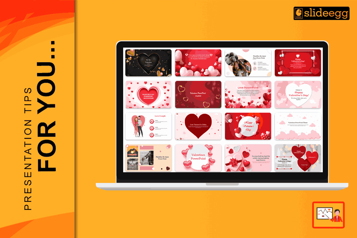
- In 2026, effective Valentine’s Day templates move away from bright reds and decorative colour blocks. Instead, modern designs follow the ‘Rouge Reimagined’ approach—using deep burgundy, muted rose, clay tones, and charcoal-based neutrals that remain readable across light mode, dark mode, and shared screen.
- Typography should prioritise hierarchy and readability. A professional template uses a single font family and high contrast, not stylised or novelty scripts.
Step 3: Check Structural Flexibility
A strong Valentine’s Day PPT template should handle real content easily.
Look for:
- Multiple slide layouts (title, content, image-led, closing)
- Editable styles without breaking alignment
- Image placeholders that preserve composition
- Layouts that scale well on large screens, mobile devices, and split-screen hybrid calls
If the design falls apart once text is added—or becomes unreadable on mobile or shared screens—the template isn’t professionally built.
Step 4: The ‘White Space’ Rule
- White space improves comprehension and makes slides feel more confident. Clean slides feel intentional and easier to follow.
- When content feels crowded, add slides instead of compressing information into one screen.
- In 2026, many presenters will use AI-assisted tools to adapt slides quickly—such as swapping colour styles, resizing layouts for mobile viewing, or replacing stock visuals in bulk. A strong Valentine’s Day template should hold its structure even when AI is used to modify format or styling.
How to Edit Your Valentine’s Day PPT Template
Once you find the perfect Valentine’s Day PPT template, follow these simple steps to make it yours:
- Replace stock images manually or through AI-assisted image swaps, ensuring visuals remain relevant and professional.
- Limit colour changes to one controlled accent
- Maintain consistent spacing and alignment
- Avoid adding extra visual elements outside the original design system.
Precision editing preserves professionalism.
Conclusion: Share the Love with Style
Choosing the best Valentine’s Day templates in 2026 is about clarity, restraint, and adaptability across hybrid viewing, dark mode, and mobile screens. Whether you are using a valentines day powerpoint template for a big meeting or a small family party, the goal is the same: to make the message easy to understand and trust. Pick a design that matches your audience, use colors that are easy on the eyes, and keep your slides simple.
When you start with a great template, you spend less time working and more time celebrating with the people you love.
If you want a template that looks professional even with minimal Valentine styling, start with a layout built for clarity. Download Valentine’s Day Templates
FAQ
1. How do I choose a Valentine’s Day template that still looks professional?
Start with layout discipline. Choose templates with clean typography, strong spacing, and subtle seasonal accents. Avoid clip-art symbols, heavy reds, and decorative fonts. A professional template should still look credible even if you remove the Valentine elements.
2. What should I check if the presentation will be shared on virtual or hybrid calls?
Test readability on screen share. Use high-contrast text, avoid thin fonts, and keep key content large enough to read on smaller displays. Templates with clean layouts and controlled color accents hold up best during virtual viewing.
3. Can I use a Valentine’s template in a business setting without it feeling unprofessional?
Yes, if the theme is subtle. Use conservative accents (one colour or a minor pattern), prioritise charts and numbers, and avoid quirky fonts. In business decks, Valentine styling should support the message, not become the focus.
4. What design choices make Valentine’s slides look dated fast?
Over-saturated reds, repeated heart icons, heavy gradients, and script fonts used for body text. Current templates also tend to overcrowd slides with decorations. Modern templates rely on muted tones, generous spacing, and typography that stays readable.
5. Can Valentine’s templates be reused beyond February?
Yes. Choose templates built on clean layout systems—good spacing, neutral typography, and removable seasonal accents. If you can remove the Valentine elements and the design still feels balanced, the template will stay useful for other occasions.