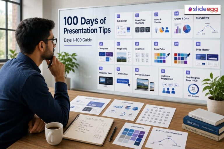
If you are still using flat corporate blue backgrounds and bullet points in 2025, your decks are already obsolete. As we move into 2026, the data is clear: audiences are demanding shorter, bolder, and more visual stories.
At SlideEgg, we analyzed over 100,000 downloads from our Free PowerPoint Templates library to see exactly what consultants, students, and marketers are using right now. The results? The “Minimalist” era is evolving into something much more interesting.
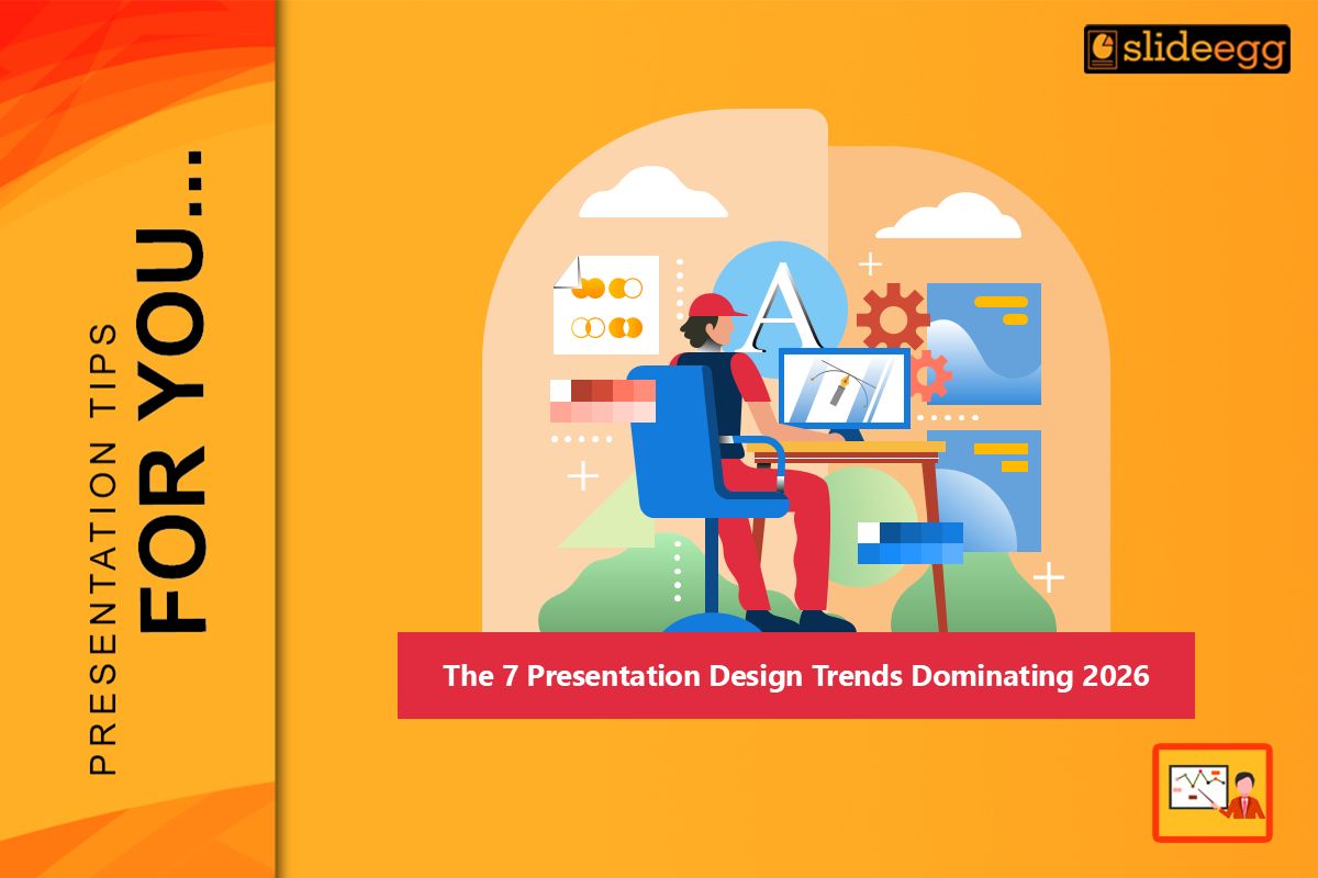
The Top 7 Trends for 2026
| Trend | Best Used For |
| Bento Grids | Organizing complex data cleanly. |
| Dark Mode | Tech pitches & low-light rooms. |
| Massive Typography | Title slides & bold statements. |
| Data Storytelling | Simplifying Excel charts. |
| Glassmorphism | Adding depth & premium feel. |
| Vertical Slides | Mobile viewing & social sharing. |
| Interactive Menus | Non-linear conversational pitching. |
1. The “Bento Grid” Layout
Inspired by Apple’s promotional videos and dashboard UI, the Bento Grid is taking over. Instead of one big title and a list of text, the slide is divided into modular, rectangular boxes—like a Japanese Bento box.
- Why it works: It allows you to organize disparate data (a chart, a quote, and a photo) on one slide without it looking cluttered.
- How to use it: Don’t build this from scratch. Download our [Free Grid Layout Templates] to get the spacing perfect instantly.
2. Dark Mode is the New Default
For years, “white background with black text” was the standard. In 2026, Dark Mode is the king of the boardroom. High-contrast neon accents (lime green, electric blue) on deep charcoal or black backgrounds reduce eye strain and make colors pop on modern LED screens.
- Pro Tip: If you are presenting in a dimly lit room, Dark Mode is mandatory. Check out our [Free Dark Theme PowerPoint Templates] to see how professional high-contrast design looks.
3. Massive Typography (The “Big Type” Trend)
In 2026, your slide title isn’t just a label; it is the main image. We are seeing a 300% spike in downloads for decks that use massive, bold, sans-serif fonts that take up 50% of the screen.
- The Rule: If your font size is under 80pt, go bigger.
- Get the Look: Our [Free Modern Typography Slides] are pre-formatted with these heavy fonts so you don’t have to guess.
4. Data Storytelling (No More Excel Screenshots)
Copy-pasting a screenshot of an Excel sheet is now considered a “presentation crime.” The trend for 2026 is “Data Simplification”—using clean Donut Charts, Sankey Diagrams, and simplified Funnels to show only the data point that matters.
- The Fix: Use editable vector charts so you can highlight specific numbers. You can find hundreds of these in our [Free Chart & Graph Templates] section.
5. The Return of Gradients (Glassmorphism)
Flat design is out. Depth is in. “Glassmorphism”—the effect of looking through frosted glass—is being used to add texture to backgrounds and text boxes. Soft, blurred color gradients (aurora borealis style) are replacing solid color blocks.
- Why use it: It makes a deck feel “premium” and “tech-forward.” It is especially popular in our [Free Technology PowerPoint Templates].
6. Vertical & Mobile-First Slides
New Trend Alert: Executives are reading your decks on iPhones, not projectors. The “Vertical Slide” (9:16 aspect ratio) is the fastest-growing category in 2026. Designing for mobile means larger fonts and less text.
- The Action: Don’t shrink a wide slide. Use a dedicated [Free Mobile-Ready PowerPoint Template] to ensure your pitch looks perfect on a phone screen.
7. Interactive & Zoomable Slides
Linear presentations (Slide 1 -> Slide 2 -> Slide 3) are fading. 2026 is the year of Non-Linear Presenting. Presenters are using clickable menus to jump to specific sections based on audience questions, turning a pitch into a conversation.
Summary: Don’t Design from Scratch in 2026
The bar for design quality has never been higher. But you don’t need to be a graphic designer to keep up.
We have updated our entire library to reflect these 2026 standards. Whether you need a Dark Mode pitch deck or a Mobile-Ready report, you can access our Free PowerPoint Templates 2026 Collection right now.
FAQs
What is a “Bento Grid” layout?
It’s a modular design that organizes different content—like charts, text, and photos—into clean rectangular boxes. It makes complex slides look organized and modern.
Why should I use Dark Mode in 2026?
Dark Mode reduces eye strain and makes neon accents pop. It is the professional standard for tech pitches and presentations in dimly lit boardrooms.
When should I use Vertical Slides?
Use them whenever your audience will view your deck on a smartphone. Designing in a 9:16 aspect ratio ensures your pitch is readable without forcing users to rotate their phones.
How is Data Storytelling different from regular charts?
Regular charts dump data; Data Storytelling simplifies it. It uses clean visuals to highlight a single, critical insight rather than showing an entire Excel spreadsheet.
Do I need design skills to use these trends?
No. You can apply these 2026 trends instantly by using SlideEgg’s free templates, which are pre-formatted with Bento Grids, Glassmorphism, and bold typography.