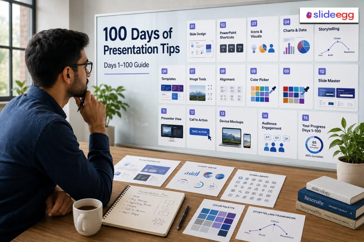
Presentations are more than slides — they are your chance to communicate ideas clearly and leave a lasting impression. SlideEgg’s 100 Days of Presentation Tips series delivers one practical tip every day to help you sharpen your skills. This blog combines Days 1–100 into a single reference guide, organized into five focused sections.
What You’ll Learn
- Quick PowerPoint fixes that save editing time
- Slide design rules for cleaner and more readable slides
- Useful tools for images, icons, colors, and layouts
- Storytelling and delivery strategies for better audience engagement
- Common presentation myths you should stop following.
Presentation Tips: Days 1–74
Day 1 – The “B” Key Hack Quick Fix
Source: PowerPoint B Key Screen Hack
Press B during a PowerPoint slideshow to instantly black out the screen. This single keystroke shifts all audience focus back to you. Use it mid-presentation to emphasize a key verbal point or create a moment of dramatic pause.
Quick Win: Works in PowerPoint and Google Slides — no settings needed.
Day 2 – Stock Photo Secrets Tool
Source: Use Better Stock Photos in Slides
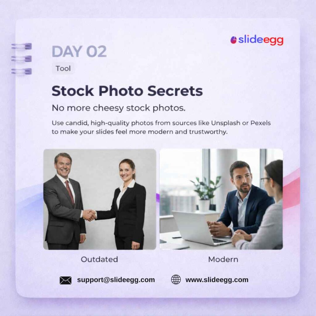
Replace outdated clip-art with free, high-quality images from Unsplash or Pexels. Candid, professionally shot photos boost credibility and keep your deck visually modern. Most photos on both platforms are free for commercial use with no attribution required.
Quick Win: Search by emotion, not just subject — “confident team” beats “office workers.”
Day 3 – Icons Over Bullets Design
Source: Replace Bullet Points with Icons
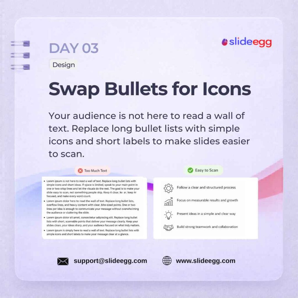
Swap long bullet lists for icons paired with short labels. Visuals are easier to scan than long text blocks, so icon-based slides help audiences understand your point faster. Keep labels to three words or fewer. If you need a head start, you can easily add and modify icons in PowerPoint add and modify icons in PowerPoint using native shapes.
Quick Win: Browse a massive library of free PowerPoint templates free PowerPoint templates for ready-built infographic and icon layouts.
Day 4 – The 10/20/30 Rule Strategy
Source: Follow the 10/20/30 Rule
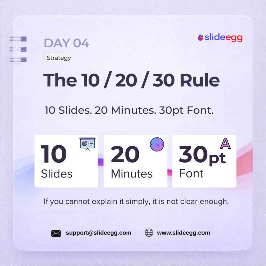
10/20/30 Rule says: use 10 slides, present for 20 minutes, and use a minimum 30-point font. This formula prevents information overload, forces concise storytelling, and keeps every audience engaged. It works equally well for startup pitches, team updates, and conference talks.
Quick Win: If you need more than 10 slides, you haven’t edited enough — cut one slide at a time.
Day 5 – Ctrl+G to Group Quick Fix
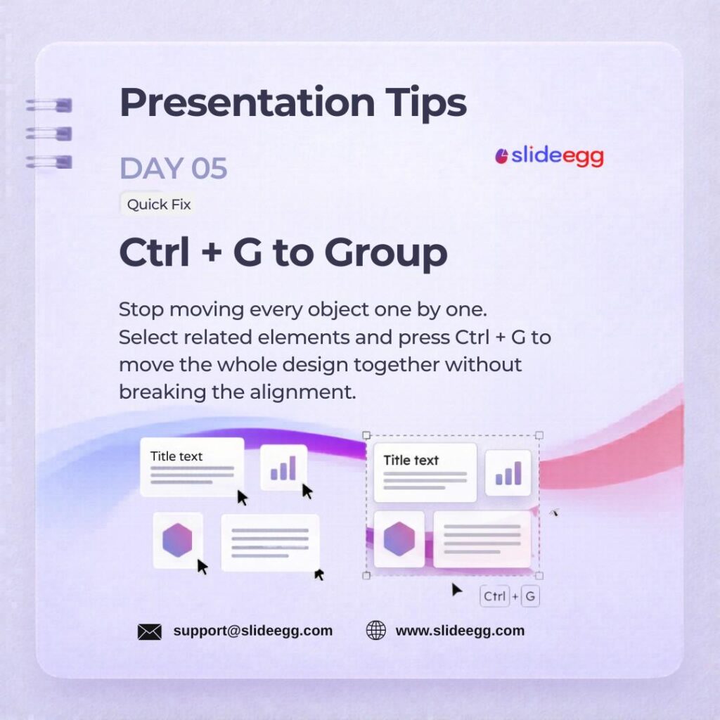
Source: Press Ctrl+G to Group Objects
Select multiple elements and press Ctrl+G to group them into a single object. Grouped elements move, resize, and animate together — saving significant editing time and keeping complex layouts aligned perfectly. To master this cross-platform layout strategy, check out our guide on how to group or ungroup objects in Google Slides.
Quick Win: Group your layout before duplicating it across slides — everything moves as one.
Day 6 – Background Remover Tool
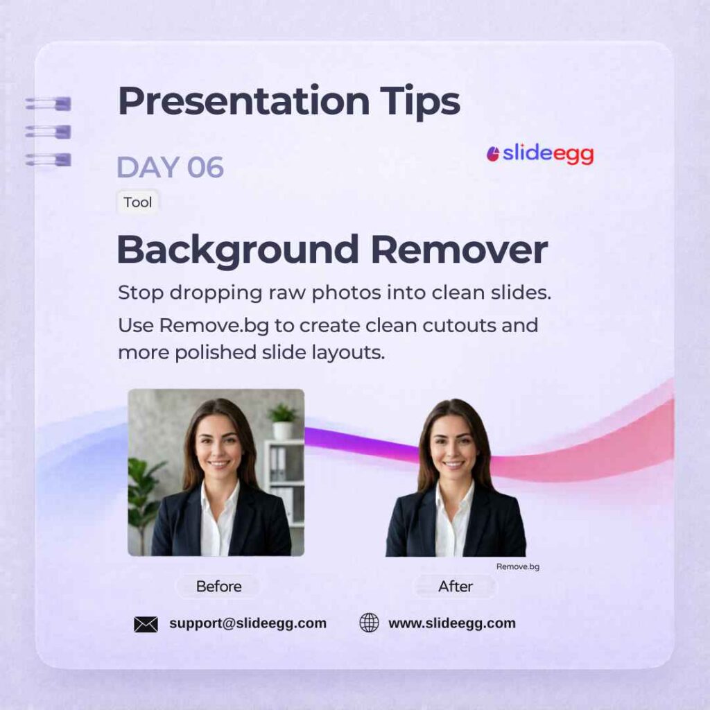
Source: Remove Image Backgrounds Quickly
Use Remove.bg to strip image backgrounds in one click — no Photoshop skills needed. Clean, background-free visuals look polished and professional on profile slides, product showcases, and team bios. Export as PNG and drop straight into your PowerPoint slide.
Quick Win: Use the free tier for most slides — the 5MB limit is enough for 90% of presentation images.
Day 7 – Left-Align Text Design
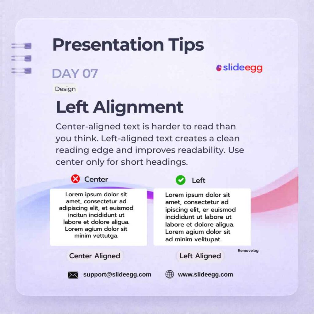
Source: Left-Align Text for Better Reading
Left-align all body text for natural reading flow and a polished look. Center alignment is reserved for slide headlines only — mixing alignments on the same slide creates visual tension and looks unfinished. This one change alone makes a slide feel instantly more structured.
Quick Win: Select all text boxes with Ctrl+A, set to left-align, then manually center your H1 headline.
Day 8 – The “W” Key Quick Fix
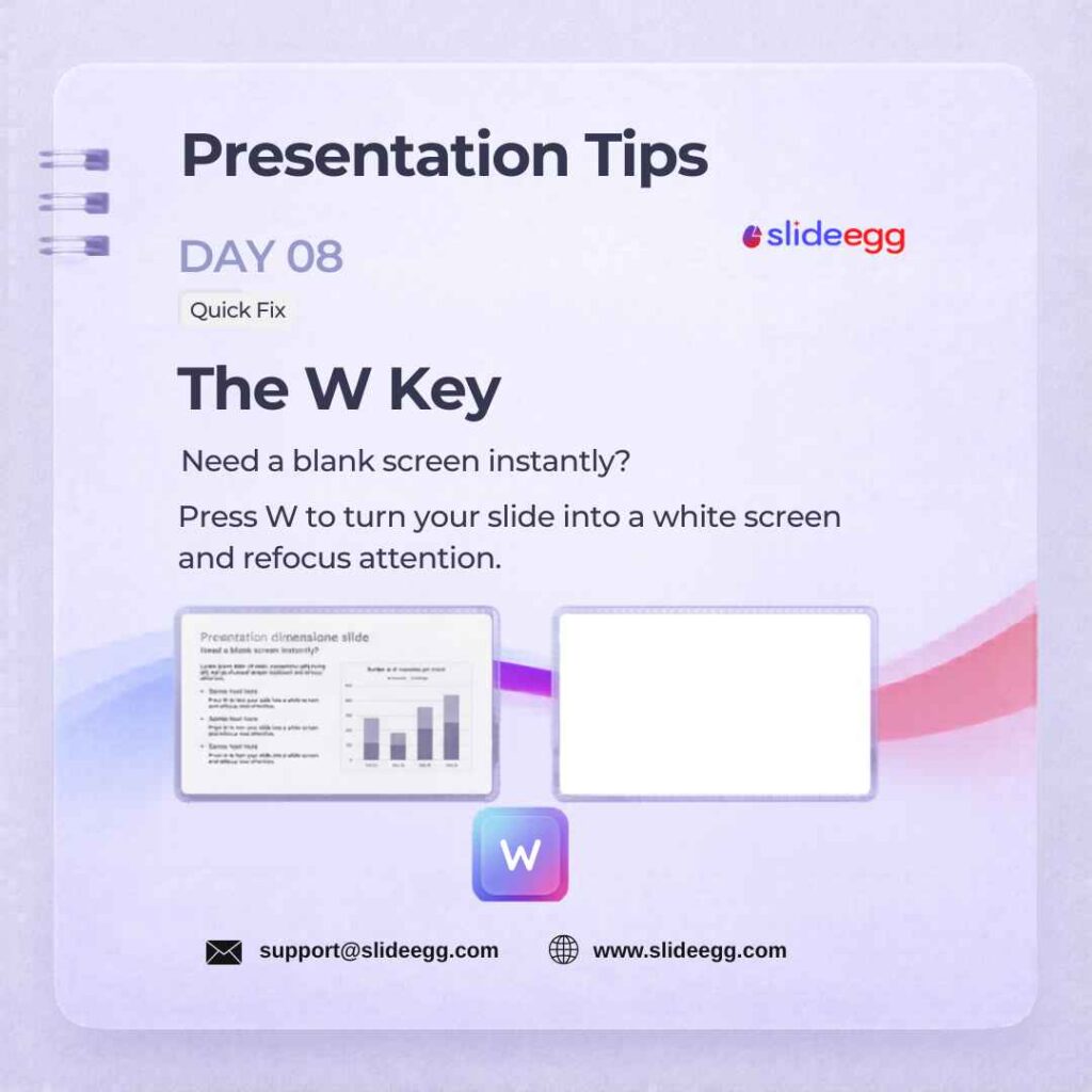
Source: Press W to Turn the Screen White
Press W during a slideshow to turn the screen white instantly. This helps you pause the visual flow and bring attention back to your explanation. Use it during Q&A sessions, classroom teaching, product demos, or when you want the audience to stop reading and listen.
Quick Win: Use B for a black screen and W for a white screen. Both shortcuts help you control audience attention without exiting slideshow mode.
Day 9 – Ctrl+D Duplicate Quick Fix
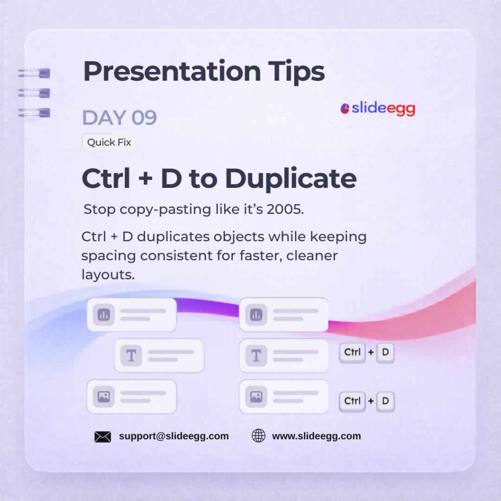
Source: Press Ctrl+D to Duplicate Objects
Press Ctrl+D to duplicate any object while preserving its exact position and spacing offset. This is faster than copy-paste and keeps your layout grid consistent across the whole slide. Use it to replicate icons, timeline nodes, and repeated text blocks without manual realignment.
Quick Win: Use Ctrl+D for repeated icons, timeline points, pricing cards, or comparison blocks. It keeps spacing more consistent than manual copy-paste.
Day 10 – Vector Icons (SVG) Tool
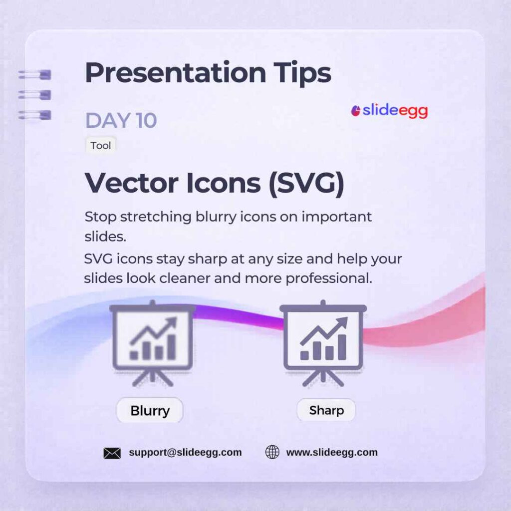
Source: Use SVG Icons for Sharp Slides
Use SVG icons instead of PNG or JPEG images to keep your slides sharp and professional. SVGs scale smoothly at any size, so they look clear on both a 4K projector screen and a laptop display. They are also easy to recolour directly inside PowerPoint or Google Slides, helping you match your icons with your presentation theme without extra editing tools.
Quick Win: Use SVG icons instead of stretched image icons. They stay crisp on laptops, projectors, and large screens.
Day 11 – The 6×6 Rule Strategy
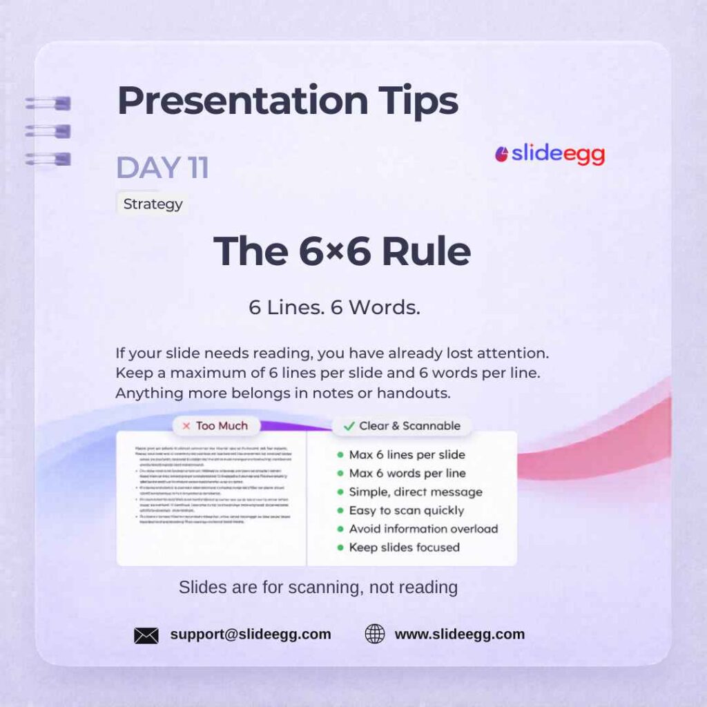
Source: Use the 6×6 Rule for Clean Slides
Limit each slide to 6 lines of text with a maximum of 6 words per line. This constraint forces you to remove padding text and communicate only what truly matters. Audiences process clean, minimal slides faster and remember them far longer than dense text-heavy ones.
Quick Win: Write your key idea in 6 words first, then build the slide around it.
Day 12 – Slide Master Tool
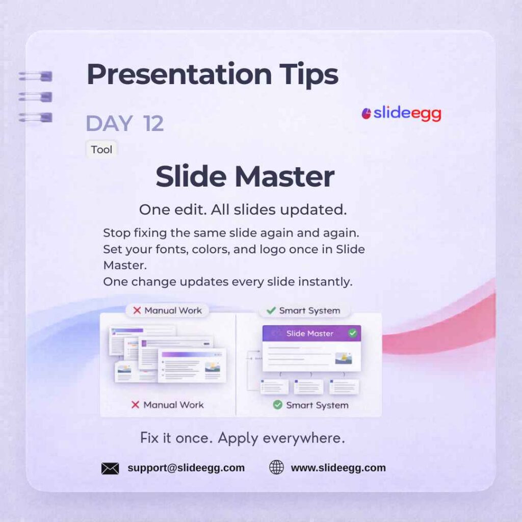
Source: Set Up Slide Master for Consistency
Set your fonts, brand colors, and logo once inside the Slide Master(View → Slide Master in PowerPoint). Every new slide you create automatically inherits those settings. This is the single most powerful consistency tool in PowerPoint — it eliminates repetitive formatting across 50+ slide decks.
Quick Win: Apply Slide Master to Google Slides templates too — it’s under Slide → Edit Theme.
Day 13 – Eyedropper Tool Quick Fix
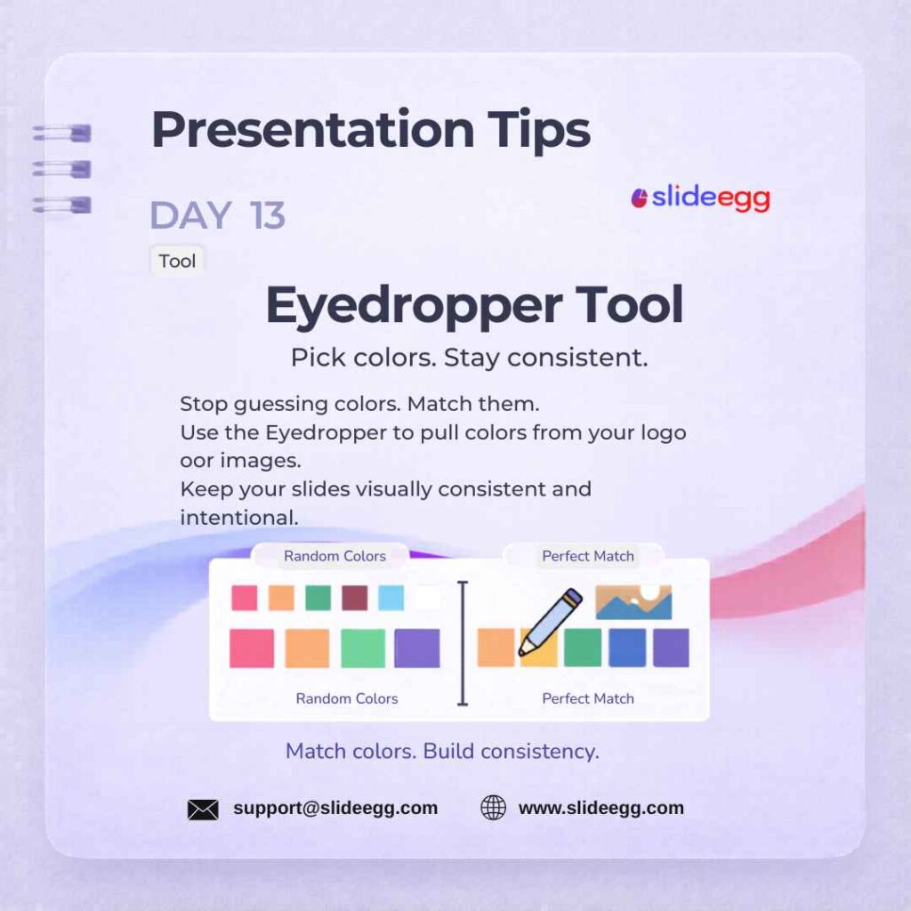
Source: Use Eyedropper to Match Brand Colors
Use the Eyedropper (Format → Shape Fill → Eyedropper) to sample an exact color from any image or logo on your slide. This makes precise brand color matching possible without guessing hex codes. Apply the sampled color to text, shapes, and backgrounds for a fully cohesive look.
Quick Win: Use the Eyedropper to match your slide colors with a logo, product image, or brand screenshot. This keeps your deck visually consistent without guessing color codes.
Day 14 – Anchor Points & Alignment Design
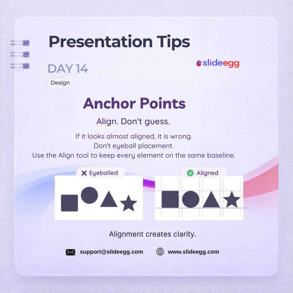
Source: Align Slide Elements with Guides
Always use alignment guides instead of visually guessing where objects should sit. Select multiple elements, then use Format → Align → Center or Middle for instant symmetry. Perfectly aligned slides look polished and professional — eyeballing creates subtle misalignments that audiences notice subconsciously. For a step-by-step guide, learn how to arrange and align elements in PowerPoint before finalizing your slide layout.
Quick Win: Select all related objects, then use Format → Align → Center or Middle. Do not drag objects by eye when PowerPoint can align them exactly.
Day 15 – Safety Margins Design
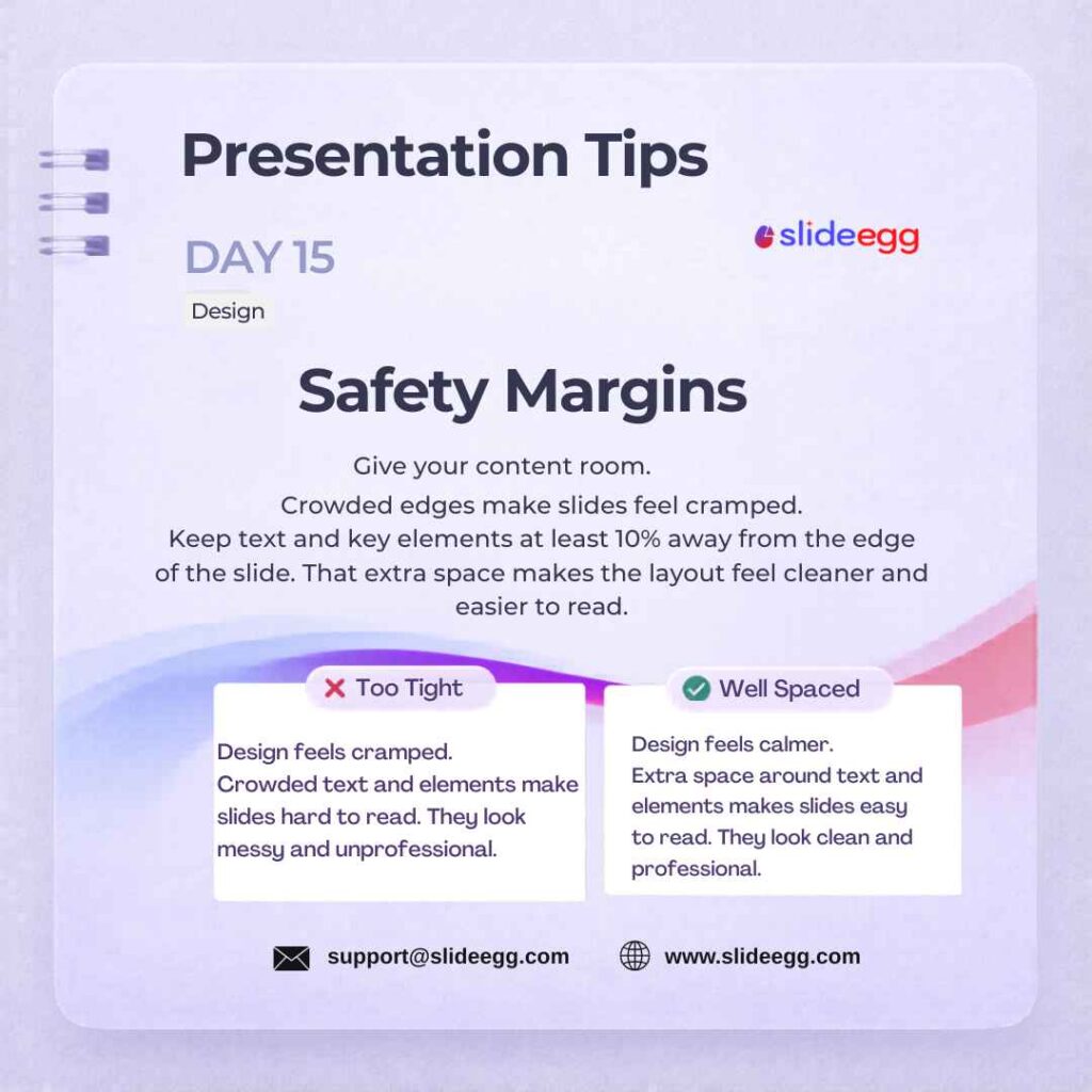
Source: Keep Content Away from Slide Edges
Keep all text and images at least 10% away from slide edges. Content placed too close to the edge gets cut off on certain projectors and screens. This one spacing rule prevents the “cramped” look that makes amateur decks instantly recognisable.
Quick Win: Draw a rectangle at 10% inset from all four edges, use it as a placement guide, then delete it before presenting.
Day 16 – Chart Cleanliness Design
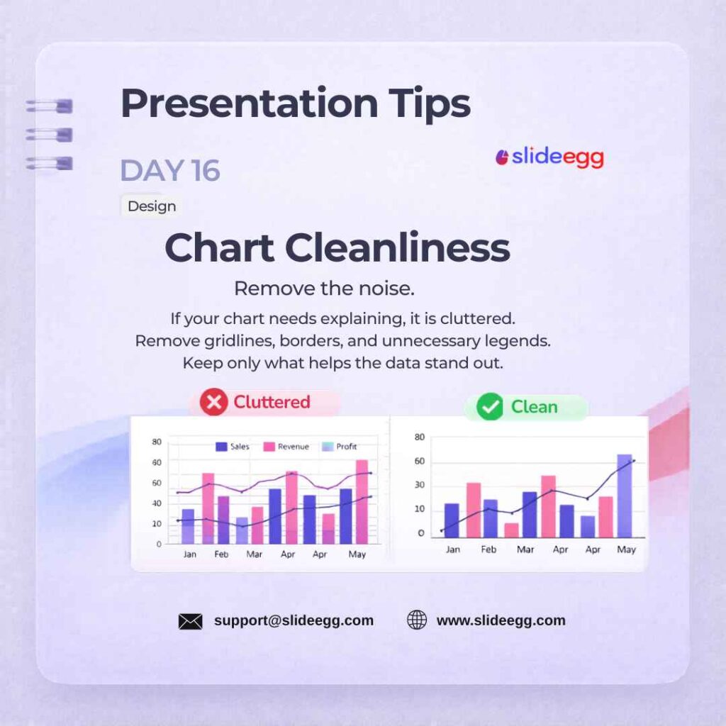
Source: Remove Chart Clutter for Clarity
Strip unnecessary gridlines, axis borders, and chart legends from every graph. Clean charts let the data tell the story without visual noise competing for attention. A chart with three elements communicates faster than one with eight. Browse chart PowerPoint templates for editable examples of clean data layouts.
Quick Win: Remove one chart element at a time and check if the message is still clear. If the chart is easier to understand without it, keep it removed.
Day 17 – Highlight One Stat Design
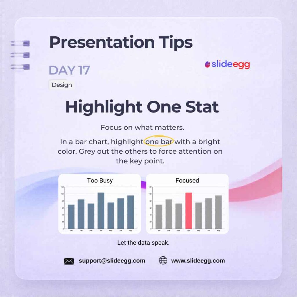
Source: Highlight One Important Data Point
Make a single data point visually dominant using bold color contrast or larger font size. One highlighted figure guides the audience’s eye directly to your key insight. This works best on bar charts, line graphs, and dashboard PowerPoint templates — leave everything else in a neutral grey.
Quick Win: Pick one number you want the audience to remember, then make only that number bigger, bolder, or brighter than the rest.
Day 18 – Clear CTA Strategy
Source: End Slides with a Clear CTA
Every presentation must end with a clear call to action. Tell your audience exactly what to do next: “Sign up here,” “Schedule a call,” or “Scan to visit the link.” Ambiguous endings cause missed opportunities — a specific CTA increases follow-through from your audience.
Quick Win: Add a QR code to your CTA slide for in-person events — it bridges the slide to action immediately.
Day 19 – Contact Slides Design
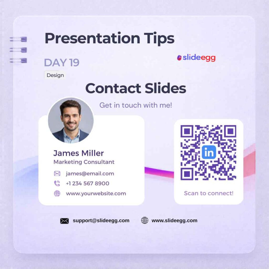
Source: Add a Contact Slide for Follow-Up
Include a dedicated closing slide with your name, email, LinkedIn, and an optional QR code. This makes it easy for your audience to follow up long after the presentation ends. Adding a professional photo makes the slide personal and creates a stronger impression.
Quick Win: Add your email, LinkedIn, and one QR code. Do not overload the contact slide with every social profile you own.
Day 20 – Pie Chart Limit Myth Busted
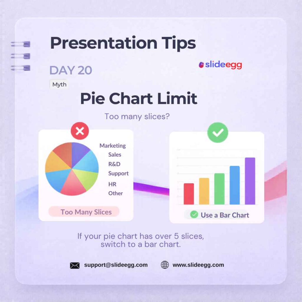
Source: Keep Pie Charts Under Five Slices
Never use a pie chart with more than 5 slices— it becomes visually unreadable. Replace overcrowded pies with horizontal bar charts, which are easier to compare and label. Fewer segments equal faster comprehension and clearer insights for your audience.
Quick Win: Group anything below 5% into an “Other” slice to keep pie charts clean.
Day 21 – Morph Transition Tool
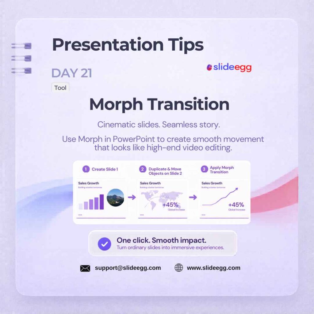
Source: Use Morph Transition for Smooth Movement
PowerPoint’s Morph transition creates smooth, cinematic movement between slides by animating shared objects automatically. Use it to zoom into a diagram, reveal a timeline step, or pan across an infographic. One well-placed Morph per section adds polish without looking gimmicky.
Quick Win: Duplicate a slide, move or resize an object, then apply Morph — PowerPoint handles the animation automatically.
Day 22 – Icon Uniformity Design
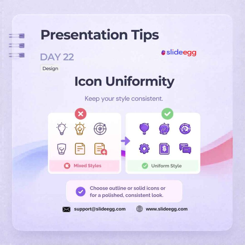
Source: Keep One Icon Style Across Slides
Use one consistent icon style throughout your entire deck. Mixing filled, outlined, and flat icons looks disjointed and amateur — even if the icons are individually attractive. Download a complete icon family from Flaticon and stick to it.
Day 23 – Merge Shapes Quick Fix
Source: Use Merge Shapes to Create Custom Visuals
Use PowerPoint’s Merge Shapes feature to create custom visuals without external design software. Select two or more shapes, then go to Shape Format → Merge Shapes and choose Union, Combine, Fragment, Intersect, or Subtract. This helps you build custom icons, image masks, and modern slide graphics directly inside PowerPoint.
Quick Win: Use Subtract to cut text or shapes out of a background image for a bold title-slide effect.
Day 24 – Presenter View Tool
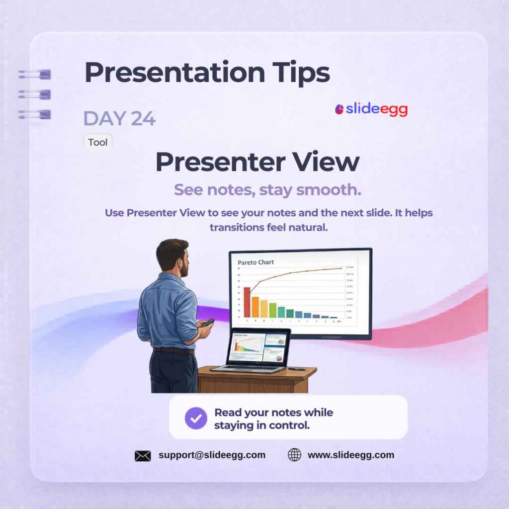
Source: Use Presenter View for Better Delivery
Presenter View shows your speaker notes and the next upcoming slide on your screen — while the audience only sees the current slide. To get the most out of your hardware configuration, make sure you understand how to use presentation modes in PowerPoint effectively
Quick Win: Before presenting, add short talking points in the Notes section instead of full paragraphs. Use Presenter View to glance at cues, not read word-for-word.
Day 25 – Aspect Ratio Check Quick Fix
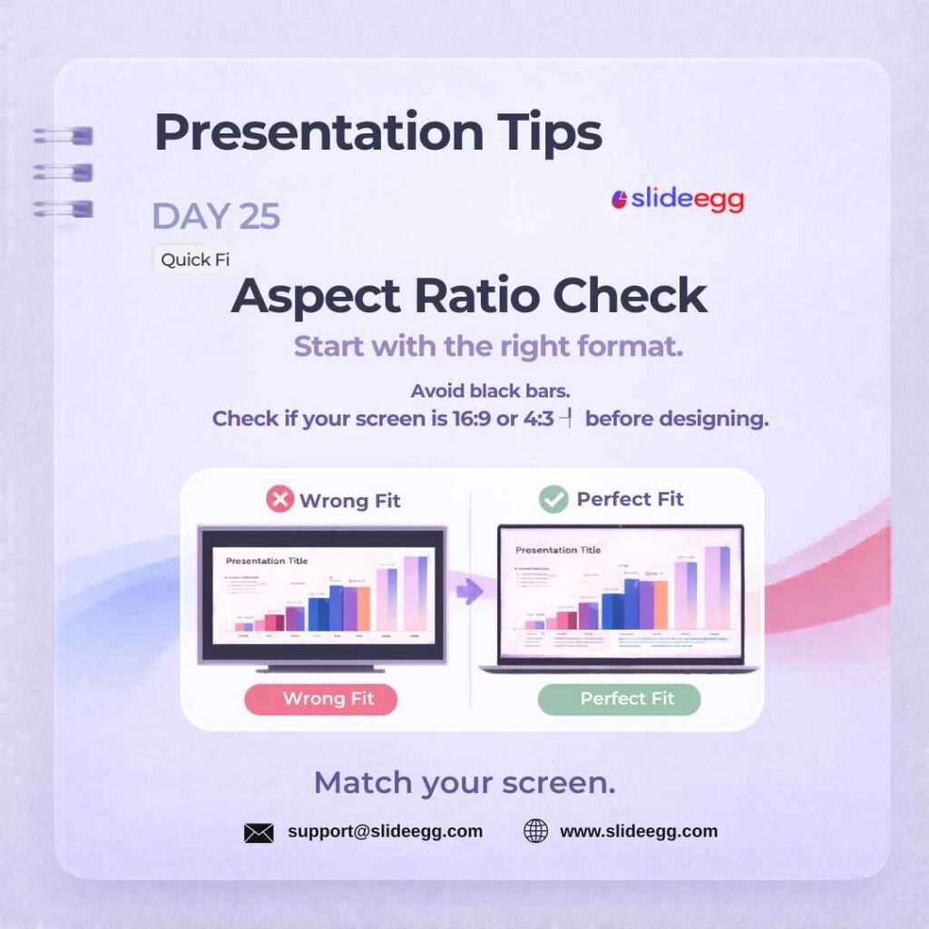
Source: Check Slide Size Before Designing
Set your slide dimensions before you start building — not after. Use 16:9 for widescreen monitors and projectors, or 4:3 for older displays. Changing the ratio after building distorts images and breaks carefully placed layouts. Check your venue’s screen format before starting any new deck.
Quick Win: Before starting the deck, go to Design → Slide Size and choose the correct format. Use 16:9 widescreen for most modern screens and projectors.
Day 26 – Device Mockups Design
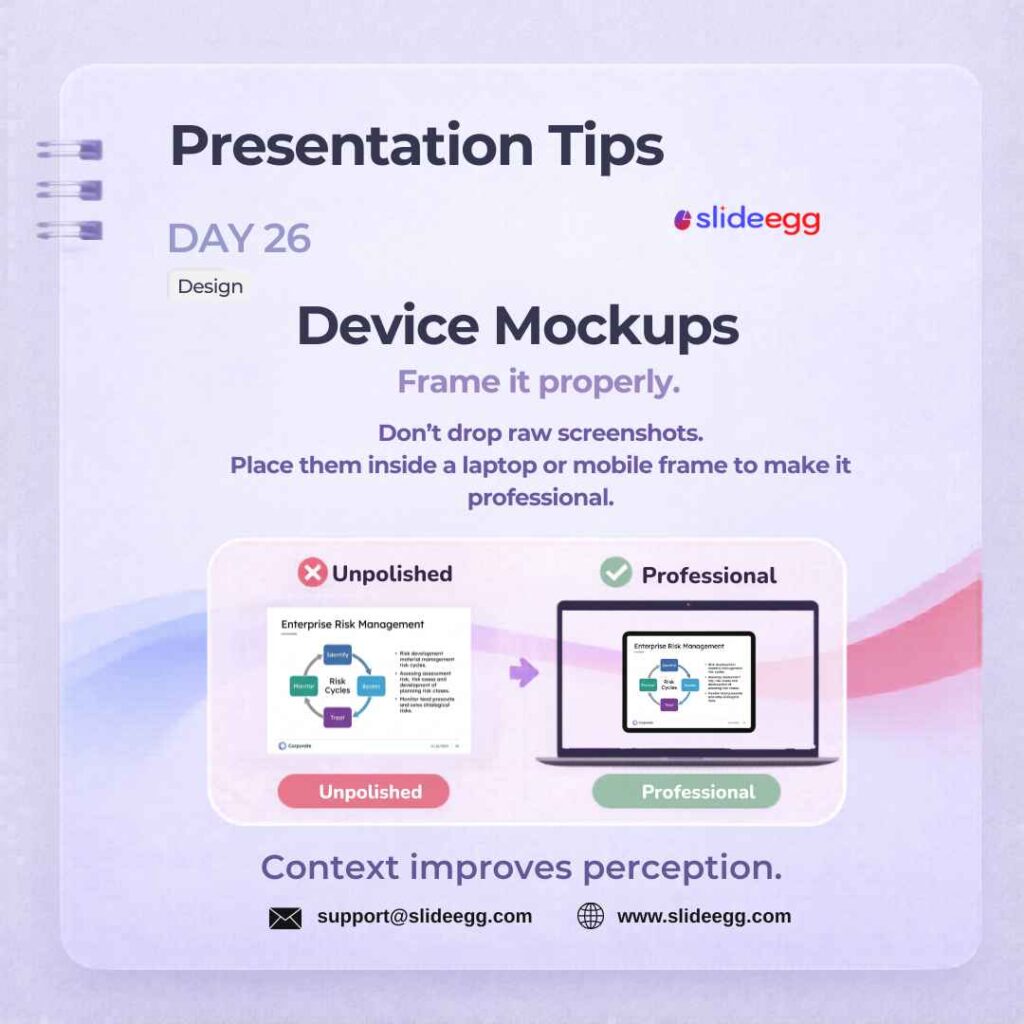
Source: Show Screens Inside Device Mock-ups
Frame app screenshots inside laptop, tablet, or phone shapes to give them real-world context. Device mock-ups transform a flat screenshot into a compelling, product-ready visual story. They are especially effective for software demos, app launches, and marketing presentations.
Quick Win: Use laptop frames for dashboards, websites, and software screens. Use mobile frames for apps, social media previews, and responsive design examples. Keep the screenshot sharp and properly cropped inside the device.
Day 27 – Laser Pointer Quick Fix
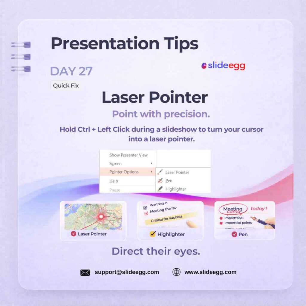
Source: Use CTRL+Left Click as a Laser Pointer
Hold Ctrl + Left-Click during a PowerPoint slideshow to activate the built-in laser pointer. Use it to highlight charts, key text, or diagram callouts without leaving full-screen mode. No physical pointer needed — it is built into every version of PowerPoint.
Quick Win: During slideshow mode, hold Ctrl + Left Click to activate the laser pointer. Use it only for key points—too much pointing becomes distracting.
Day 28 – Compress Images Quick Fix
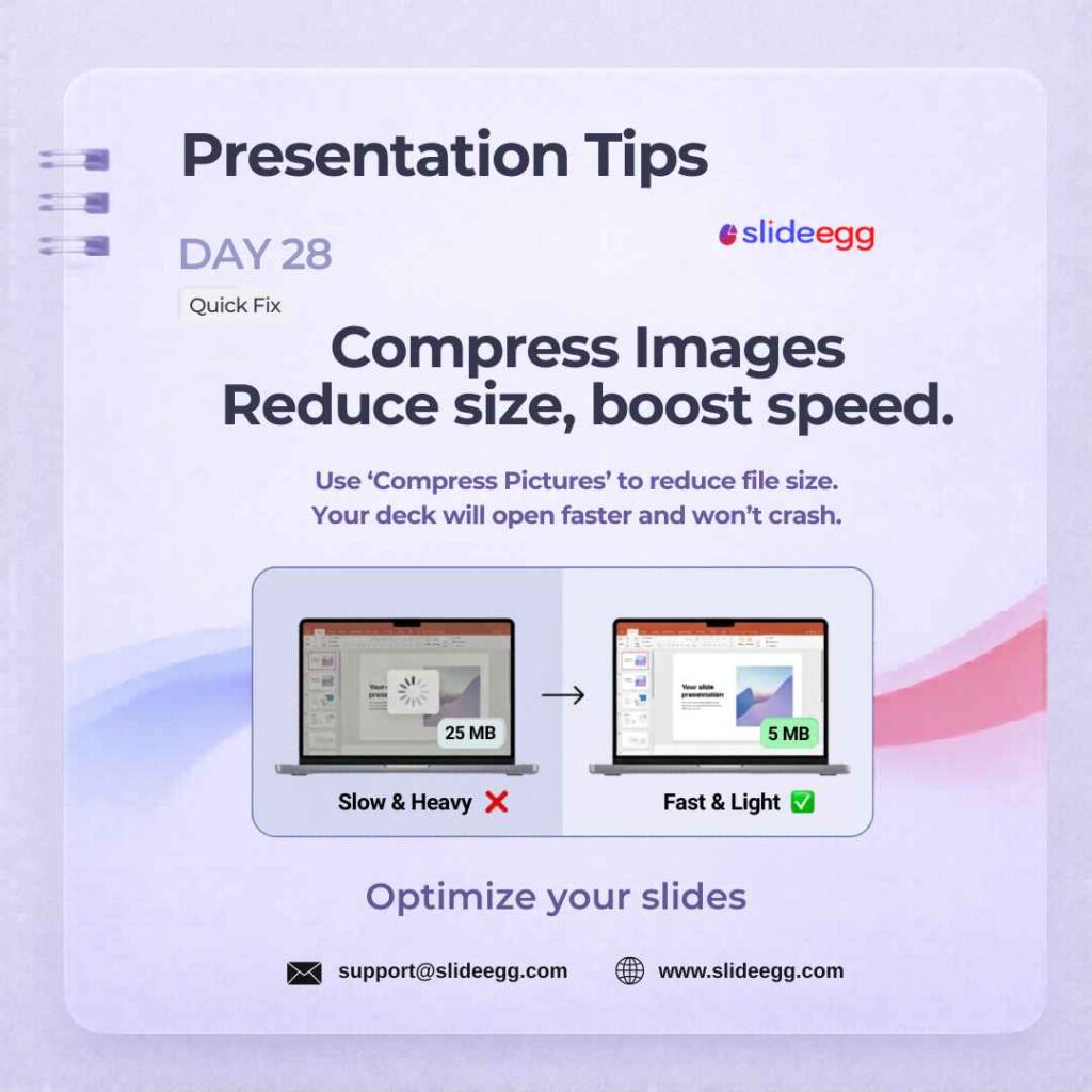
Source: Compress Images to Reduce File Size
Use PowerPoint’s built-in Picture Format → Compress Pictures to reduce file size before sharing. Large, uncompressed images cause slow loading and crashes — especially on older hardware. Run compression on all images in one step by leaving “Apply to all pictures” checked.
Quick Win: In PowerPoint, select an image and go to Picture Format → Compress Pictures. Choose Web or Email quality when sharing online, and keep Print quality only when the deck needs high-resolution output.
Day 29 – Cloud Collaboration Strategy
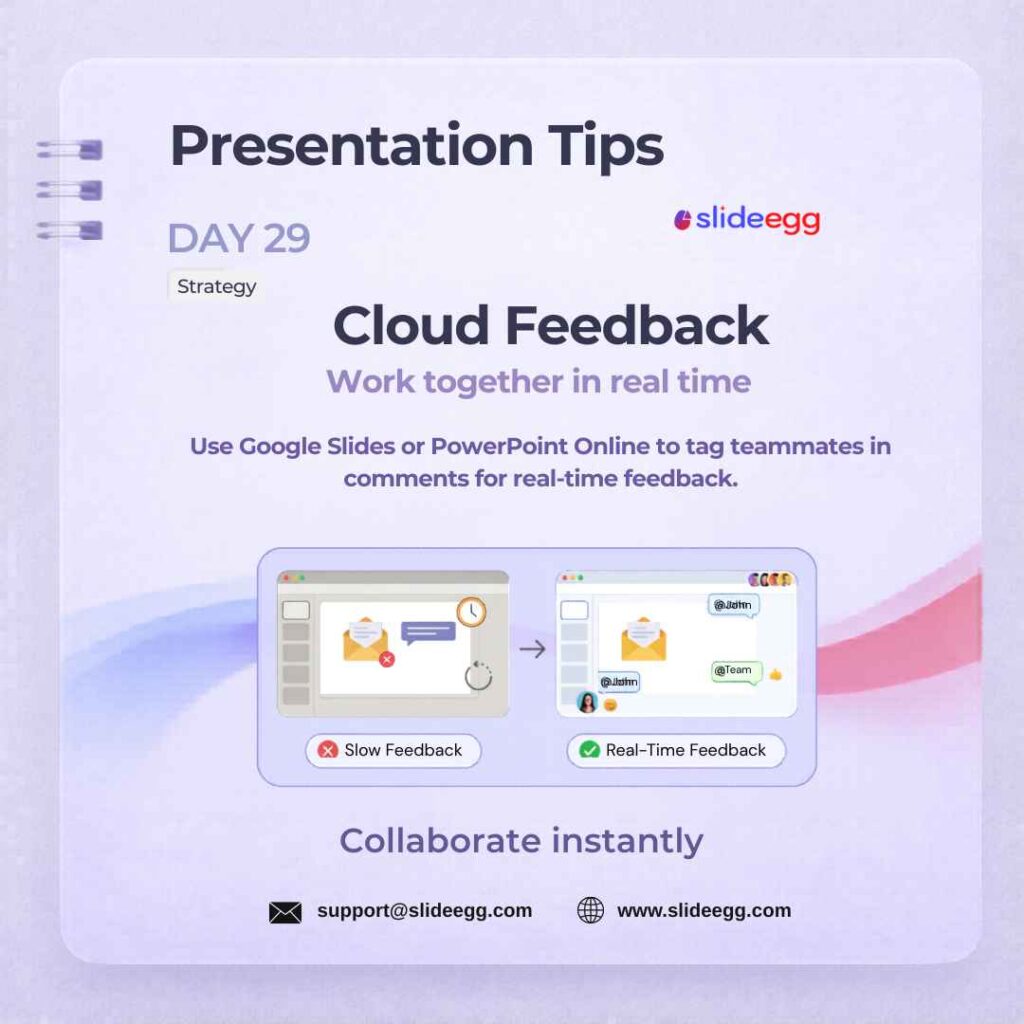
Source: Use Cloud Comments for Faster Feedback
Cloud feedback makes presentation review faster by letting teammates comment directly on the slide. Instead of sending files back and forth, everyone can suggest edits, tag people, and resolve feedback in one shared deck.
Quick Win: Upload your deck to Google Slides or PowerPoint Online, then use comments and @mentions to assign feedback clearly. This keeps revisions organized and avoids confusing email threads.
Day 30 – Undo Like a Pro Quick Fix
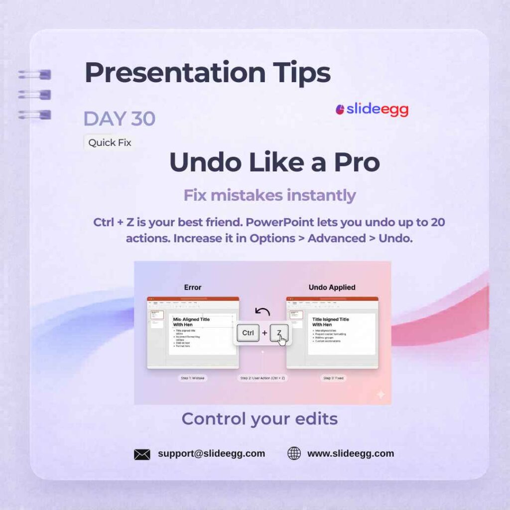
Source: Press Ctrl+Z to Undo Mistakes
Press Ctrl+Z to undo multiple steps instantly. PowerPoint stores 20+ undo actions by default — far more than most users realise. This safety net is critical during live editing sessions, last-minute changes, and collaborative workshops where quick error recovery matters.
Quick Win: Use Ctrl + Z for quick fixes, and increase your undo limit in File → Options → Advanced → Editing Options. This gives you more room to experiment without fear of losing your work.
Day 31 – Canva for Quick Drafts Tool
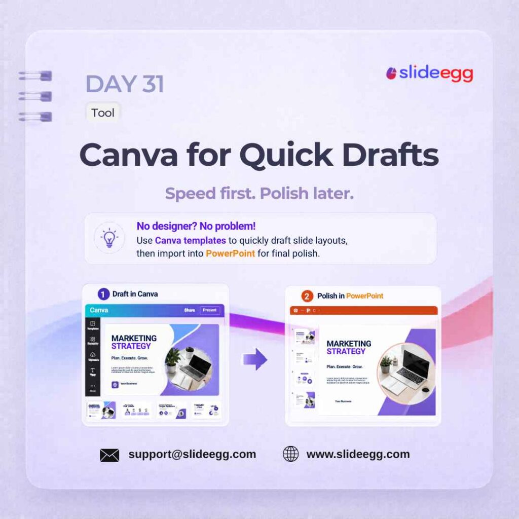
Source: Use Canva to Draft Slides Faster
Canva helps you create quick slide drafts when you need speed before perfection. Use Canva slides to build the basic layout, test the visual direction, and then move the deck into PowerPoint for final cleanup and polish.
Quick Win: Use Canva for rough structure only—headings, image placement, and layout flow. Do final editing in PowerPoint so fonts, spacing, animations, and export quality stay presentation-ready.
Day 32 – Rule of Thirds Design
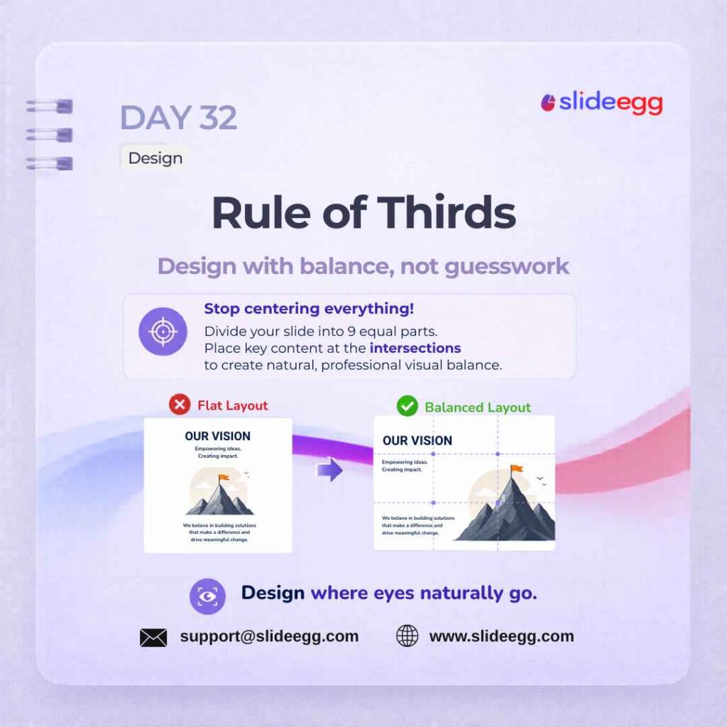
Source: Use Rule of Thirds for Better Layouts
The Rule of Thirds helps you place content where the eye naturally looks first. Instead of centering everything, divide the slide into a 3×3 grid and position key text, images, or icons near the intersection points for better balance.
Quick Win: Turn on guides in PowerPoint and imagine your slide split into 9 equal sections. Place your main visual on one side and your headline near an intersection point to create a more professional layout.
Day 33 – Start With Why Strategy
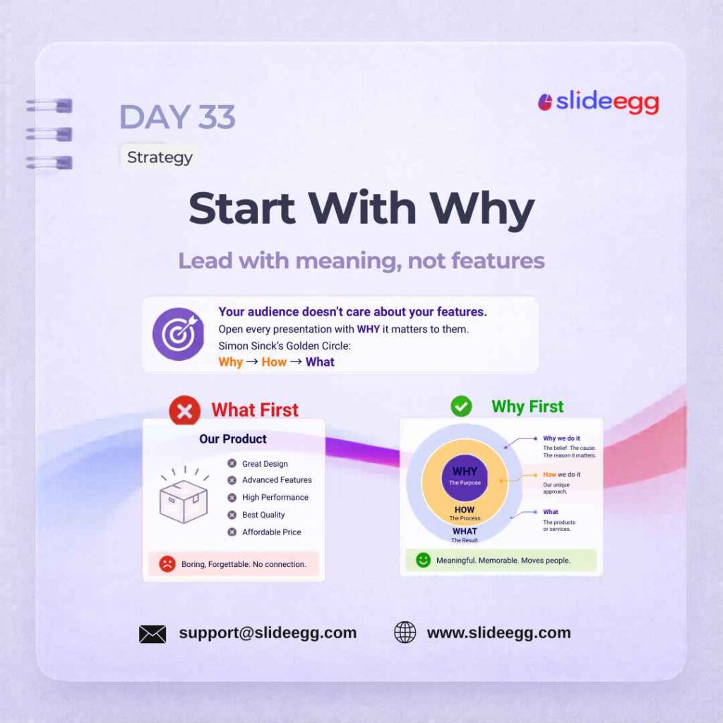
Source: Start Your Presentation with Why
Open your presentation by explaining why your topic matters to the audience — not just what it is. This framing creates immediate relevance and hooks attention from slide one. Apply Simon Sinek’s “Start With Why” principle to your opening slide to turn a cold audience into an engaged one.
Quick Win: Write your first slide using this order: Why it matters → How it works → What you offer. This makes your message feel more meaningful, clear, and audience-focused.
Day 34 – Slide Numbers Quick Fix
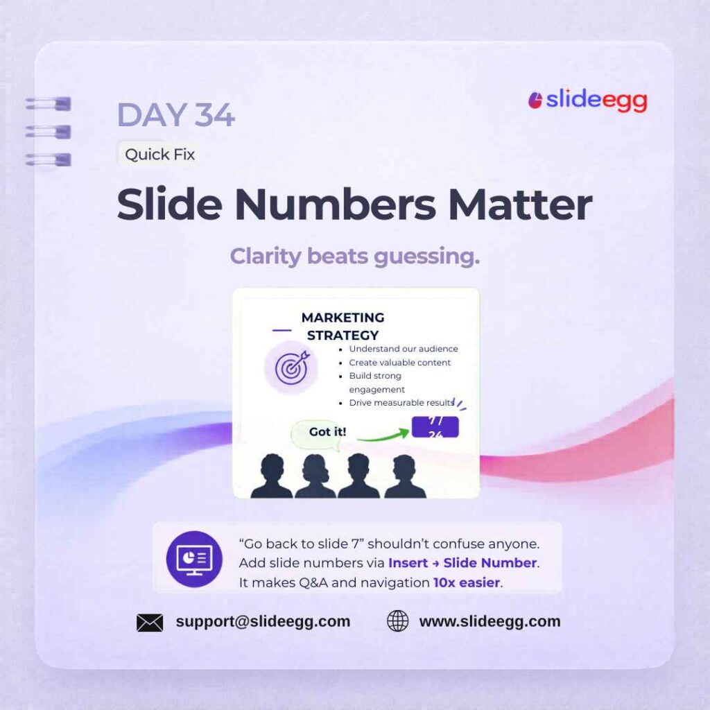
Source: Add Slide Numbers for Easy Navigation
Add slide numbers via Insert → Header & Footer → Slide Number. They help audiences follow along during long decks and make Q&A sessions far easier to navigate — “go back to slide 7” is a phrase every presenter should be able to respond to instantly. Numbers update automatically when you reorder slides.
Quick Win: Add slide numbers using Insert → Slide Number before finalizing your deck. Keep them small and consistent in the same corner across all slides.
Day 35 – Unsplash PluginTool
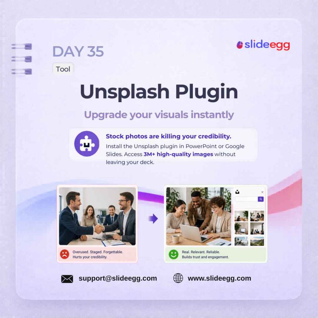
Source: Use Unsplash for Better Slide Photos
Install the Unsplash add-in for PowerPoint or Google Slides. You get direct access to millions of free, high-resolution photos without leaving your editor — search by keyword, click once to insert. No downloads, no browser switching, and no attribution required for most images.
Quick Win: Search by feeling, not just object. Use terms like “team collaboration,” “confident presenter,” or “modern workspace” instead of generic words like “business” to find more realistic images.
Day 36 – Consistent Padding Design
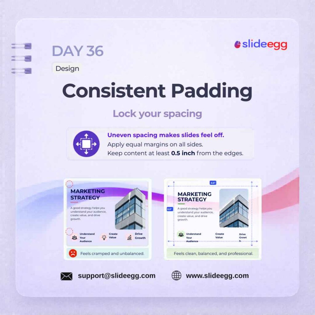
Source: Keep Padding Consistent on Every Slide
Consistent padding keeps your slides clean, balanced, and easier to read. When text, images, and icons have equal spacing from the edges, the slide feels more professional and less crowded.
Quick Win: Keep all important content at least 0.5 inch away from the slide edges. Use guides or margins to lock the spacing so every slide follows the same layout rule.
Day 37 – More Slides ≠ More Value Myth Busted
Source: Focus on Value, Not Slide Count
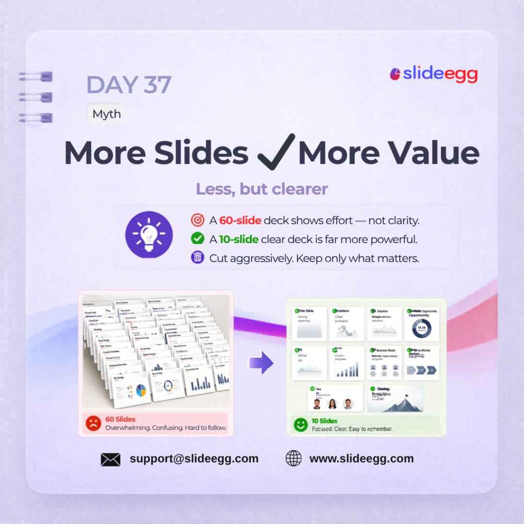
A longer deck does not automatically make your presentation more useful. A 60-slide deck may look like an effort, but it often creates confusion when the message is not clear. A focused 10-slide deck can be far more powerful when every slide has a clear purpose.
Quick Win: Review every slide and ask: “Does this slide make the message clearer?” If not, delete it or move it to backup slides.
Day 38 – Tab Key for Alignment Quick Fix
Source: Use Tab to Select Slide Objects
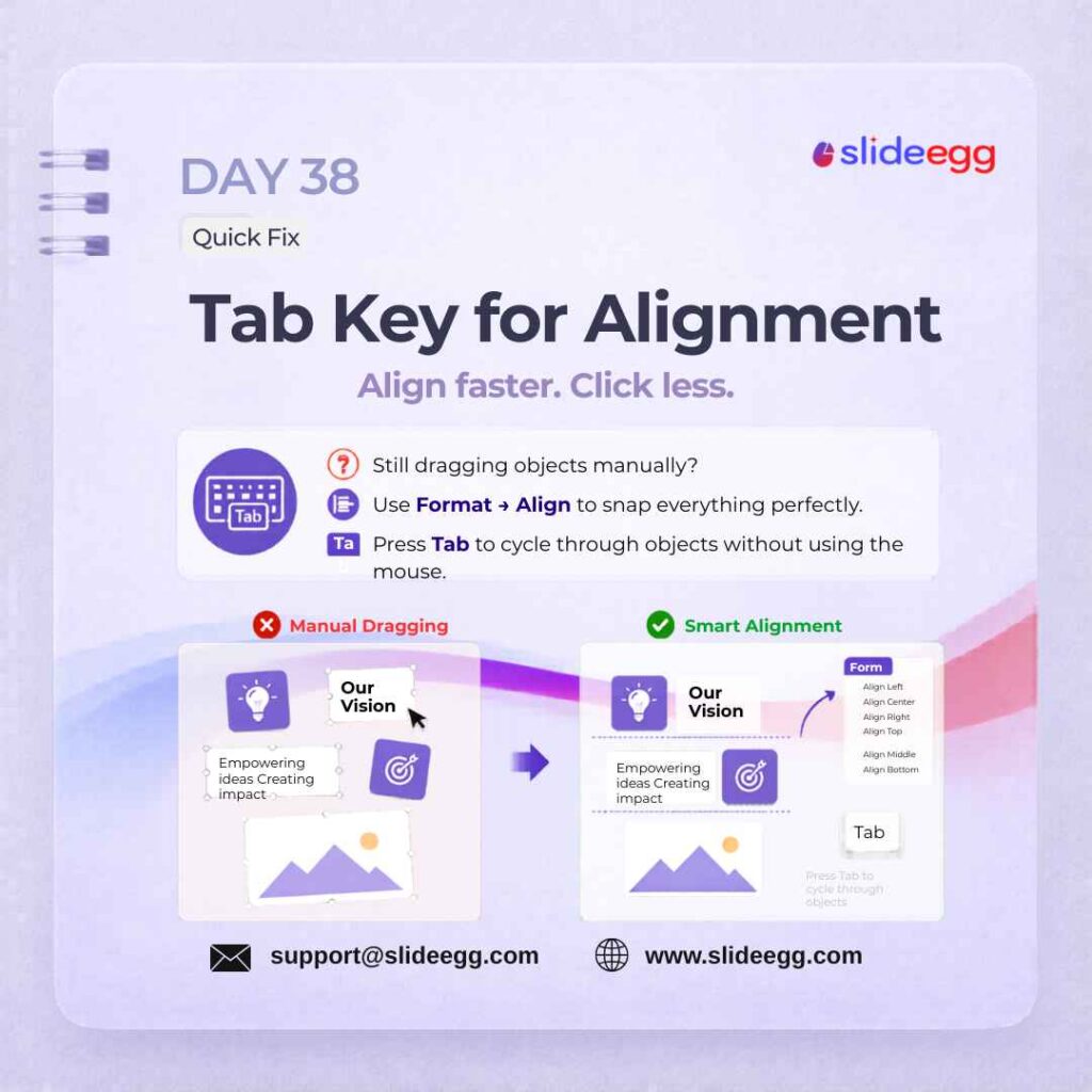
Press Tab to cycle through all objects on a slide and select them one by one. This is faster than hunting with the mouse, especially on dense slides with overlapping elements. Follow up with the Aligntools to snap selected objects into perfect position.
Quick Win: Press Tab to cycle through objects on your slide, then use Format → Align to snap them into position. This is faster than dragging each element by hand.
Day 39 – Live Polls with Slidea Tool
Source: Add Live Polls to Engage Audiences
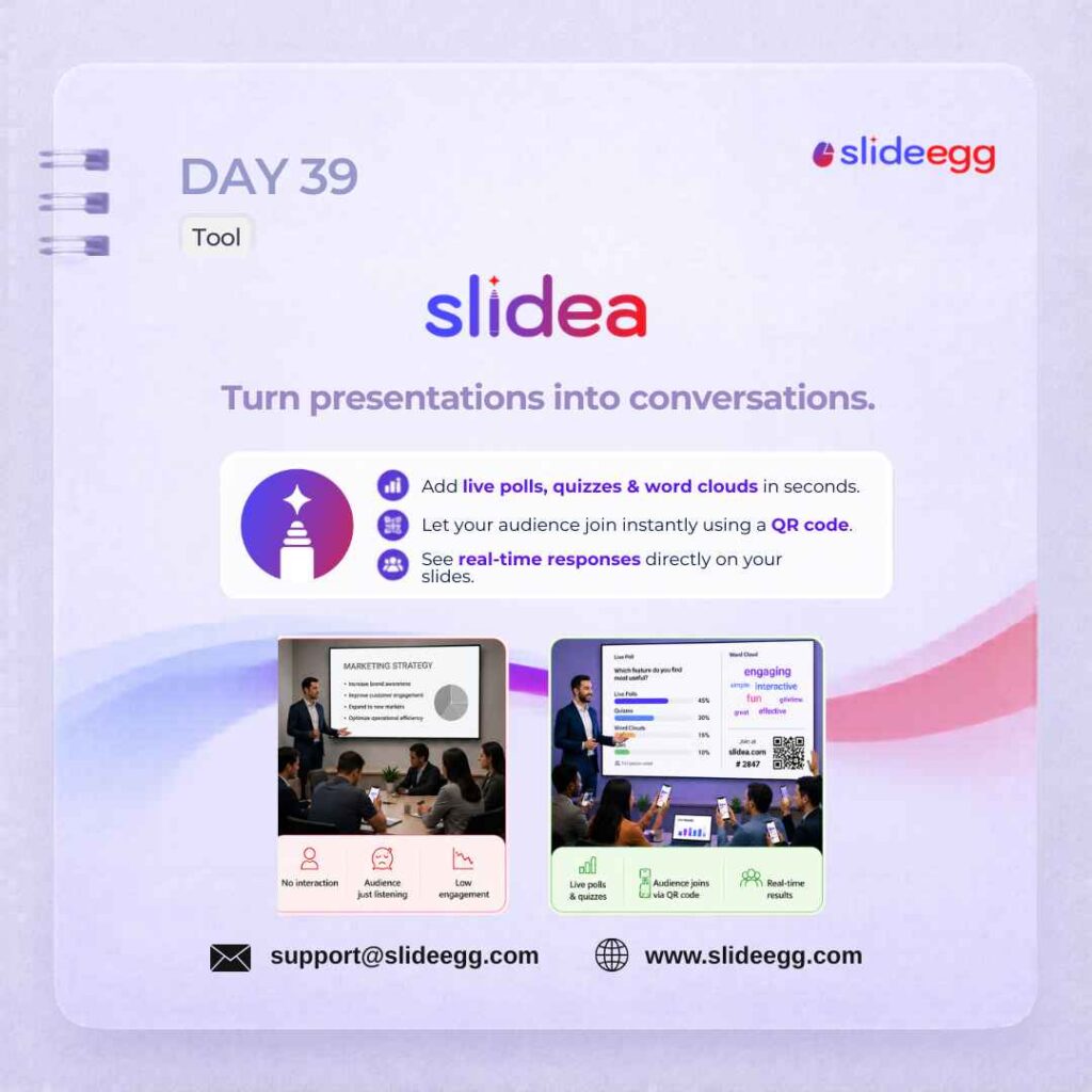
Slidea turns a normal presentation into an interactive session with live polls, quizzes, word clouds, and QR-based audience participation. Instead of only speaking to the audience, you can collect responses and keep them engaged in real time.
Quick Win: Add one live poll after an important section to check understanding or collect opinions. Keep the question simple so the audience can respond quickly without breaking the presentation flow.
Day 40 – The Power of Pause Strategy
Source: Pause After Key Points for Impact
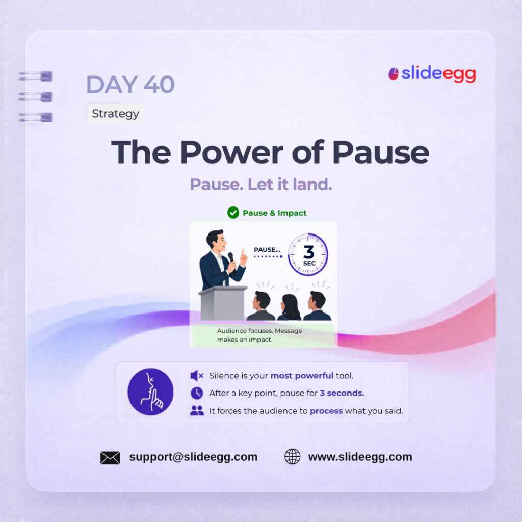
The power of pause makes your message stronger by giving the audience time to think. A short silence after an important point creates focus, confidence, and impact instead of rushing through the slide.
Quick Win: After sharing a key idea, pause for 3 seconds before moving on. Use the silence to let the point land and help your audience process what you just said.
Day 41 – Dark Background = Drama Design
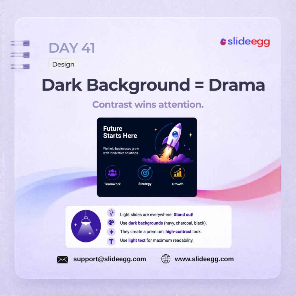
Source: Use Dark Backgrounds for Strong Contrast
Dark slide backgrounds make colors pop and create a premium, high-contrast look that light themes cannot match. Light text on a dark background grabs attention immediately and works especially well for product launches, marketing presentations, and conference keynotes. Use a dark theme for sections where you want maximum visual impact.
Quick Win: Use dark navy, charcoal, or black as the background, then pair it with light text and one bright accent color. Don’t use dark backgrounds with tiny text—contrast only works when readability stays strong.
Day 42 – Group Everything Quick Fix
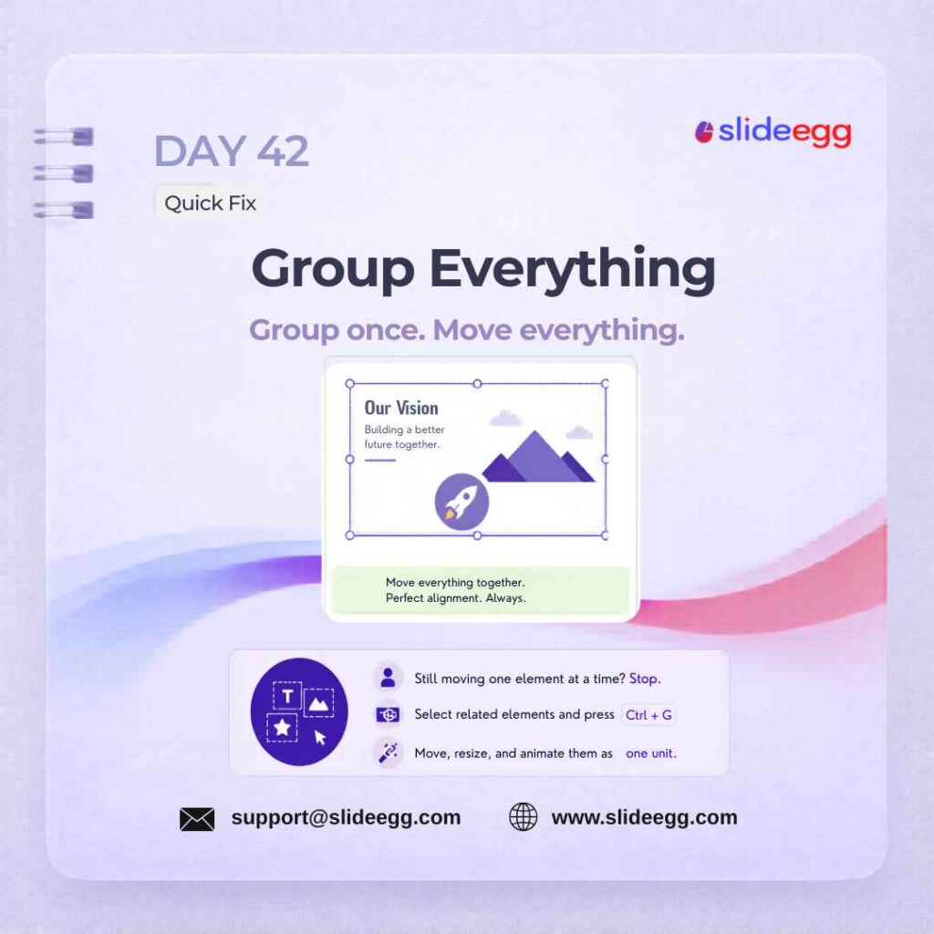
Source: Group Related Elements Before Moving Them
Grouping elements keeps your slide layout locked and easy to manage. Instead of moving text, icons, and images one by one, group related items so they stay aligned and move together as a single unit.
Quick Win: Select all related objects, then press Ctrl + G to group them. Move, resize, or animate the grouped elements together so your alignment does not break.
Day 43 – Instant Feedback with Slidea Tool
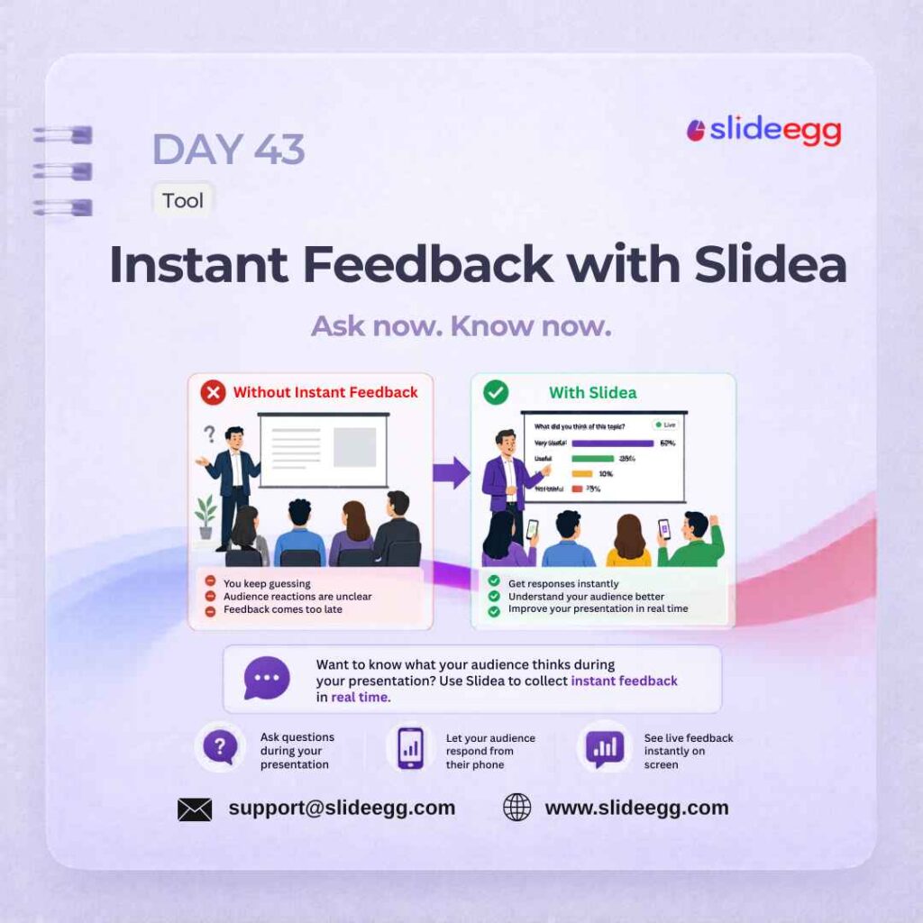
Source: Collect Instant Feedback During Presentations
Use Slidea to collect real-time audience responses directly inside your presentation. Run a quick poll, open-ended question, or live quiz and display results on screen as they come in. This transforms any static deck into a dynamic, participatory experience. Interactive moments help audiences stay involved and make the session easier to remember.
Quick Win: Add one quick feedback question after an important slide. Let the audience respond from their phones, then use the live results to clarify doubts before moving to the next section.
Day 44 – One Idea Per Slide Design
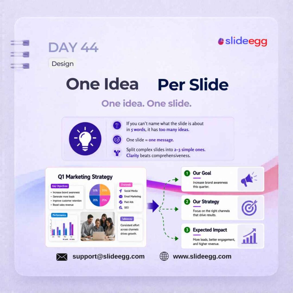
Source: Keep One Main Idea Per Slide
One idea per slide keeps your message clear and easy to follow. When a slide has too many points, the audience gets distracted, so split complex content into smaller, focused slides.
Quick Win: Check each slide with this test: Can you explain the slide in 5 words? If not, break it into 2–3 separate slides with one clear message on each.
Day 45 – Smart Guides Quick Fix
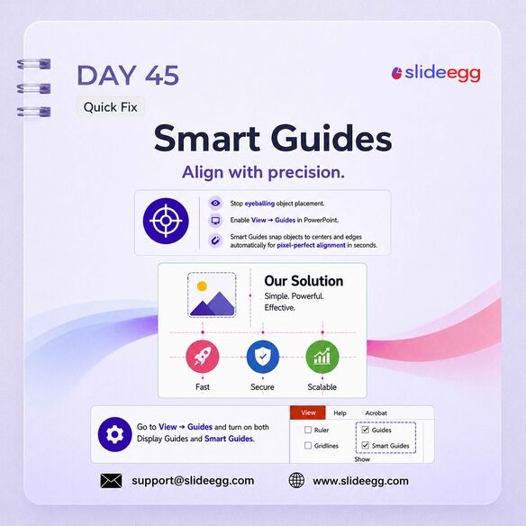
Source: Use Smart Guides for Better Alignment
Smart Guides help you align objects accurately without guessing. They show visual alignment lines while you move elements, making it easier to place text, icons, and images evenly across the slide.
Quick Win: Go to View → Guides and enable both Display Guides and Smart Guides. Use them while moving objects so your slide elements snap neatly to centers, edges, and consistent spacing.
Day 46 – Flaticon for IconsTool
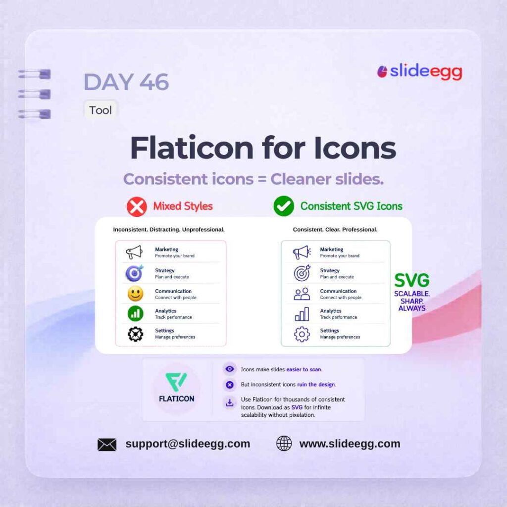
Source: Use Flaticon for Consistent Icons
Flaticon helps you find clean, consistent icons for your slides. Using the same SVG icon style across the deck makes your presentation look sharper, more organized, and easier to scan.
Quick Win: Download icons in SVG format and stick to one icon style, such as outline or filled. Do not mix different icon styles on the same slide—it makes the design look messy.
Day 47 – Z-Pattern Layout Design
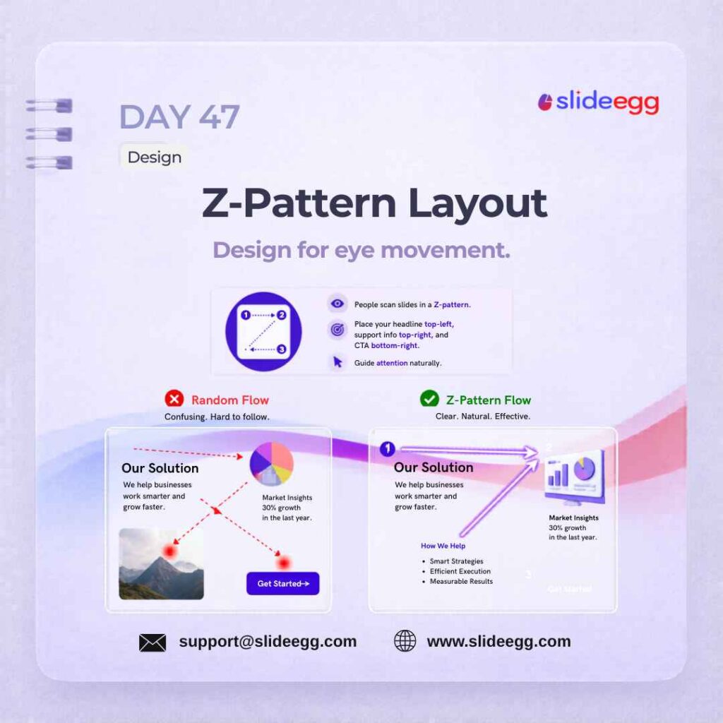
Source: Use Z-Pattern Layout to Guide Attention
The Z-pattern layout guides the audience’s eyes in a natural reading flow. By placing the headline at the top-left, supporting content across the top, key details in the middle, and CTA at the bottom-right, your slide becomes easier to follow.
Quick Win: Before finalizing a slide, trace an imaginary Z path across it. Put the most important message at the start of the path and the action point at the end.
Day 48 – Animations ≠ Professionalism Myth Busted
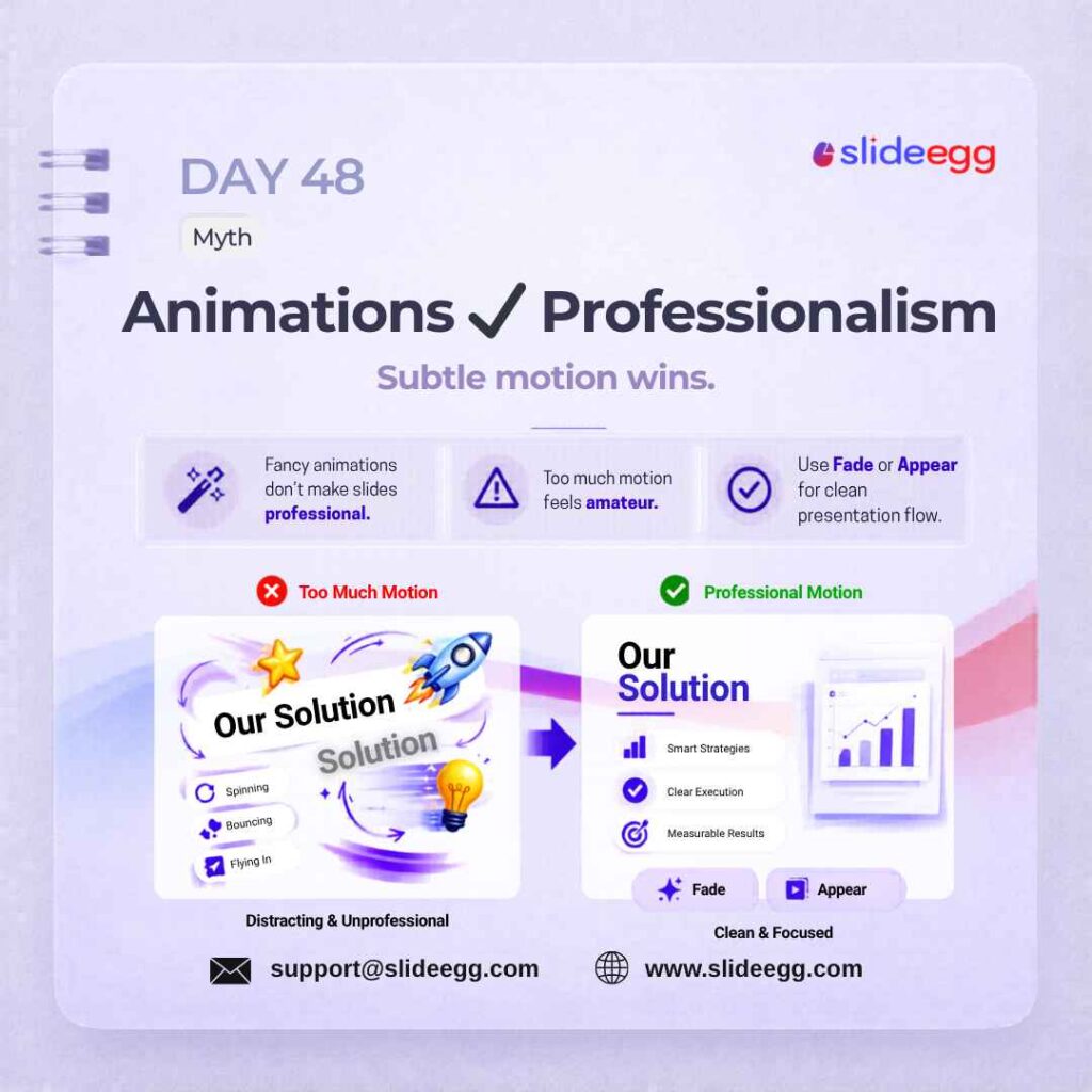
Source: Avoid Overusing Slide Animations
Animations can support a presentation, but too much motion makes slides look distracting and unprofessional. Clean effects like Fade or Appear keep the focus on your message instead of the movement.
Quick Win: Use animation only when it helps reveal information step by step. Avoid spinning, bouncing, and flying effects—stick to Fade for smooth, professional slide transitions.
Day 49 – Rehearse Timings Quick Fix
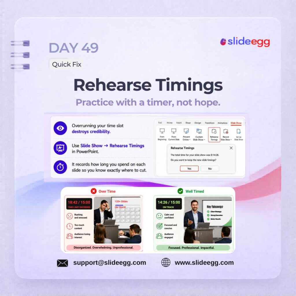
Source: Rehearse Timings Before Presenting
Rehearse Timings helps you control your presentation speed before the real session. It records how long you spend on each slide so you can cut, adjust, and stay within your time limit.
Quick Win: Go to Slide Show → Rehearse Timings and run through the full deck once. Check which slides take too long, then shorten or split them before presenting.
Day 50 – Notion for Outline Planning Tool
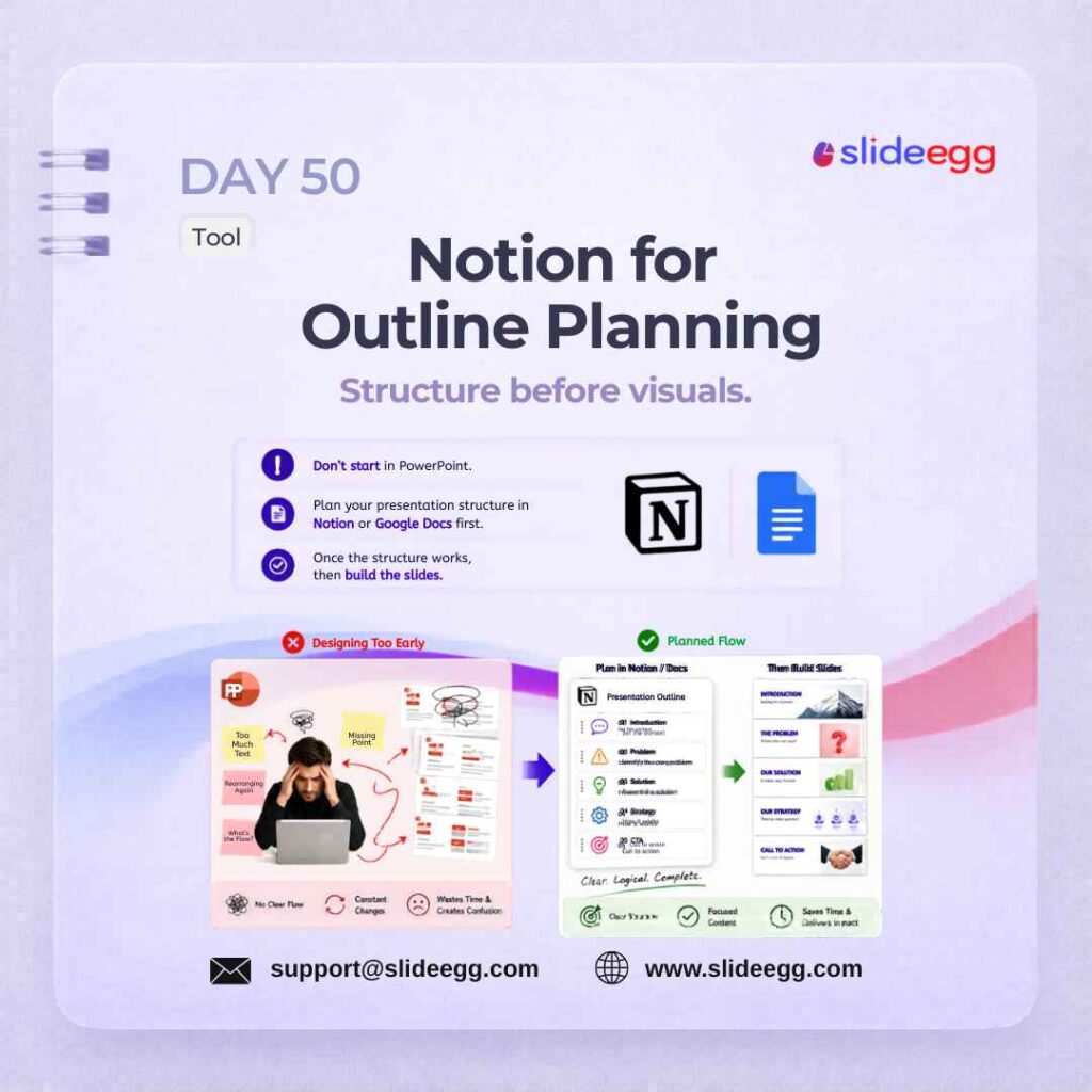
Source: Plan Slide Flow in Notion First
Notion helps you plan the full presentation structure before designing slides. By organizing the flow, key points, and slide order first, you avoid messy layouts and save time during slide creation.
Quick Win: Write your outline in Notion or Google Docs before opening PowerPoint. Finalize the story flow first, then turn each point into one clean slide.
Day 51 – Gradient Backgrounds Done Right Design
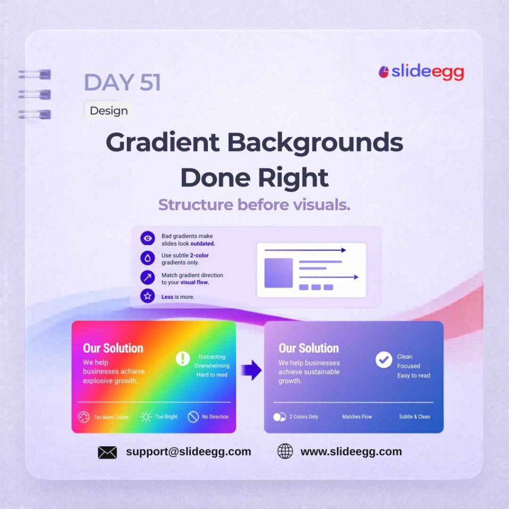
Source: Use Subtle Gradients for Modern Slides
Gradient backgrounds can make slides look modern and polished, but only when they are subtle. Use a simple two-color gradient that supports the content and keeps the text easy to read.
Quick Win: Avoid bright rainbow gradients. Pick 2 soft colors, match the gradient direction to your slide flow, and reduce brightness if the text is not readable.
Day 52 – Tell a Story Arc Strategy
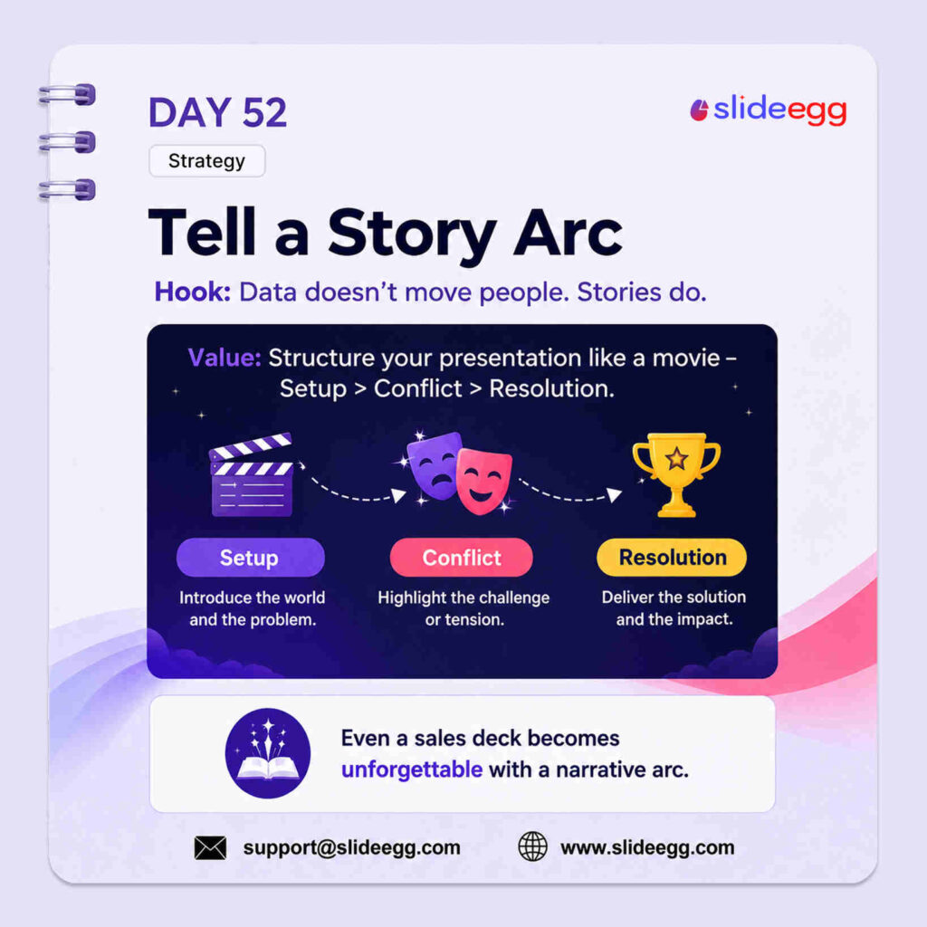
Source: Build Slides Around a Story Arc
A story arc makes your presentation easier to remember by giving it a clear flow: Setup → Conflict → Resolution. Instead of listing facts, you guide the audience through a problem, tension, and final solution.
Quick Win: Before creating slides, write your presentation in 3 parts: What is happening? What is the challenge? What is the solution? This gives your deck a natural narrative flow.
Day 53 – Spell Check Always Quick Fix
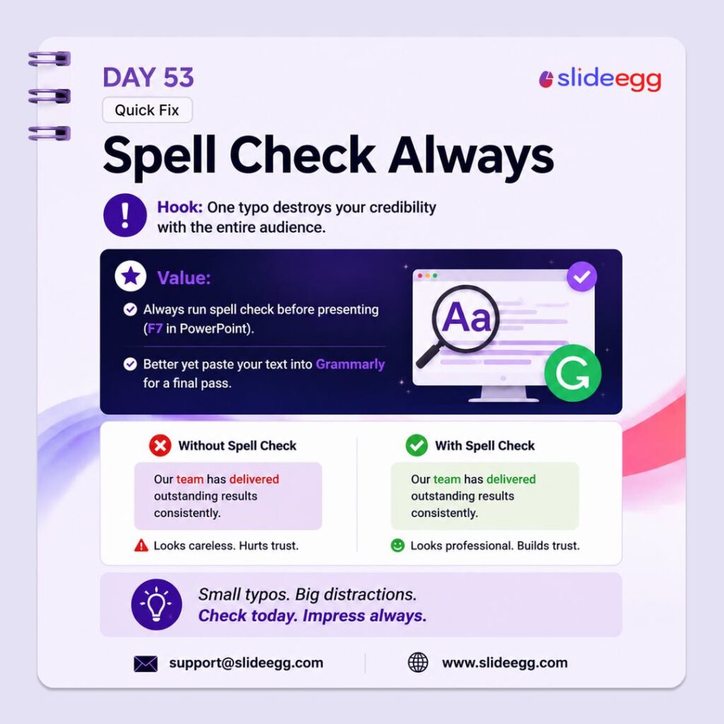
Source: Run Spell Check Before Sharing Slides
Spell check protects your credibility before the presentation starts. Even one small typo can make a slide look careless, so always review your text before presenting or sharing the deck.
Quick Win: Press F7 in PowerPoint to run spell check, then do one final manual scan in slideshow mode. For important decks, paste key text into Grammarly or another writing tool before final delivery.
Day 54 – Google Fonts Pairing Tool
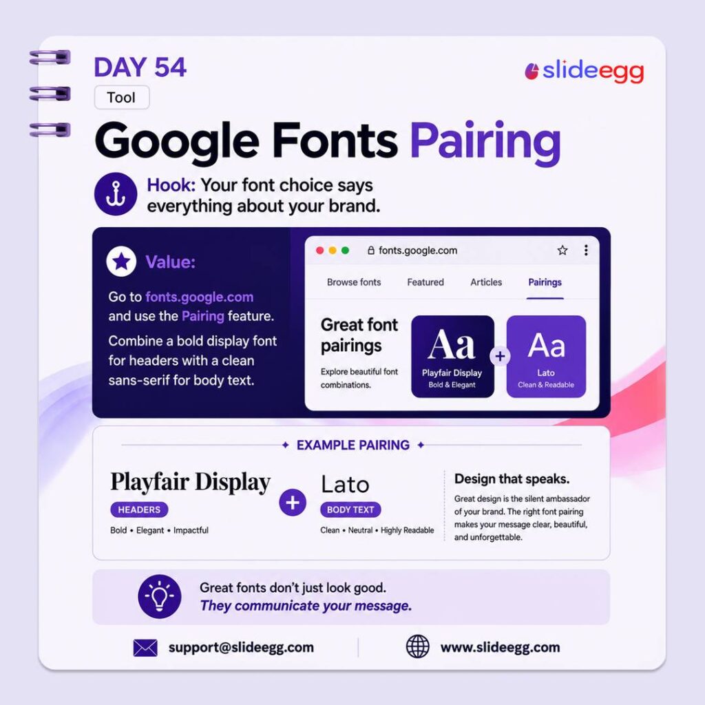
Source: Pair Fonts for Better Slide Design
Google Fonts Pairing helps you choose fonts that look good together and match your brand style. A strong pairing usually uses one bold font for headings and one clean, readable font for body text.
Quick Win: Use only 2 fonts in your deck: one for titles and one for body text. Try a pairing like Playfair Display + Lato for a clean, professional look.
Day 55 – Use a Grid System Design
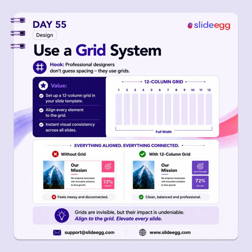
Source: Use a Grid System for Clean Layouts
A grid system keeps every slide aligned, balanced, and consistent. Instead of placing objects randomly, use columns and guides to make text, images, icons, and numbers feel connected.
Quick Win: Set up a simple 12-column grid before designing your deck. Align every major element to the grid so each slide looks cleaner, sharper, and more professional.
Day 56 – Reading Slides is Not Fine Myth
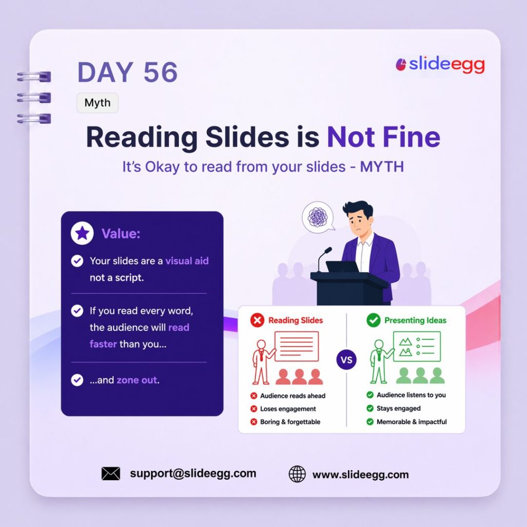
Source: Stop Reading Directly from Slides
Reading directly from slides weakens your delivery and makes the audience disengage. Slides should support your message visually, not act as your full script.
Quick Win: Keep only keywords or short phrases on the slide, then explain the idea in your own words. Use Presenter Notes for your script so the audience listens to you instead of reading ahead.
Day 57 – The 3-Act Structure Strategy
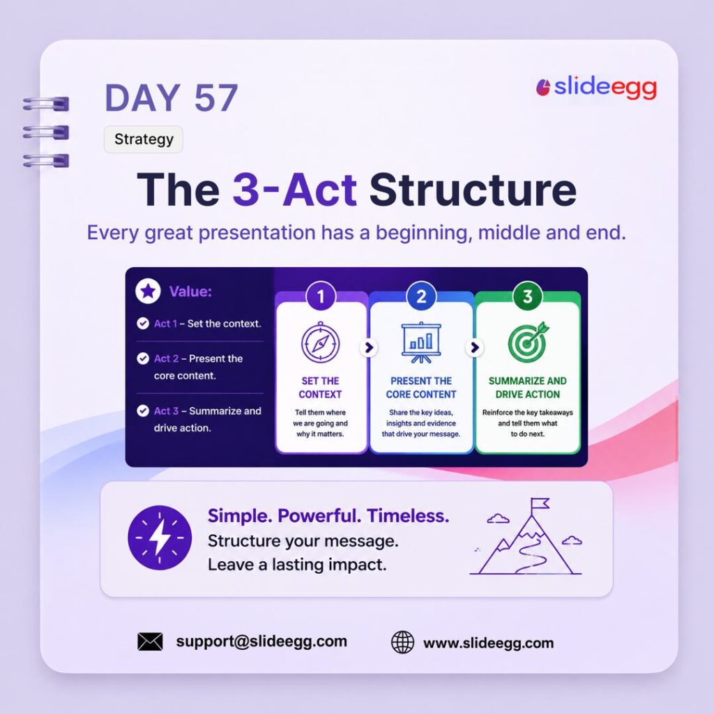
Source: Structure Your Deck in Three Acts
The 3-act structure gives your presentation a clear beginning, middle, and end. It helps you set the context, explain the core message, and finish with a strong action or takeaway.
Quick Win: Plan your deck in 3 parts: Act 1 – Set the context, Act 2 – Present the key ideas, and Act 3 – Summarize and drive action. This keeps your message simple, focused, and easy to follow.
Day 58 – Custom Slide Size Quick Fix
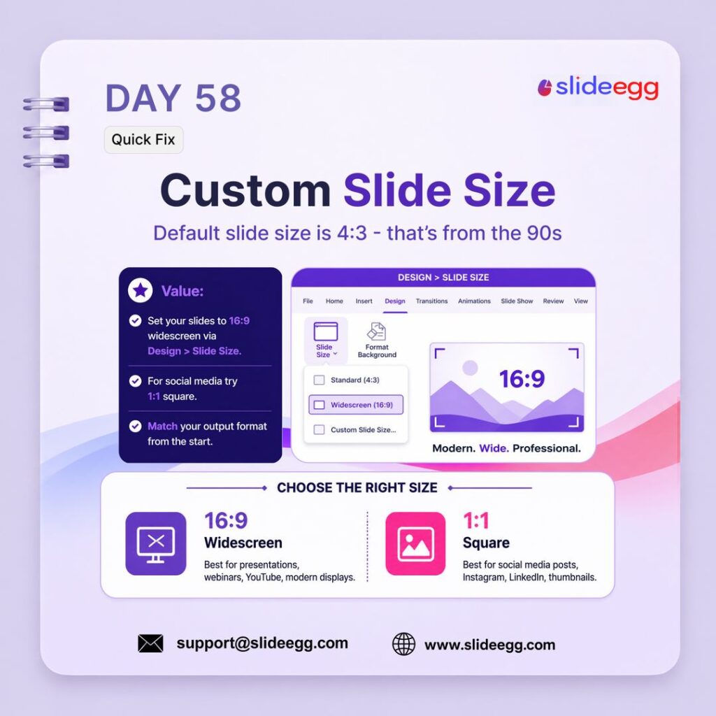
Source: Choose the Right Slide Size First
Custom slide size helps your deck fit the platform or screen where it will be shown. Choosing the right size from the start prevents stretched layouts, black bars, and awkward cropping.
Quick Win: Go to Design → Slide Size before designing. Use 16:9 widescreen for presentations, webinars, and YouTube, and use 1:1 square for social media posts or thumbnails.
Day 59 – Prezi for Dynamic Decks Tool
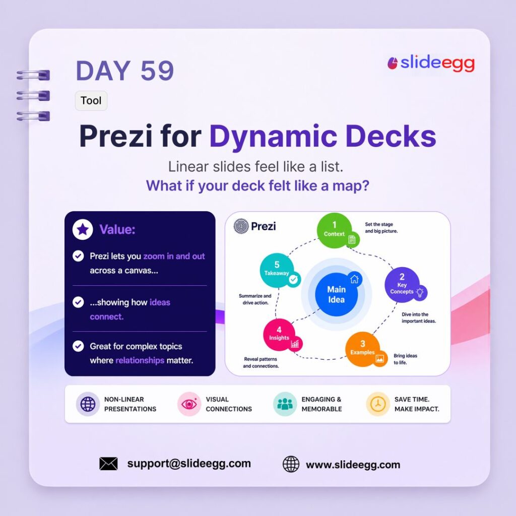
Source: Use Prezi for Non-Linear Presentations
Prezi helps you create non-linear presentations that feel more like a visual map than a slide-by-slide list. It is useful for complex topics where you need to show how ideas connect.
Quick Win: Use Prezi when your content has relationships, sections, or connected ideas. Start with one main idea in the center, then zoom into key points one by one to keep the audience engaged.
Day 60 – Breathing Room = Confidence Design
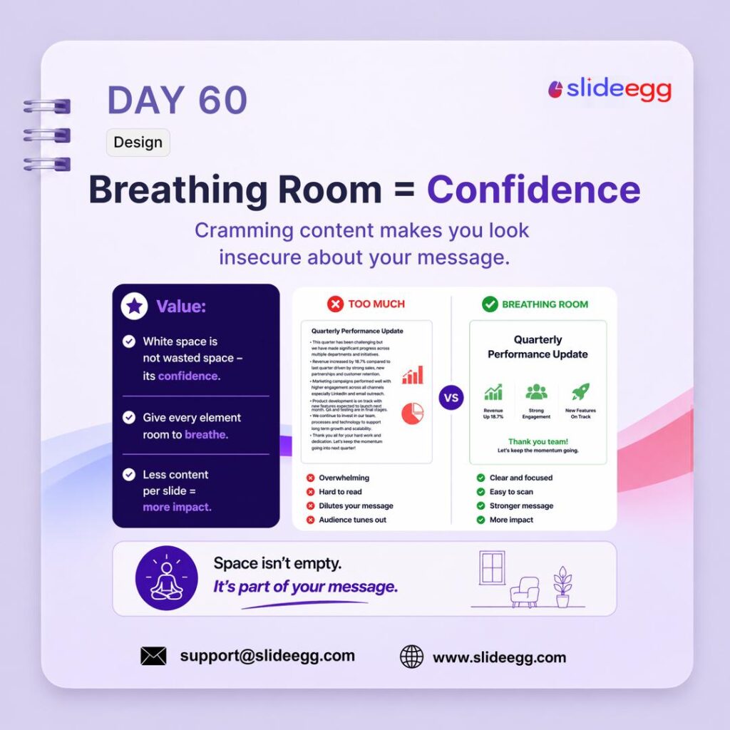
Source: Add White Space for Better Focus
Breathing room makes slides look clean, confident, and easy to understand. When you leave enough white space around text, icons, and images, the audience can focus on the message without feeling overwhelmed.
Quick Win: Remove one unnecessary element from each crowded slide. Keep only the strongest text, visual, or data point, then give it enough space to stand out clearly.
Day 61 – Know Your Audience Strategy
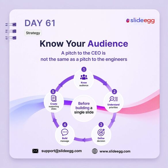
Source: Know Your Audience Before Designing
Knowing your audience helps you build a presentation that speaks to the right priorities. A deck for a CEO should focus on business impact, while a deck for engineers should focus on details, process, and execution.
Quick Win: Before creating slides, answer these 3 questions: Who is in the room? What do they care about? What decision do they need to make? Build your deck around those answers.
Day 62 – Hide Slides for Q&A Quick Fix
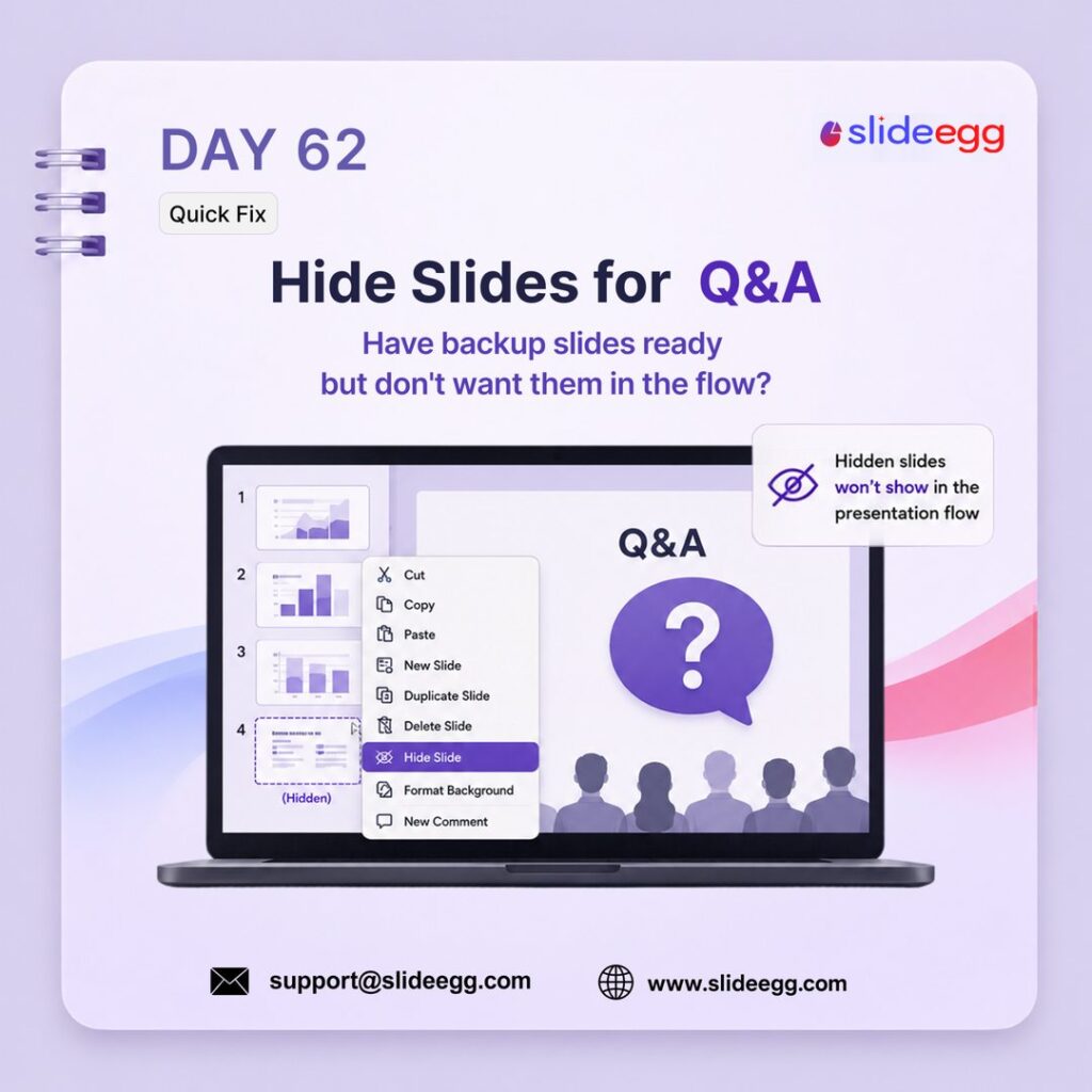
Source: Hide Backup Slides for Q&A
Hidden slides let you keep backup content ready without interrupting your main presentation flow. They are useful for extra data, detailed charts, case studies, or answers you may need during Q&A.
Quick Win: Right-click a backup slide and choose Hide Slide. It will not appear during the normal slideshow, but you can still open it quickly if someone asks a related question.
Day 63 – Coolors.co for Palettes Tool
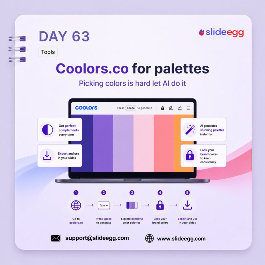
Source: Use Coolors to Build Color Palettes
Coolors.co helps you create clean color palettes quickly without guessing. It gives you matching color combinations that make your slides look more consistent, balanced, and professional.
Quick Win: Go to coolors.co, press Space to generate palettes, then lock your brand colors and let the tool suggest matching colors. Use the final palette consistently across your whole deck.
Day 64 – Typography Contrast Design
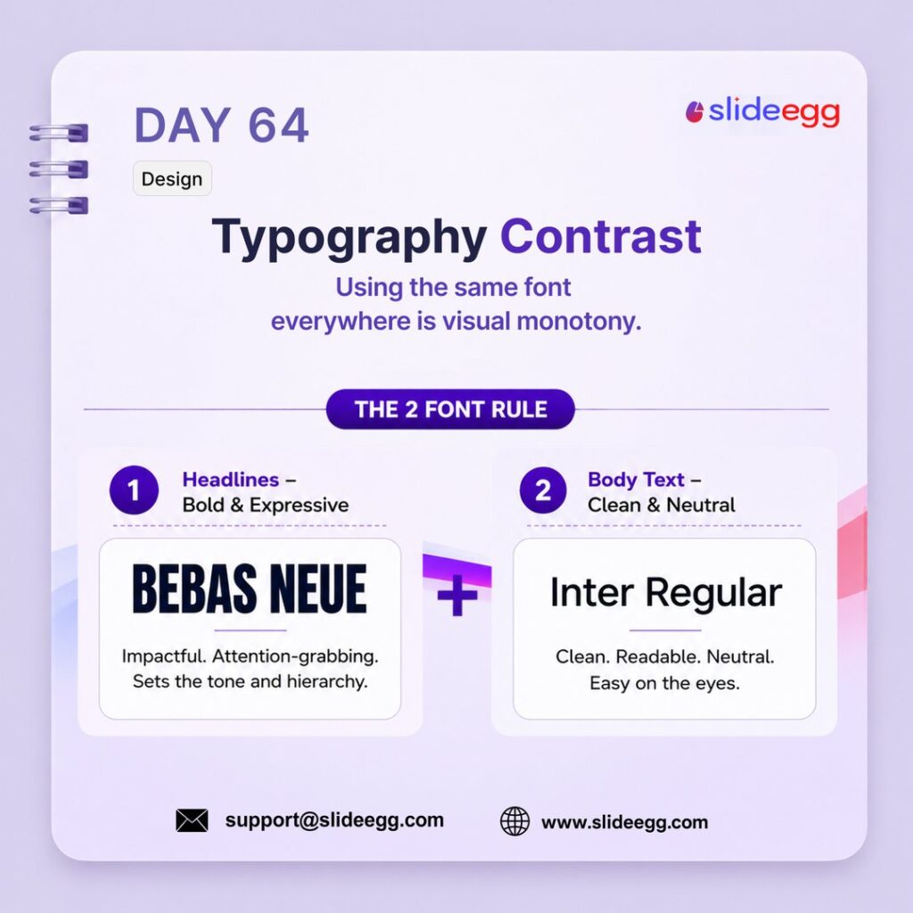
Source: Use Typography Contrast for Clear Hierarchy
Typography contrast helps your slides look clear, structured, and easy to read. Use a bold, expressive font for headlines and a clean, neutral font for body text so the audience knows what to read first.
Quick Win: Follow the 2-font rule: one font for titles and one font for body text. Avoid using multiple font families because it makes the slide look messy and inconsistent.
Day 65 – More Data Is Not More Credibility Myth
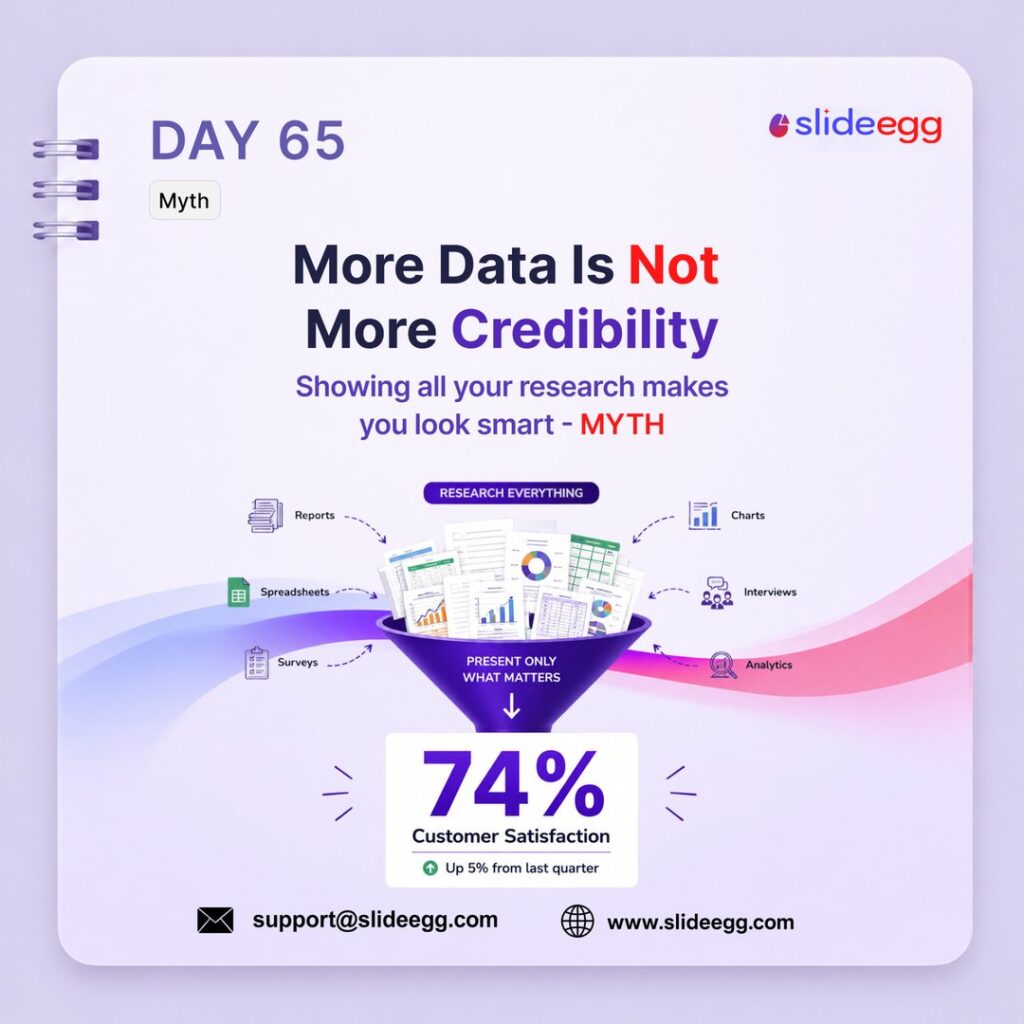
Source: Show Less Data for Better Clarity
Adding too much data can overwhelm your audience instead of building trust. A strong presentation shows only the most important insight, making the message easier to understand and remember.
Quick Win: Pick one powerful data point and make it the focus of the slide. Move extra charts, tables, and research details into backup slides for Q&A.
Day 66 – The Repetition Principle Strategy
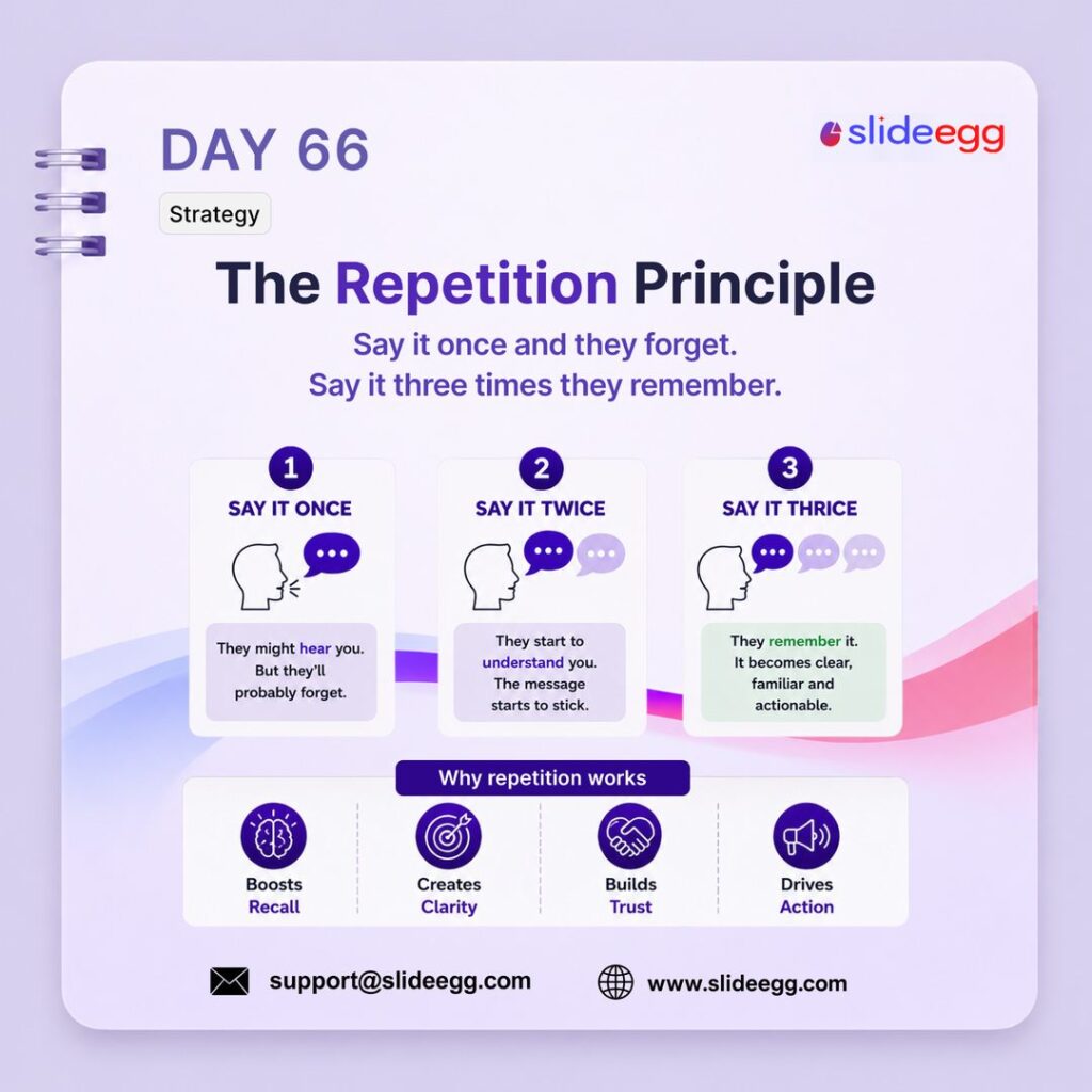
Source: Repeat Your Main Message Clearly
The repetition principle helps your audience remember the main message. When you repeat a key idea at the start, middle, and end, it becomes clearer, stronger, and easier to act on.
Quick Win: Choose one core message for your presentation. Introduce it early, reinforce it with examples in the middle, and repeat it clearly in your closing slide.
Day 67 – Format Painter Quick Fix
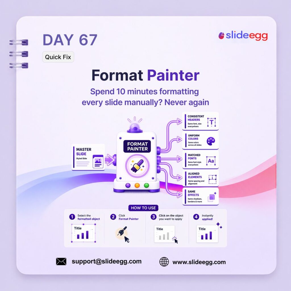
Source: Use Format Painter to Copy Styles
Format Painter helps you copy the same style across slides without manually changing fonts, colors, spacing, and effects. It keeps your deck consistent and saves time during final formatting.
Quick Win: Select a perfectly formatted object, click Format Painter, then click the object you want to update. For multiple objects, double-click Format Painter and apply the same style repeatedly.
Day 68 – Slidea for Interactive AI Presentation Tool

Source: Add Interactive Elements to Static Slides
Slidea helps turn static slides into interactive presentations with live polls, quizzes, Q&A, and audience reactions. It keeps viewers involved instead of letting them passively watch the deck.
Quick Win: Add one interactive element every few slides, such as a quick poll or quiz. Use it to check understanding, collect opinions, or bring the audience back when attention starts dropping.
Day 69 – Use Real Photos, Not Clipart Design
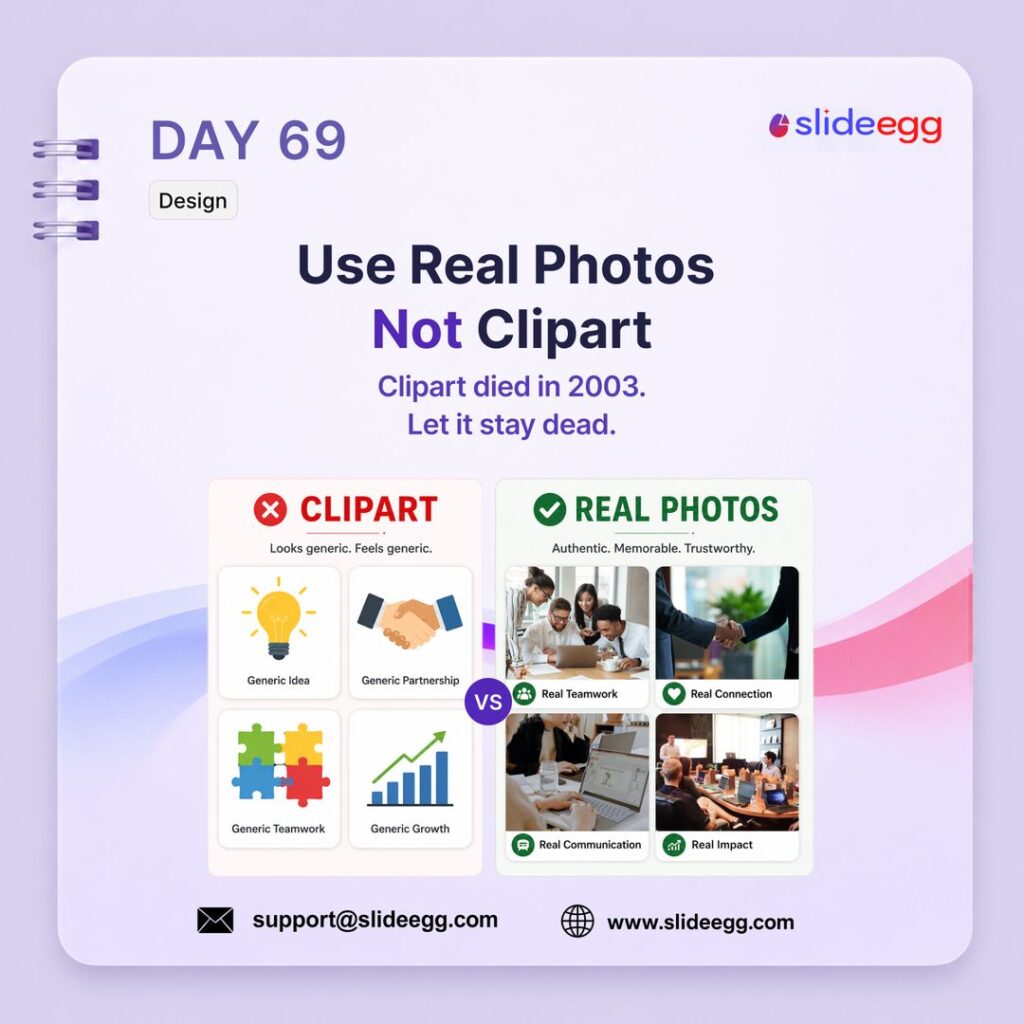
Source: Use Real Photos Instead of Clipart
Real photos make your slides feel more authentic, modern, and trustworthy. Clipart often looks generic and outdated, while real images help create emotion, context, and stronger audience connection.
Quick Win: Replace clipart with high-quality photos from real work settings, people, products, or environments. Choose images that support the message directly instead of using random decorative visuals.
Day 70 – Anchor With a Question Strategy
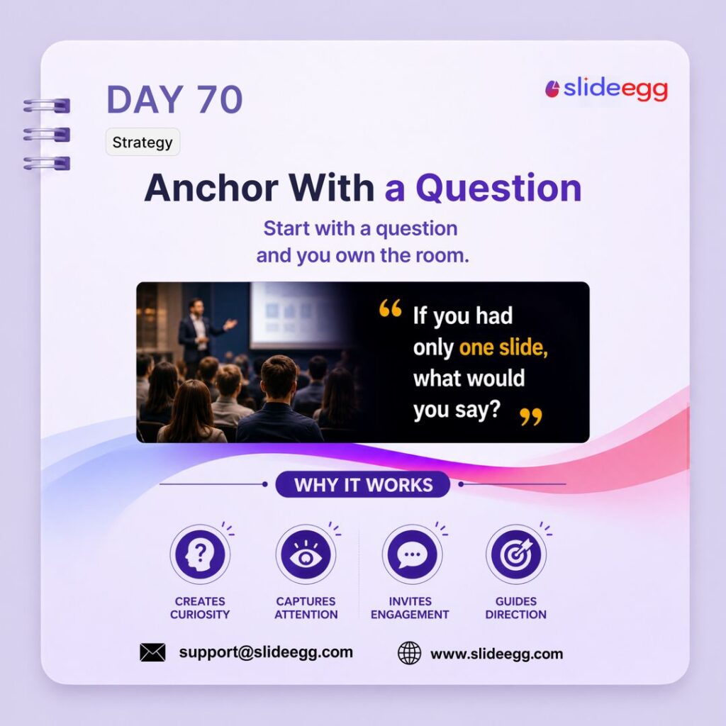
Source: Open with a Question That Hooks
Starting with a question pulls the audience into the topic immediately. A strong opening question creates curiosity, makes people think, and gives your presentation a clear direction from the first slide.
Quick Win: Open with a question your audience cannot ignore, such as: “If you had only one slide, what would you say?” Keep it short, relevant, and tied directly to your main message.
Day 71 – Slide Zoom in PowerPoint Quick Fix
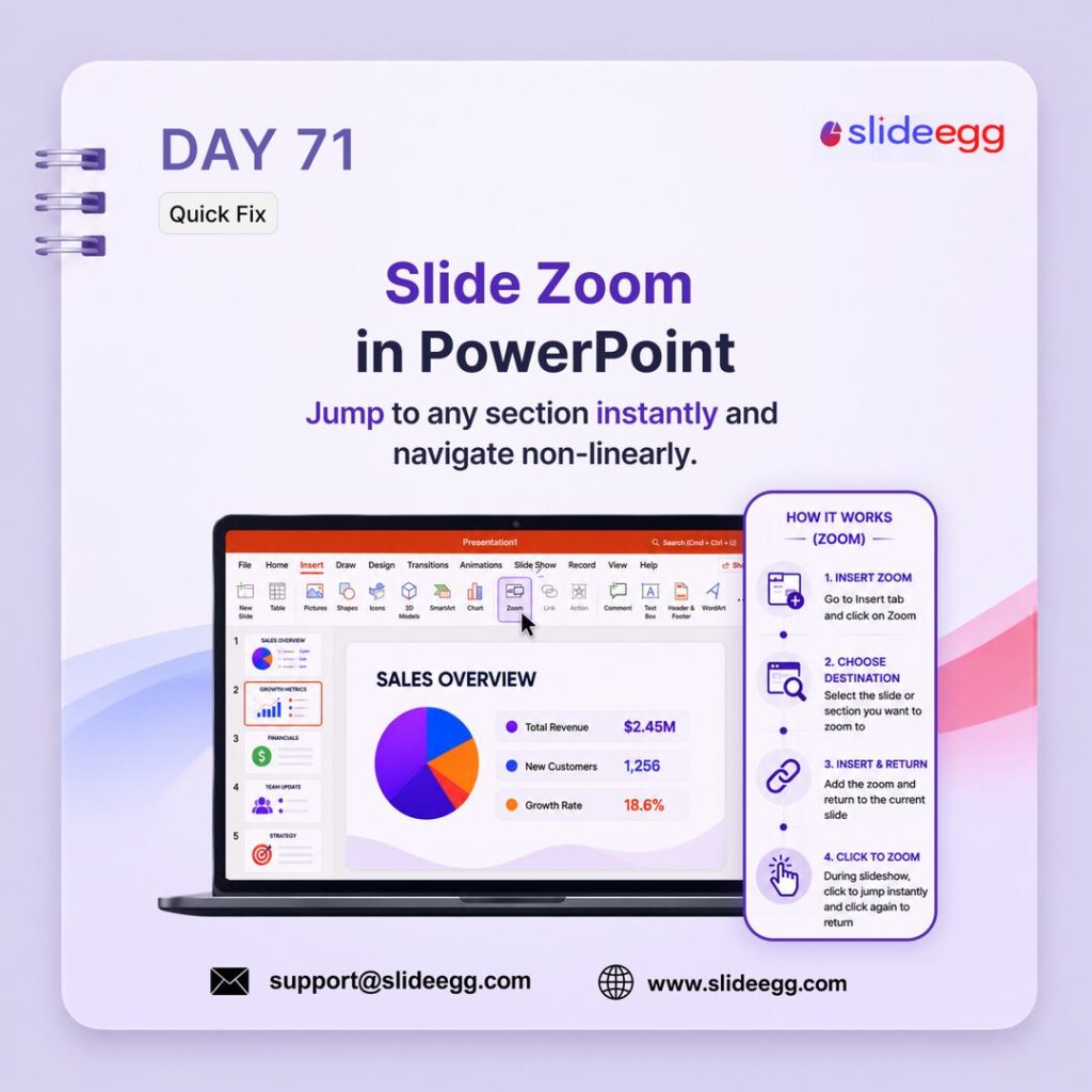
Source: Use Slide Zoom for Easy Navigation
Slide Zoom lets you jump to any slide or section during a presentation without following a fixed order. It is useful for non-linear decks, Q&A sessions, sales presentations, and topic-based navigation.
Quick Win: Go to Insert → Zoom, choose the slide or section you want to link, and place it on your main slide. During slideshow mode, click the zoom link to jump there instantly and return smoothly.
Day 72 – Visme.co for Infographics Tool
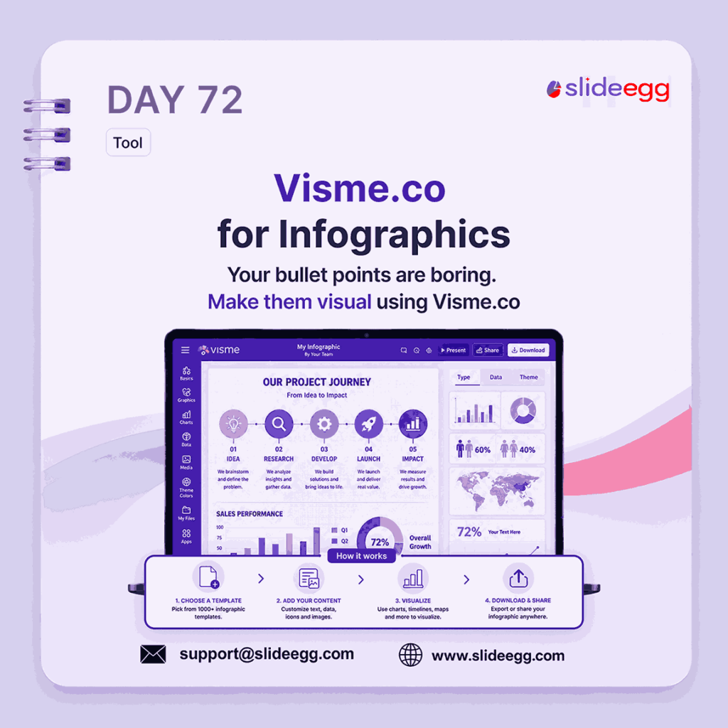
Source: Visme.co for Infographics
Visme.co helps turn plain bullet points into visual infographics, timelines, charts, and data layouts. It makes complex information easier to scan, understand, and remember.
Quick Win: Use Visme when your slide has too many bullet points or data blocks. Convert the content into a timeline, process flow, chart, or icon-based infographic so the message becomes visual.
Day 73 – Color Psychology in Slide Design
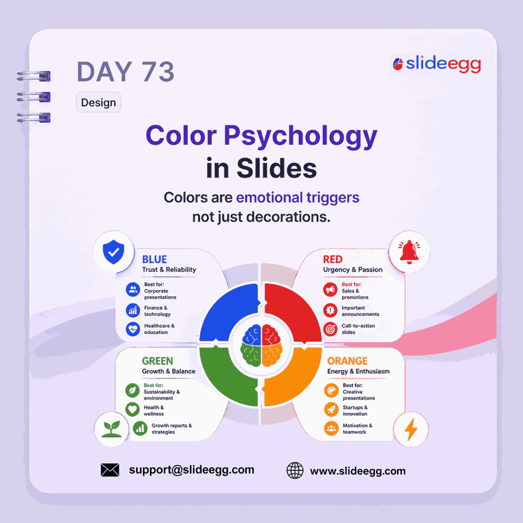
Source: Color Psychology in Slides
Color psychology helps you choose colors based on the feeling you want your message to create. Blue can suggest trust, red can show urgency, green can signal growth, and orange can add energy.
Quick Win: Pick colors based on your slide’s purpose, not just decoration. Use blue for trust, red for action, green for growth, and orange for energy or creativity.
Day 74 – Bullet Points Are Not Efficient Myth
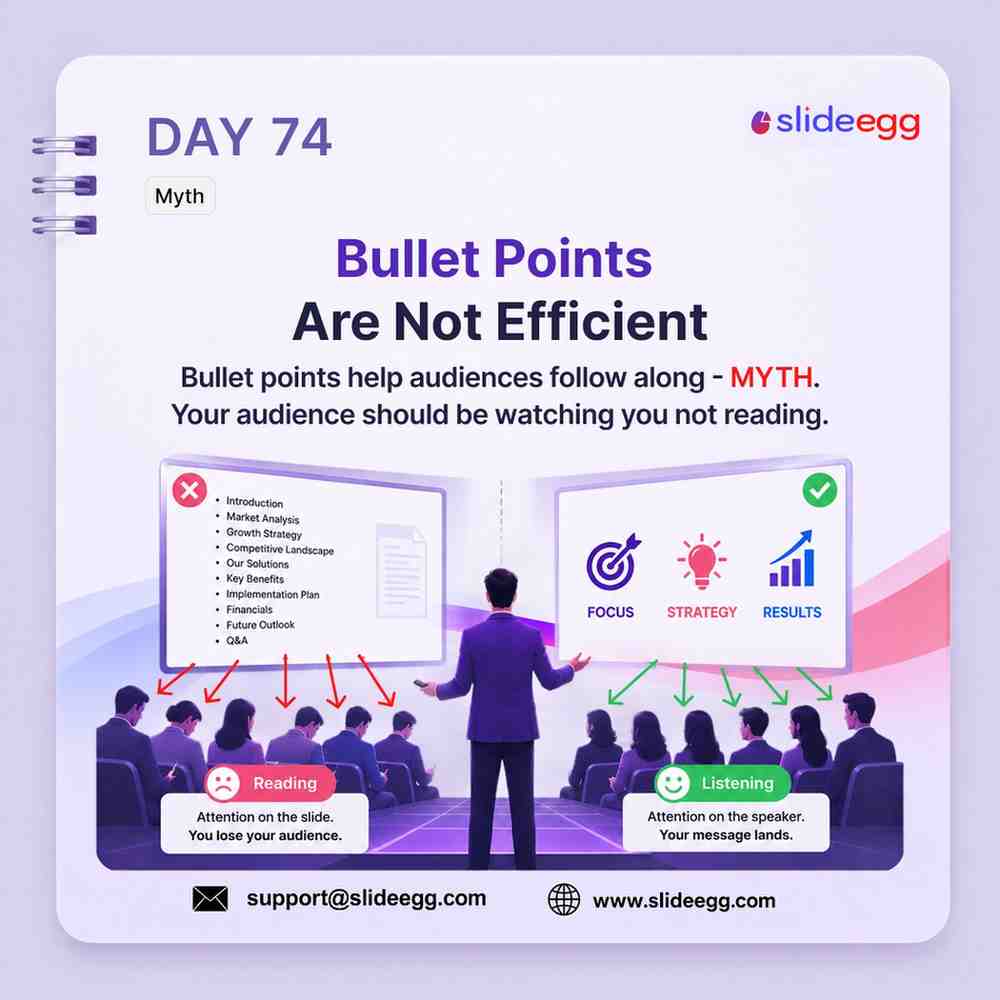
Source: Bullet Points Are Not Efficient
Too many bullet points make your audience read instead of listen. Replace long lists with icons, keywords, or simple visuals so attention stays on the speaker and the message lands faster.
Quick Win: Take one bullet-heavy slide and reduce it to 3 key words or icons. Explain the details verbally instead of putting every sentence on the slide.
Day 75 – Use Contrast to Emphasize Strategy
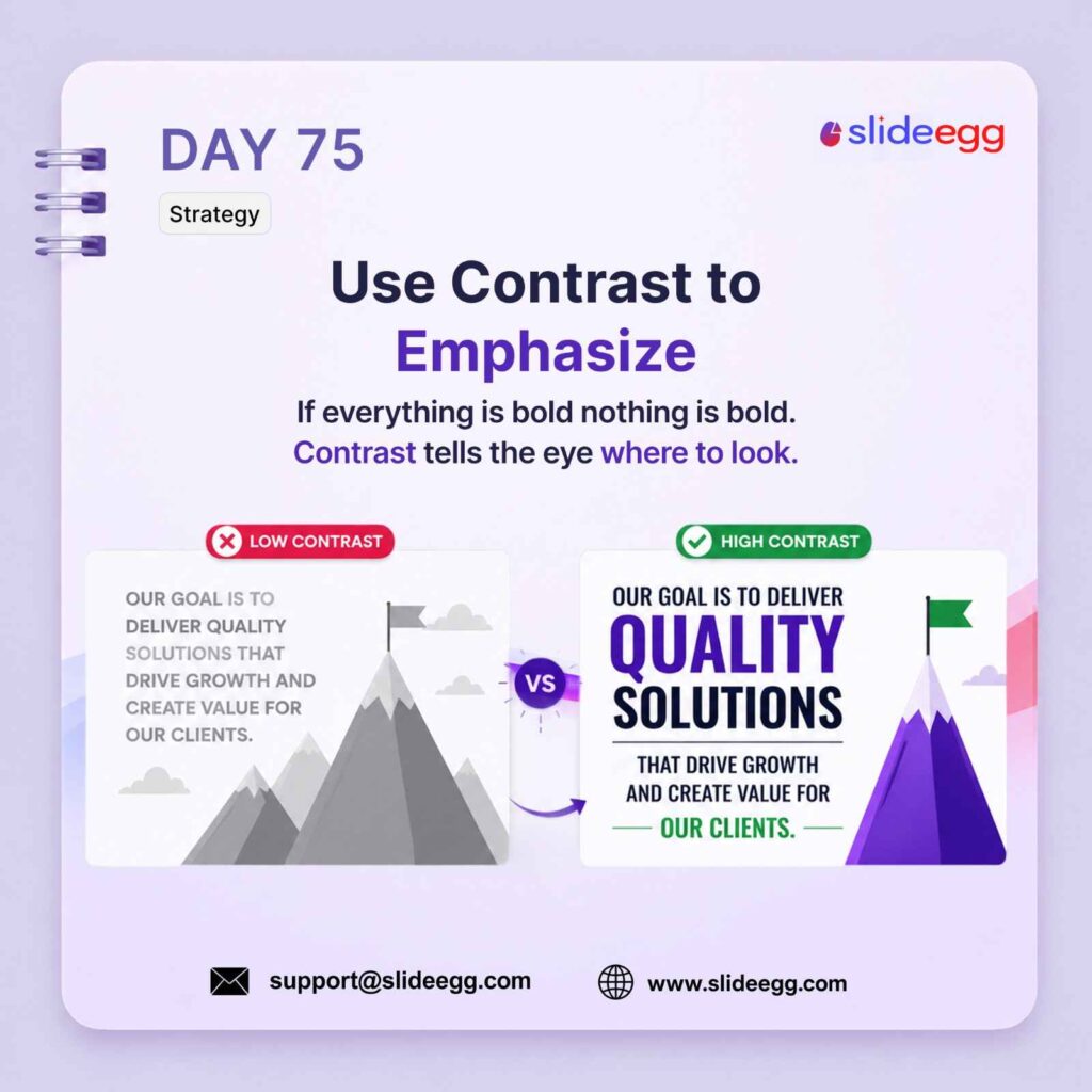
Source: Use Contrast to Emphasize
Contrast makes the key message stand out clearly. By changing size, color, weight, or brightness, you guide the audience’s eyes to the most important part of the slide.
Quick Win: Highlight only one main word, number, or phrase per slide. Make it bigger, bolder, or brighter than the rest so the audience knows exactly what to focus on.
Day 76 – Duplicate Slides to Create Variations
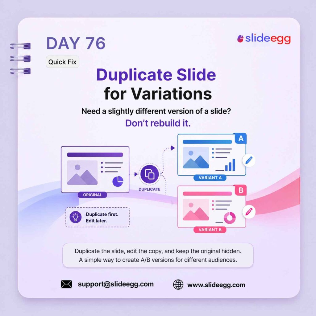
Source: Create Slide Variations Faster
Need a slightly different slide version? Duplicate the original slide first, then edit the copy. This helps you test new layouts, colors, or messages without losing the original design.
Quick Win: Duplicate first, edit later. Keep the original slide hidden so you can compare versions or reuse it when needed.
Day 77- ChatGPT for Slide Outlines
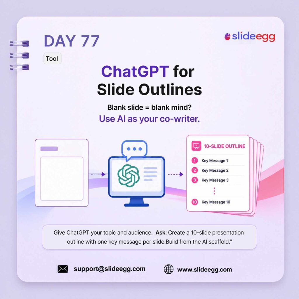
Source: Use ChatGPT for Slide Outlines
Staring at a blank slide wastes time. Use ChatGPT to create a clear slide outline before you start designing. Give it your topic, audience, and goal, then turn the outline into one focused message per slide.
Quick Win: Ask ChatGPT: “Create a 10-slide presentation outline for [topic] with one key message per slide.” Use the result as a starting structure, then edit it with your own ideas.
Day 78 – Section Divider Slides
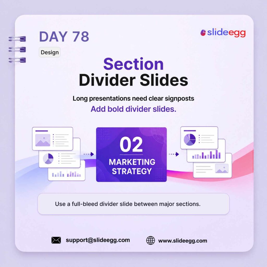
Source: Use Section Divider Slides
Long presentations can feel confusing when every slide looks the same. Use section divider slides to separate major parts of your deck and help the audience understand where they are in the story.
Quick Win: Add a bold divider slide before each major section. Keep it simple with a section number, title, and strong visual contrast.
Day 79 – Mirror Your Audience’s Language
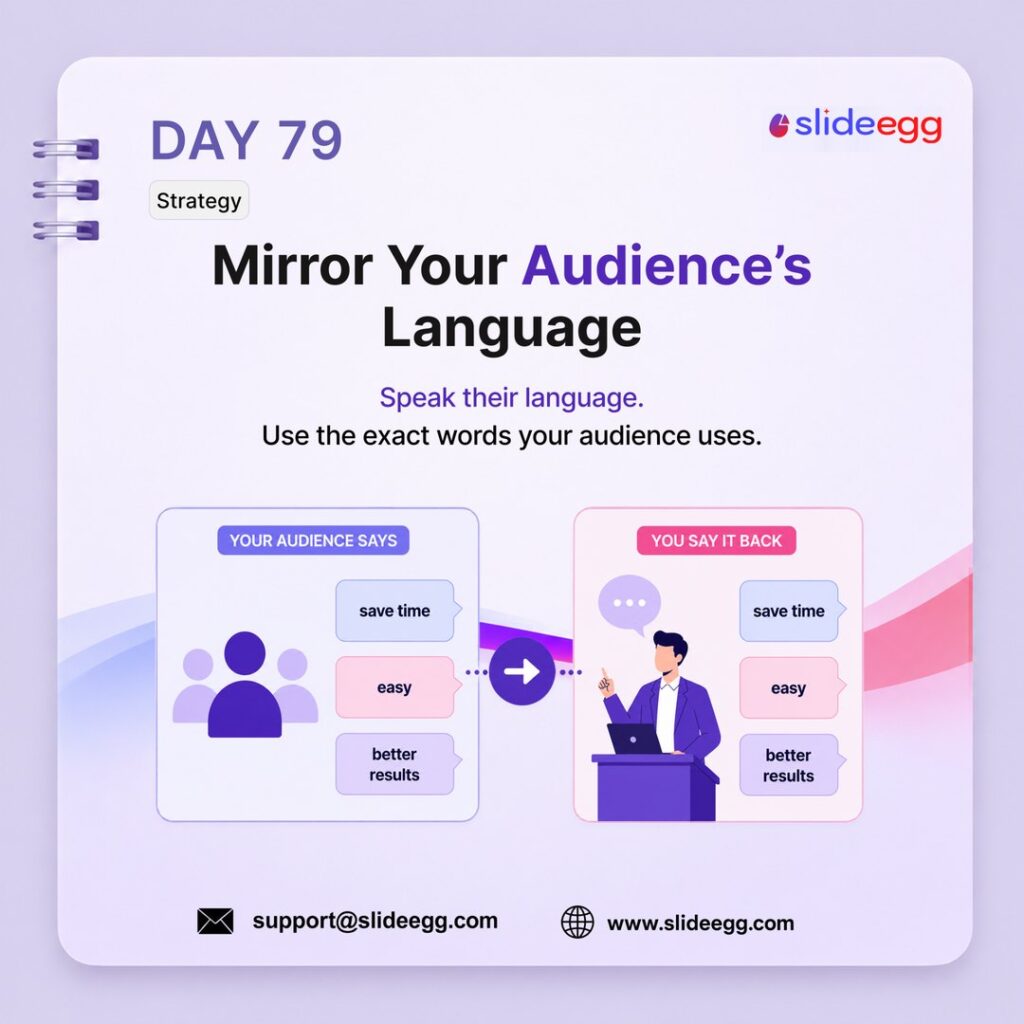
Source: Speak Your Audience’s Language
Your presentation becomes stronger when it sounds familiar to your audience. Use the same words, problems, and goals they already care about. This makes your message easier to trust, follow, and remember.
Quick Win: Before writing your slides, list 3 words your audience commonly uses. Add those exact words into your headline, examples, or CTA.
Day 80: Presenter Notes Are Your Script
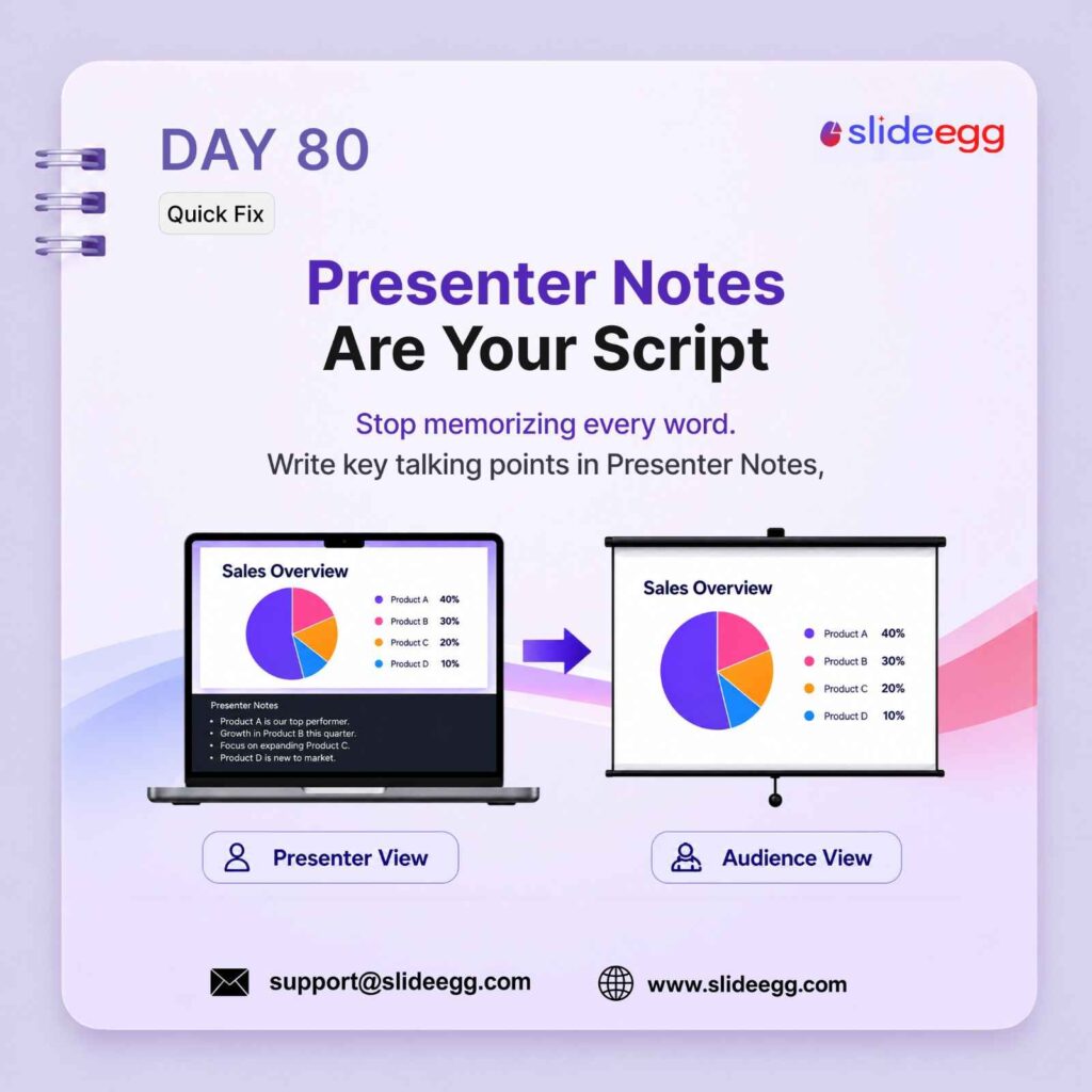
Source: Use Presenter Notes as Your Script
Do not try to memorize every word of your presentation. Add short talking points in Presenter Notes so you can stay confident while the audience sees only the clean slide.
Quick Win: Write 3–5 bullet points in Presenter Notes for each important slide. Use them as speaking cues, not a word-for-word script.
Day 81: Figma for High-Fidelity Slides
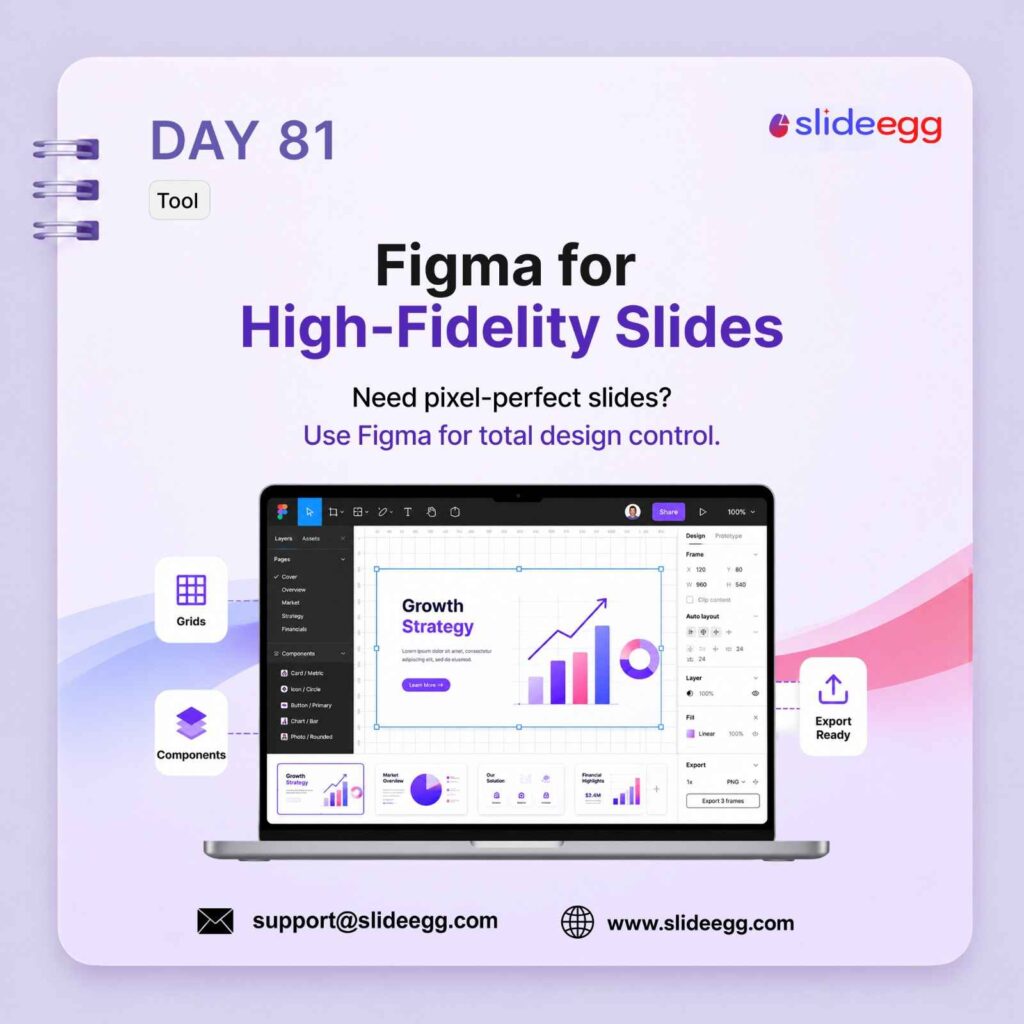
Source: Use Figma for High-Fidelity Slides
Use Figma when your slides need pixel-perfect design, clean spacing, and full visual control. It is useful for polished pitch decks, product slides, landing-page mockups, and brand-heavy presentations.
Quick Win: Design complex slides in Figma first, then export them for PowerPoint or Google Slides once the layout, spacing, and visuals are final.
Day 82 : The Power of Empty Space
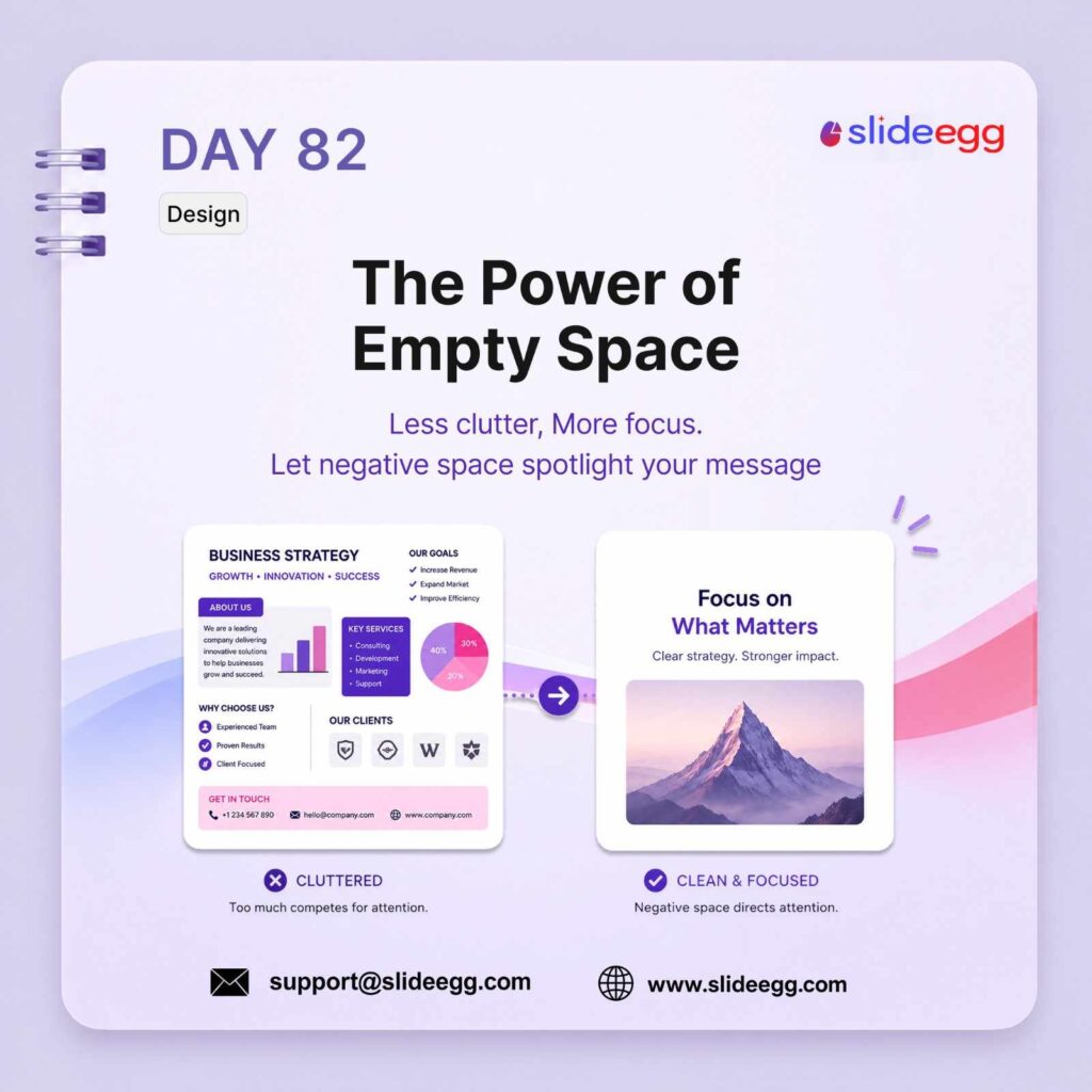
Source: Use Empty Space to Focus Your Slide Message
Empty space is not wasted space. It helps your main message stand out and makes the slide easier to read. When you remove clutter, the audience knows exactly where to focus.
Quick Win: Delete one unnecessary element from a crowded slide. Leave more space around the main headline, visual, or key message.
Day 83: Templates Are Not Lazy
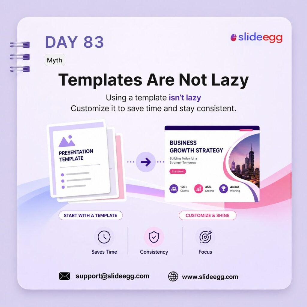
Source: Customize Templates to Save Time
Using a template is not a shortcut for lazy work. It helps you save time, keep your slides consistent, and focus more on the message. The real value comes from customizing the template to fit your audience and purpose.
Quick Win: Start with a template, then edit the colors, text, images, and examples so the final deck feels original and useful.
Day 84: Preview on the Actual Screen
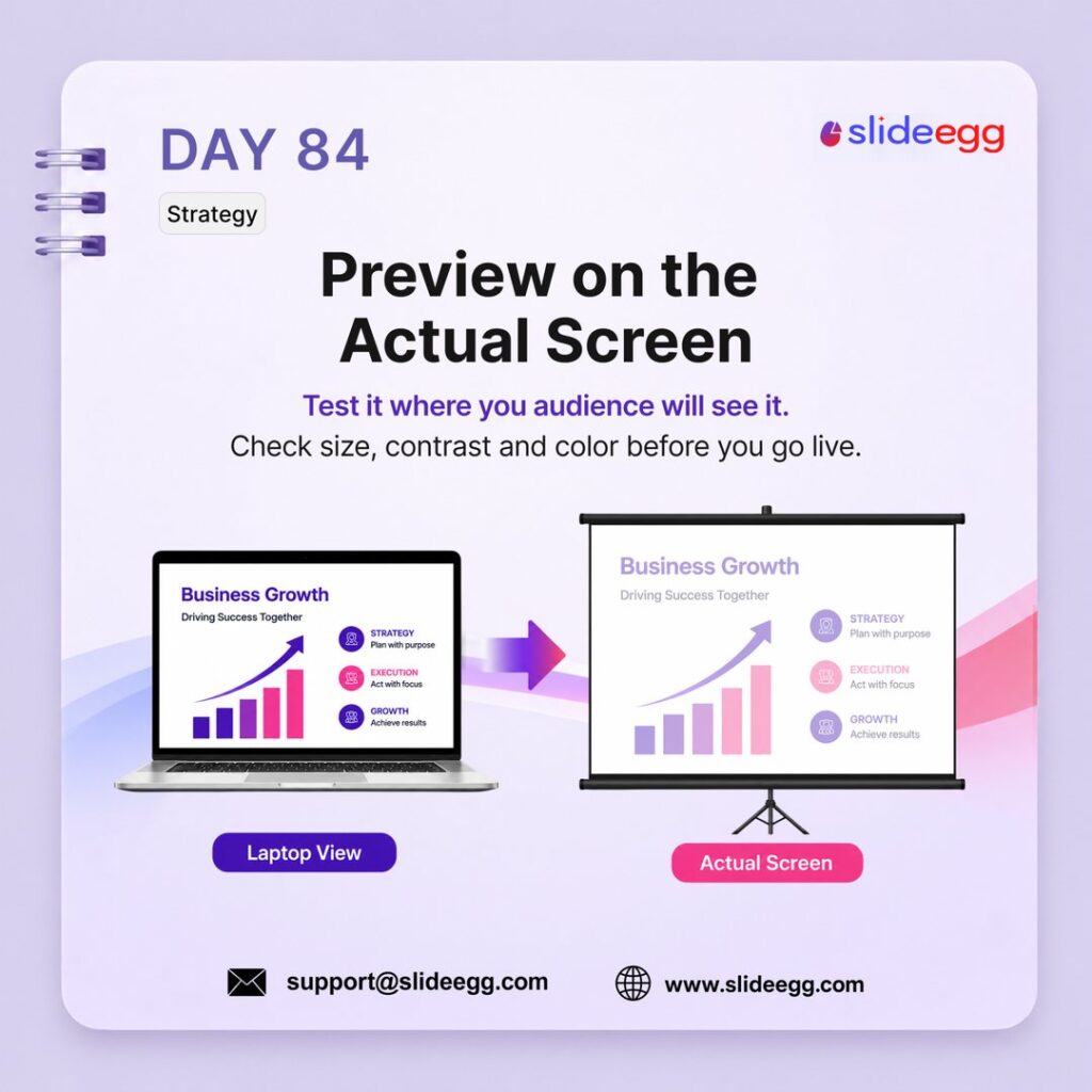
Source: Test Slides on the Actual Screen
A slide that looks perfect on your laptop may look weak on a projector or large screen. Always preview your deck on the actual screen to check font size, contrast, colors, and spacing before presenting.
Quick Win: Test your slides on the real display before the session. If anything looks small, pale, or crowded, fix it before you go live.
Day 85: Use Keyboard to Advance Slides
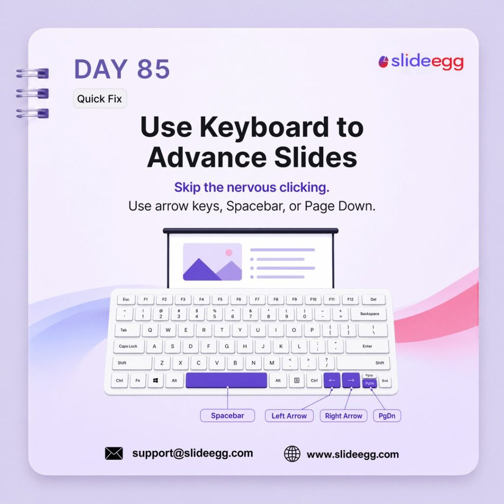
Source: Advance Slides with Keyboard Shortcuts
Avoid nervous clicking during your presentation. Use the keyboard to move through slides smoothly with the arrow keys, Spacebar, or Page Down. It gives you better control and keeps your delivery cleaner.
Quick Win: Use Spacebar, Right Arrow, or Page Down to move forward. Use Left Arrow or Page Up to go back when needed.
Day 86: Gamma.app for AI Presentations
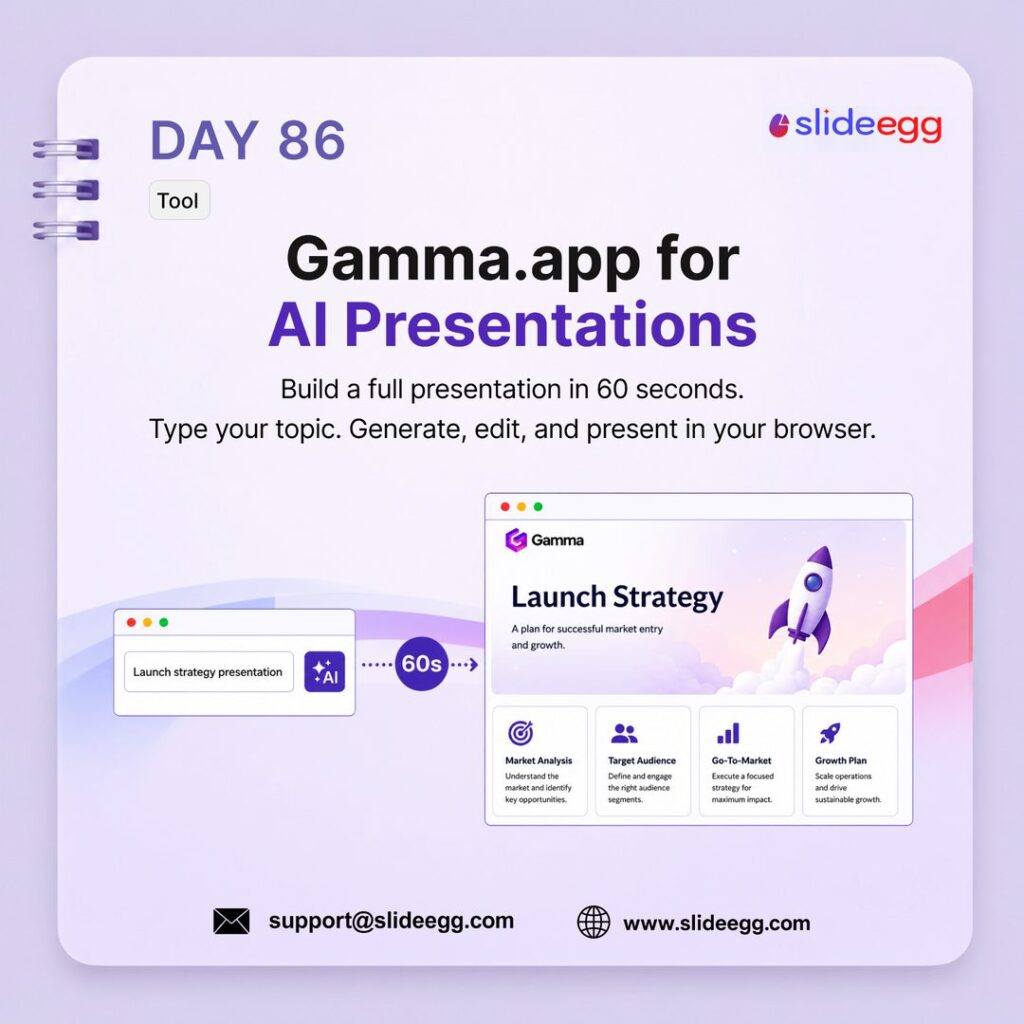
Source: Create AI Presentations with Gamma.app
Gamma.app helps you create a full presentation quickly from a simple topic. It is useful when you need a fast first draft that you can edit, improve, and present directly in the browser.
Quick Win: Type your topic clearly, generate the first draft, then review every slide before presenting. Do not use AI slides without checking the message, flow, and design.
Day 87: Limit to 3 Colors
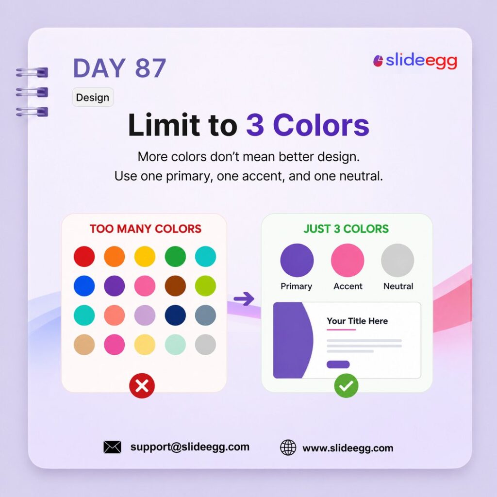
Source: Use a 3-Color Palette in Slides
Too many colors make a slide look messy and hard to follow. Use one primary color, one accent color, and one neutral color to keep your design clean, consistent, and easy to read.
Quick Win: Before designing, choose only 3 colors for the full deck: primary for branding, accent for highlights, and neutral for text or backgrounds.
Day 88: Practice Out Loud
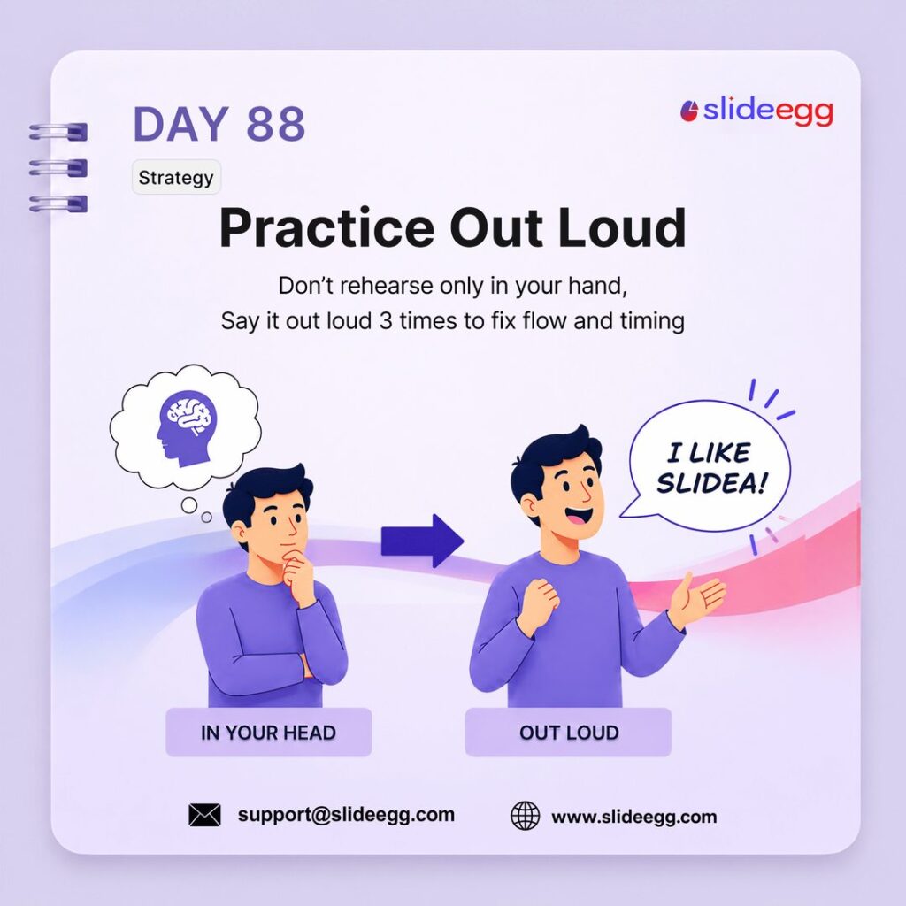
Source: Practice Out Loud Before Presenting
Practicing only in your head is not enough. Say your presentation out loud to catch awkward sentences, fix your flow, and understand your real timing before the final delivery.
Quick Win: Rehearse your presentation out loud at least 3 times. If a sentence feels hard to say, rewrite it before presenting.
Day 89: Export as PDF for Safe Delivery
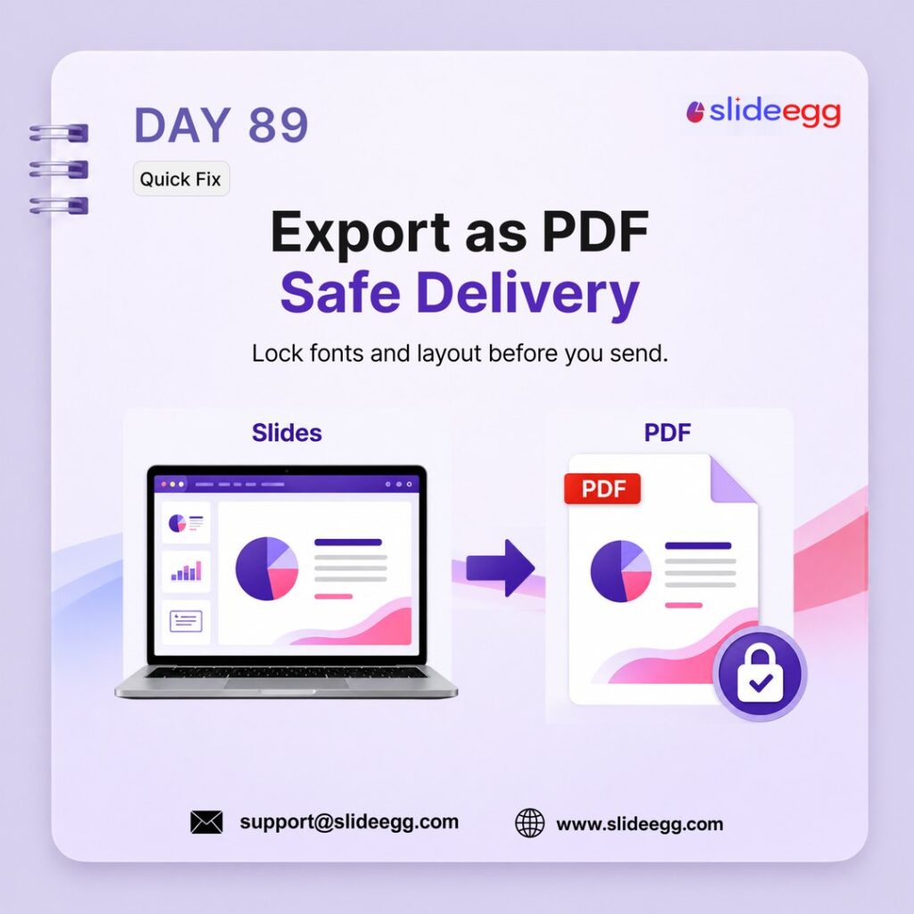
Source: Export Slides as PDF Before Sharing
Before sending your final deck, export it as a PDF to protect the layout, fonts, spacing, and visuals. This helps your presentation look the same on any device.
Quick Win: Use PDF when sharing a finished deck with clients, teachers, or teams. Keep the editable PowerPoint file only for people who need to make changes.
Day 90: Use Problem-Solution Thinking
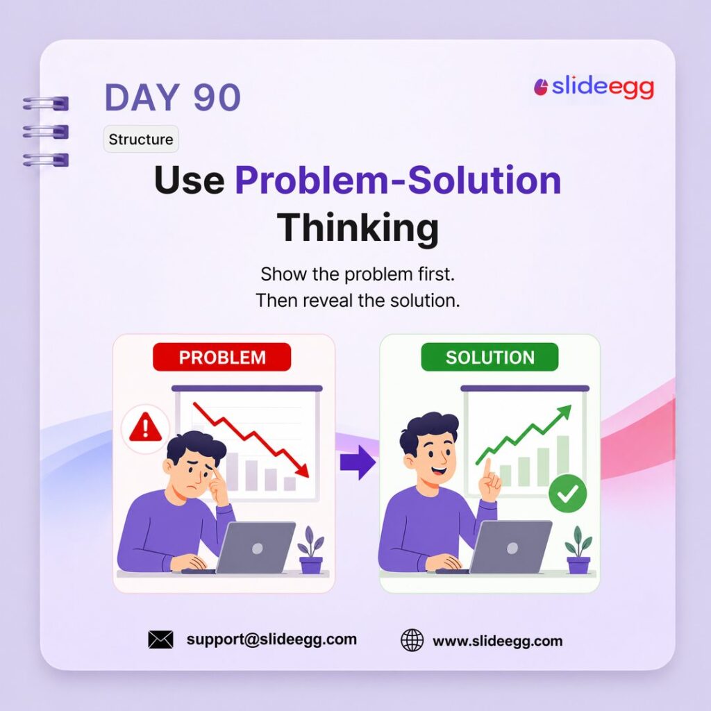
Source: Show the Problem Before the Solution
A strong presentation should not jump straight into ideas. Show the problem first so your audience understands the need, then reveal the solution clearly. This makes your message easier to follow and more convincing.
Quick Win: Build one slide for the problem and the next slide for the solution. Let the audience feel the gap before you show the answer.
Day 91: Use Comparison Slides for Clarity
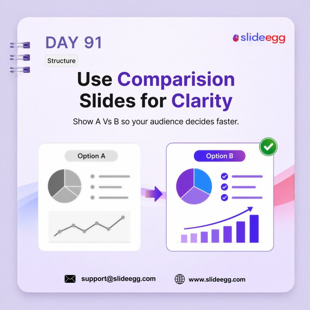
Source: Use Comparison Slides for Faster Decisions
Comparison slides help your audience understand options faster. Instead of explaining two choices separately, show them side by side so people can quickly see the difference, value, and best option.
Quick Win: Use a simple A vs B layout. Keep the same criteria on both sides so the comparison feels fair, clear, and easy to decide from.
Day 92: Make Transitions Feel Natural
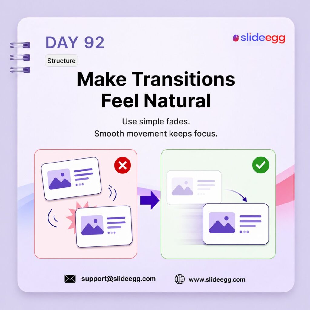
Source: Use Smooth Slide Transitions
Transitions should help your presentation flow, not distract the audience. Use simple effects like Fade to move smoothly between ideas while keeping attention on your message.
Quick Win: Use one clean transition style across the deck. Avoid loud effects like bounce, spin, or random motion unless they truly support the story.
Day 93: Use One Font Family
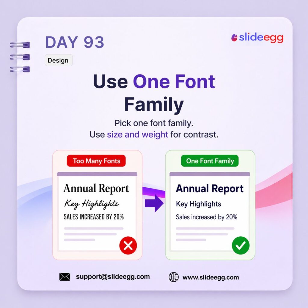
Source: Use One Font Family Presentation Tip
Too many fonts make slides look messy and inconsistent. Choose one font family for the whole deck, then use different sizes, weights, and spacing to create contrast.
Quick Win: Use bold text for headings, regular text for body content, and smaller text for supporting details. Do not mix random font styles on the same slide.
Day 94 – Sizes Create Hierarchy Design
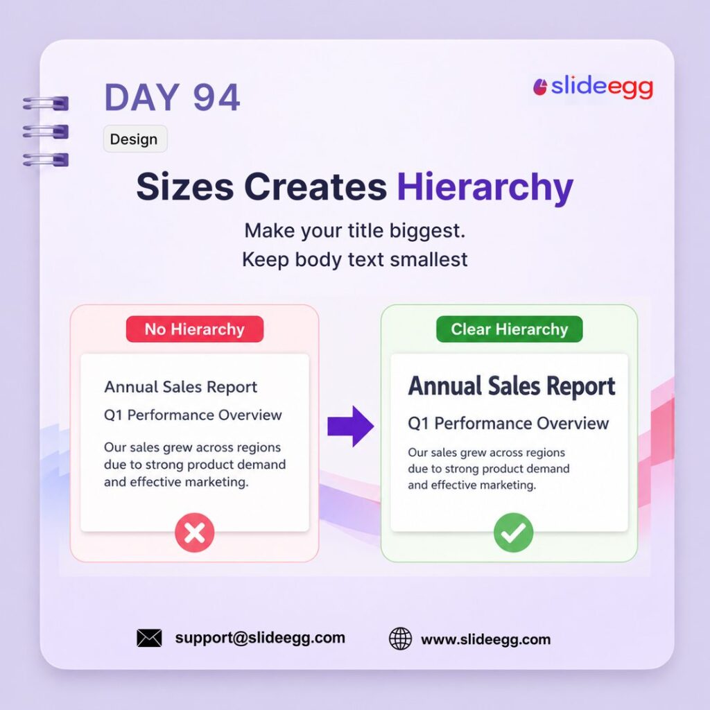
Source: Sizes Create Hierarchy Presentation Tip
Size hierarchy tells the audience what to read first. When the title is largest, the subtitle is medium, and the body text is smallest, the slide becomes easier to scan and understand.
Quick Win: Use a clear size order: Title → Subtitle → Body text. Make the main message noticeably larger than the supporting text so the audience’s eyes follow the right path.
Day 95 – Don’t Centre Everything in Design
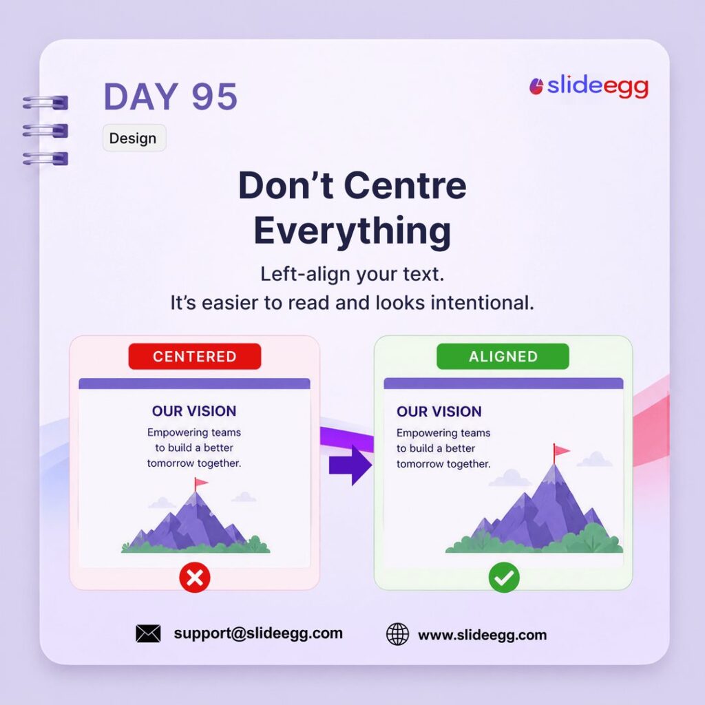
Source: Don’t Centre Everything Presentation Tip
Center alignment can make body text harder to read and less structured. Left-aligning text creates a clean visual edge, improves readability, and makes the slide look more intentional.
Quick Win: Use center alignment only for short titles or hero statements. For body text, descriptions, and lists, switch to left alignment so the audience can scan the slide faster.
Day 96 – Use Bold With Purpose Design
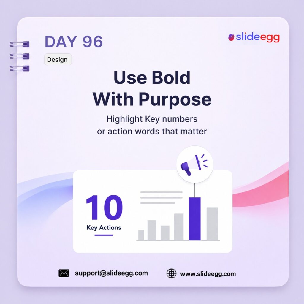
Source: Use Bold With Purpose Presentation Tip
Bold text should guide attention, not decorate every sentence. Use it only for the most important number, keyword, or action phrase so the audience instantly knows what matters.
Quick Win: Bold only one key element per slide, such as a metric, result, or action word. If more than three things are bold, the slide has no real emphasis.
Day 97 – Use High-Quality Images Only Design
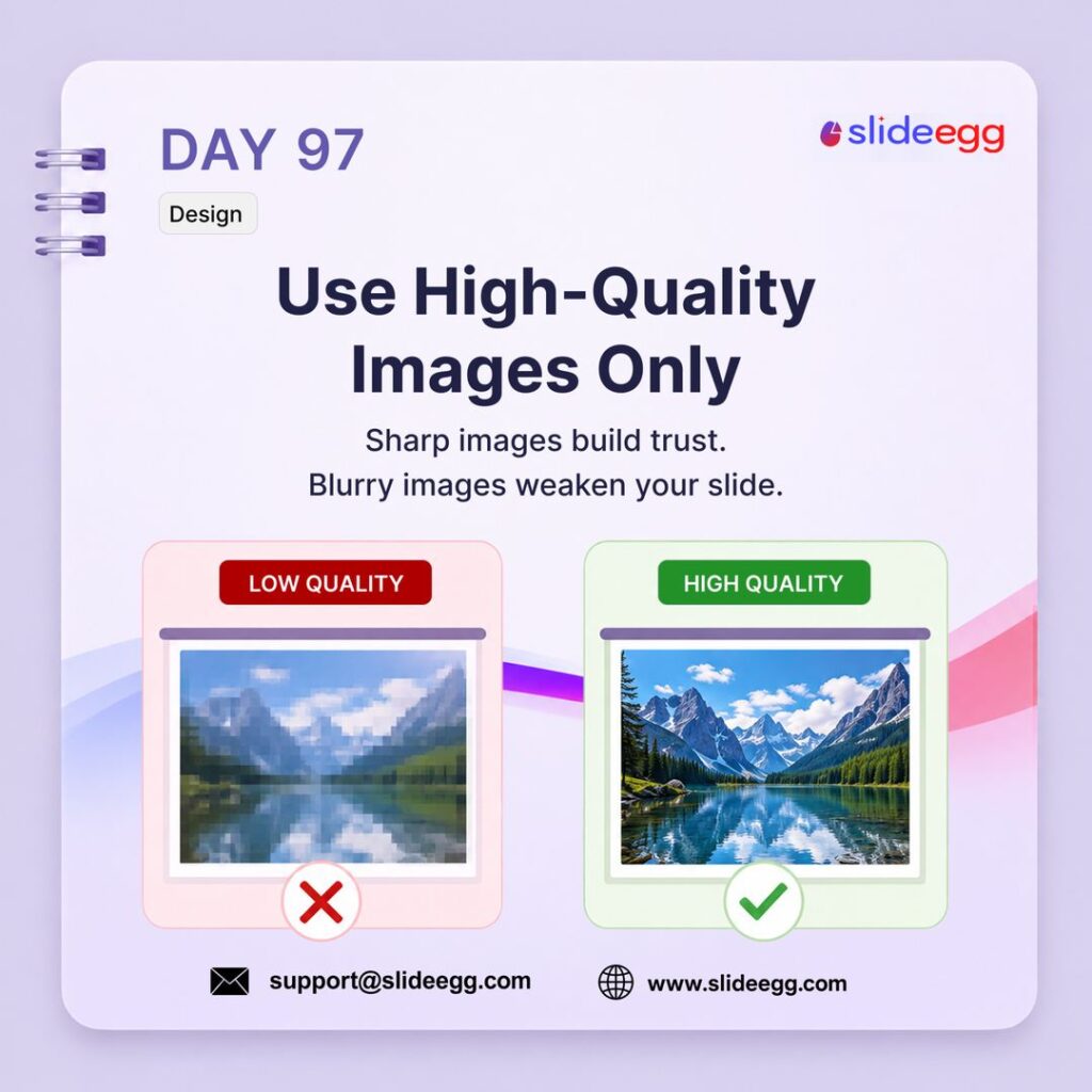
Source: Use High-Quality Images Only Presentation Tip
High-quality images make your slides look sharper, more credible, and more professional. Blurry or stretched images weaken the slide instantly, even if the content is strong.
Quick Win: Never enlarge a small image to fill a slide. Use high-resolution visuals and crop them properly so the image stays sharp, clean, and presentation-ready.
Day 98 – Avoid Visual Noise Design
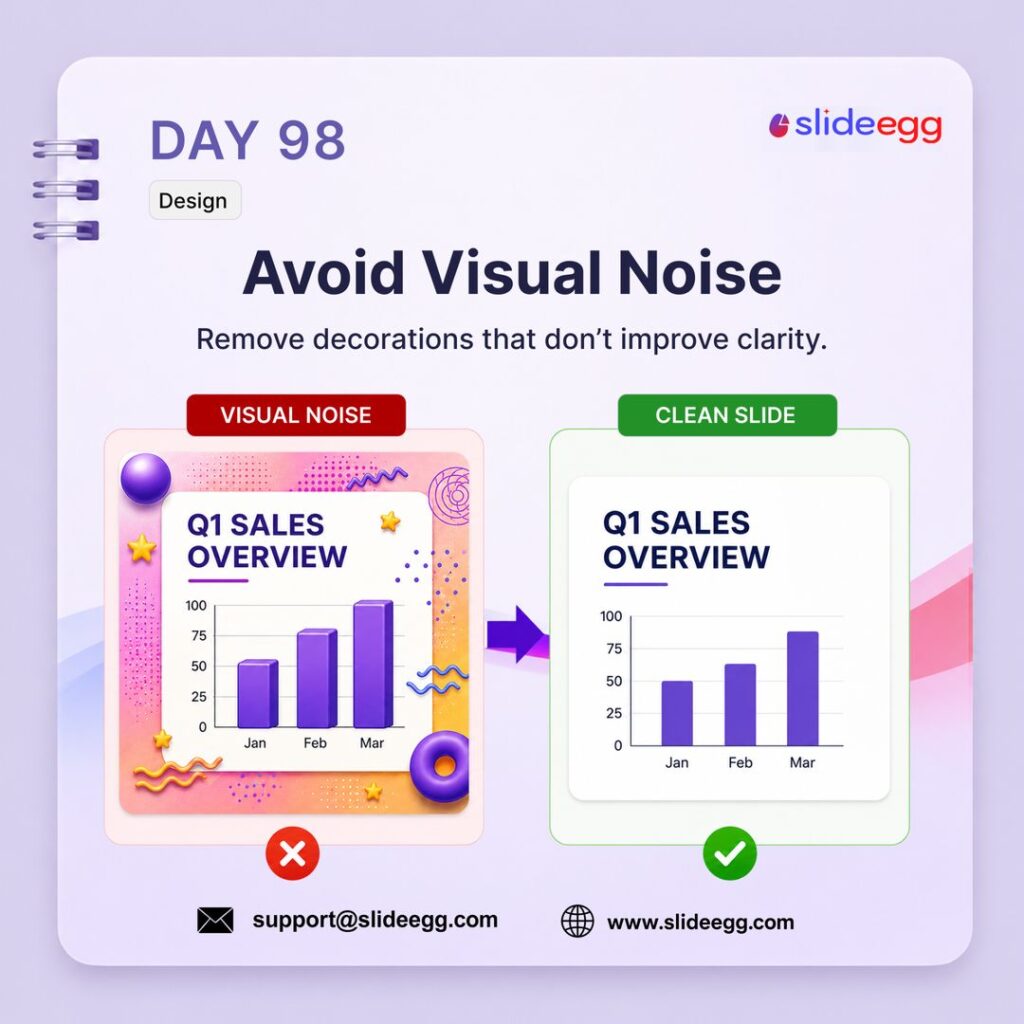
Source: Avoid Visual Noise Presentation Tip
Visual noise makes a slide harder to understand by adding decorations that do not support the message. Clean slides remove unnecessary effects, shapes, patterns, and clutter so the main content stands out.
Quick Win: Delete anything that does not improve clarity. Remove extra shadows, gradients, stickers, patterns, and decorative icons, then keep only the chart, title, and key message.
This isn’t the end—new presentation tips are added daily, so stay tuned for what’s coming next!
Follow SlideEgg for more presentation tips.
Want more quick presentation tips, design ideas, and free template updates? Follow SlideEgg across our social channels for daily slide inspiration, PowerPoint shortcuts, and practical presentation advice.
- Instagram: slideegg_official
- LinkedIn: Slide Egg
- X (Twitter): SlideEgg Free Presentation Hub
- Pinterest: SlideEgg Presentation Hub
- Facebook: SlideEgg
- Threads: SlideEgg│PPT Presentation Design Service
Frequently Asked Questions (FAQs)
What are the best PowerPoint presentation tips for beginners?
Start with one idea per slide, use large, readable text, keep layouts simple, and avoid overcrowding slides. Beginners should focus on clarity before adding animations or complex designs.
What is the 10/20/30 rule in presentations?
The 10/20/30 rule suggests using 10 slides, presenting for 20 minutes, and keeping font size at 30 points or larger. It helps presenters stay clear, concise, and audience-focused.
What is the 6×6 rule for slide design?
The 6×6 rule recommends using no more than 6 lines per slide and 6 words per line. It helps reduce text overload and makes slides easier to scan.
How do I make PowerPoint slides look professional?
Use consistent fonts, clean alignment, strong spacing, matching icons, readable colors, and one main message per slide. Professional slides look organized, not overcrowded. For more step-by-step help, explore our PowerPoint tutorials.
How can I reduce the PowerPoint file size?
Use PowerPoint’s Compress Pictures option under Picture Format. Choose Web or Email quality when sharing online, and avoid using unnecessarily large image files.
Why should I use SVG icons in presentations?
SVG icons stay sharp at any size and can be recolored inside PowerPoint or Google Slides. They are better than blurry PNG or JPEG icons for professional decks.
How do I keep my audience engaged during a presentation?
Use questions, pauses, live polls, short stories, and clear visual slides. Engagement improves when the audience has something to think about or respond to.
What should every presentation include at the end?
Every presentation should end with a clear call to action, contact details, and a final takeaway. Do not end with a vague “Thank You” slide alone.