A presentation does not end when the speaker stops talking. In client meetings and webinars, the final slide sits on the screen for 15 minutes during Q&A. It is the “Visual Anchor” of your pitch.
Despite this, many presenters treat it as a formality. A blank slide with “Any Questions?” in Arial font is not just boring—it’s a missed opportunity.
A Personal Thank You Slide is your digital business card. In 2026, it must do three things: Humanize the speaker, bridge the physical-digital gap, and reinforce the brand.
Here is how to build one that actually converts.
What is a “Personal” Thank You Slide?
It is not about adding emojis or casual slang. It is about Identity.
- A standard slide says: “This presentation is over.”
- A personal slide says: “I am the person who can solve your problem. Here is how to reach me.”
Step 1: Ditch the “Thank You” Headline

“Thank you” is polite, but it is passive. The strongest slides in 2026 use Action-Oriented Headers. Instead of “Thank You,” try:
- “Let’s Build This.” (For project pitches)
- “Let’s Connect.” (For networking)
- “Your Next Step.” (For training/webinars)
- “Let’s Discuss.” (Simple, but invites dialogue)
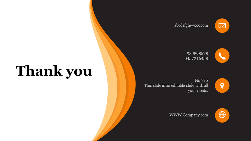
Step 2: The “Split-Screen” Layout (The 2026 Standard)

Centered text is dated. The most effective layout for personal branding is the 60/40 Split.
- Left Side (40%): A high-quality, professional headshot or a candid shot of you “in action” (working/speaking).
- Right Side (60%): Your closing headline, minimal contact info, and the CTA.
- Why it works: Humans connect with faces, not text. Putting your face on the final slide builds subconscious trust during the Q&A session.
Step 3: The “Frictionless” Contact (QR Codes)
Nobody types email addresses from a screen anymore.
- The Rule: Your Thank You slide must have a QR code.
- The Destination: Do not link to a generic homepage. Link to your LinkedIn profile, a calendar booking page, or a “Link in Bio” page containing your deck download.
- Design Tip: Match the QR code color to your brand’s primary accent color. (Use tools like Canva or Adobe Express to generate these instantly).
Step 4: Brand Elements with Restraint

Your slide should look like it belongs to the company, but feel like you.
- Fonts: Use the company header font for your name.
- Colors: Use a brand color overlay on your photo (e.g., a “Gradient Map”) to blend your headshot with the corporate identity.
- Logo: Keep the company logo small in the corner. You are the focus of this slide, not the logo.
Step 5: Design for Optical Comfort (Dark Mode)
In modern conference rooms and Zoom calls, bright white slides can be blinding.
- The Trend: Use “Cinematic Dark Mode” for your Thank You slide.
- The Look: Charcoal or Deep Navy background with white text.
- Why: It signals “The show is over, let’s chat.” It is easier on the eyes and looks more premium.
When to Use This Slide
This layout is perfect for:
- Sales Pitches (Builds trust).
- Webinars (Encourages LinkedIn connections).
- Job Interviews (Shows professionalism).
Don’t want to design from scratch? Download SlideEgg’s Personal Thank You Slide Templates—featuring pre-built split layouts, QR code placeholders, and dark mode options.
Common Mistakes to Avoid
- The “Wall of Links”: Listing Facebook, Twitter, Instagram, Email, and Phone. Pick one primary channel (usually LinkedIn or Email).
- Low-Resolution Photos: A blurry headshot looks amateur.
- Missing Call-to-Action: Don’t just leave contact info. Say “Scan to connect” or “Email me for the PDF.”
Final Thoughts
The final slide is the period at the end of your sentence. Make it bold. By combining a personal image, a frictionless QR code, and a confident headline, you turn a “closing slide” into an “opening door.”
FAQs
1. Should I use a professional headshot or a candid photo?
In 2026, authenticity wins, but quality is non-negotiable.
- For Corporate/Sales: Use a high-resolution studio headshot.
- For Creative/Workshops: A high-quality “action shot” (you speaking on stage or working) builds authority better than a stiff portrait.
- The Rule: Never use a low-light selfie or a cropped wedding photo.
2. How do I adapt the “Personal” slide for a team presentation?
Do not cram 5 headshots into a split screen; it looks messy.
- Option A: Use a high-quality group photo on the left.
- Option B: Use a “Meet the Team” QR code that links to a landing page with individual bios.
- Option C: If 2 speakers, split the image section vertically (two tall portraits).
3. Is it okay to use a video background on the Thank You slide?
Only if it is a Cinemagraph (a still image with subtle movement, like drifting clouds or a slow-moving abstract gradient). Avoid fast-paced video loops; they distract the audience while you are trying to answer Q&A questions.
4. Why is my QR code not scanning on the projector?
Two common reasons:
- Low Contrast: You used a light grey code on a white background. Always use black or dark navy on white (or white on dark).
- Size: It is too small. The QR code should be at least 15% of the slide height to be scannable from the back of the room.
5. Can I include my social media handles?
Avoid the “Icon Soup.” Do not list LinkedIn, X, Instagram, and TikTok. Pick the one platform where you are most active professionally (usually LinkedIn) and drive all traffic there. If theywant your other socials, they can find them on your profile.