In today’s digital world, people do not have the patience to read long blocks of text. Whether you are presenting business data, teaching students, pitching an idea, or explaining a process, visuals help people understand information faster. That is why infographic presentations have become an essential communication tool for businesses, educators, marketers, and professionals.
But choosing the right infographic presentation template is not always easy.
A template that works for a corporate company may look too serious for a startup. A colorful design that works for social media may not fit a financial presentation. The style you choose shapes how people see your message and your brand.
Think of your presentation like a storefront window. Before people understand the content inside, they notice the appearance first. If the design feels confusing, outdated, or mismatched, people lose interest quickly.
So how do you choose the right infographic style for your audience and brand?
Let’s break it down step by step.
Understand Your Brand Personality First
Before selecting any template, understand your brand identity.
Ask yourself:
- Is your brand modern or traditional?
- Professional or creative?
- Minimal or energetic?
- Corporate or casual?
Your infographic design should reflect your personality clearly.
For example, a law firm usually benefits from clean layouts, neutral colors, and professional icons. On the other hand, a startup or creative agency may prefer bold typography, bright visuals, and dynamic slide designs.
When the visual style matches your brand voice, your presentation feels more trustworthy and polished.
A good infographic presentation template should feel like an extension of your brand, not a random collection of slides.
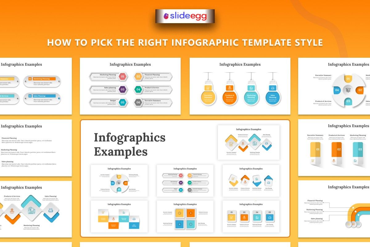
Match the Template With the Content Type
Not every infographic style fits every topic.
The structure of your content matters just as much as the design.
For Data and Reports
If your presentation contains statistics, analytics, or sales reports, choose templates with:
- Charts
- Graphs
- KPI visuals
- Comparison layouts
- Percentage infographics
These layouts help viewers understand numbers quickly without feeling overwhelmed.
For Processes and Workflows
If you are explaining steps, systems, or procedures, use templates with:
- Timelines
- Flowcharts
- Roadmaps
- Step-by-step diagrams
This style works especially well for educators, trainers, HR teams, and consultants.
For Storytelling Presentations
Brand stories, startup pitches, and marketing presentations work best with visually engaging templates.
Use:
- Large visuals
- Minimal text
- Bold headings
- Visual storytelling layouts
People remember stories far more easily than plain facts.
Choose Colors Carefully
Colors are the silent heroes of a presentation. They influence mood and send signals that affect decisions. According to our guide on How to Choose the Best Colors for Your Presentations, different colors evoke different emotions:
Here are a few common examples:
| Color | What It Often Represents |
| Blue | Trust and professionalism |
| Green | Growth and balance |
| Red | Energy and urgency |
| Yellow | Creativity and positivity |
| Black | Authority and sophistication |
Keep Readability a Priority
One of the biggest presentation mistakes is adding too much information to one slide.
Even the most attractive infographic fails if people struggle to read it.
Avoid:
- Tiny fonts
- Crowded layouts
- Too many icons
- Long paragraphs
- Excessive animations
Good design should guide the viewer naturally from one point to the next.
Think of your presentation like a road sign. People should understand the message quickly without extra effort.
Simple layouts often communicate ideas more effectively than overly decorative designs.
Use Interactive Features Wisely
Modern presentations are becoming more dynamic in 2026. Many professionals now use an interactive presentation tool to make online meetings and presentations more engaging.
Interactive features can include:
- Animated transitions
- Clickable sections
- Interactive charts
- Zoom effects
- Dynamic slide navigation
These elements can improve audience attention when used correctly.
However, too many animations can become distracting. If every object moves constantly, viewers may focus more on the effects than the message itself.
Use interaction only when it helps explain the content better.
Free Templates vs Premium Templates
Many professionals begin with a free PowerPoint template because it saves time and money.
Free templates are useful for:
- Students
- Freelancers
- Small businesses
- Internal team presentations
However, premium infographic templates often offer:
- Better customization
- Modern layouts
- Higher visual quality
- More unique designs
- Better branding flexibility
If presentations are an important part of your business communication, investing in quality templates can improve how people perceive your brand.
FAQs
What is an infographic presentation template?
An infographic presentation template is a pre-designed slide layout that uses visuals like charts, icons, diagrams, and timelines to explain information clearly and quickly.
Why are infographic presentations important for businesses?
They help businesses simplify complex information, improve audience engagement, and make presentations more visually appealing and memorable.
Can I use a free PowerPoint template for professional presentations?
Yes. A free PowerPoint template works well for many business and educational presentations, especially when the design is clean and organized.
What is an interactive presentation?
An interactive presentation tool includes features like clickable navigation, animations, and dynamic visuals that improve audience engagement during presentations.
How do I make infographic slides look professional?
Use consistent colors, readable fonts, simple layouts, and visuals that support the message instead of distracting from it.