| Essential Steps for Magazine Layout in Google Slides Before you start creating your magazine-style presentation, here are the key steps you’ll follow: ✅ Change slide size to custom dimensions (8.5″ x 11″ or A4). ✅ Set up a grid system using guides and alignment tools. ✅ Create text columns with text boxes for article content. ✅ Add high-quality images and position them strategically. ✅ Choose complementary fonts for headlines and body text. ✅ Apply consistent spacing between elements. ✅ Use color schemes that match your magazine theme. |
Introduction
Creating a professional magazine layout doesn’t require expensive design software anymore. Google Slides offers all the tools you need to design magazine-style presentations that look polished and engaging. Whether you’re working on a school project, business newsletter, or digital publication, this guide will show you exactly how to make a magazine layout in Google Slides using simple techniques that anyone can master.
Step 1: Set Up Your Canvas Size
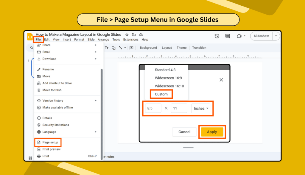
Start by opening Google Slides and creating a new presentation. The default slide size won’t work for magazine design, so you need to change it.
Click on File > Page Setup and select Custom. For a standard magazine layout, use these dimensions:
- 8.5 x 11 inches for letter size
- 8.27 x 11.69 inches for A4 size
These dimensions give you the perfect canvas for magazine design in Google Slides.
Step 2: Create a Grid System
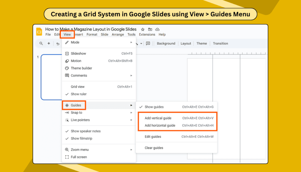
Professional magazines use grid systems to organize content. In Google Slides, you can create guides to help align your elements perfectly.
- Go to View > Guides and add vertical and horizontal guides. Place them at regular intervals to create columns. Most magazines use 2-3 column layouts, so add guides accordingly.
Step 3: Design Your Magazine Header
Every magazine needs a striking header. Create a text box at the top of your slide for your magazine title. Select a bold, eye-catching font, such as Impact or Bebas Neue.
Make your title large enough to grab attention—typically 36-48 points. Add a subtitle below it in a smaller, complementary font.
Step 4: Add Article Content with Columns
This is where your magazine layout ideas for a digital magazine come to life. Create separate text boxes for each column of your article.
For a two-column layout:
- Make each text box about 3 inches wide
- Leave 0.5 inches between columns
- Align text boxes to your grid guides
Type your article content in each text box. Use 11-12 point fonts for body text to ensure readability.
Step 5: Insert and Position Images
Images make your simple magazine design Google Slides layout pop.
- Click Insert > Image and upload your photos.
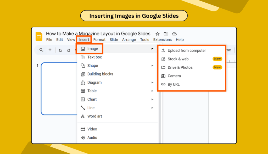
Position images strategically:
- Large hero images at the top or center
- Smaller images alongside text columns
- Image captions in smaller fonts below pictures
Remember to crop images to fit your layout perfectly using the crop tool.
Step 6: Apply Typography Hierarchy
Create a visual hierarchy with different font sizes:
- Headlines: 24-36 points
- Subheadings: 16-20 points
- Body text: 11-12 points
- Captions: 8-10 points
Stick to 2-3 font families maximum for a cohesive look.
Step 7: Add Design Elements
Enhance your Google Slides template magazine layout with:
- Colored backgrounds for text boxes
- Borders and lines to separate sections
- Drop shadows for depth
- Shapes as decorative elements
Step 8: Fine-tune Spacing and Alignment
Professional magazines have consistent spacing. Use the Arrange > Align tools to perfectly position elements.
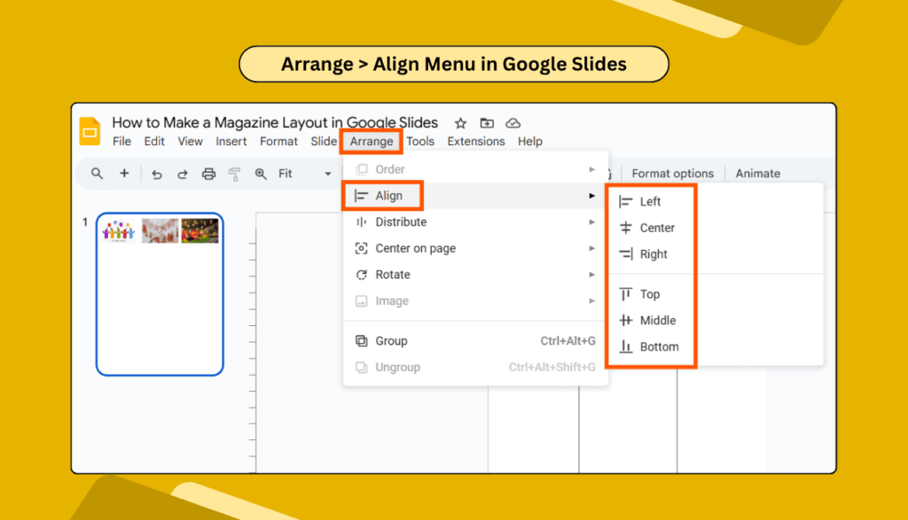
Check that:
- Text boxes align with your grid
- Images have consistent margins
- Spacing between headlines and text is uniform
For more advanced formatting, explore how to format text in Google Slides.
Step 9: Create Multiple Pages
Most magazines have multiple pages. Duplicate your slide and modify the layout for variety. You can add, duplicate, or delete slides easily.
Create different layouts for:
- Cover page
- Table of contents
- Feature articles
- Back cover
Step 10: Review and Export
Before finalizing, review your magazine layout for:
- Consistent fonts and colors
- Proper alignment
- Readable text sizes
- High-quality images
Once you are satisfied, download your presentation as a PDF for sharing or printing.
Pro Tips for Better Magazine Layouts
- Use high-resolution images (300 DPI minimum) for crisp printing.
- Maintain white space around text and images—don’t cram everything together.
- Test readability by viewing your slides at actual size.
Consider converting your Google Slides to PowerPoint if you need to share with others who prefer different software.
FAQs
Q1: Can I design a magazine in Google Slides for free?
Yes, Google Slides is completely free and includes all the tools needed for magazine design. You can create professional-looking layouts without any subscription fees or additional software purchases.
Q2: What size should I use for magazine slides?
Use custom dimensions of 8.5″ x 11″ for standard letter size or 8.27″ x 11.69″ for A4 size. These dimensions work best for magazine-style layouts and printing.
Q3: How can I add columns like a real magazine?
Create separate text boxes for each column instead of using built-in column features. This gives you more control over spacing, alignment, and individual column formatting.
Q4: Can I add interactive elements to my digital magazine?
Yes, you can create hyperlinks and add animations to make your magazine interactive for digital viewing.
Q5: How do I ensure my magazine looks professional?
Focus on consistent typography, proper spacing, high-quality images, and a clear grid system. Limit your color palette to 2-3 colors and use plenty of white space around elements.
Conclusion
Creating a magazine layout in Google Slides is easier than you think. With the right setup, grid system, and design elements, you can produce professional-looking magazines without expensive software.
Remember to focus on clean typography, consistent spacing, and high-quality images. Practice these techniques, and you’ll soon be designing magazine layouts that rival professional publications.
Start with simple layouts and gradually add more complex elements as you gain confidence. Your digital magazine is just a few clicks away!