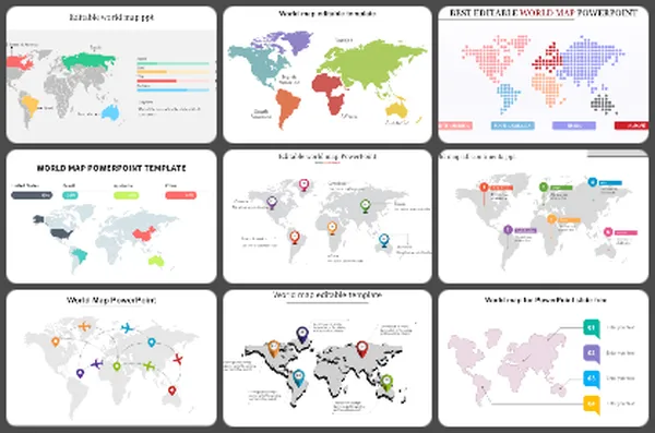
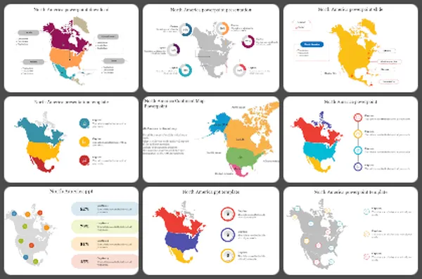
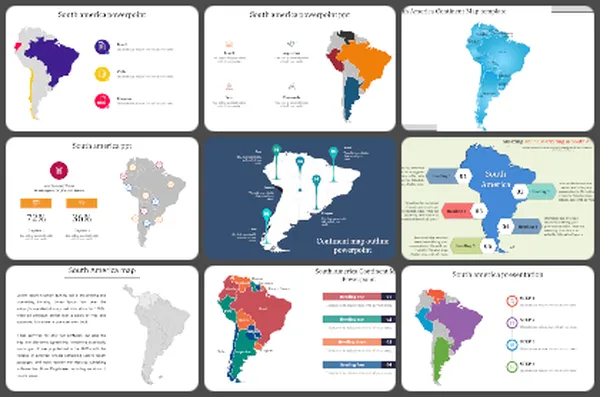
1280+ Maps Presentation Templates
You're sharing something about places – teaching geography, showing sales territories, explaining a project location, planning an event. Your audience needs to visualize WHERE it is. Without a map, they're left imagining.
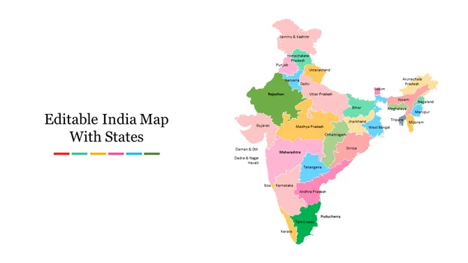
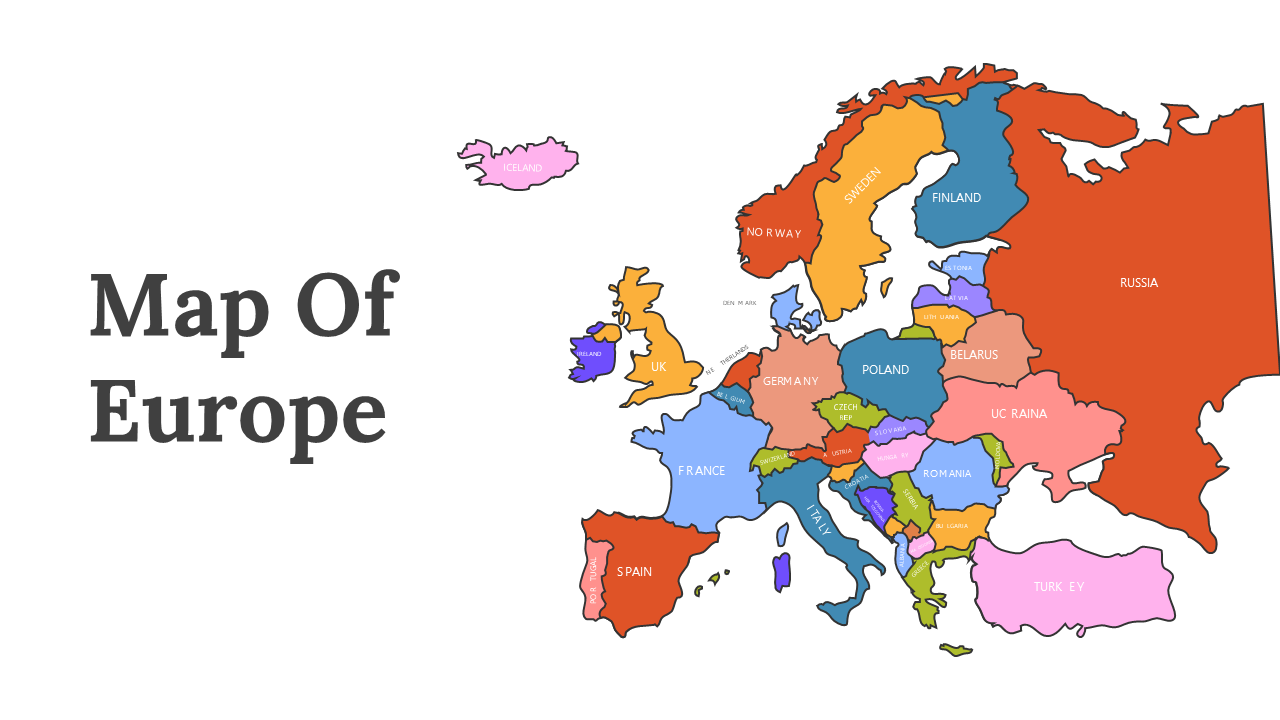
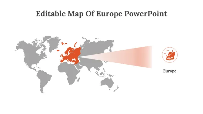
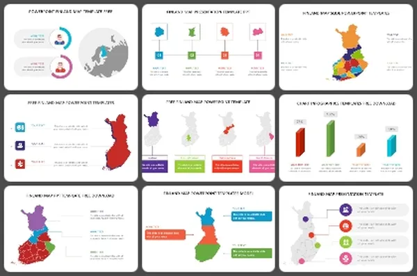
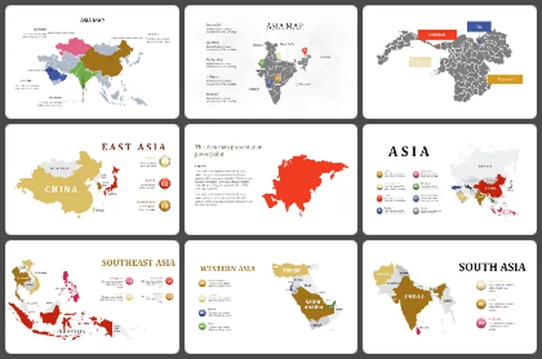
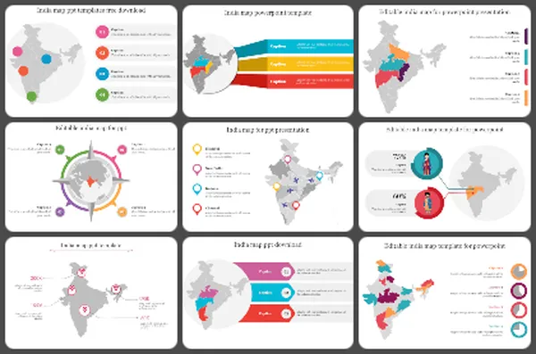
Editor's Choice (1 of5) –India Map With States PowerPoint


Related Collections
Frequently Asked Questions
1. How do I know when my customized map template is ready to present?
When someone unfamiliar with your topic looks at it and immediately understands: What geography is this? What's being shown? Why does it matter? If they need you to explain the map, it's not clear enough yet. Refine until the map speaks for itself. Your job is to support the map with your words, not explain what the map should already show clearly.
2. I have a map template but don't know where to start — how do I customize it for my specific locations?
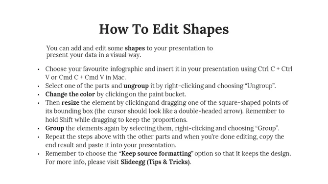
Open the template and identify what you need to change. If it's a US map and you need to highlight specific states, color those states. If it's a world map and you need to mark specific countries, add markers there. Start with what matters to YOUR message. Edit only what's necessary. Remove what doesn't apply. The template gives you the structure — you add your specific information.
3. How do I add my information to a map template so it's clear what I'm showing?
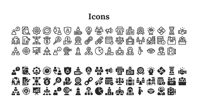
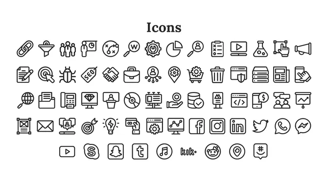
Use the template's built-in features — colors, labels, markers, shapes. If highlighting regions, use color-coding. If marking locations, use the marker tool. Add labels so people know what they're looking at. Keep it simple. Every element should answer a question: "What am I showing here?" If it doesn't serve that purpose, remove it.
4. My map template has too much detail for what I need — how do I simplify it?
Delete what doesn't matter to your message. If you only need three regions highlighted, hide or remove the others. If you don't need every city labeled, remove those labels. Templates give you options — use only what you need. A cleaner map is easier to understand. Don't feel obligated to use every element in the template.
5. How do I make sure my customized map template communicates clearly to my audience?
Add a title that explains what the map shows. Use a legend if you're using colors or symbols. Label important locations. Keep colors consistent — one color should mean the same thing throughout. Test it: Can someone understand your map in 5 seconds without explanation? If not, simplify further. Clarity comes from removing confusion, not adding information.
6. I'm using multiple maps in my presentation — how do I keep them consistent?
Use the same color scheme across all maps. If red means "high" in one map, red should mean "high" in all maps. Use the same font for labels. Consistent formatting helps your audience follow the story. They see the first map, understand the pattern, and understand subsequent maps faster. Consistency reduces cognitive load.
7. How do I edit the map template if I don't have design experience?
Templates are designed to be user-friendly. Most editing is drag-and-drop or click-to-change-color. You don't need design skills — just common sense. Click on what you want to change. Experiment. If you make a mistake, undo it. The template is there to support you, not confuse you. Start simple and add complexity only if needed.