Most business proposals lose the room before slide six. Not because the offer was wrong, but because the slide order was. The buyer wanted to know what problem you’d solve before you told them about your team, and what it cost before you walked them through your methodology. Get the order right, and the same offer reads as confident; get it wrong, and it reads as confused.
This is the slide-by-slide structure we recommend across sales pitches, partnership decks, and project proposals. It maps to how decision-makers actually read a deck — top to bottom, looking for the answer to their question, not yours. Use this as a starting point and adjust the count for your meeting length: 11 slides for a 30-minute first meeting, 14–18 if you’re going deeper.
Want a head start? Every slide below is built into our business proposal PowerPoint templates. Download a free starting point and edit the slides in the order shown — the structure is already done for you.
What’s inside
- Why slide order matters more than slide design
- The 11-slide structure (slide-by-slide)
- How the structure changes by use-case
- 5 mistakes that flatten a proposal deck
- How to tighten an over-long proposal
- Frequently asked questions
Why slide order matters more than slide design
A proposal deck is not a document. It’s a sequence of decisions you’re asking the buyer to make. Slide one earns the next thirty seconds. Slide two earns the next minute. By slide five, the buyer has either decided you understand them or quietly checked out and is now answering email.
That’s why the structure below leads with their world, not yours. Your team, your methodology, and your credentials only earn the buyer’s attention after you’ve shown you understand the problem they’re trying to solve. Reverse that order — which is what most templates do by accident — and the same content lands flat.
The single biggest improvement most proposals can make is moving the “About us” slide from slide three to slide eight. Buyers don’t care who you are until you’ve shown you understand them.
The 11-slide structure
Slide 1: Cover & client name
Their company name and logo, the proposal title, and the date. Yours small and at the bottom. The cover slide is the first signal of whether this proposal was written for them or recycled — make it unmistakably theirs.
- Key rule: the buyer’s name should be larger than yours on the cover. Always.
- Why it works: tells the buyer this is a custom proposal in the first three seconds. Generic-feeling covers cost you trust before you’ve earned the right to make a claim.
Slide 2: Executive summary
Three lines, no more. The problem you’re solving (one sentence). The solution you’re proposing (one sentence). The expected outcome (one sentence). If a senior buyer reads only this slide, they should be able to make a yes/no decision.
- Key rule: if you can’t write the executive summary in three sentences, you don’t yet understand the proposal you’re writing. Go back to discovery.
- Why it works: respects the senior reader’s time. Most decision-makers read this slide twice — once at the start and once before signing — and skip everything in between.
Slide 3: The client’s challenge
State the problem in their language, not yours. Quote the words they used in discovery calls if you can. Show you understand the cost of inaction — what stays broken if they don’t move forward.
- Key rule: if the buyer reads this slide and thinks “yes, that’s exactly it,” everything that follows lands. If they think “kind of, but…”, you’ve already lost ground.
- Why it works: proposals that lead with the buyer’s pain — accurately — outperform proposals that lead with the seller’s solution. Empathy is the cheapest competitive advantage in B2B.
Slide 4: Proposed solution
One headline that names the solution, three to five lines that describe it, and one visual that makes it concrete. Resist the urge to list every feature; this slide is about fit, not completeness. Details come later.
- Key rule: the buyer should be able to repeat your solution to a colleague after seeing this one slide.
- Why it works: a single clear solution slide is more persuasive than five feature slides. Compression is a credibility signal — it shows you’ve thought about what matters and what doesn’t.
Slide 5: Scope & deliverables
What’s in. What’s out. List the deliverables explicitly — services, artifacts, milestones. The “what’s out” line is the most underused tool in proposal writing: it pre-empts the scope-creep conversation that always happens later.
- Key rule: every “out of scope” line you write here saves an awkward email three months from now.
- Why it works: ambiguous scope is the single biggest cause of soured proposals. Writing the boundary in early signals professionalism — and protects both sides.
Slide 6: Timeline
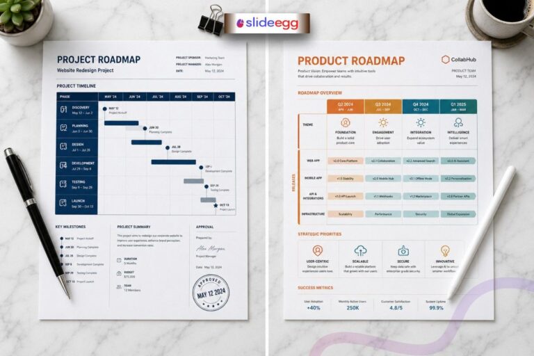
A simple Gantt chart or phase diagram that shows when each deliverable lands. Mark the buyer’s key dates (their launch, their event, their fiscal-year close) on the same chart so they see how your work maps to their calendar, not yours.
- Key rule: use the buyer’s milestones, not your project phases, as the visual anchor.
- Why it works: buyers approve proposals that fit their calendar. Showing you’ve already thought about their dates demonstrates ownership.
Slide 7: Pricing tiers
Three options if you can. Bronze/silver/gold or basic/standard/premium — whatever language fits your industry. The middle option should be where most buyers land. The high option exists to make the middle look reasonable; the low option exists to give buyers a face-saving way to negotiate.
- Key rule: never present a single price. Buyers anchored on one number negotiate down. Buyers presented with three options to compare and pick from.
- Why it works: three-tier pricing exploits a known psychological pattern (the compromise effect) without manipulating anyone. Buyers feel in control, and you protect your middle.
Slide 8: Team & credentials
Now introduce the people. Two or three named individuals with photos, titles, and a one-line statement of relevant experience. The buyer is no longer wondering whether you understand them — they’re wondering whether you can deliver. This slide answers that.
- Key rule: name people the buyer will actually work with. Generic agency-wide credentials feel like marketing; named team members feel like a commitment.
- Why it works: placed early, an “About us” slide feels like seller talk. Placed at slide eight, it feels like reassurance — the buyer is the one asking for it by now.
Slide 9: Social proof
One named client testimonial (with permission), or two case studies that match the buyer’s industry or problem shape. Logos alone don’t earn trust anymore — buyers know logos can be borrowed. Quotes with names and titles do.
- Key rule: a relevant case study from a smaller, similar buyer outperforms an irrelevant case study from a famous one.
- Why it works: trust transfers from the named, similar buyer onto your offer. Generic logo walls have stopped converting; specific stories still do.
Slide 10: Risks & mitigation
Two or three risks the buyer is privately worried about, named explicitly, with how you handle each. This slide does the most heavy lifting in the entire deck — and most proposals leave it out because it feels uncomfortable to write.
- Key rule: the risks they’re worried about, not the risks you’re worried about. If you don’t know what they are, you didn’t ask enough questions in discovery.
- Why it works: naming a risk first defuses it. If you don’t, the buyer will raise it after the meeting in private — and then it’s their objection, not your answer.
Slide 11: Next steps & CTA
Three concrete next steps with dates and owners. Not “let us know what you think” — that’s not a next step, it’s a hope. Something the buyer can actually do this week: a contract review meeting on Thursday, a kick-off call the following Tuesday, and a deliverable date.
- Key rule: the next step should require a calendar invite, not an email reply. Calendars commit; emails drift.
- Why it works: a vague “we’ll be in touch” close is the single biggest deal-killer in proposal decks. Specificity converts.
How the structure changes by use-case
The 11-slide order above is the default. Three buyer scenarios change it slightly:
| Use-case | Adjustments | Final slide count |
| Sales pitch (first meeting) | Trim risks/mitigation to a footnote on slide 10. Combine team + social proof if you’re tight on time. | 9–11 slides |
| Partnership proposal | Replace pricing-tier slide with a “shared value” slide showing what each partner contributes. Add a governance slide before next steps. | 11–13 slides |
| Project / agency proposal | Expand scope & deliverables to two slides (scope + detailed deliverables). Add a methodology slide between solution and timeline. | 13–15 slides |
| Formal RFP response | Expand to 25–40 slides with section dividers. Add company background, methodology, references, and pricing schedule sections. Order maps to RFP rubric, not the buyer’s natural read. | 25–40 slides |
5 mistakes that flatten a proposal deck
- Leading with “About us.” Buyers don’t care who you are until you’ve shown you understand them. Move it to slide 8.
- Hiding pricing. Pricing-on-request feels evasive in 2026. Show three tiers; the buyer expects it.
- One-tier pricing. A single number invites negotiation downward. Three tiers invite comparison across.
- No “what’s out of scope” line. Every line you don’t write becomes a renegotiation later. Write them now.
- Vague next steps. “We’ll be in touch” is not a close. Three dated, owner-assigned actions are.
How to tighten an over-long proposal
If your deck has crept past 18 slides for a sales pitch or 22 for a project proposal, the deck isn’t longer — the message is weaker. Three quick fixes:
- Combine duplicates. If two slides cover similar territory (e.g., “Methodology” and “Approach”), merge them. The reader is reading the same thing twice and you’re paying with attention.
- Move the appendix. Anything that supports the proposal but isn’t required to make a decision belongs at the back, not in the flow. Long bios, detailed statements of work, regulatory references — appendix.
- Cut every “this is important because…” If a slide can’t justify itself by being on screen, the explanation slide before it is doing the work the slide should be doing. Cut the explainer.
Compression is a credibility signal. Senior buyers read short proposals as “this person knows what matters” and long proposals as “this person doesn’t.”
Frequently asked questions
How many slides should a business proposal presentation actually have?
For a sales pitch, 11–15. For a partnership proposal, 11–13. For a project or agency proposal, 13–15. For a formal RFP response, 25–40 with section dividers. Match the depth to the meeting type — a 30-slide pitch deck feels long; a 12-slide RFP response feels sloppy.
What format should a business proposal presentation be in?
Send a PDF for the final read-only version (so the buyer can’t accidentally edit it) and a .pptx if your buyer may want to add comments or edit. For collaborative drafting, share via Google Slides. SlideEgg’s business proposal templates export cleanly to all three.
What’s the difference between a business proposal and a business plan?
A business proposal pitches a specific deal to a specific buyer (a sale, a partnership, a project). A business plan presents your overall company strategy to investors or internal stakeholders. Different audience, different content.
Where does the executive summary go — start or end?
Start. Slide 2. Senior buyers read the executive summary twice — once at the start and once before signing — and often skip the middle entirely. Putting it at the end is a holdover from written proposals; in a presentation, it belongs up front.
Should I include pricing in the deck or send it separately?
Include it. Slide 7. Buyers in 2026 read pricing-on-request as evasive. Three tiers is the convention; it gives the buyer something to compare across rather than negotiate down.
Do I need a separate appendix?
Only if you have content that supports the proposal but isn’t required to make the decision — long bios, detailed statements of work, regulatory references, technical specifications. Anything you’d be tempted to skip during the live presentation belongs at the back.
Skip the structure work — start from a template. Pick a free design, edit in PPT or Google Slides or Canva, and ship a polished deck today.