Slides are strange creatures. They promise precision, control, professionalism—but too often, they deliver monotony. I’ve watched managers, colleagues, and even friends pour their energy into perfect alignment, font size, and charts, only to see their audiences’ attention drift. And then I’ve seen the opposite—simple slides that hum with life. One small tweak—a hand-drawn arrow, a single icon, a brief story—changes everything. Suddenly, people lean in. They laugh. They remember.
Hours of careful alignment, carefully chosen fonts, and meticulously arranged charts could not replace the spark that made a presentation engaging. Even with technical preparation—like reviewing a CSWA practice test—clarity alone does not guarantee connection.
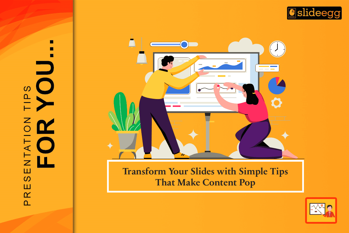
The Power of Simplicity
Take a new hire we once coached. She spent days creating a detailed flowchart of processes, meticulously checking every step. When she presented it, the room was polite but disengaged. The solution? She stripped it down, highlighted the key steps, and added one simple visual metaphor—a bridge connecting two points. Suddenly, her audience understood the flow instinctively.
Tips to Make Your Slides Pop
Here are small, human-centered techniques that make a big difference:
- One Idea per Slide: Don’t cram multiple concepts into a single frame. Give each idea its space to shine.
- Use Story Anchors: Add a short story, metaphor, or example. Humans remember narratives more than data.
- Visual Hierarchy Matters: Bold titles, contrasting colors, and consistent fonts guide attention naturally.
- White Space is Your Friend: A clutter-free slide feels lighter and more digestible.
- Engage Emotion: Humor, surprise, or curiosity can make a slide memorable.
- Practice Human Timing: Speak, pause, let the audience absorb—don’t rush.
Even small improvements in these areas create a noticeable impact. You don’t need flashy animations or complicated effects. Simple, thoughtful design often resonates more deeply.
When Voice Brings Slides to Life
A young employee preparing for her first client presentation rehearsed day after day. Her voice sounded precise but mechanical, her delivery more recital than storytelling. Her mentor suggested a small shift: “Explain your slides as if you were talking to a friend.”
The result was striking. The same words gained rhythm and warmth, the same data began to sound like insight rather than instruction. When she finally spoke before the client, her presence anchored the room.
The Real Pop Isn’t in Color
Organizations often chase presentation trends: bold palettes, cinematic transitions, moving charts. But a flash without foundation feels hollow. The true spark of engagement lies in something less visible — honesty.
During a high-stakes all-hands meeting, a team lead glanced at her slide deck mid-presentation and smiled. “Let’s be honest,” she said, looking around the room, “no one here has time to read all this text.” The crowd laughed, relieved. She cleared away half her slides within minutes and kept only a single title: What Actually Matters.
Designing for the Way People Look
Audiences rarely read. They scan. Keep one idea per slide, guide the eye, and choose colors that breathe rather than clash. For template ideas that help you implement these principles, SlideEgg is a great resource.
To make information resonate:
- Keep one idea per slide.
- Guide the eye, don’t challenge it.
- Choose colors that breathe rather than clash.
- Treat visuals as rhythm — a balance of silence and sound.
Slides are not essays. They are frames for thought. The best ones allow both the speaker and the audience to stay in sync. Seen from across the room, a good slide should feel like an open hand — simple, clear, and inviting.
When Simplicity Becomes Contagious
In one creative agency, a small internal initiative began to ripple outward. A few designers started replacing bar graphs with candid photos from project life — coffee stains, whiteboards, blurred laughter. Their presentations looked less “corporate” and more human.
Soon, other teams followed, inspired more by tone than template. Without any formal directive, meeting culture began to shift. Discussions turned conversational, not performative. Leaders noticed engagement rising, not because of data density, but because authenticity replaced pretense.
How Simplicity Speaks Louder Than Perfection
Audiences remember authenticity, not symmetry. The trick lies in tension—knowing when to pause, when to let silence carry meaning, when to strip away everything except the one line that matters.
One design consultant often compared slides to film editing: “You cut scenes not to remove material, but to reveal story.” Well-crafted presentations follow the same logic. They aim for emotional accuracy, not technical thoroughness.
The Human Brain Isn’t Built for Bullet Points
How audiences process visual information hasn’t changed much since the first cave drawings. The mind seeks patterns, not paragraphs. It finds comfort in sequence, space, and rhythm. Overloading a slide with text breaks that pattern and replaces curiosity with fatigue.
In one global company, trainers discovered a strange trend: participants remembered the jokes and pauses between topics more vividly than the graphs themselves. The laughter and silences created anchors in memory—moments where the brain registered meaning through emotion.
Emotional Honesty as a Design Element
Every slide carries emotional weight, whether acknowledged or not. Some express anxiety—crammed text, overcrowded visuals, everything justified and aligned to reassure the speaker. Others express confidence through restraint, curiosity through whitespace, empathy through visual balance.
Recognizing emotional tone turns design from decoration into dialogue. Good design, then, isn’t about tools or artistic skill. It’s about choice—what to keep, what to let go, and what to allow people to feel.
Beyond the Screen
The transformation of slides mirrors a larger truth about communication: clarity grows from empathy. Visual polish means little without the patience to understand what an audience needs to feel, not just know.
Each presentation carries emotion — anxiety, pride, anticipation, exhaustion. Recognizing that human undercurrent changes how a deck is built. It’s no longer about what looks professional, but about what feels real.
When presentations adopt that philosophy, meetings stop being obligations and start becoming conversations. The slides serve as quiet companions — there, but never overshadowing the voice that carries them.