Introduction
A well-designed pricing table is one of the most important parts of any business or marketing presentation. It helps customers or stakeholders quickly understand your offer and make decisions. But too often, pricing tables look messy, confusing, or too crowded. In this blog, you’ll learn practical and easy-to-follow PowerPoint tips to make your pricing tables clear, clean, and easy to understand.
What is a Pricing Table in PowerPoint?
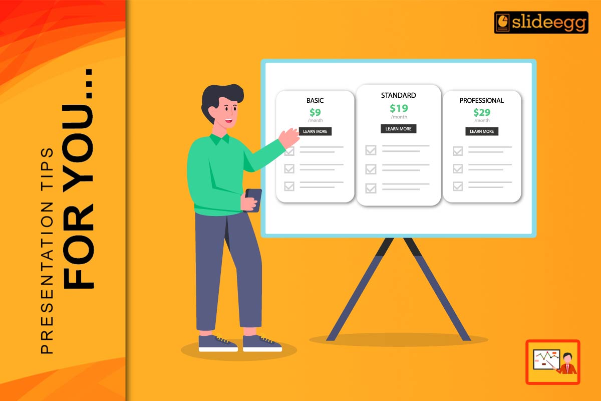
A pricing table is a slide that shows different packages, plans, or product prices side by side. These tables help compare features, benefits, and costs so the audience can quickly decide what suits them best.
A simple pricing table usually includes:
- Product or plan names (e.g., Basic, Standard, Premium)
- Price points (e.g., $9/mo, $29/mo)
- Feature lists under each plan
- A highlight or call-out to show the recommended plan
Pricing tables are mostly used in sales decks, SaaS product pitches, marketing proposals, or service comparisons.
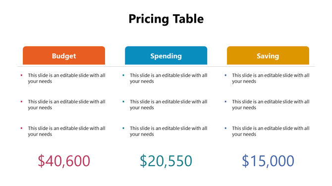
1. Use a Clean and Simple Layout
A cluttered layout can confuse your audience and take focus away from your message. A clean and simple layout allows the key information—like price and features—to stand out. This helps the viewer quickly scan and compare options without being overwhelmed.
Tips:
- Use 2–4 columns only
- Align content evenly inside each column
- Keep spacing consistent across the table
- Use lines or boxes to separate plans clearly
Why this works: A simple layout helps prevent information overload and creates a professional impression.
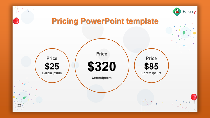
2. Use Bold Fonts and Sizes for Price Points
Your price is one of the most important pieces of information. Make it impossible to miss by using bold fonts and larger sizes. This creates a visual hierarchy that draws the eye directly to the cost, making comparison easier.
Tips:
- Increase the font size of the price
- Use bold or highlight colors for the price
- Keep the currency symbol smaller and neat
Why this works: The eye naturally goes to the boldest item. Highlighting the price helps users compare quickly.
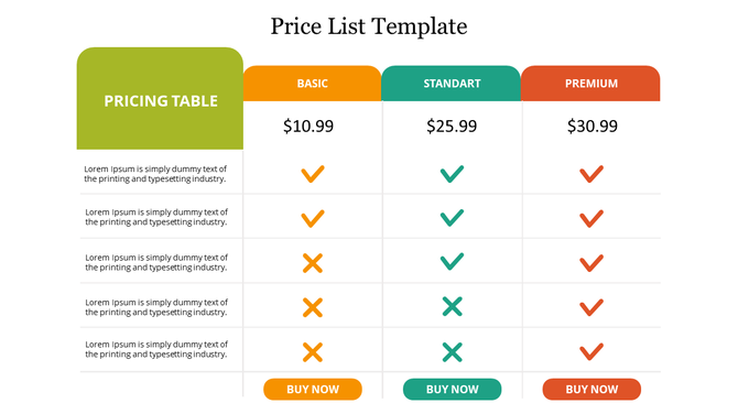
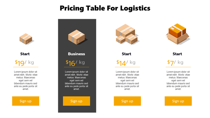
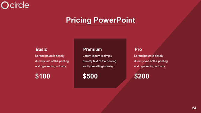
3. Highlight the Recommended or Popular Plan
Guide your audience toward a specific plan by visually highlighting it. This reduces hesitation and helps speed up decision-making. A standout design element can make one plan feel like the obvious choice.
Tips:
- Use a different background color for the recommended plan
- Add a label like “Most Popular” or “Best Value”
- Use a drop shadow or raised effect to make it stand out
Why this works: Visual cues guide decision-making and make one option appear more attractive.
4. Use Icons or Checkmarks for Features
Icons make your table easier to scan and understand. Instead of long descriptions, symbols like checkmarks simplify your message and keep the design clean. This is especially useful when comparing multiple plans.
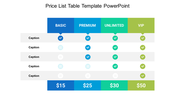
Tips:
- Use checkmarks for available features
- Use dashes or blanks for unavailable ones
- Use simple icons that match your theme
Why this works: Icons create visual consistency, save space, and increase clarity.
5. Keep Feature Descriptions Short
Lengthy text can make your table look cluttered. Short feature descriptions ensure your audience grasps the benefits quickly. Consistent formatting across rows also keeps the design tidy and easy to follow.
Tips:
- Use 1–3 words per feature
- Avoid technical jargon
- Make all feature rows the same height
Why this works: Short, consistent text helps your audience understand the content faster and reduces cognitive load.
6. Use Contrast for Better Visibility
Contrast improves readability, especially when your presentation is viewed from a distance or on a projector. Poor contrast can hide important details and frustrate your audience.
Tips:
- Use dark text on a light background or vice versa
- Avoid using too many colors in one slide
- Test your slide from a distance
Why this works: Strong contrast ensures that your content is clear and accessible to everyone.
Where to Get Pricing Table Templates
If designing from scratch feels overwhelming, use ready-made Pricing Table Templates to speed up your process. These templates are designed for clarity and ease of use. Also, take a look at how to create and format tables in PowerPoint effortlessly.
Look for templates that offer:
- Multiple layout styles
- Easy-to-edit pricing blocks
- Matching color themes
- Device and service compatibility
Why this helps: Templates save time, ensure consistency, and make your slides look polished and professional.
Conclusion
Pricing tables can either make or break your pitch. When done right, they help your audience understand your offers quickly and take action. Use clean design, bold pricing, short feature lists, and clear calls-to-action to guide your audience. With these PowerPoint tips, you’ll be able to turn your pricing table into a powerful slide that sells your offer clearly and confidently.
FAQs
1. What is the best layout for a pricing table in PowerPoint?
Use 2–4 columns with consistent spacing and bold price text to ensure readability.
2. How do I highlight one pricing option?
Use a different background color, label it as “Most Popular,” or add effects like shadows to draw attention.
3. Can I use icons in a pricing table?
Yes! Icons and checkmarks make it easy for viewers to scan and compare features.
4. Should I include a CTA with my pricing table?
Absolutely. A CTA like “Choose Plan” helps guide users to take the next step.
5. Where can I find pricing table templates?
You can find customizable PowerPoint templates online that fit various business needs.