
Introduction: A Story That Shows the Power of Good Design
Let me tell you a real-like story.
Ravi had a brilliant startup idea — organic fruit delivery. He made a pitch deck with 20 slides full of text, small fonts, and no visuals. The idea was good, but investors were lost. He didn’t get any funds.
A month later, he redesigned his pitch deck. Fewer slides. Bigger fonts. Nice icons. Clear message. This time, he raised ₹5 lakh in funding.
So what changed?
The design.
A good pitch deck is not just about what you say — it’s also how you show it. This blog will teach you how to design a pitch deck that looks professional, flows like a story, and makes investors say yes.
What Is a Pitch Deck and Why Is Design So Important?
A pitch deck is a short slideshow that explains your business idea to investors. It’s like your business brochure + story + plan — all in 10 to 15 slides.

But here’s the key: Investors judge your idea by how your deck is designed. If it’s messy, confusing, or boring — even a great idea may be rejected. If it’s clean, smart, and clear — even a simple idea can shine.
So, a well-designed pitch deck helps you:
- Build trust
- Show clarity
- Prove professionalism
- Make your idea easy to understand
What Does “Good Design” Mean in a Pitch Deck?
Good design is not about fancy colors or expensive software. It’s about clear structure, visual balance, and simple storytelling.
Here are the key qualities of a well-designed pitch deck:
✅ 1. Simple and Focused Layout
- Use 1 idea per slide
- Keep slides light with plenty of space (white space)
- Avoid paragraphs — use bullet points or 1-liners
✅ 2. Readable Fonts
- Font size: 24pt or larger
- Use easy-to-read fonts (Arial, Roboto, Calibri)
- Don’t use more than 2 fonts
✅ 3. Consistent Colors and Theme
- Stick to 2–3 brand colors
- Use the same layout on all slides
- Choose light background with dark text (or reverse)
✅ 4. Visual Support
- Add product images, icons, charts
- Replace text blocks with visuals
- Use screenshots or photos if available
✅ 5. Clear Flow (Storytelling)
- Slides should follow a logical order
- Every slide should lead to the next one naturally
- Build a beginning, middle, and end like a story
How Should a Winning Pitch Deck Be Structured?
Here’s the best structure for a business pitch deck — not just what to include, but also how to design each slide to make a strong impression on investors.
Most founders use PowerPoint Slides or Google Slides to design their pitch deck. If you’re using PowerPoint, it’s important to keep your design clean, modern, and professional. PowerPoint has many built-in themes, layouts, icons, and charts. Pick one layout and stick to it.
PowerPoint Slide Design Tips:
- Use Slide Master to set a clean and consistent theme
- Use Title + Content layout for most slides — it looks neat
- Add SmartArt or icons to represent your points visually
- Use Animations very lightly (e.g., Fade or Appear only)
- Save the final version as a PDF before sharing
With PowerPoint, you can also embed simple charts, images, and logos easily. Just remember — less is more. White space, clarity, and structure are more important than flashy effects.
Now let’s break down the ideal structure — slide by slide.
1. Title Slide – The First Look at Your Business
This is the opening slide of your pitch deck. It creates the first impression in the mind of the investor. The title slide tells them your company’s name, what you do, and who is presenting. It sets the stage and shows that you are professional.

What to include:
- Company name and logo
- One-line tagline
- Your name, contact info, location, and date
2. Problem Slide – Explaining the Real Pain Point
This slide shows the problem your product is solving. Investors need to know if there is a real demand. If there is no big problem, then there is no need for a solution. So, this slide proves that your business matters.

What to include:
- A short real-life story
- One or two strong facts
- Show that the problem is widespread
✅ Example:
“70% of Indian families don’t trust fruits from markets due to chemical usage.”
3. Solution Slide – How You Solve the Problem
Once the problem is clear, now show your unique solution. This slide tells the investor what your product or service is, and how it helps people. The goal is to make the investor say, “This makes sense.”

What to include:
- What is your product or service?
- How does it fix the problem?
- Keep it simple with visuals or a short demo
✅ Example:
“Farm Fresh delivers fresh, chemical-free fruits directly from farms within 24 hours.”
4. Market Opportunity Slide – Showing the Size of the Business
This slide explains how big the market is for your product. If the market is large and growing, investors feel there’s good potential. It also shows who your customers are and how many people need your product.

What to include:
- Total market size (TAM, SAM, SOM if possible)
- Growth rate (e.g., 12% per year)
- Customer segment (age, place, interest)
✅ Example:
- ₹12,000 Cr fruit delivery market
- 12% annual growth
- Target: urban families aged 25–45
5. Business Model Slide – Explaining How You Will Make Money
This is one of the most important slides. It explains how you plan to earn revenue and grow profit. Investors want to see a clear way your company will make money.
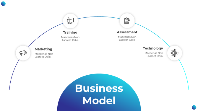
What to include:
- Pricing plan (monthly fee, one-time purchase, etc.)
- Income sources (product sales, subscriptions)
- Profit margins or cost structure (if possible)
✅ Example:
- Subscription: ₹499/month
- Avg profit per user: ₹120
- Gross margin: 60%
6. Traction Slide – Proving Your Idea is Working
This slide shows the results you’ve already achieved. Investors love progress. It builds trust. Even small numbers can impress if they show growth or user love.
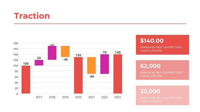
What to include:
- Number of users, customers, or revenue
- Media mentions or partnerships
- Charts showing growth or testimonials
✅ Example:
- 4,200 paid users in 6 months
- ₹3.5 lakh revenue in Q1 2025
- Partnered with 10 local farms
7. Go-To-Market Slide – How You Will Reach Your Customers
Having a good product is not enough. You need to reach people. This slide shows how you plan to promote and sell your product. Investors want to see that you have a smart growth strategy.
What to include:
- Marketing channels (Instagram, YouTube, offline stores)
- Launch location and plan
- Referral plans, partnerships
✅ Example:
- Influencer campaigns
- 5,000 signups from digital ads in 3 months
- Tie-ups with dieticians and local farmers
8. Team Slide – Who is Behind the Business
This slide introduces your core team. Investors often decide based on whether the team is capable, experienced, and passionate. They want to trust the people running the company.

What to include:
- Names, photos, and roles of key team members
- 1-line background (past jobs, skills)
- Mentors or advisors (if any)
✅ Example:
- Ravi Kumar – Founder, Ex-IT Engineer turned organic farmer
- Deepa Sharma – 5 yrs experience in FMCG marketing
- Advisor – Rajat Jain, former CEO of FreshCart
9. Financials Slide – Showing Your Money Plan
This slide gives a simple overview of your financial forecast. It doesn’t need to be too detailed. Just show that you’ve thought about costs, revenue, and profit.
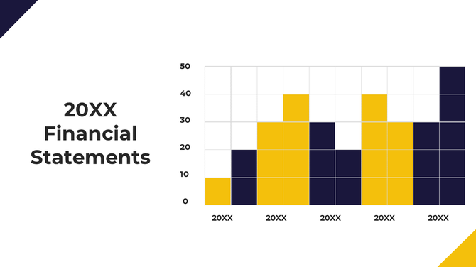
What to include:
- 3-year revenue and cost forecast
- Profit or break-even year
- Major spending areas
✅ Example:
| Year | Revenue | Expenses | Profit |
| 2025 | ₹12 L | ₹9 L | ₹3 L |
| 2026 | ₹36 L | ₹22 L | ₹14 L |
| 2027 | ₹60 L | ₹35 L | ₹25 L |
10. Ask Slide – What You Need From Investors
This final slide clearly tells the investor how much money you are raising and what it will be used for. It should be specific and confident.
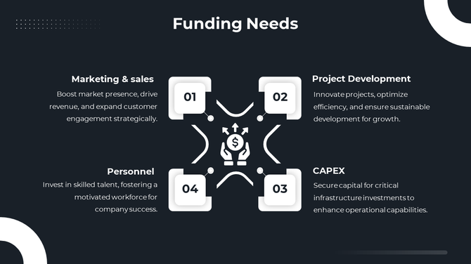
What to include:
- Funding amount (ex: ₹50 lakh)
- How you will use the funds (tech, marketing, hiring)
- Optional: Equity offered
✅ Example:
- Ask: ₹50 lakh
- Use: 40% tech, 30% marketing, 30% hiring
- Offering: 10% equity (optional)
🧠 How to Practice Before Meeting an Investor?
Just having a pitch deck is not enough. You must present it with confidence.
Practice tips:
- Pitch in front of friends and ask for feedback
- Record yourself to improve tone and speed
- Keep it under 10 minutes
- Know your numbers — don’t read from slides
- Be ready to answer tough questions
Common Mistakes to Avoid in Your Pitch Deck
Many founders make simple errors that reduce their chances.
Don’t do this:
- Too much text on slides
- No clear funding request
- Unrealistic revenue promises
- Slides with spelling or grammar mistakes
- Using more than 3 fonts or too many colors
Bonus: Design Checklist Before You Send Your Deck
Before you send or show your pitch deck, make sure:
✅ All slides have the same font and color theme
✅ Font size is large and readable
✅ Visuals are not blurry or stretched
✅ No grammar/spelling mistakes
✅ Slides look good on both desktop and mobile
✅ File is under 10MB (for email sharing)
Conclusion: Design Can Win or Lose Your Investor
Design is not decoration — it’s communication.
A good pitch deck design tells your story clearly, shows your value quickly, and builds trust with your investors. Don’t let poor layout, small fonts, or unclear flow ruin your chance.
And if you feel your slides don’t look polished or professional enough, it’s okay to get help. Many startups today choose a pitch deck design service to turn their ideas into clean, investor-ready slides. It’s a small investment that can make a big difference in your next funding round.
With the right content and smart design, your pitch deck can open the door to big opportunities.
FAQs – Simple Answers to Common Questions
1. What tool should I use to design my pitch deck?
Canva, Google Slides, or PowerPoint are all great for clean, easy design.
2. Can I use a template?
Yes, but customize it to your brand colors and content.
3. Should I send a PDF version?
Yes. Always send the PDF — it’s easier to open and keeps the design intact.
4. Can I use animations?
Avoid heavy animations. Keep transitions smooth and minimal.
5. How many slides is too much?
10–12 slides are ideal. Never go beyond 15 unless requested.