PowerPoint Map Presentation - Cango Democratic Map

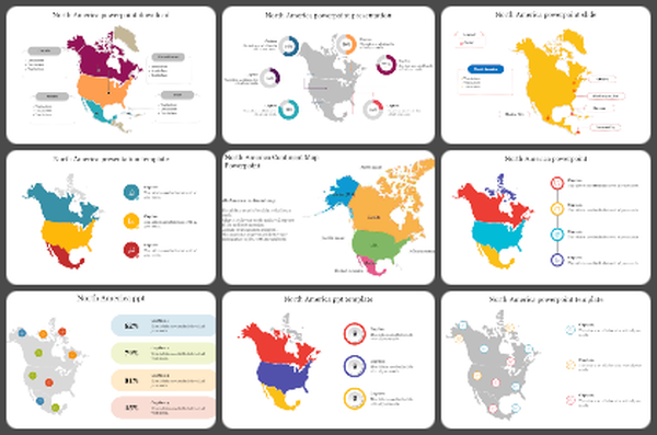
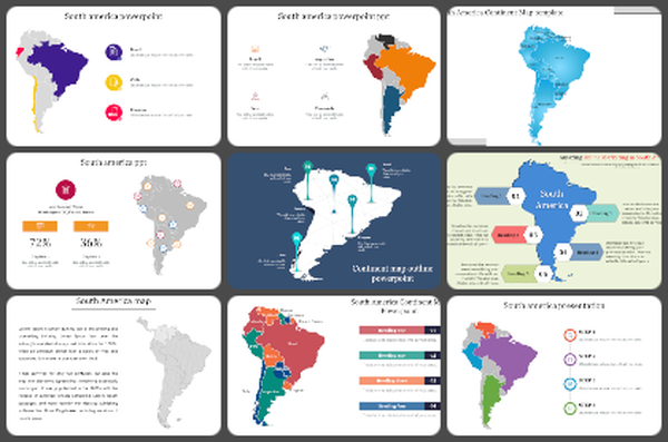
Maps PowerPoint Template and Google Slides Themes
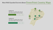
Introducing our Maps PowerPoint Template and Google Slides Themes, crafted to elevate your presentations with geographic precision. This template features a detailed map of the Democratic Republic of Congo, divided into three distinct regions highlighted in different colors, each with a dedicated caption text area.
Ideal for educators, researchers, geographers, and business analysts, this template enables clear and insightful presentations on regional demographics, market analysis, or geographic studies. Utilize active voice and concrete language to engage your audience seamlessly, emphasizing the template's user-friendly customization options. Enhance your presentations with compelling visuals and strategic insights, ensuring your content resonates effectively and leaves a lasting impact.
Features of this template:
- 100 % customizable slides are easy to download.
- Slides are available in different nodes and colors.
- The slide was contained in 16:9 and 4:3 formats.
- It is easy to change the slide colors quickly.
- Well-crafted template with an instant download facility.
- The clear layout of this template will help you design a professional-looking presentation.
- The multi-color visuals on this slide will make your presentation eye-catching.
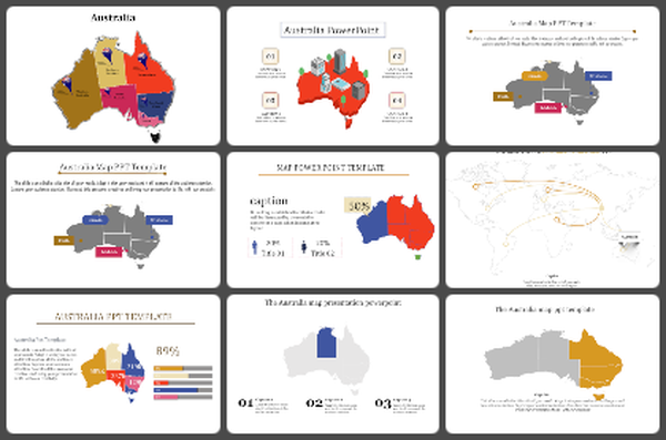
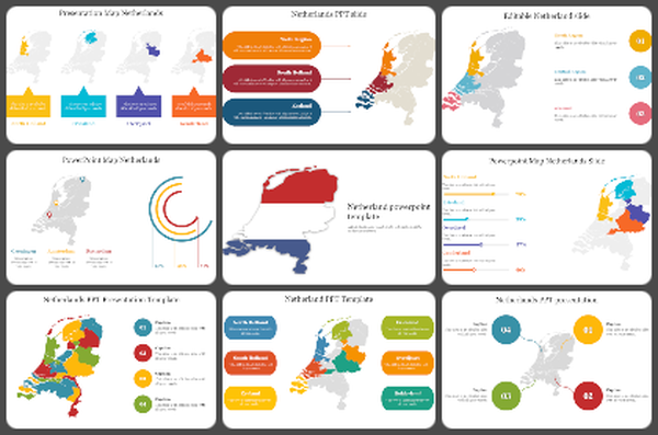
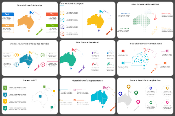
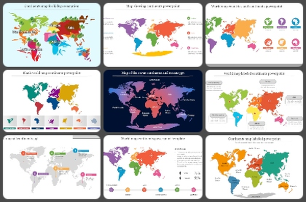
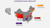
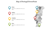
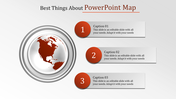
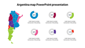
You May Also Like These PowerPoint Templates
Add to Wishlist
Download
Edit

Add to Wishlist
Download
Edit


Add to Wishlist
Download
Edit

Add to Wishlist
Download
Edit

Add to Wishlist
Download
Edit

Add to Wishlist
Download
Edit

Add to Wishlist
Download
Edit

Add to Wishlist
Download
Edit

Add to Wishlist
Download
Edit

Add to Wishlist
Download
Edit

Add to Wishlist
Download
Edit


Add to Wishlist
Download
Edit

Add to Wishlist
Download
Edit

Add to Wishlist
Download
Edit

Add to Wishlist
Download
Edit

Add to Wishlist
Download
Edit

Add to Wishlist
Download
Edit
