Download our Premium Collection of Infographic PPT

 Canva
Canva
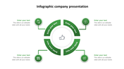
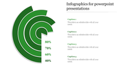
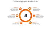
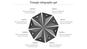


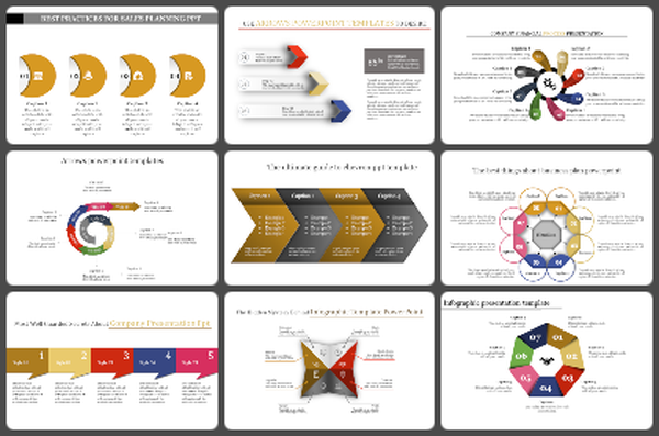
PowerPoint Pie Chart Design and Usage
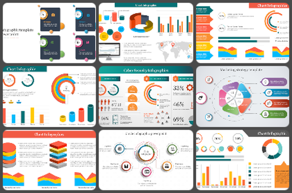
Nowadays, most infographic presentations are now done in Infographic PowerPoint or Adobe PowerPoint. However, back in the days, people would make the presentation in a different method. One of these methods is by creating graphs and charts. These days, the best ways to use PowerPoint and Infographic PowerPoint would be through the free option of creating your PowerPoint slideshow using a template. First, let us understand a little about the pie chart. In this form of graphic representation, the distribution of a set of numbers is shown in a large circle. A pie chart can also be made by filling a solid circle with numbers representing the points for the groups of people being shown. In this form of the pie chart, the size of the circle would depend on the number of people in each group. For a small number of points, the circles would be smaller in diameter. On the other hand, if there are several points, the circle would be more significant in diameter. Also, these circles can have a width of a few inches or even several inches.
If you want to create a pie chart in such a manner, you can use other shapes like line, lines, bar, disc, semi-circle, and different shapes designed to be used with this concept. Another way to show a pie chart is by creating a bar chart. In this form of a chart, you would also fill a solid circle with the points of the groups that are being shown. But, the point of this version is to display the relative sizes of the groups. So, in this form of a chart, the circle would be the only element that is filled. The axis can also be useful to show the relative sizes of groups. However, the axes should be appropriately designed so that they will be displayed properly. There should be equal width on both the axes so that it will appear like one continuous axis. The height of the axes should also be equal so that it will look appealing and attractive. Another way to show a pie chart is by using dots. A dot can be made by displaying two dots separated by a line. It would then appear like two points on the chart. Now, dots are also considered as bars in this case. If you want to create a pie chart in PowerPoint or Infographic PowerPoint, you should learn about the steps to make the chart. Start creating a chart for your presentation today!
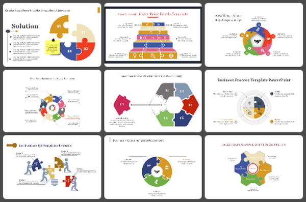
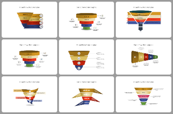
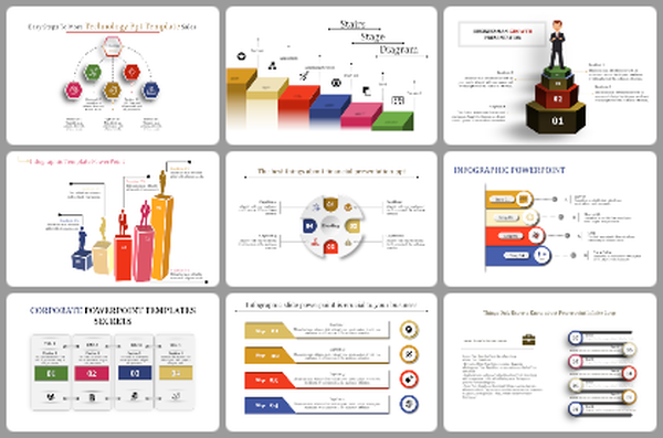
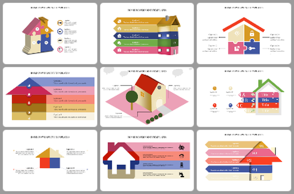
You May Also Like These PowerPoint Templates
Free
Add to Wishlist
Download
AI Customize

Add to Wishlist
Download
AI Customize

Add to Wishlist
Download
AI Customize


Add to Wishlist
Download
AI Customize


Add to Wishlist
Download
AI Customize

Add to Wishlist
Download
AI Customize


Add to Wishlist
Download
AI Customize

Add to Wishlist
Download
AI Customize


Free
Add to Wishlist
Download
AI Customize

Add to Wishlist
Download
AI Customize

Add to Wishlist
Download
AI Customize


Add to Wishlist
Download
AI Customize

Add to Wishlist
Download
AI Customize

Add to Wishlist
Download
AI Customize

Add to Wishlist
Download
AI Customize
