Many people spend hours making their first slide look perfect. They want to make a great first impression. But did you know that the last slide is actually the most important? In public speaking, we call this the “Peak-End Rule.” This means people remember how they felt at the very end of your talk more than anything else.
If you end with a boring, blank screen, your audience will forget your message. But if you end with one of the best Thank You PowerPoint templates, you can turn a simple “goodbye” into a big opportunity.
In 2026, a “Thank You” slide is not just about being polite. It is a growth tool. It is your chance to get more followers, more emails, and more business deals. At SlideEgg, we have built a massive collection to help you finish your talk like a star.
The 2026 Strategy: 3 Modern Rules for Closing
Before we look at the slides, you need to know how the “pros” close their talks today. Whether you are on a stage or a Zoom call, follow these three rules:
1. The Scan-to-Action Rule
In the past, people tried to write down phone numbers from the screen. In 2026, nobody will do that. The new standard is a large QR Code in the center of your slide. When you show your “Thanks” slide, your audience should be able to hold up their phones and scan it instantly. This can link to your LinkedIn, your website, or a free gift.
2. The “Next Step” Visualization
Don’t just ask, “Are there any questions?” That is too passive. Instead, show a slide that tells them exactly what to do next. If you are selling something, show the “Start Date.” If you are a teacher, show the “Home Task.” This keeps the audience thinking about the future, not just the talk that just ended.
3. The Virtual Meeting “Safe Zone.”
If you are presenting on Zoom or Microsoft Teams, your video bubble often covers the corners of your slide. If you put your email in the bottom right corner, it will be hidden! You must place your contact info in the “Safe Zones”, usually the left or right third of the slide, to make sure everyone can see it.
A Deep Dive into Our Top Thanks Templates
Choosing the right design is not just about picking a pretty picture. It is about matching your message. Here is a closer look at our favorite templates and exactly why they will work for you:
1. The Digital Business Card (Best for Networking)

The PPT Thank You Page is the ultimate choice for the digital age. It features clean, organized spots for social media icons and your professional email address.
- Why it works: It acts as a one-stop shop for your digital identity. Instead of overwhelming people with a long list of links, it organizes your handles into a neat, readable grid.
- Pro Tip: Place a large, high-contrast QR code right in the center. This turns your slide into a bridge that connects your live audience to your online profile in three seconds.
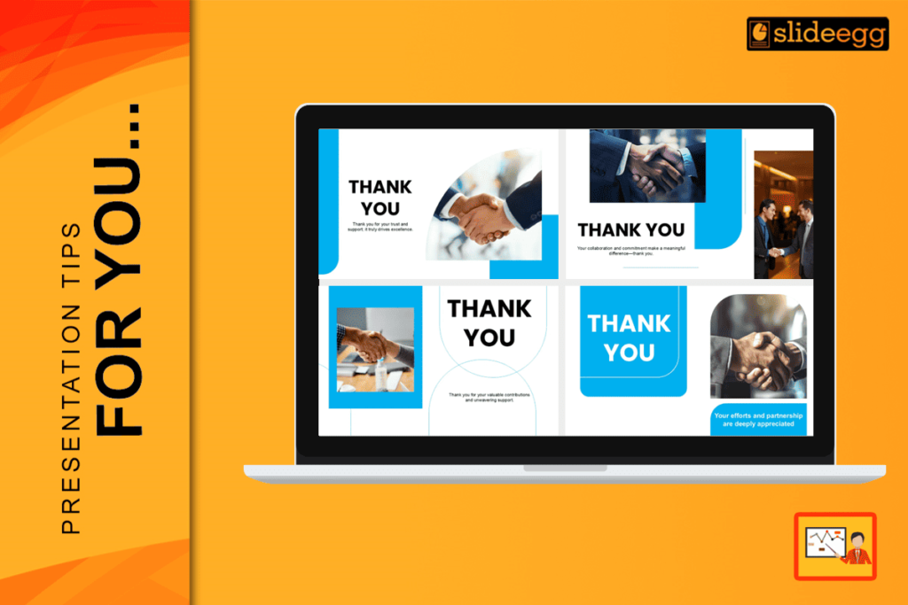
2. The Professional Trust-Builder (Best for High-Stakes Business)

The Thank You Pics for PPT uses high-quality imagery, such as a professional handshake, to signal a successful partnership.
- Why it works: Human connection is vital in business. Seeing a handshake creates a “psychological close,” making your audience feel that a deal is done and trust has been built.
- Pro Tip: This is the #1 choice for banking, real estate, or high-level sales pitches. Use it when you want your last impression to be one of credibility and strength.
3. The Ice-Breaker (Best for Q&A Sessions)
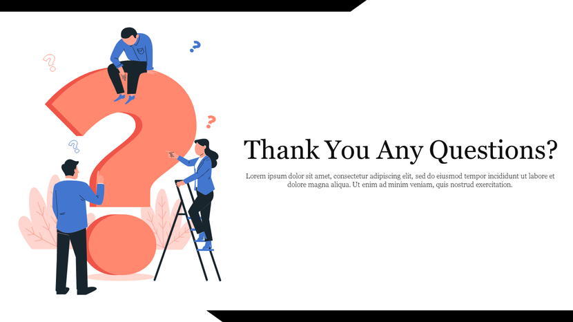
The Thank You, Any Questions slide uses friendly 3D graphics and warm colors to open the floor for discussion.
- Why it works: Most people are shy and afraid to ask the first question. This slide uses soft, inviting shapes and a big question mark to signal that the room is a “safe space” for curiosity.
- Pro Tip: Teachers and students love this design. It changes the mood from “listening to a lecture” to “having a conversation.”
4. The Minimalist Tech Frame (Best for Modern Startups)

The Diamond Frame Thank You Slide is sharp, geometric, and very clean.
- Why it works: Modern tech companies love minimalism. The diamond shape creates a “focal point” that draws the eye directly to your thank you message without any distracting “visual noise.”
- Pro Tip: If you are pitching a new app or a software tool, this is your slide. It tells the audience that your brand is efficient, modern, and high-tech.
5. The “Big Hall” Visibility Slide (Best for Events)

The Modern Thanks Slide uses very high contrast, typically featuring bold blue and white color schemes.
- Why it works: On a large projector screen in a bright room, light colors can “wash out.” This design uses deep, saturated tones to ensure your text stays sharp and readable even from the back row.
- Pro Tip: Use this for keynote speeches or large conferences. Ensure your email address is at least 32 pt so that people sitting 50 feet away can still read it.
6. The Clean Corporate Finish (Best for Office Meetings)

The Standard Professional Slide is simple, powerful, and very direct.
- Why it works: In a corporate board meeting, you don’t want flashy art. You want clarity. This slide provides a neat, empty space where you can list the date for the next meeting or the “Next Step” milestone.
- Pro Tip: Use the extra space on this slide to write: “Project Kickoff: March 1st.” It shifts the audience’s mind from the past talk to future action.
7. The Strategic Partnership (Best for High-Stakes Closing)

The HD Professional Thank You Slide features a bold, dark-themed handshake with vibrant orange geometric accents.
- Why it works: The combination of black and orange creates an immediate psychological sense of authority and energy. The handshake is positioned in the center-right, using the “Rule of Thirds” to create a strong visual anchor for the eyes.
- Strategic Use: This is the ultimate choice for B2B sales, project handovers, or partnership agreements. It visually signals that the “deal is done” and the next phase of work is beginning.
- 2026 Pro Tip: The dark background is perfect for high-contrast white QR codes. Place your QR code in the bottom-right orange block to guide the viewer’s eyes directly toward your call to action.
How to Make Your Last Slide Work Harder
Once you pick a template, follow these simple tips to make it perfect:
- Check the Size: Your “THANK YOU” should be 64–96 pt. Your email should be 28–32 pt.
- Contrast is Key: Use dark text on a light background. Never use “soft” colors like light grey; they are too hard to see on a projector.
- One Goal per Slide: Don’t ask them to follow you on 5 different apps. Pick one (like LinkedIn) and make that the main goal.
Common Questions People Ask (FAQ)
1. How do I handle “dead air” if nobody asks a question?
Don’t let the room stay silent! Ask your audience to drop a specific emoji in the chat (if online) or raise their hands if they want you to send them the slide deck. This gives you their contact info instantly.
2. Should I put my phone number on the last slide?
Only if you want people to call you. In 2026, a LinkedIn QR code will be much safer and more professional for building a network.
3. Can I use a “funny” closing slide?
It is better to stay professional. A clean and smart design is always the safer choice for your brand and your reputation.
4. Where should the QR code go?
Put it in the center-left or center-right. Avoid the very corners, as some screens might cut off the edges, making the code impossible to scan.
Conclusion
Every great talk deserves a great ending. Don’t let your presentation be a “dead end” where people just walk away and forget you. By using one of the best Thank You PowerPoint templates, you turn a polite goodbye into a powerful way to grow your network.
Ready to be remembered? Explore the full Thanks PowerPoint Templates collection on SlideEgg here!