Most presenters treat the “Thank You” slide as an afterthought. They drop in a generic stock image, type “Questions?”, and call it a day. This is a missed opportunity.
Your final slide is often the longest-running slide in your entire deck. It sits on the screen for 10, 15, or even 20 minutes while you answer questions or chat with the room. It is the backdrop to your final impression.
A high-performance closing slide doesn’t just say goodbye; it drives the next action. Whether you want to secure a meeting, drive a download, or simply get connected on LinkedIn, your design dictates the result.
This guide covers exactly how to design a Thank You Slide that works, including 5 specific layouts and the technical rules for professional typography.
The Strategy: What is the Goal of the Last Slide?
Before you open PowerPoint, stop designing. Start strategizing.
If you try to do everything (ask for questions, show email, show phone, show a QR code, and show a quote), the slide becomes a cluttered mess. The audience will ignore it.
Pick ONE primary goal for your ending:
- Connection: You want them to email or add you on LinkedIn.
- Action: You want them to download a report or sign a contract.
- Discussion: You want to spark a Q&A session.
- Impact: You want to leave them with a powerful closing thought.
Once you have a goal, choose the layout below that matches it.
5 Proven Thank You Slide Layouts (With Examples)
Don’t guess at the design. Use one of these five standard formats used by professional slide designers.
1. The “Q&A First” Layout
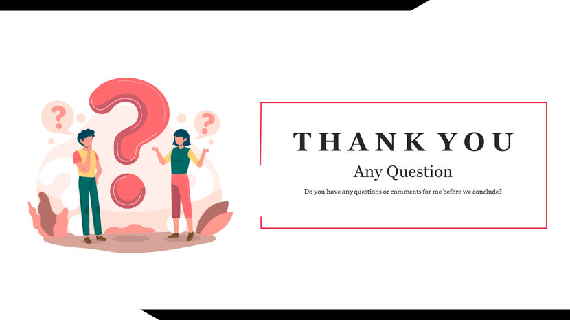
When the immediate next step is discussion, make the invitation big and bold. Do not hide “Questions?” in the corner. Make it the headline.
- Design Rule: Center alignment.
- Key Element: Large, inviting text (60pt+).
- Best for: Live presentations, workshops, and training.
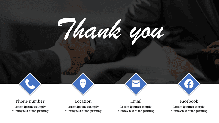
2. The “Contact Card” Layout

This mimics a digital business card. It creates a clear visual hierarchy that guides the eye directly to the contact information.
- Design Rule: Split screen (Left/Right) or strong left alignment.
- Key Element: Icons to denote Email, Phone, and LinkedIn.
- Best for: Sales decks, client proposals, and networking.
3. The “Next Steps” Layout
If you end a project update with “Thank You,” you confuse the stakeholders. End with “Next Steps” to drive the project forward.
- Design Rule: Bullet points with generous spacing.
- Key Element: Action verbs (e.g., “Approve budget,” “Schedule Kick-off”).
- Best for: Internal meetings, project updates, and approvals.
4. The “Resource Link” Layout

If you promised a PDF, a checklist, or a copy of the slides, this is the format to use.
- Design Rule: The QR code must be the “Hero” of the slide.
- Pro Tip: Your QR code must appear at least 2 feet wide on the projector screen, or 2 inches on a shared laptop screen, to be scannable from the back row.
- Best for: Webinars, keynotes, and lead generation.
5. The “Impact Statement” Layout
Sometimes, the best contact info is no contact info. If you want the audience to sit with an idea, display it on the screen.
- Design Rule: Dark background, White text. High contrast.
- Key Element: A quote or a final summary statement.
- Best for: Inspirational speeches and Ted-style talks.
Technical Specs: How to Make It Look Professional
Amateur slides look messy because they ignore basic design principles. Follow these rules to ensure your slide looks like it was made by a pro.
1. Typography Hierarchy
Your audience is tired. Do not make them squint. Use the 24/44 Rule:
- Headlines: Must be 44pt–60pt.
- Body Text: Must be 24pt–32pt.
- Avoid: Anything smaller than 18pt. It is invisible on a projector.
2. The “Breathing Room” Rule
Clutter destroys credibility. A “Thank You” slide should feel open.
- Bad: Putting your full office address, 4 social media handles, a disclaimer, and a logo on one slide.
- Good: Name, Email, LinkedIn. That’s it.
3. QR Codes Done Right
QR codes are powerful, but only if they work.
- Contrast: Always put a black QR code on a white background (or white on black). Do not place a QR code over a photo; cameras cannot scan it.
- Link Shorteners: Don’t link to a 5-line URL. Use a short link so the QR code pattern is simple and scans faster.
What To Avoid (Common Mistakes)
- The “End of Show” Black Screen: Never end your deck without a final slide. It feels abrupt.
- The “Cliché Handshake”: Avoid using stock photos of two people shaking hands. It looks dated and corporate.
- Poor Contrast: Do not put gray text on a white background. It is unreadable in a bright meeting room.
- Orphans: Don’t leave a single word dangling on a new line. Fix your text box width.
Final Checklist: Before You Present
Before you step on stage, look at your final slide and ask these 3 questions:
- The Squint Test: If you squint your eyes, can you still read the email address?
- The Link Test: Does the QR code actually work? (Test it on your phone now.
- The Goal Test: Does the slide clearly tell the audience what to do next?
A great Thank You slide is the bridge between your presentation and a lasting relationship. Keep it simple, keep it actionable, and design it with intent.
Conclusion: Design for the Consequence, Not Just the End
Your Thank You slide isn’t just a polite ending; it is a strategic business tool. It is the visual anchor that sits on the screen while the most important conversations happen.
If you treat it as a formality, you lose momentum. But if you design it with a clear goal, whether that is to spark a debate, capture a lead, or secure a follow-up meeting, you turn a standard presentation into a conversion engine.
Don’t let your hard work fade away with a weak finish. Choose one of the layouts above, follow the typography rules, and ensure your final impression is as strong as your first.
Ready to upgrade your ending without the design hassle? Explore SlideEgg’s library of professional Thank You slide templates to find a high-impact layout that is ready to use in seconds.
FAQs
1. Should I put my phone number on a presentation slide?
Only for sales meetings or 1-on-1 client proposals. For public speaking or webinars, stick to Email and LinkedIn to avoid unwanted spam calls.
2. What is the best font size for a Thank You slide?
For the headline (“Questions?” or “Thank You”), use 44pt–60pt. For contact details, use 24pt–32pt.
3. Is it better to say “Thank You” or “Questions”?
“Questions” is better if you have a Q&A time allocated. It invites engagement. “Thank You” is a passive statement; use it only if the talk is completely over and you are leaving the stage.
4. How do I make a QR code for my slide?
You can use free tools or built-in PowerPoint add-ins. Ensure the code links to a mobile-optimized page, as users will be opening it on their phones.