PowerPoint has supported learning for many years across schools and training rooms. Many teachers and trainers still feel they use only a small part of its value. Busy staff often wish someone could do my PowerPoint presentation, and that will guide minds with ease. Small, mindful choices can raise impact and help lessons learned with calm strength.
This guide explores the tool with a focus on attention, memory, and drive. Ideas draw on e-learning practice, cognitive research, and daily classroom work. Each tip stays simple for new users and still pays off for seasoned hands. Image choices should tell a story, while words should sound warm and direct. Every move aims to serve learning rather than chase bright, noisy tricks. By the end, teachers, trainers, and designers can turn rough notes into strong slides. Students gain from clear steps that invite curiosity and spark steady, active thought.
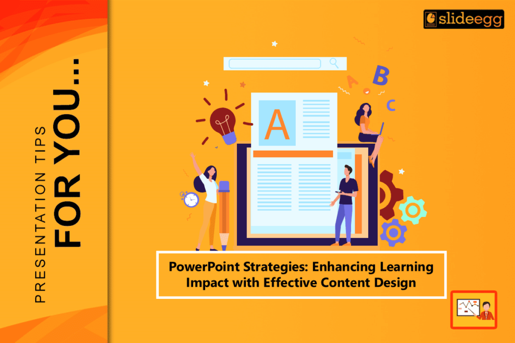
Why PowerPoint Still Matters in the Classroom
Some voices claim video, virtual headsets, or social feeds replaced slide decks. PowerPoint still earns a place because it works when used with care and skill. Studies on multimedia learning show that words paired with images can double recall. Treat the app like a flexible canvas rather than a source of endless bullets. That shift keeps focus longer and eases the load of frantic note-taking. Built-in shapes, icons, and templates help build clean visuals in little time.
Young learners gain because slides split hard ideas into small, clear pieces. When joined with narration, light motion, and live checks, a deck guides minds. Sight, sound, and pacing move together to build a path through new ideas. Remove clutter so each screen supports the goal and keeps attention steady. Use slides as tools that turn screen time into brain time for every group. Sharing files across devices stays simple for class, home, or company work.
Principles of E-Learning Content Design
Moving a lesson online demands more than posting slides on a shared drive. Good online design starts with clear goals and a map of the learner path. First, define what students should do by the end of the lesson segment. Keep that aim in view while each part supports the needed outcome. Split content into short modules that fit eight to ten focused minutes. Use simple organizers, like a timeline, to set the place within the unit.
Follow one concept per slide to limit overload and invite calm thinking. Pair brief text with helpful images tied to the core idea, not decoration. Let narration add meaning rather than read each word on the screen. Interleave light practice, such as polls or drags, to keep minds working. Close each module with a short recap so gains settle into long-term memory. When these rules guide decks, online time feels human, clear, and well planned.
Crafting Effective PowerPoint Presentations
Great decks rely on strong structure rather than flashy moves between screens. Begin with a hook slide that sets a vivid fact tied to the lesson goal. Follow with an agenda that shows parts and helps learners track progress. Keep fonts, colors, and alignment steady to reduce noise and raise polish.
The Picture Superiority Effect shows that images tend to linger longer than text. Replace heavy blocks with photos, charts, or icons that carry clear meaning. When text remains, apply the 6×6 guide to hold each screen clean and light. Move rich detail to presenter notes or audio tracks to support delivery. Use consistent spacing so each element breathes and stands in balance. Close with a summary that links back to the opening hook and stated aim. Add a prompt for quick reflection to help new ideas settle into place. These steps guide minds along a path that feels smooth, kind, and direct.
Premade templates can streamline this process by offering pre-designed layouts that already follow these best practices. Using professional PowerPoint templates also ensures visual consistency and saves valuable preparation time. Close with a summary that links back to the opening hook and stated aim. Add a prompt for quick reflection to help new ideas settle into place. These steps guide minds along a path that feels smooth, kind, and direct.
Educational Content Writing That Sticks
Slides are visual tools, yet language still shapes how learning lands and lasts. Write to the learner in plain, active lines that sound like real speech. This matches the personalization principle from research on mental processing. Short sentences with clear verbs prevent drift and support steady focus. Replace jargon like utilize with use, and prefer actions over heavy nouns.
When adding a new term, give a tight meaning with a picture or analogy. Stories with people, tension, and outcomes help facts tie to memory. Use signaling with bold or color to steer eyes toward key points. Keep tone friendly, confident, and direct to build trust and reduce strain. Add brief examples from daily life so ideas feel close and useful. End each slide with a line on value or a next step for the learner. These choices turn words into guides that stick beyond the close of class.
Visual Storytelling and Engaging PowerPoint Slides
Pictures and icons can show meaning faster than long strings of sentences. Visual storytelling turns a list into a path with a start, middle, and end. Pick one strong metaphor, like a mountain climb, to guide the full deck. Let that choice shape color use, icon forms, and the order of slides. Choose high-quality photos that show real action rather than stiff posing. Place the subject off-center with the Rule of Thirds to make space for text. Reveal parts with quick fades under one second to keep a smooth flow.
Use motion paths with care so movement supports meaning rather than distracts. Keep open space around key items to give minds time to process. Align edges and baselines so screens feel neat, calm, and easy to scan. Add captions that name the idea shown so pictures and words work together. The set then feels alive, like pages from a graphic tale unfolding.
Instructional Design with PowerPoint: A Step-by-Step Approach
Building an interactive deck can feel large, yet a simple path brings order. Step one is analysis of learner needs, prior knowledge, and likely pitfalls. Step two is writing goals with measurable verbs like compare, explain, or create. Step three is storyboarding to map the flow before opening the software. Sketch each slide on paper or a whiteboard to test sequence and pacing. Step four is production using templates, palettes, and layouts that fit the aim.
Place elements with care so screens remain clear under tight time limits. Step five is evaluation with a colleague or student who thinks aloud. Note any confusion and mark places that slow down the talk or break attention. Revise language, spacing, or order until each part serves the target. This loop mirrors ADDIE and keeps work aligned from start to finish. The workflow saves time, cuts late edits, and models sound planning for learners.
PowerPoint Tips for Teachers on a Tight Schedule
Packed days leave little room for long design sessions or deep rework. Build a master template with brand colors and preset fields to speed builds. Use Slide Sorter to move parts fast without constant cuts and pastes. Pull past content with Reuse Slides to gather pieces in a single view. Insert Microsoft Forms to collect live checks during class with no extra tabs. Record rehearsal timings so motion syncs when exporting to the lesson video.
Duplicate objects with Ctrl plus D and keep lines straight with Shift drag. Create asset folders for photos, icons, and charts to avoid repeated hunts. Set theme fonts and styles once so decks remain steady across weeks. Save a blank starter file so new sets begin with the right base. These tips turn the app into a helper that returns time for human tasks. Feedback, care, and presence then take center stage where learning grows.
Designing Interactive Lessons for Active Learning
Passive listening rarely builds deep insight or lasting change in behavior. Plan action in the deck so students engage every few minutes with intent. Use quick triggers like think-pair-share, hotspots, or live polls within slides. In Presenter View, point and mark while volunteers explain their thinking. Link buttons to challenge paths or bonus parts for added choice and control.
For math or science, embed Excel so that table values update during class. In humanities, add a brief clip and a drag to sort key terms after viewing. Give instant, clear feedback on each move so students learn the reason. Keep tasks light yet frequent to build progress without raised stress levels. Mix solo, pair, and whole group moments to include many voices. This cycle of action and reflection builds routes for transfer and recall. Large rooms and remote groups still gain a shared sense of active work.
Measuring and Improving Learning with Presentations
Design counts only when it changes what learners do after the lesson. Place checks across the deck to track gains and guide the next round. Use short quizzes, emoji meters, or one-word posts to spot patterns. Export poll data to a sheet to find themes in right and wrong picks. After class, scan the slide timeline and note where the talk slowed or stalled. Those points often show crowded text or unclear images without labels.
Compare quick pre- and post-scores from a tight five-item assessment. If gains stay low, ask for notes on slides that helped or held things back. Raise font size, add labels, or trim parts that pull eyes away from the aim. Add white space where screens feel dense or pressed for breath. Share updates with peers and collect fresh ideas that fit the goal. Small changes stack over time and lift results in clear, steady ways.