Talking to clients is a normal process for any business, especially if you’re a financial planner or work in the loan industry. You need to carefully consider each case, provide actionable, clear insights, and devise a foolproof solution for your client. The issues, though, start exactly at the stage of explaining.
Although managing your own finances is easier nowadays, people are still unfamiliar with basic concepts. Most don’t know what diversification entails, and some have never heard about savings accounts. As such, presenting your strategy and ideas simply and clearly is a reliable way to secure your next client.
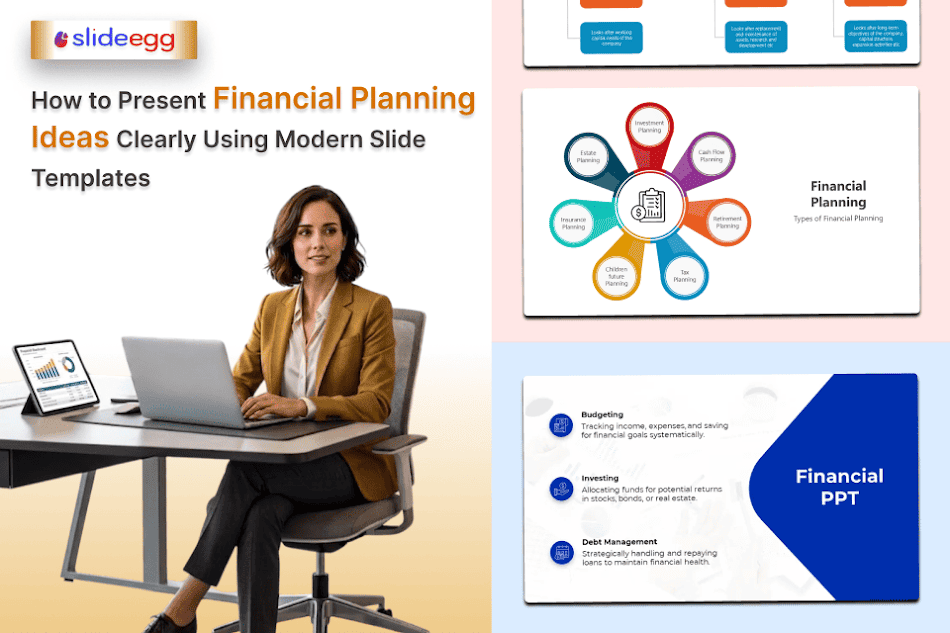
That’s why we’re going to discuss presentations and how their design affects comprehension. We’ll go over what modern, effective templates should have and provide expert-level tips.
Financial Literacy and How It Affects Perception
Let’s get back to financial literacy. Only 1 in 3 adults can answer basic financial questions. Financial literacy isn’t as widespread as many think. This, however, does not mean that your clients are fully unable to understand where you are coming from.
Before deciding to borrow or do any kind of financial planning, most people go to someone they trust for advice. If they hear something that conflicts with the information they received, they become increasingly defensive, shut down, and eventually leave without following through. If they truly don’t understand a concept, confirmation bias could deal a bad hand and derail the conversation.
If you’re in a client-facing role, simplifying information and explaining it in a calm, friendly manner is key to mastering it. That’s why creating presentations can lead to an excellent client experience, but there are nuances.
Planning Stages: Creating an Effective Framework
Before you start with the presentation, you need to map out your approach. Collecting good data is one thing, but presenting it to the client is another, and if you overload them with information, they will struggle to care.
As Ashley Bennett, a financial specialist at Cash Loans Bear, explains, “When we present financial topics, clarity is everything. In our team, we build presentations the same way we structure our content — step by step. First, we outline the situation, then show possible options, and only after that introduce solutions. Simple slides with clear comparisons and real-life examples help people quickly understand what actually applies to them, especially when they’re dealing with urgent expenses.”
This kind of framework may seem simplistic, but there’s more to it than initially meets the eye. It’s entirely rooted in how people make financial decisions.
Start With the Situation
The very first thing any client thinks when they’re offered a solution is, “Does it apply to my situation and will it really help?” This means that covering their financial challenge in depth is a good start. Open with an analysis, explain how it affects the client, and clearly outline potential risks of inaction. Presenting a relatable situation (You have a $900 repair bill due Friday, and your paycheck clears Monday”) could further help in building trust.
Then Lay Out the Options
The next step is covering possible options. Some make the mistake of jumping ahead to the solution, but it’s important to establish your logic and explain where you’re coming from. A side-by-side comparison of approaches (eg, dipping into savings vs. short-term loans), along with comparison tables and scenario columns, establishes your expertise and helps overcome confirmation bias.
Only Then Introduce the Solution
After you have moved through the previous steps, you can introduce your solution. At this stage, the client understands the context and already knows the alternatives and how ineffective they are. They will be open to your recommendation, and are very likely to act on your plan.
What Makes a Modern Financial Slide Template Actually Work
After you’ve come up with a plan, it’s time for the design. Having a custom organizational or personal template is often a good choice, as it helps further impress your clients. But you can also use templates you find online. The important thing is that they comply with the criteria below.
Layout Logic
The structure of the template must fit the specific scenario. A monthly budget breakdown needs a clean proportional chart. A loan options comparison may need a side-by-side comparison.
Dashboard-style layouts work well for executive summary slides and help communicate key metrics. A good executive financial dashboard should cover performance overview, profitability metrics, cash flow tracking, expense breakdown, or just look at things in great detail. But you can also choose something simpler, as clarity is the main goal.
Consistent Visual Language
Clients don’t only listen to what you say — they also pay attention to what you’re showing. If they notice a color shift, conflicting fonts, or a change in chart design style, that’s the only thing they might remember. Effective templates establish and maintain a consistent visual language throughout. This means, for example, one color for income, another for expenses, and a third for projections.
Prominent Numbers
If you focus solely on text, that might work against your case. Currency figures, percentages, and decimals require fonts and sizing choices that prioritize legibility and hierarchy over style. A strong template should give them enough prominence, surrounding whitespace, and general contrast to highlight their importance.
Cross-Format Readability
Presentations get shared with clients, who may open them on various devices. If the presentation looks good on a computer, it might have poorer contrast, small fonts, and be barely readable on a smartphone. That’s why you should also ensure the template has a consistent style across devices.
Applying Templates to Specific Financial Topics
Financial planning can cover a wide range of situations, and your template has to match the topic. Here’s how that works across the three most common scenarios.
Budgeting
If you have to discuss budgeting, the slides should skip the dense spreadsheet format. Instead, use pie charts for expenses, bar charts for month-over-month comparisons, and color-coded breakdowns. Start with the client’s income, and move to fixed expenses, discretionary spending, and the gap or surplus. Use the previous year’s data to establish a baseline, then make projections to show the before-and-after.
Emergency Savings
Emergency savings are a difficult subject. Most people are fully aware of the risks, but elect not to create an additional safety layer. To put things in perspective, open with the statistics and explain they’re not unique in their views. Then, show the client how their savings will grow over time and break the process into small, manageable steps. Tie the presentation to a clear end goal and explain how creating emergency savings will solve their problem.
Short-Term Financing
Short-term financing is about urgency. Clients get caught in a stressful moment and are actively looking for an immediate solution. Here, a good practice is to focus on comparison slides showing different financing options, their costs, timelines, and real-world implications. You can also use a scenario-based approach and anchor options to recognizable situations. The final slide should always close with plain next steps: what to do, what to prepare, what to expect.
Common Mistakes That Undermine Financial Presentations
When you feel like you’re almost ready with your presentation, spend some time double-checking. Ensure you didn’t make any of these mistakes:
- No context behind the numbers. Showing a client their debt-to-income ratio without explaining what it means for their borrowing options leaves them more confused than informed. Every figure needs some sort of clarification.
- Generic slide titles. A slide labeled “Loan Overview” tells a stressed client nothing useful. Using a headline like “Why a 3-Month Repayment Plan Saves You $340” clearly ties into their situation and keeps them engaged.
- Raw data overload. A table comparing five loan products with twelve variables per row is not optimal. Strip it down to the two or three metrics that matter most to the client’s specific situation.
- Unexplained financial jargon. Terms like “APR,” “collateral,” or “debt consolidation” may be routine for a financial planner but unfamiliar to a client under pressure.
- Key takeaway buried at the end. Clients in financial distress need clarity fast. Leading with the most relevant recommendation respects both their time.
- No preparation for client questions. Clients will ask hard questions: What happens if I miss a payment? Is there a cheaper option? A planner who hesitates on these loses credibility at the most critical point in the client relationship.
Although these steps are more tailored to short-term borrowing, any financial planner needs to explain how diversification enriches the client’s portfolio in simpler, manageable terms. So, no matter the client’s situation, these mistakes are universal and best avoided.
Closing Thoughts
Financial presentations are about building trust. A client sitting across from you while you talk isn’t actively thinking about your expertise levels. They look at the data, the way it’s presented, and whether what you say makes sense to them personally. If you didn’t structure things right, made poor design decisions, they may just walk.
If you want to convert a consultation, structuring information into a presentation could be your most effective tool. In a short 10-minute presentation, you might achieve more than with a lengthy 30-40-minute oral discussion.
So before your next client meeting, don’t just ask whether your numbers are accurate. Ask whether someone under financial stress could sit down, flip through your deck in five minutes, and walk away knowing exactly what to do next. If the answer is yes, you’ve built something worth presenting.