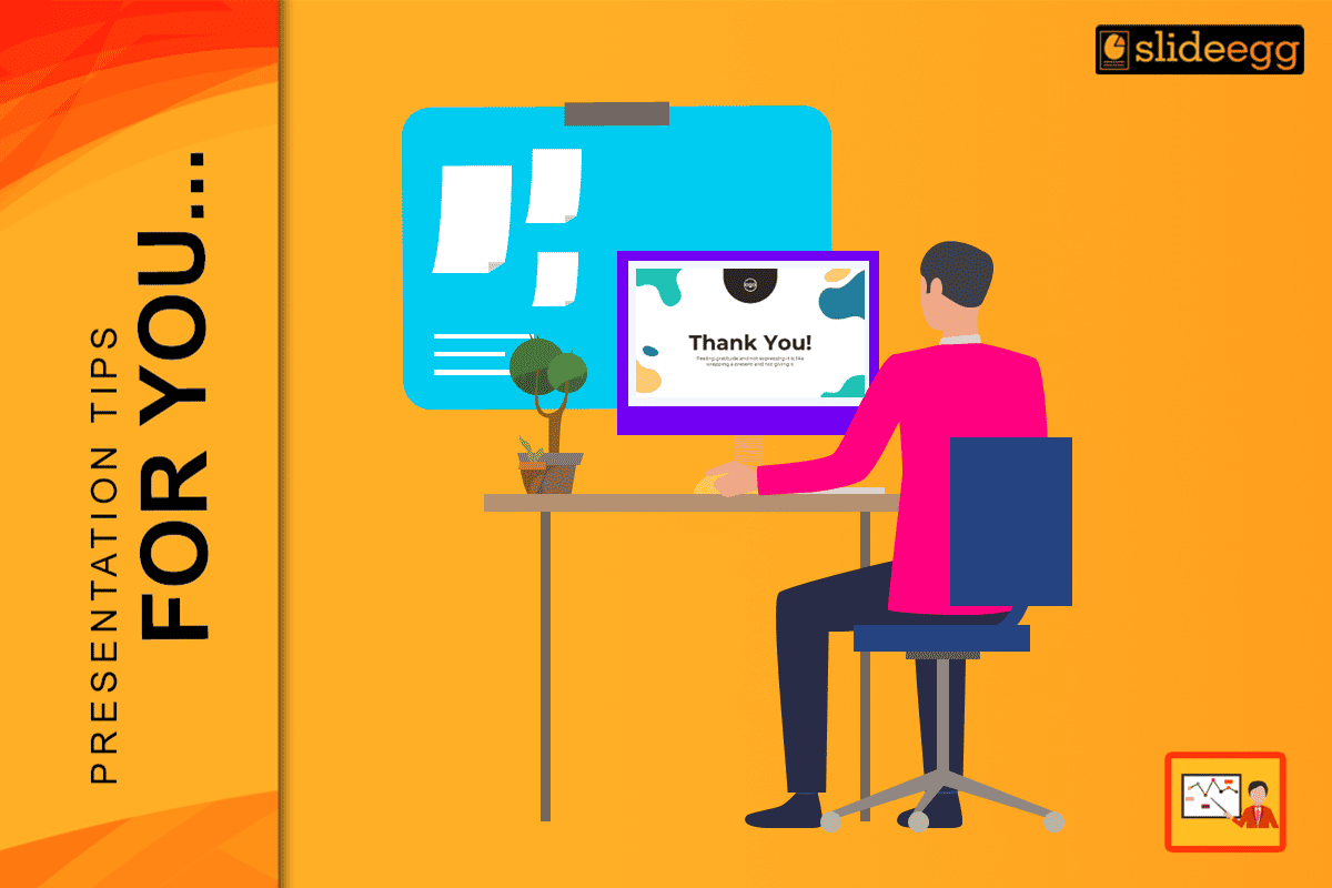
For years, the “Thank You” slide has been treated as a formality, something added at the last minute with a blurry stock photo of a handshake, a generic “Any Questions?” in Arial font, or a crowded list of social media icons.
In 2026, that doesn’t just look boring—it looks lazy.
Your final slide is the “visual anchor” of your presentation. It sits on the screen for 15 minutes during Q&A. It is the backdrop to your most critical conversations. If your opening slide is the hook, your Thank You slide is the mic drop.
This guide moves beyond the basics. We explore 5 creative Thank You slide trends that feel genuinely fresh, modern, and high-impact for 2026 audiences.
Why “Safe” is Dangerous in 2026
Audiences today are visually literate. They scroll through high-end design on Instagram and TikTok every hour. When they see a standard, low-effort closing slide, they subconsciously tune out.
A creative Thank You slide does three things:
- Retains Attention: It uses motion or layout to keep eyes on the screen during Q&A.
- Signals Quality: It proves you paid attention to every detail, building trust.
- Drives Interaction: It uses design psychology to guide the next step (e.g., a scan, a click, or a question).
5 Creative Layout Trends for 2026
Forget “Centered Text” or “Bullet Points.” Here are the specific design aesthetics dominating professional decks this year.
1. The “Bento Grid” Layout
Inspired by Apple’s promotional videos and dashboard UI, the Bento Grid organizes information into clean, rounded boxes. It is structured yet visually rich.
- The Look: A grid of 3-4 distinct boxes. One box for your photo, one for your “Thank You” message, one for a QR code, and one for a key metric or quote.
- Why it Works: It allows you to display multiple content types (photo, text, data) without looking cluttered. It feels like a modern app interface.
2. The “Glassmorphism” Overlay
Flat design is out, and depth is in. Glassmorphism uses translucent, frosted-glass effects to create layers and sophistication.
- The Look: A high-quality, abstract background (or a photo of your office/team) with a “frosted glass” card floating on top containing your contact details.
- Why it Works: It adds 3D depth and looks incredibly premium. It separates the text from the background, ensuring perfect readability.
3. The “Cinematic Dark Mode”
In 2026, “Eco-Dark” mode is the standard. Bright white slides hurt eyes in dim conference rooms. Go dark, go big, and go bold.
- The Look: A Deep Ocean Blue or Charcoal background. A massive, high-contrast headline (e.g., “Let’s Build This”) in a serif font. Minimal text.
- The Trick: Use a “Cinemograph”—a background where only one element moves slightly (e.g., slowly drifting clouds or a pulsing gradient) to keep the slide alive.
4. The “Editorial” Split
Borrow the look of high-end fashion magazines. This layout relies on sharp contrast and massive typography.
- The Look: Split the screen 50/50. On the left, a bold, solid color block with your headshot or a product shot. On the right, clean white space with massive, thin typography.
- Why it Works: It feels confident. It says, “I don’t need to shout to be heard.”
5. The “Interactive Portal”
Static slides are passive. Make your ending a portal to the next step.
- The Look: A slide designed entirely around a central “Action Portal”—usually a large, stylized QR code or a short URL.
- The Creative Twist: Don’t just stick a QR code in the corner. Frame it inside a phone mockup or integrate it into the artwork. Make it the hero.
Technical Rules for Creative Polishing
Creativity needs structure. Follow these 2026 design rules to ensure your “fresh” idea doesn’t look messy.
1. The 60-30-10 Color Rule
Don’t use random colors.
- 60%: Primary Background (Deep Blue, Charcoal, or Forest Green).
- 30%: Secondary Neutral (White, Light Grey, or Soft Beige).
- 10%: Accent “Pop” (Neon Lime, Solar Yellow, or Electric Blue).
Tip: Use the 10% accent color only for your CTA (e.g., the QR code or the email address).
2. Kinetic Typography (Motion)
In 2026, text shouldn’t just sit there. Use “Morph” or “Fade” transitions so your Thank You message enters elegantly.
- Idea: Have the words “Thank You” slowly transform into “Any Questions?” using the Morph transition in PowerPoint.
3. Human Micro-Copy
Stop talking like a robot. “Thank you for your attention” is dead. Try these human alternatives:
- “Let’s discuss.”
- “What’s on your mind?”
- “I’m ready for your questions.”
- “Let’s build the future.”
Conclusion: End With Intent
Your Thank You slide is the period at the end of your sentence. If it’s weak, the whole statement loses power.
In 2026, you don’t need to be a graphic designer to look like one. By adopting a Bento Grid, using Dark Mode, or trying an Editorial Layout, you instantly elevate your personal brand. Stop treating the end like an afterthought. Treat it like the grand finale.
Want to skip the design struggle? Download SlideEgg’s Creative Thank You Slide Templates to get these exact 2026 trends in a ready-to-edit format.
FAQs
1. What is the biggest presentation design trend for 2026?
The “Bento Grid” layout is the dominant trend. It organizes photos, text, and data into neat, rounded boxes, mimicking the look of modern mobile apps and dashboards.
2. Should I use a GIF or a video on my Thank You slide?
Yes, but keep it subtle. A “Cinemagraph” (a mostly still image with one moving element) creates a premium feel without distracting the audience during Q&A.
3. Is “Thank You” still the best phrase to use?
Not always. For workshops, “Questions?” is better. For sales, “Next Steps” is stronger. For keynotes, a closing quote or “Let’s Connect” feels more modern and conversational.
4. How do I make my QR code look good on a slide?
Don’t just paste the default black-and-white square. Use a QR code generator to round the corners or change the color to match your brand’s “Accent” color (the 10% rule). Ensure it is high-contrast enough to scan.