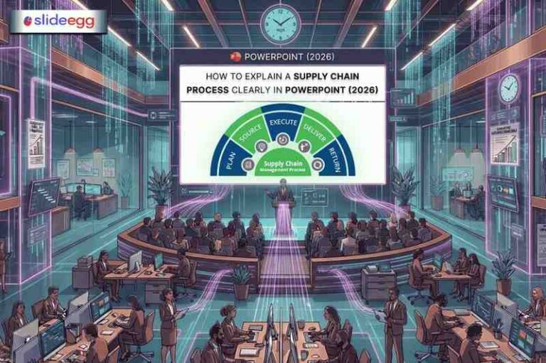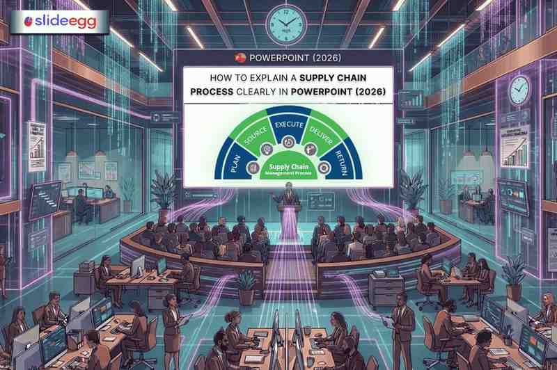
If you’ve ever been in a supply chain presentation packed with messy flowcharts and walls of text, you know the real problem: the information might be critical, but the delivery makes it hard to follow. As a logistics or supply chain manager, your role isn’t only to run the process — it’s to make the process understandable to people who don’t live inside it every day.
A well-built PowerPoint can turn a complicated multi-tier supply chain into something your team, leadership, or clients can track in one pass. This guide shows you how to do that in 2026 using a clear structure, clean visuals, and practical templates you can edit quickly instead of designing from scratch.
Why Most Supply Chain Presentations Fail
Most supply chain presentations struggle not because of a lack of data, but because of how the data is presented. Here are the most common mistakes:
• Too many steps crammed into a single slide
• Using raw data tables instead of visual process flows
• No clear beginning, middle, or end to the story
• Slides that look different from one another — no visual consistency
• No context for why each step matters to the audience
The good news is that all of these are easy to fix with the right approach and the right template.
Pro Tip: To avoid these common pitfalls, check out these Helpful Tips for Making a Professional PowerPoint, which focus on visual hierarchy and white space.
Quick Comparison: Weak vs Strong Supply Chain Slide
| Element | Weak Slide | Strong Slide |
| Slide Layout | Bullet points only | Process flow diagram with icons |
| Data Display | Raw numbers in a table | Visual chart with key highlights |
| Process Steps | Listed as text paragraphs | Step-by-step flowchart or timeline |
| Supplier Info | Named in a paragraph | Mapped on a visual network diagram |
| KPI Metrics | Written inline in sentences | Dashboard-style cards with color coding |
| Audience Clarity | Hard to follow | Easy to scan and remember |
Step-by-Step: How to Build a Clear Supply Chain Presentation in 2026
Step 1 — Define Your Audience First
Before you open PowerPoint, ask yourself: Who is sitting in the room? A warehouse team needs operational detail. A CFO wants cost and efficiency numbers. Board members want risk and resilience. Tailor each slide to what your audience actually cares about.
Step 2 — Use a Template That Matches Your Topic
Starting from a blank slide usually creates two problems: inconsistent visuals and wasted time. A supply chain template solves the layout problem (flows, maps, dashboards). Your job is to replace placeholders with your real steps, handoffs, and KPIs—then delete anything you cannot explain in under 60 seconds.
Step 3 — Break the Process into Logical Stages
Never put an entire supply chain on one slide. Instead, break it into stages like Procurement, Production, Warehousing, Distribution, and Delivery. Give each stage its own slide or section. This makes it easy for the audience to follow along and ask questions at the right time. If a slide shows more than 7 process nodes, it’s not a slide anymore—it’s a poster. Split it.
Step 4 — Use Visuals, Not Just Text
Replace paragraph descriptions with flowcharts, arrows, icons, and diagrams. A simple left-to-right process flow immediately tells your audience how the steps connect. Use one base color for the full flow, and use a second color only for exceptions (risk, delay, handoff). If everything is color-coded, nothing stands out.
Step 5 — Add Real Numbers That Matter
Support every key point with a relevant metric. Instead of saying ‘our delivery time improved,’ show a before-and-after bar chart. Numbers give your presentation credibility and make your points stick.
Step 6 — End With a Clear Action or Summary
Close with a summary slide that shows the full process at a glance and highlights the next steps or recommendations. Do not leave your audience guessing about what you want them to do next.
Real-World Example: Presenting an Automotive Supply Chain
Imagine you are a supply chain manager at an automotive company, presenting to senior leadership about your supplier network. Here is how you could structure the deck using an Automotive Supply Chain template:
• Slide 1 — Title slide with your company name and presentation date

• Slide 2 — Overview of the full supply chain from raw material sourcing to finished vehicle
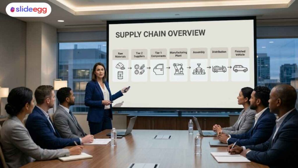
• Slide 3 — Tier 1 and Tier 2 supplier network map with icons for each supplier category

• Slide 4 — Production flow: assembly stages with timeline

• Slide 5 — Logistics and distribution: regional delivery zones on a map

• Slide 6 — Key performance indicators: lead time, order fill rate, and inventory turnover

• Slide 7 — Bottleneck diagnosis: top 2 delay points, root cause, impact, and fix owner

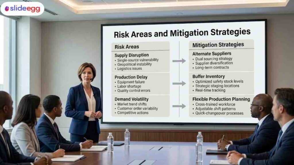
• Slide 8 — Risk areas and mitigation strategies
• Slide 9 — Recommendations and next steps

This structure gives leadership exactly what they need — a clear picture of how the supply chain works, where it performs well, and where attention is needed. The visual templates do the heavy lifting on design so you can focus on the content.
Benefits of Using a Supply Chain Management Presentation Template
• Saves time — no need to build diagrams or layouts from scratch
• Looks professional — consistent fonts, colors, and spacing throughout
• Works across platforms — compatible with PowerPoint and Google Slides
• Fully editable — replace placeholder text and charts with your own data
• Improves understanding — pre-built visuals communicate complex processes instantly
Quick Tips for Supply Chain Presenters in 2026
• Keep each slide focused on one idea only — if a slide needs two headlines, split it
• Use icons instead of clip art — they look cleaner and scale better on any screen
• Label every arrow and connector so the audience knows what each link means
• Use a consistent color palette — stick to two or three main colors across all slides
• Test your slides on a projector before the meeting — colors sometimes shift
• Add slide numbers so your audience can reference specific slides during Q&A
• Keep the font size above 18pt for body text — anything smaller is hard to read in a room
Final Thoughts
Explaining a supply chain process doesn’t need to be complicated. If you use a clean structure, simple visuals, and a consistent template, even a complex workflow becomes easy for the whole audience to follow and remember.
Supply chain presentation templates are built for logistics teams who need clarity, not decoration. Whether you’re presenting to a warehouse team, senior leadership, or an external client, choose a layout that matches the purpose—process flow, network map, KPI dashboard, or risk-and-mitigation view—so your message lands fast and stays consistent.
Frequently Asked Questions
1) What is the biggest mistake people make in supply chain presentations?
They explain everything they know instead of showing what the audience actually needs. Too much detail weakens the message and makes the presentation harder to follow.
2) How do I present a process with 20+ steps without overwhelming the audience?
Start by grouping the steps into a few clear phases so people can understand the flow first. Then, only expand the phase that matters most to that audience.
3) Should I use a supply chain PowerPoint template or build the slides from scratch?
A template is usually the smarter option because it gives you a clear structure before you start designing. That saves time and helps you focus on the message instead of formatting.
4) How do I show supply chain data without making the slide look like a spreadsheet?
Pull out the few numbers that actually support your point and show them in a simple visual way. If the full data matters, keep it in an appendix instead of forcing everything onto one slide.
5) Why do supply chain presentations often fail to connect with the audience?
They usually focus too much on internal process and not enough on what the audience needs to understand. People respond better when the presentation explains the issue, the impact, and the decision clearly.