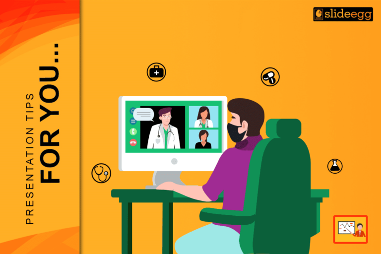
The context of care has shifted. In 2026, you are just as likely to present a case study or a treatment plan via a webcam as you are in a lecture hall.
However, most clinicians still use “Stage Decks” for “Screen Meetings.” This is a fundamental error.
When you present face-to-face, you rely on physical presence, eye contact, and a massive projector screen to command authority. In Telemedicine, you are a 2-inch thumbnail in the corner of a patient’s laptop. Your slides are no longer just a visual aid; they are your primary Clinical Proxy.
To maintain authority and clarity across the digital divide, you must adapt your Medical Presentations to the realities of the remote screen. Here is the new standard for virtual care communication.
1. The “Bandwidth Constraint” (Designing for Compression)
In a hospital auditorium, your 4K projector shows every detail of an MRI. On a Zoom or Teams call with a patient in a rural area, video compression algorithms crush your image quality.
If your slide relies on subtle greyscale gradients to show a fracture or a tumor, the streaming codec will blur it into “digital noise.”
The Fix:
- High-Contrast Overlays: Do not rely on the raw image alone. Use bright, high-contrast arrows or circles (Neon Green or Cyan) to explicitly annotate the pathology. You must guide the eye to what the compression might hide.
- The “Zoom Test”: Before presenting, view your slide at 50% zoom on your own monitor. If the text or pathology is unreadable at that size, it will be invisible to your audience on a tablet or phone.
2. The “Notification Risk” (HIPAA 2.0)
In a physical conference room, a pop-up notification on your laptop is an annoyance. In a Telemedicine session where you are screen-sharing patient data, a pop-up notification is a HIPAA Breach.
If a colleague messages you, “Did Mrs. Jones sign the consent?” while you are screen-sharing with Mr. Smith, you have just violated patient privacy laws.
The Protocol:
- Clean Mode Only: Never share your “Whole Screen.” Only share the specific PowerPoint Window.
- The “Safe” Background: Ensure your slide has a neutral, professional background. If you minimize the deck, your desktop wallpaper should not be personal family photos or cluttered files. It must be “Clinical Neutral.”
3. The “Trust Artifact” (Visual Authority)
In a virtual consult, the patient cannot see your white coat, your stethoscope, or your clean office. They only see your pixels. If your slides look amateurish (stretched images, Comic Sans, misalignment), the patient subconsciously questions your medical competence.
The Fix:
- Branded Consistency: Use Medical PowerPoint Templates that carry a consistent header/footer with your clinic’s logo. This acts as a digital “ID Badge.”
- Typography as Uniform: Use standard, clean sans-serif fonts (Arial, Roboto, Helvetica). They render better on low-resolution screens than serif fonts (Times New Roman), which can look jagged and “pixelated” on poor connections.
4. The “Cognitive Load” of Screen Sharing
Remote audiences have lower attention spans. They are often multitasking or distracted by their own environment. A “Wall of Text” slide in a webinar guarantees they will tab-switch to their email.
The Fix:
- One Idea, One Slide: Break your “Treatment Plan” into 3 separate slides (Step 1, Step 2, Step 3) rather than one dense list.
- The “Pointer” Protocol: Use the digital laser pointer feature in PowerPoint. Since you cannot physically gesture at the screen, you must use motion to tether their attention to the specific data point you are discussing.
Frequently Asked Questions: Virtual Health
Q: Can I use animations in a Telemedicine presentation?
A: Avoid complex transitions like “Fade” or “Fly In.” Video conferencing software often lags, causing these animations to stutter or freeze. Stick to “Cut” or “Appear” for instant, lag-free transitions.
Q: How do I present data to a patient on a phone?
A: Assume they are on a phone. Make your fonts 30pt minimum. If you have a complex table, break it down into a simple bar chart. If they have to pinch-to-zoom, you have failed.
Q: What is the best background color for remote slides?
A: A dark background (Dark Blue or Charcoal) is often better for screens, as it emits less “glare” and reduces eye strain for the viewer compared to a blinding white slide.
Summary: Your Slides Are Your Stethoscope
In the era of Telemedicine, your digital presentation is your bedside manner.
- Optimize for video compression.
- Sanitize your screen sharing for privacy.
- Simplify your visuals for small screens.
Do not let bad design become a barrier to care. A professional Medical Presentation builds the bridge of trust that distance tries to break.