Global warming is one of the most widely discussed topics in classrooms, conferences, and public speaking. For the year 2026, climate change presentations should be more than just useful. It should be clear, relevant, and easy to understand. A well-structured PPT on global warming has the purpose of teaching essential ideas without confusing the audience.
The lesson will show you how to customise the global warming presentation template, customising the message to your audience while maintaining the content informative and accurate in a simple, practical manner.
Start with a Clear Purpose
Before viewing any slide template, define the information that you want the audience to receive. The purpose of global warming presentations differs. While some attempt to raise awareness, others work with scientific facts or suggest solutions.
Consider the following questions:
- Is it targeted for students, experts, or the public in general?
- Will I present the reasons, effects, or measures?
- What should the message be: informed, urgent, or optimistic?
A clear purpose facilitates the adjustment of the global warming PowerPoint presentation to be more relevant without adding extra slides or details.
Use the Climate Cycling Sequence for Ten Minutes
In 2026, presentations must move fast to keep attention. Instead of listing topics, customise your global warming PPT template to follow a short narrative flow that creates curiosity and interaction.
Use this structure:
- Slide 1 – The Hook:
Show a strong visual of a local climate change example (heatwave, drought, flooding). - Slide 2 – The Data:
Display one clear chart showing a temperature or climate trend. - Slide 3 – The Interaction:
Add a simple poll or question slide, such as:
Which climate impact worries you the most? - Slide 4–5 – The Response:
Present practical actions and solutions using icons and minimal text.
This sequence keeps the audience focused and prevents passive listening.
Use ordinary and simple language.
- Global warming is a hot topic, but don’t use complicated words in your slides. Try to use very simple words and very short sentences, and if a technical term comes up, just give a very short explanation.
- For instance, rather than defining with a lot of words, just give a very short summary in one or two lines. This way, the global warming presentation template becomes understandable by everyone, regardless of age.
- No paragraphs on slides, please. Your slides should be the backbone of your speech. They should not take the place of an explanation but rather direct the focus.
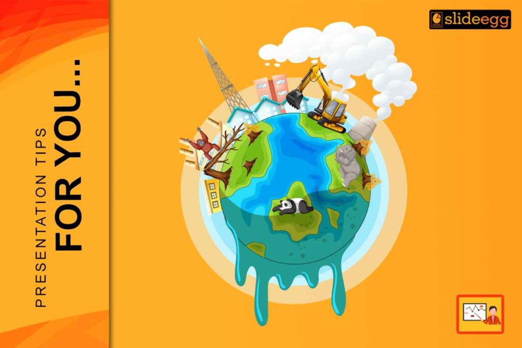
Choose Relevant Visuals
Visuals are one of the key elements in climate change presentations. According to the forecast for 2026, it is expected that the audience will be provided with graphics that will facilitate the understanding of ideas very quickly.
Use pictures that illustrate:
- Rising temperatures
- Melting ice
- Changing weather patterns
- Impact on animals and humans
Avoid putting too many images on the slides. One powerful visual per slide is sufficient. Charts and diagrams should be very simple and have very clear labels.
Make sure that visuals correspond to the message that is being delivered on the slide. The use of random images will not only reduce the clarity but also cause the audience to lose their concentration.
Use the Sustainable Visual Standard for 2026.
Presentations on climate change in 2026 will need power and urgency. Projector reflections and decreased focus are frequently caused by light backdrops. Use high contrast images to personalise your global warming PowerPoint presentation.
Follow these specifications:
- Backgrounds:
Use Deep Ocean Blue or Forest Green - Typography :
Titles: 44 pt or larger
Body text: 24 pt or larger - Signal Colors:
Solar Yellow for heat, risk, or warnings
Vibrant Green for solutions and positive actions
This visual standard improves readability on LED screens, projectors, and mobile devices.
Edit Text Layout and Spacing
Proper spacing enhances the readability of the slides. In the year 2026, minimalistic layouts will be more acceptable than those with a lot of elements.
Follow these basic guidelines:
- Large font sizes should be used
- Leave a good space between lines
- Text should be aligned uniformly
Avoid utilising text near the edges. Proper spacing allows the audience to concentrate more and decreases visual fatigue.
Customise Data Slides Using Semantic Heatmapping
In 2026, audiences must understand data instantly. Instead of rounding numbers, customise charts to visually guide attention.
Apply these methods:
- Trend Indicators:
Add large arrow icons (↑ ↓) to show an increase or a decrease clearly. - Color Signals:
Use red tones for rising risk and green tones for improvement. - The 8-Second Rule:
If a chart cannot be understood in 8 seconds, remove it.
Add one Key Takeaway box in 44 pt text to explain the message clearly.
This approach makes climate data easy to read without overwhelming the audience.
Add Current Context.
For 2026, individuals can relate to familiar examples. You can personalise your template on global warming by referencing local events.
You could include:
- Regional climate change
- Local temperature trends
- Current events related to the environment
In this way, it becomes possible to make a connection with this topic and explain how it affects each person.
Review for Clarity and Simplicity
Before finalizing the presentation, review every slide. Ask yourself:
- Do you understand what was said?
- Could it be put in simple terms?
- Do all slides support the main theme?
Eliminate everything that appears to be repeated or unnecessary. Slides with less complexity are likely to have a greater impression.
Final thoughts
Modifying the global warming PowerPoint in 2026 conveys clarity, organisation, and connectivity. A good global warming template can help with concept planning, but the most significant influence comes from incorporating one’s own ideas.
Through effective use of simple terms, relevant pictures, and rational ordering of content, one is able to make a presentation that not only teaches but also attracts without putting the audience off. If your presentation is of high quality, it will be a means of comprehension rather than simply conveying information.
Download a global warming PPT and customise it easily with your own content, visuals, and data for 2026.
FAQ
1. What is the advantage of customizing a global warming PPT over using a standard one?
Customizing a global warming PPT helps to tailor the content to the audience and purpose. The standard slides give an outline, but personalization makes the point more relevant, clearer, and more comprehensible.
2. What is the recommended number of slides for a presentation on global warming?
Generally, 8 to 12 slides are enough to cover the topic without losing the audience’s interest. The primary goal should be clarity, not the number of slides.
3. Which visuals should be included in a global warming presentation template?
Clear graphics, such as graphs, sketches, and nature photographs, are excellent. These should immediately familiarise concepts while supporting the message, not the other way around.
4. Is it possible to make global warming presentations easier for children to understand?
Yes. A global warming presentation template can be readily converted into something that schoolchildren or beginners can understand by using simple language, limited information, and good pictures.
5. Can a global warming PowerPoint presentation focus more on challenges or solutions?
It is best to take a step-by-step approach. While it is necessary to explain the reasons and the impacts, it is also important to give certain practices that will not only keep the audience engaged but also give them a feeling of hope.