
Data presentation using tables is one of the most effective ways to present results. Data in tables is clear and easily compared. By the year 2026, when making presentations using tables, instead of showing more details, one should focus on showing clear details. This makes it essential to customise the presentation template with tables appropriately.
While a table presentation in PowerPoint provides structure, customisation is what gives it importance. When properly customised, a table slide might appear calming, clear, and formal. On the other hand, if not done correctly, it appears neat and confused. This article is meant to provide an easy-to-follow guide to customising a table presentation template.
Start With the Purpose of the Table
First of all, before making any changes to the table, you should know its purpose.
Think about it:
What is the main thing the audience needs to see in the table?
What decision will it back up?
What are the most important values?
Your table might be used to compare plans, measure progress, display results, or explain costs. After you’ve defined the purpose, you can remove anything that doesn’t contribute to the message. A well-focused table remains easier to understand.
Choose the Right Table Template
Every type of table does not serve the same purpose for data. Pick a table format that complements your content.
An effective PowerPoint table template must:
- Be organised with clear rows and columns
- Provide adequate spacing in between cells
- Employ legible fonts
- Refrain from using thick borders
If the table is already appearing neat before you fill in the data, you are definitely on the right track. Good table design should be light, not cramped.
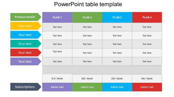
Credit: https://www.slideegg.com/powerpoint-table-template-8
Before styling, simply the data
Customisation starts with the content, not colours.
Before making any design adjustments:
- Remove extra columns.
- Reduce the number of rows.
- Use about one numeric digit if exact decimal precision is not required.
- Replace lengthy text with brief headings.
A slide does not equal a spreadsheet. In case the table looks too big, divide it into two slides. Clear data presentation is more important than showing everything at once.
Adjust Font Size and Spacing
Tables must be readable on mobile screens, 4K displays, and projectors—without zooming.
Typography Rule
Header titles: 44–64 pt
Cell data: 24–32 pt
Dark Mode Optimisation
Use Deep Charcoal backgrounds to reduce eye strain and keep the table sharp on LED screens.
7:1 Contrast Ratio (AA Standard)
Ensure the text-to-background contrast meets 7:1. Use Saffron or Electric Blue only for data highlights—not decoration.
Use Visual Hierarchy Inside the Table
Implement Semantic Heatmapping: In 2026, don’t only use bold text; build visual anchors so that the audience can see the “So What” in under 8 seconds.
Trend Charts: Use micro-icons inside cells (↑ / ↓) to show movement without adding extra text. This reduces mental effort.
Decision Point Borders: Highlight the most important row (or the “winning metric”) with a strong, high-contrast border. If the audience has to search for the key metric, the slide has failed.
Data Contrast Strategy for Dark Mode Tables in 2026
- Background Rule: Use Deep Charcoal for the table area. Avoid light table backgrounds in dark-mode decks.
- Text Rule: Use off-white or light grey for normal text. Keep it consistent across all rows.
- Signal Colours Only: Use Saffron or Electric Blue only when a value needs attention (target met/missed / action required).
- Binary Definition: Every colour must represent either a message or a background. If it does not change the choice, remove it.
- Border Control: Use a slight border to ensure that the grid is visible but not overly busy.
Add Clear Titles and Context
- A table without context can confuse the audience.
- Every table slide should have:
- A clear title that explains what the table shows
- One short line that explains why the data matters
For example:
- This table compares quarterly performance across teams.
- This small addition helps the audience understand the table faster, even before reading the data.
Maintain Consistency Across All Table Slides
If there are several tables in your presentation, then consistency is the most important thing.
So make sure that:
- The same font size is used for all tables
- Column spacing remains equal
- The same highlighting rules are applied
- Consistency is an important feature in developing trust. It also helps the audience to focus on the data rather than adjusting to different layouts.
Test the Table in Presentation Mode
Before concluding, it is a must to test the table in a full-screen mode first.
Look into:
- Is the text legible?
- Are the columns straight?
- Is there anything that seems busy?
- Can the main message be understood in seconds?
Why Table Customisation Matters in 2026
Individuals expect clarity in 2026. They want information that is not only easy to scan but also quick to understand. A well-designed table PPT meets this requirement.
Using a clean PowerPoint table template and making essential adjustments allows you to deliver facts accurately and quickly. It also helps to save time during meetings and avoid confusion.
Conclusion
Customising a table presentation template is not considered as only decorating it. It means to make it more understandable and properly organised, and also to put in a definite purpose. Always begin with the right data, then simplify and make it more readable while keeping the design the same.
Once the tables are easy to read, it leads to easier discussions and quicker decisions. A simple and nicely designed table usually communicates more than a lengthy explanation.
FAQ
1. What is the best use of a table PPT in 2026 presentations?
It should be used when there is a need to have a specific number or a basis for comparison, as in the examples below. Pricing, the status of progress
2) How much data is too much for a 2026 table?
It is not about the number of rows. It is about Time-to-Insight. If your audience cannot understand the key takeaway in 8 seconds, divide the table into multiple slides. High-performance meetings in 2026 often use 20–30 slides per 30 minutes to maintain visual momentum.
3. How can I improve the readability of a PowerPoint table template?
Improve readability by utilising fewer rows and columns, increasing cell padding, and using consistent fonts. Highlight important information with light colours, icons, or bold text while keeping the layout simple.
4. Can I use colour inside tables in 2026?
Yes, but just as a signal and not for decorations. Saffron or Electric Blue can be used to represent critical decision values (risk, target failure, importance). If colour does not cause an action, it is considered clutter and should be removed.
5. How can I make a table slide understandable and clear?
Reduce the number of rows and columns on a table presentation, use basic headings, and leave enough space between each one. Highlight important information with modest colours or icons, and keep the design clean and consistent.