Introduction
Matrix diagrams are powerful tools for organizing information and showing relationships between multiple elements. In PowerPoint presentations, they can simplify complex data, help identify priorities, and communicate insights in a clear and visual format. Whether you’re presenting a marketing strategy, project plan, or business analysis, matrix diagrams can make your slides more effective and easier to understand.
This blog explores creative and practical ways to use matrix diagrams in PowerPoint presentations to capture attention and improve clarity.
What Is a Matrix Diagram?
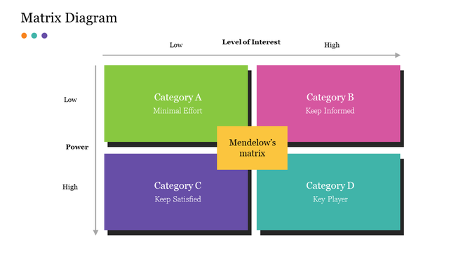
A matrix diagram is a visual chart that shows relationships between two or more sets of items. It usually appears in a table or grid format, helping viewers quickly see connections, categories, and comparisons. In PowerPoint, matrix diagrams can be used to present data in a clean, organized, and visually engaging manner.
They’re commonly used in:
- Business strategy presentations
- Risk management reports
- Marketing campaign analysis
- Product feature comparisons
- Team roles and responsibilities
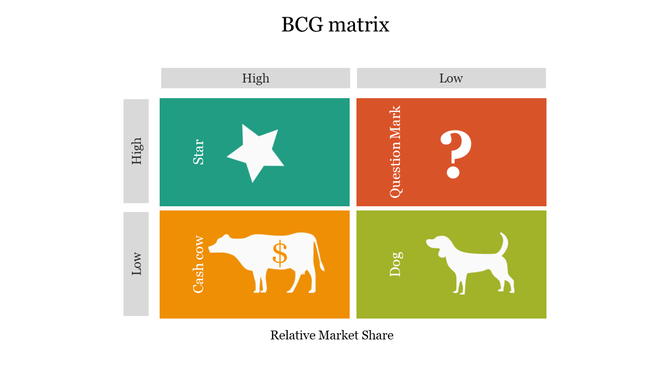
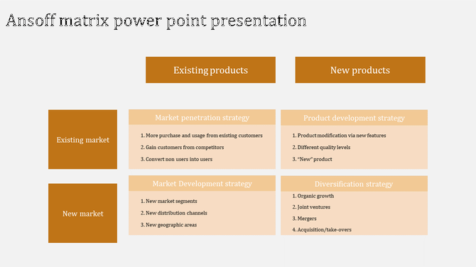
1. Visualize Business Strategies
Matrix diagrams help visualize strategies like SWOT, Ansoff Matrix, or BCG Matrix in a structured way. Instead of plain text lists, these diagrams let you map out goals, priorities, and options clearly.
Use Cases:
- SWOT Matrix: Show strengths, weaknesses, opportunities, threats.
- Ansoff Matrix: Present market vs. product growth strategies.
- BCG Matrix: Visualize product performance vs. market share.
Tip: Use color-coded cells and icons to make each quadrant stand out.
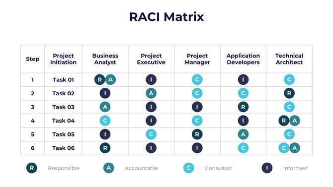
2. Clarify Roles and Responsibilities
You can use a matrix diagram to assign team responsibilities based on tasks or project phases. This keeps everyone on the same page and helps avoid overlaps or confusion.
Use Cases:
- RACI Matrix (Responsible, Accountable, Consulted, Informed)
- Project planning and team management
Tip: Highlight responsibilities with bold icons and align colors with your branding.
3. Compare Product or Service Features
Use a comparison matrix to show which features are available across different products, services, or packages. This is especially helpful in sales or marketing presentations.
Use Cases:
- Product A vs. Product B vs. Product C
- Feature inclusion in different service tiers
Tip: Use checkmarks, stars, or progress bars to represent availability or performance.
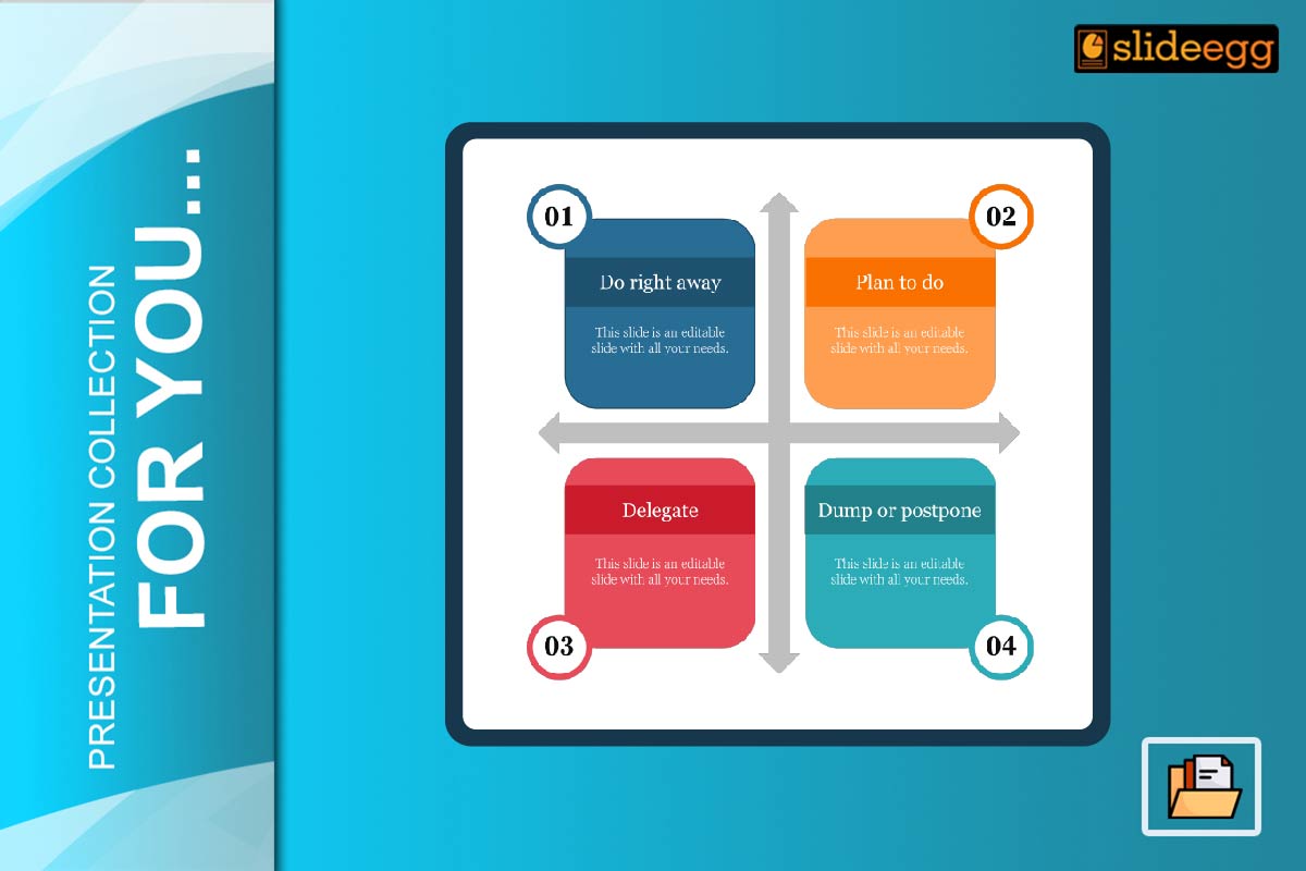
4. Prioritize Tasks or Issues
Matrix diagrams help teams make better decisions by mapping items based on urgency and importance. This simplifies decision-making and helps allocate time effectively.
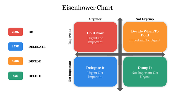
Use Cases:
- Eisenhower Matrix (urgent vs. important)
- Risk assessment charts
Tip: Use gradient color scales to show severity or priority.
5. Show Relationships Between Factors
If your presentation involves variables that influence each other, a matrix diagram can be a great way to display these interconnections.
Use Cases:
- Cause and effect diagrams
- Correlation matrices in research
Tip: Use arrows or flow indicators to emphasize directional relationships.
Want another structured tool to analyze root causes? Check out our Fishbone PowerPoint Templates for Root Cause Analysis to visualize problems and solutions side by side.
6. Track Project Milestones or KPIs
Matrix diagrams are also useful to track performance across departments or time frames. Instead of listing metrics, show them in a matrix for easy comparison.
Use Cases:
- KPI tracking for departments
- Milestone achievements over weeks/months
Tip: Add icons, status indicators, and dates for clarity.
Templates That Can Help
Want to save time and still make your slides look professional? Matrix diagrams PowerPoint templates can be a great help.
Popular Templates:
- SWOT Matrix Slides
- Product Comparison Charts
- KPI Dashboard Matrices
- RACI Matrix Templates
Templates help maintain visual consistency and keep the focus on your message.
Conclusion
Matrix diagrams are more than just tables—they are versatile visual tools that bring structure, clarity, and engagement to your PowerPoint presentations. From business planning to feature comparison and task prioritization, using matrix diagrams creatively can make your presentations easier to follow and more impactful. Try them out in your next slide deck to organize ideas and impress your audience.
FAQs
1. What is the purpose of a matrix diagram in a presentation?
To show relationships, comparisons, and organized data in a clear, structured format.
2. Where can I use matrix diagrams?
They are useful in business, marketing, strategy, project management, and education.
3. What makes a matrix diagram effective?
Clarity, color usage, simplicity, and relevance to the topic make them effective.
4. Can I customize matrix templates in PowerPoint?
Yes, you can change colors, text, icons, and layout as needed.
5. Are matrix diagrams good for data-heavy presentations?
Yes, they simplify complex data and make comparisons easy to understand.