| Smart Tips for Creating Gantt Charts in Google Slides ✅ Use tables for easy alignment and structure. ✅ Choose bright colors to show different tasks. ✅ Keep task names short and clear. ✅ Add start and end dates for each task. ✅ Use shapes and lines to show task duration. ✅ Leave space between rows for better reading. ✅ Save your work often while making the chart. |
Introduction
Project managers around the world use Gantt charts every single day. Studies show that teams using visual project tools like Gantt charts finish projects 25% faster than those who don’t. But here’s the thing – you don’t need expensive software to make one.
Google Slides, the free tool you probably already use, can create amazing Gantt charts. Many people think they need special apps, but that’s not true. With just a few simple steps, you can build charts that look professional and help your team stay on track.
What is a Gantt Chart and Why Use It?
A Gantt chart shows your project timeline in a visual way. Think of it like a calendar that shows when each task starts and ends. It helps you see which tasks happen at the same time and which ones must wait for others to finish.
You can use Gantt charts for many things:
- School projects and assignments
- Work deadlines and meetings
- Planning events like parties or weddings
- Home renovation projects
- Daily and weekly schedules
Step-by-Step Guide to Create Gantt Chart in Google Slides
Step 1: Open Google Slides and Create a New Presentation
Go to slides.google.com and click “Blank” to start fresh. Give your presentation a name like “Project Timeline” or “Gantt Chart.”
Step 2: Insert a Table
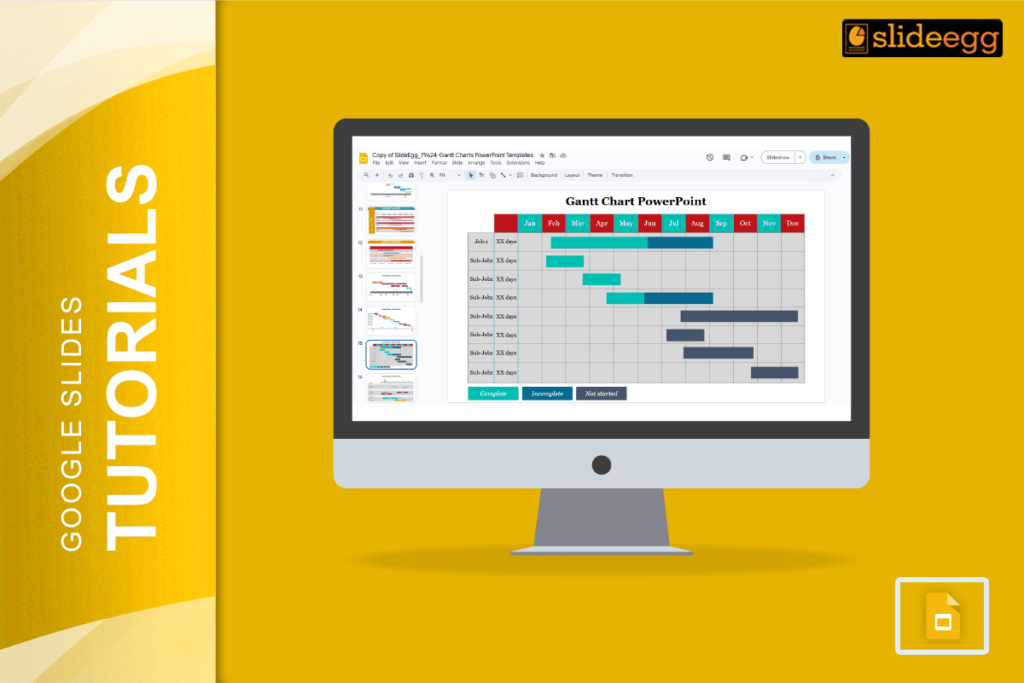
Click “Insert” in the top menu, then choose “Table.” Start with a 6×6 table. You can always add more rows or columns later. This table will be the base of your Gantt chart.
Step 3: Set Up Your Headers
In the first row, add these headers:
- Task Name (first column)
- Start Date (second column)
- End Date (third column)
- Duration (fourth column)
- Timeline columns for weeks or months
Step 4: Add Your Tasks
Fill in your task names in the first column. Write simple, clear names like “Research,” “Write Report,” or “Review Content.” Keep them short so they fit well in the cells.
Step 5: Add Dates and Duration
Fill in when each task starts and ends. You can use dates like “Jan 1” or “Week 1” – whatever works best for your project. Calculate how long each task takes and write it in the duration column.
Step 6: Create the Visual Timeline
Now comes the fun part. In the timeline columns, you’ll add colored shapes to show when tasks happen.
- Click “Insert” then “Shape” and choose “Rectangle.” Draw a rectangle in the cells where your task happens. For example, if Task 1 runs from Week 1 to Week 3, draw a rectangle across those three cells.
Step 7: Color Code Your Tasks
Right-click on each rectangle and choose “Fill color.” Use different colors for different types of tasks:
- Blue for planning tasks
- Green for action tasks
- Red for urgent deadlines
- Yellow for review tasks
Step 8: Adjust and Format
Make your chart look clean and professional:
- Resize columns so the text fits nicely
- Center-align your text
- Make header text bold
- Add borders to make sections clear
Tips for Better Gantt Charts in Google Slides
- Keep it simple: Don’t try to show too much detail. Focus on main tasks and key dates.
- Use clear colors: Pick colors that are easy to see and understand. Avoid colors that are too similar.
- Update regularly: Change your chart when project dates change. Keep it current so your team can trust it.
- Share with your team: Use Google Slides sharing features so everyone can see the latest version.
Advanced Features You Can Add
Once you master the basics, try these extras:
- Dependencies: Use arrows to show which tasks depend on others. Insert arrow shapes and connect related tasks.
- Progress tracking: Use different shades of the same color to show how much of each task is done.
- Milestones: Add diamond shapes to mark important project milestones or deadlines.
- Resource assignment: Add a column to show who is responsible for each task.
Common Mistakes to Avoid
- Don’t make your chart too complex on the first try. Start simple and add details later.
- Don’t forget to leave extra time between tasks. Things often take longer than expected.
- Don’t use too many colors. Stick to 4-5 colors maximum so your chart stays clear.
- Don’t make the text too small. Your team should be able to read everything easily.
Why Google Slides Works Great for Gantt Charts
Google Slides is perfect for making Gantt charts because:
- It’s free and easy to use
- You can share it with anyone
- Multiple people can edit at the same time
- It saves automatically to the cloud
- You can access it from any device
- No special training needed
Frequently Asked Questions
1. Can I make a Gantt chart in Google Slides for free?
Yes, Google Slides is completely free. You just need a Google account to start making professional Gantt charts.
2. How many tasks can I add to my Gantt chart?
You can add as many tasks as you need. Just insert more rows in your table. For very large projects, consider breaking them into smaller charts.
3. Can I share my Gantt chart with my team?
Absolutely! Click the “Share” button in Google Slides and add team members’ email addresses. You can control who can view or edit the chart.
4. What if I need to change the dates later?
No problem! Just edit the dates in your table and move the colored rectangles to match the new timeline. Google Slides makes updates easy.
5. Can I print my Gantt chart?
Yes, you can print directly from Google Slides or download it as a PDF first. Make sure to check the print preview to ensure everything fits on the page nicely.
Creating Gantt charts in Google Slides is easier than most people think. With these steps, you can make charts that help your projects run smoothly and keep everyone on the same page. Start with a simple chart and add more features as you get comfortable with the process.