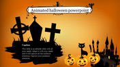
Free - Animated PowerPoint Themes Free Download
Free

 Canva
Canva


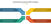
Free Animations for PowerPoint
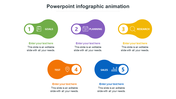
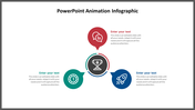
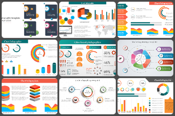
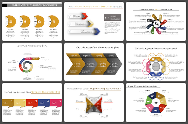
This animation PowerPoint chart displays the percentage values of various categories in a circular format. Each category is represented as curved lines in a separate color, and its percentage values are clearly marked. The animated pie chart in this slide is perfect for presenting a comparative analysis of different data sets.
The design of this slide is modern and easy to understand. The animated feature of the pie chart will grab the attention of the audience. Different colors help to clearly distinguish the sections. The customizable icons add a little visual interest, and they can be adapted to suit the theme of the section being explained. This slide is a great tool to help you present statistical information in an attractive and clear way in your presentation.
Key features:
- Market Share: You can show the market share of different products or services in percentage terms.
- Customer Segment: You can illustrate the percentage distribution of different customer segments.
- Growth Rate: You can compare the growth rates of different sectors.
- Survey Results: You can display the percentage of different responses.
- Budget Allocation: You can display the budget allocation for different expenses in percentage terms.
Features of this template:
- 100% customizable slides and easy to download.
- Slides available in different nodes and colors.
- The slide contained 16:9 and 4:3 format.
- Easy to change the slide colors quickly.
- It is a well-crafted template with an instant download facility.
- Saves time.
- Easy accessible and user-friendly.
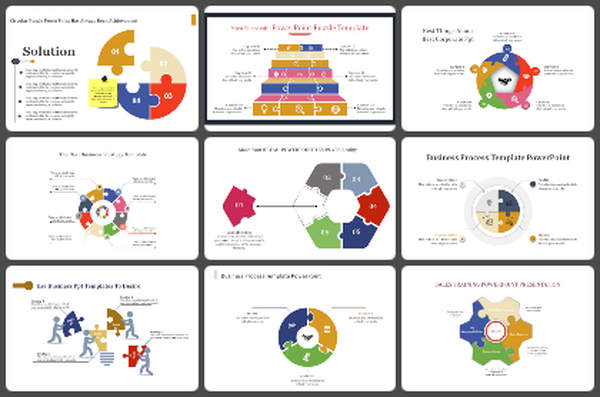
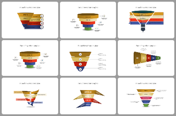
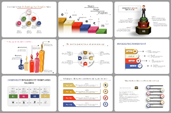
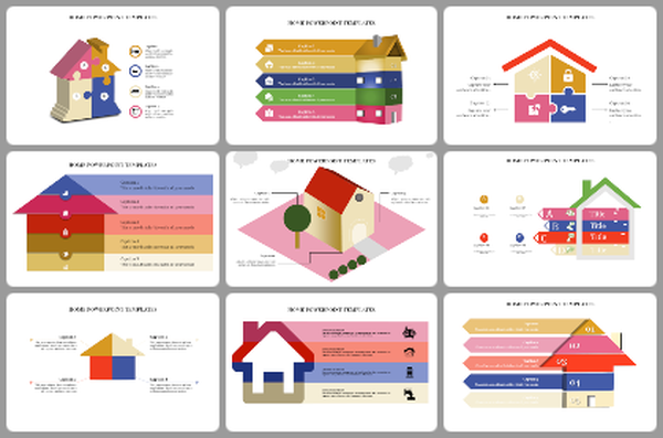
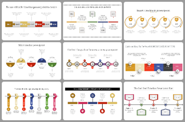
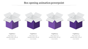
You May Also Like These PowerPoint Templates

Add to Wishlist
Download
AI Customize

Add to Wishlist
Download
AI Customize


Add to Wishlist
Download
AI Customize

Add to Wishlist
Download
AI Customize


Add to Wishlist
Download
AI Customize


Add to Wishlist
Download
AI Customize

Add to Wishlist
Download
AI Customize


Add to Wishlist
Download
AI Customize


Free
Add to Wishlist
Download
AI Customize

Add to Wishlist
Download
AI Customize

