An organizational chart is one of the most practical slides you can add to any business presentation. Whether you are onboarding new team members, pitching to investors, or mapping out a department restructure, a well-built org chart communicates who does what and how everyone connects — instantly. In this guide you will learn three different ways to create a professional org chart in PowerPoint, from the built-in SmartArt method to manual shapes for full design control to ready-made templates that get you there in under two minutes.
What you will need: Microsoft PowerPoint 2016 or later (Windows or Mac). All three methods below also work in PowerPoint for Microsoft 365.
What is an organizational chart?
An organizational chart — often called an org chart — is a diagram that maps the structure, hierarchy, and reporting relationships within a company, team, or project. At the top you usually find the CEO or department head. Each level below shows direct reports, teams, and sub-teams connected by lines. Org charts help people understand the chain of command at a glance and are used across HR, strategy, and internal communications. For more technical detail, the Microsoft SmartArt documentation is a useful reference (opens in new tab).
Method 1 — using SmartArt (quickest built-in method)
PowerPoint’s SmartArt feature includes a dedicated Hierarchy category that builds the structure and connectors automatically. This is the fastest way to get a working org chart if you do not need heavy customisation.
Tip: SmartArt is fast but has limited design flexibility. If you need precise colour control, custom fonts, or branded shapes, use Method 2 or Method 3 instead.
- Open a new or existing slide Click on the slide where you want to insert the chart. If you want it on a blank slide, go to Insert → New Slide and choose the Blank layout.
- Insert a SmartArt Hierarchy graphic On the Insert tab, click SmartArt. In the dialog that opens, select Hierarchy from the left panel. Choose Organisation Chart (the first option) and click OK. PowerPoint drops a default three-level chart onto your slide.
- Add your people and roles Click any shape and type the person’s name and title. To add a new subordinate shape: click the shape that will be the manager, then in the SmartArt Design tab click Add Shape → Add Shape Below. To add a peer shape at the same level, choose Add Shape After.
- Style the chart With the SmartArt selected, use the SmartArt Design tab to pick a colour scheme and layout style. The Change Colors button lets you apply your brand colours in one click. Use the Format tab to adjust individual shape fills, fonts, and borders.
Save your file Go to File → Save As and choose .pptx to keep it fully editable, or export to PDF if you only need to share a view-only version.
Method 2 — building an org chart manually with shapes
If you want pixel-perfect control over every element — colours, sizes, connector styles, and layout — building the chart manually with PowerPoint shapes gives you total freedom. This method takes longer but produces the most professional result when done well.
- Plan your hierarchy first Before touching PowerPoint, sketch your chart on paper or in a notes app. Count the number of levels and the widest row. A five-level chart with eight people across the bottom needs a widescreen slide — set your slide to 16:9 or a custom wider ratio before you start.
- Insert and format your first shape Go to Insert → Shapes → Rectangles and draw a rectangle near the top centre of the slide. Right-click → Format Shape → Fill and apply your brand colour. Add text inside: name on one line, job title below in a smaller font. Press Ctrl+D to duplicate it for each new box you need.
- Align shapes using the Arrange tools Select all shapes on the same level (hold Shift and click each one). On the Shape Format tab click Arrange → Align → Distribute Horizontally. This spaces them evenly in one click. Use Align → Align Middle to line up shapes on the same row perfectly.
- Draw connectors between shapes Go to Insert → Shapes → Lines → Elbow Connector. Hover over a shape — you will see small red dots appear on its edges. Click and drag from one dot to a dot on the subordinate shape. PowerPoint creates a connector that stays attached even if you move the shapes later.
- Group everything when done Select all shapes and connectors (Ctrl+A). Right-click → Group → Group. Now you can move the entire chart as a single object without breaking alignment.
Pro tip: Use different fill colours per department level — one colour for the executive layer, another for managers, and a neutral tone for individual contributors. Keep contrast high so names are readable on a projected screen.
Method 3 — using a pre-made org chart template (fastest professional result)
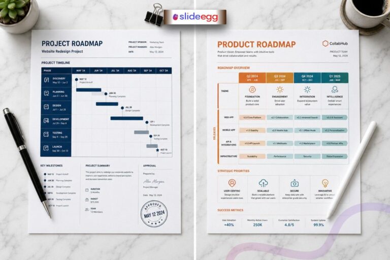
Both methods above require significant design time. If you need a polished, presentation-ready org chart in under five minutes, starting from a professionally designed template is the smartest approach. Visit the SlideEgg organizational chart presentation templates library and pick a layout that matches your team size. All templates are fully editable in PowerPoint and Google Slides.
- Browse and download a template Visit the SlideEgg organizational chart template library and pick a layout that matches your team size and style. Click Download to save the .pptx file to your computer.
- Open the file in PowerPoint Open the downloaded .pptx file. You will see a ready-made org chart with placeholder names and roles already placed in the correct hierarchy.
- Replace placeholder text Double-click any shape to enter edit mode and type your team member’s name and title. Tab through each shape to move quickly. Add or delete shapes as needed using the SmartArt or copy-paste techniques from Methods 1 and 2.
- Apply your brand colours Select all shapes of the same type, right-click → Format Shape, and change the fill to your brand colour. With templates, this usually takes under a minute per colour level.
- Apply your brand colours Select all shapes of the same type, right-click → Format Shape, and change the fill to your brand colour. With templates, this usually takes under a minute per colour level.
Need a head start? Browse our free PowerPoint templates including org chart layouts ready to customise. Browse free PowerPoint templates →
Best practices for org charts in PowerPoint
Strategic tip: rename your slide title Most presenters title their org chart slide “Our Team” — a label that says nothing. Instead, try a title that communicates purpose: “Visualizing Accountability and Support” or “Who Owns What — Q3 2026.” This instantly changes the slide from a static list into a strategic tool about company culture and efficiency — and it makes investors and stakeholders pay attention.
- Keep it simple. Show names and job titles only. Add extra detail like email or phone only if the slide is a printed handout, not a live presentation.
- Use colour to group departments. Colour-coding by team makes large charts scannable in seconds. Stick to two or three colours maximum.
- Update it regularly. Org charts go stale fast. Set a reminder to review yours every quarter, especially after team changes.
- Match your slide aspect ratio to your screen. For projected presentations use 16:9 widescreen. For printed reports, 4:3 or A4 portrait works better.
- Explore animations carefully. You can animate each level to appear on click. Go to Animations → Add Animation and apply Appear to each level group. Use sparingly.
- Test on a small screen. Before your presentation, zoom out to 50%. If names are unreadable at that size, increase your font or reduce the number of boxes per row.
The 3-second hierarchy audit The Rule: If an employee cannot find their reporting line within 3 seconds of looking at the slide, the chart is too cluttered. Before you present, hand your laptop to someone who has never seen the chart and time them finding a specific person’s manager. If it takes more than 3 seconds, simplify — split into department sub-charts, reduce font detail, or increase white space between levels.
Handling large organisations — functional grouping
Most org chart tutorials show a tidy five-person team. Real companies have 50, 100, or 500 people. Fitting all of them onto one slide creates cognitive overload — the very problem a well-designed org chart should solve. The answer is functional grouping.
What is functional grouping? Instead of showing every individual, group people by department into a single colour-coded box. For example: rather than listing all eight marketing managers as separate nodes, create one box labelled “Marketing Managers (×8)” filled in your marketing department colour. This preserves the hierarchy and reporting structure at a glance, while eliminating eye-strain. Audience members who need the full detail can refer to a separate departmental slide or a printed handout.
- Use one consistent colour per department across your entire presentation — not just the org chart slide.
- Add a small legend box in the corner of the slide mapping each colour to a department name.
- For very large organisations, create a master overview slide with functional groups, then individual department slides that expand each group with full detail.
Matrix reporting — the 2026 shift in org chart design
The traditional top-down org chart assumes every person has exactly one manager. In 2026, that is rarely true. Most modern companies operate as matrix organisations — where an engineer might report to both a team lead and a project manager, or a designer reports to the design director day-to-day but to a product owner for a specific launch.
Showing these dotted-line relationships on a static PowerPoint slide is notoriously difficult. Adding a dashed connector between two boxes works, but on a chart with more than 15 people it quickly becomes an unreadable web of crossing lines.
For static PowerPoint org charts, the cleanest approach to matrix reporting is a two-slide system: Slide 1 shows the primary (solid-line) hierarchy. Slide 2 shows the same chart with dotted-line connections overlaid, labelled as the secondary reporting view. Use dashed connectors in a different colour (grey works well) to distinguish them from primary reporting lines.
Using Google Slides instead? See our guide on How to Create an Org Chart in Google Slides for the platform-specific steps.
PowerPoint design tips and tricks for better org charts
Once your chart structure is correct, a few design refinements will make it look genuinely polished. Visit our PowerPoint design tips and tricks page for more techniques you can apply across all your presentations.
- Use Rounded Rectangle shapes instead of plain rectangles for a modern feel — available in Insert → Shapes.
- Set line spacing inside each shape to 1.2 — it makes name and title pairs easier to scan quickly.
- Add a thin border (1pt, same colour as the fill but 30% darker) to each shape for depth without gradients.
- Use Merge Shapes → Intersect to create custom icons inside shapes if you want to add department logos or headshots.
Frequently asked questions
Can I create an org chart in PowerPoint without SmartArt?
Yes. Method 2 above shows you exactly how to build an org chart using regular shapes and connectors, without touching SmartArt at all. This approach gives you far more design flexibility and is recommended for large or heavily branded charts.
How do I add a photo to an org chart in PowerPoint?
Insert an image (Insert → Pictures) and resize it to fit inside or above the person’s shape. For a cleaner look, crop the photo to a circle: click the image → Picture Format → Crop → Crop to Shape → Oval. Position it centred above the name box and group them together.
What is the difference between a hierarchical and a flat org chart?
A hierarchical org chart shows a clear top-down chain of command — CEO at the top, managers below, employees beneath that. A flat org chart shows fewer levels and emphasises cross-team collaboration. Flat charts are common in startups and agile teams where there are few management layers between leadership and individual contributors.
How many levels should an org chart have?
For presentation purposes, three to four levels is the practical limit on a single slide. Beyond four levels, shapes become too small to read on a projected screen. For large organisations, create separate slides for each department and link them with a top-level summary chart on the first slide.
How do I export my PowerPoint org chart as an image?
Go to File → Export → Change File Type and select PNG or JPEG. PowerPoint will export each slide as a separate image file. Alternatively, right-click the chart object on the slide → Save as Picture to export only that element at high resolution.
Are there free org chart templates for PowerPoint?
Yes. SlideEgg offers a wide range of free and premium org chart templates. Browse the full collection on the organizational chart presentation templates page — all templates are fully editable and available for instant download.